
Roboto font from Google has different heights on Mac vs PC
Yesterday me and my colleague were collaborating on a same part of our project's UI and I noticed that she was changing correct paddings between text elements to incorrect one. When I asked why is she doing it, she answered that they were incorrect in the first place and she changed them to correct.
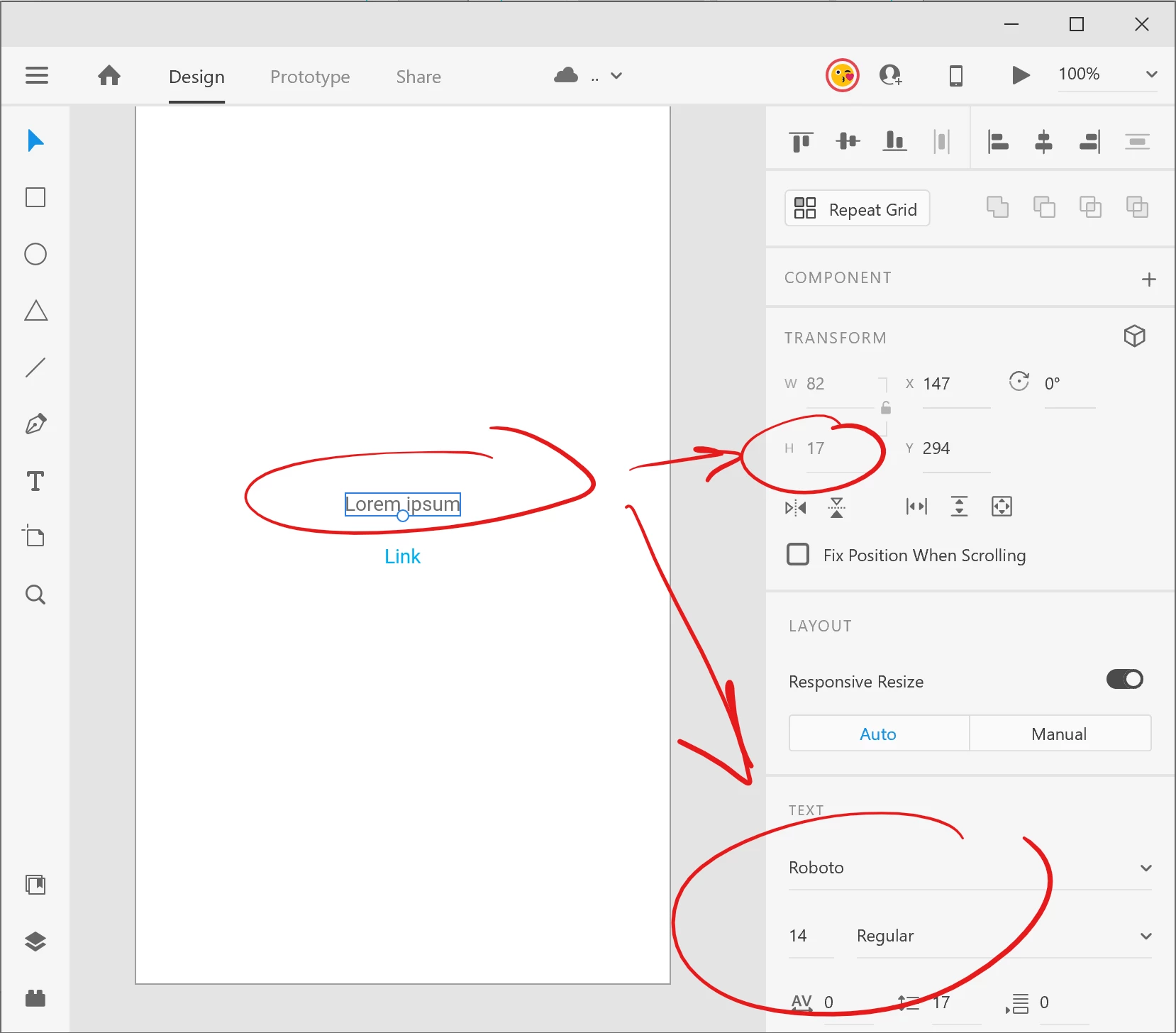
We've made a through-out testing and found out, that Roboto font has different heights on PC vs Mac. We've taken these screenshots while both co-editing this same file.
On a PC it looks like this:
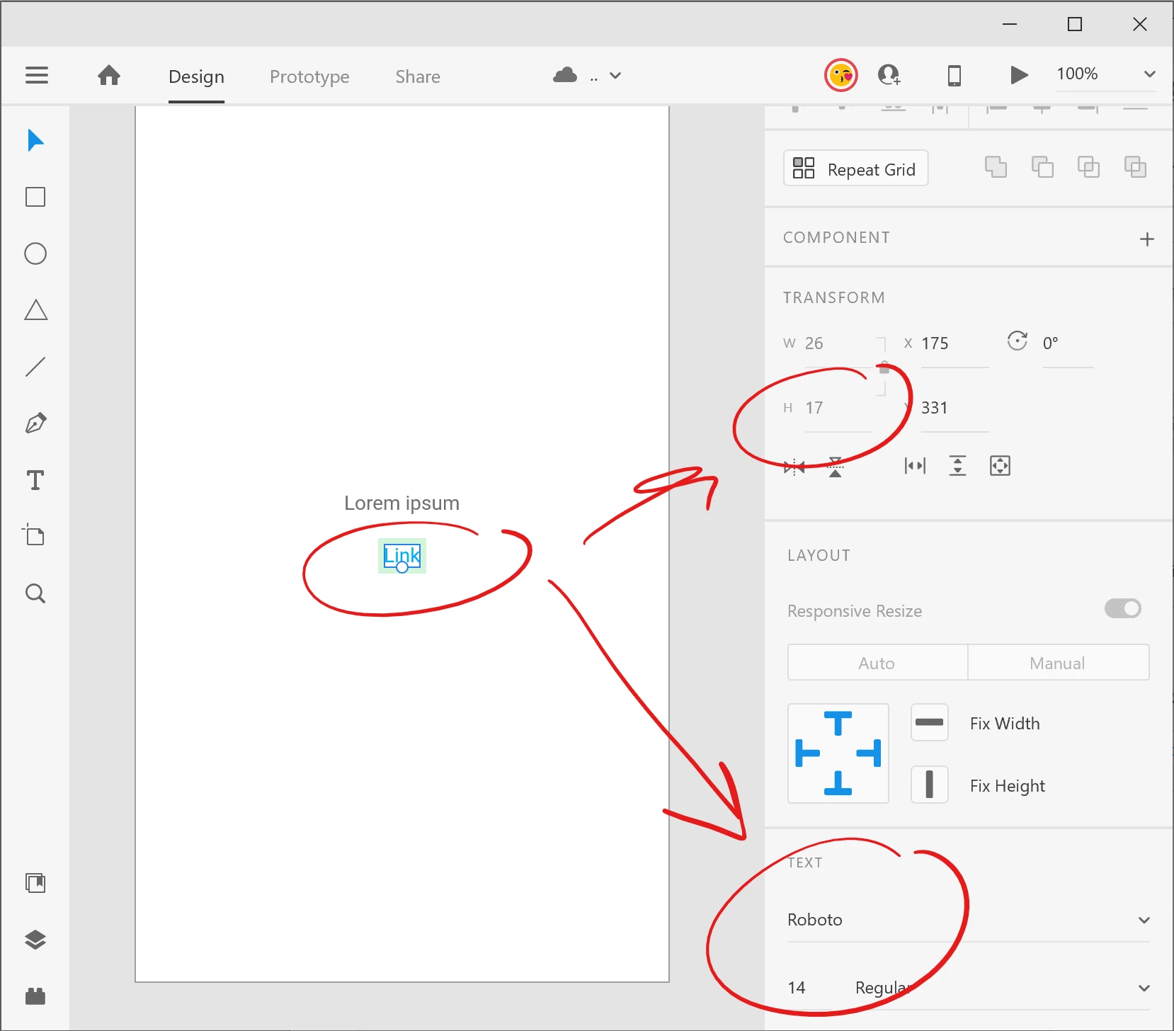
At the same time (i co-editing) it looks like this on a Mac:
We are using the same Roboto font downloaded from Google: https://fonts.google.com/specimen/Roboto
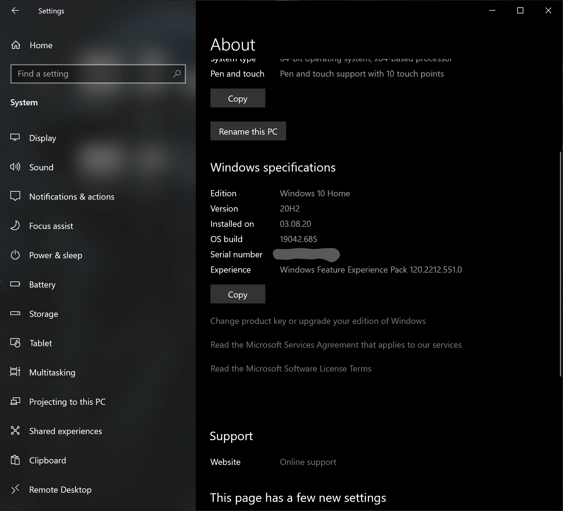
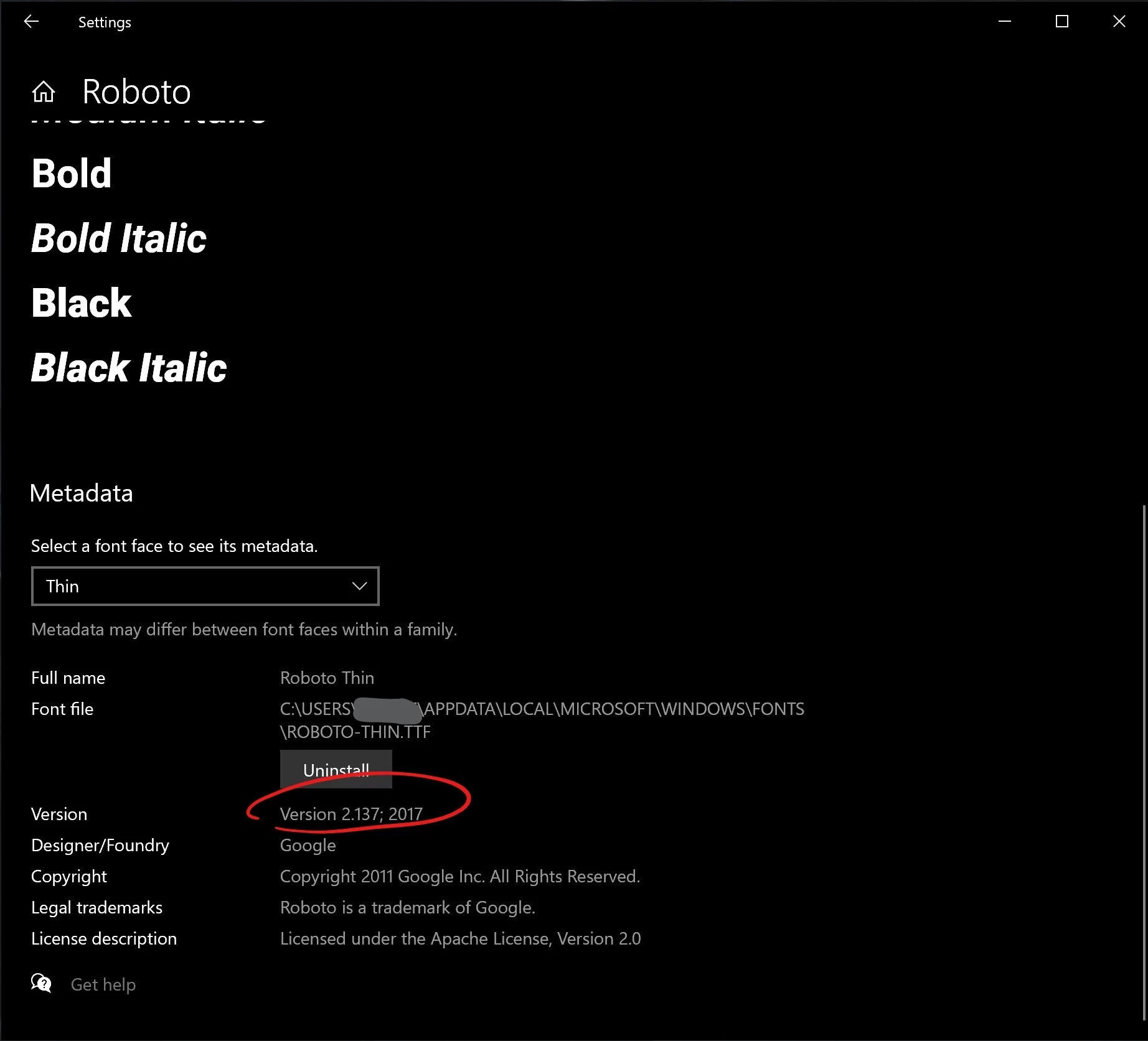
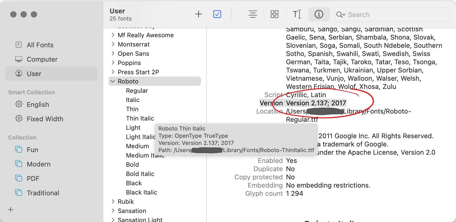
Here is a PC system and font info: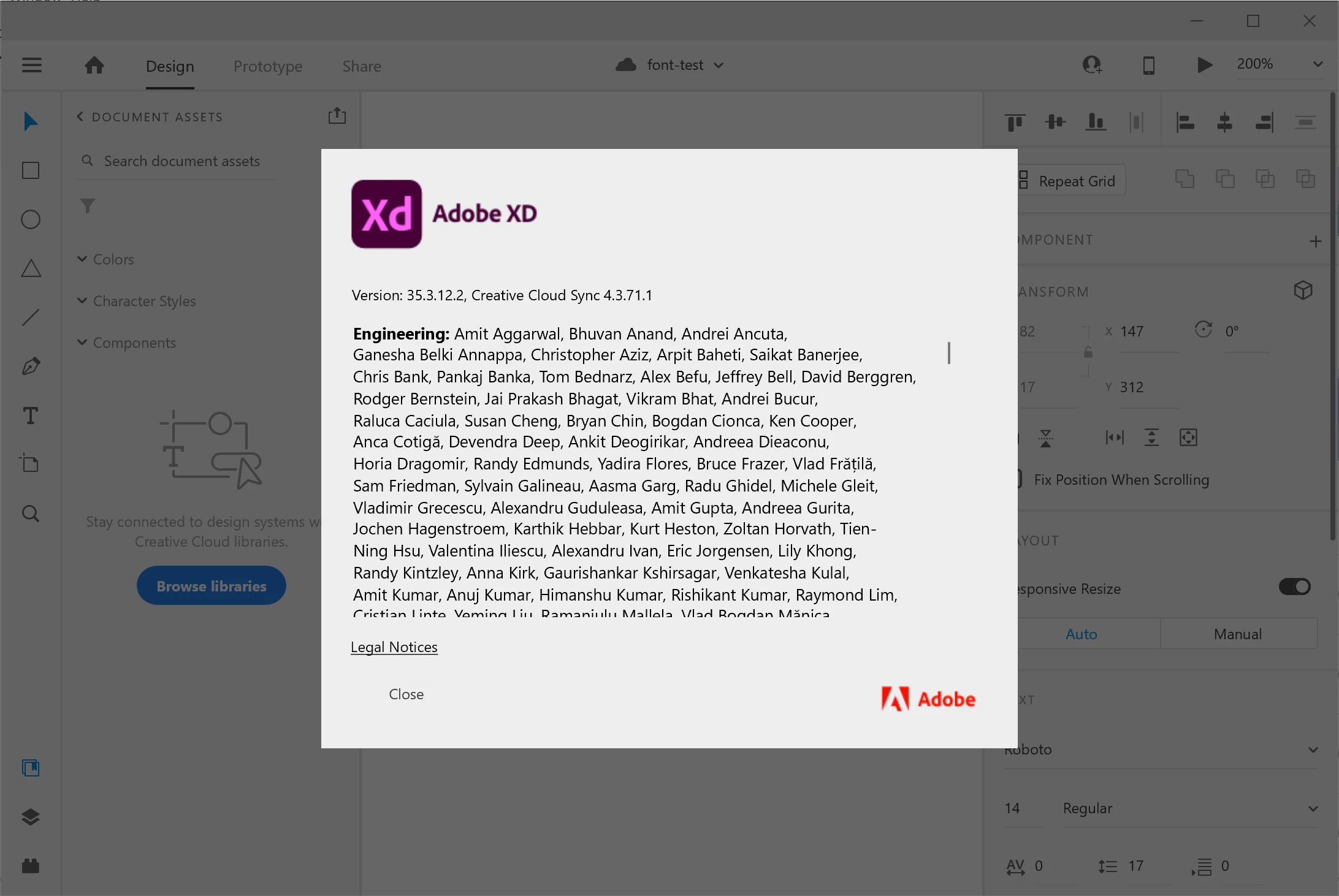
Here is a Mac system and font info: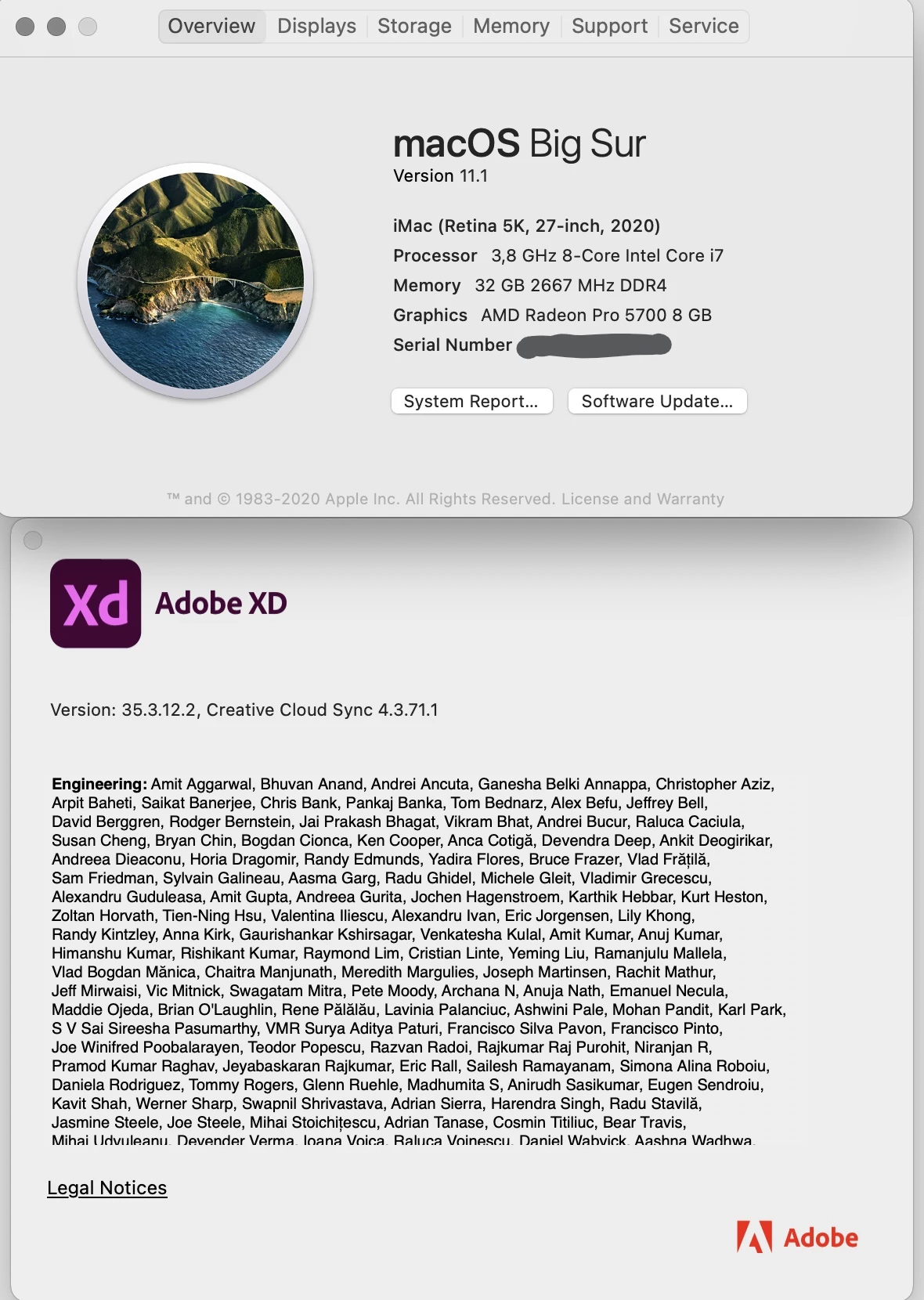
This is not a problem with one particular file, but with the font itself.
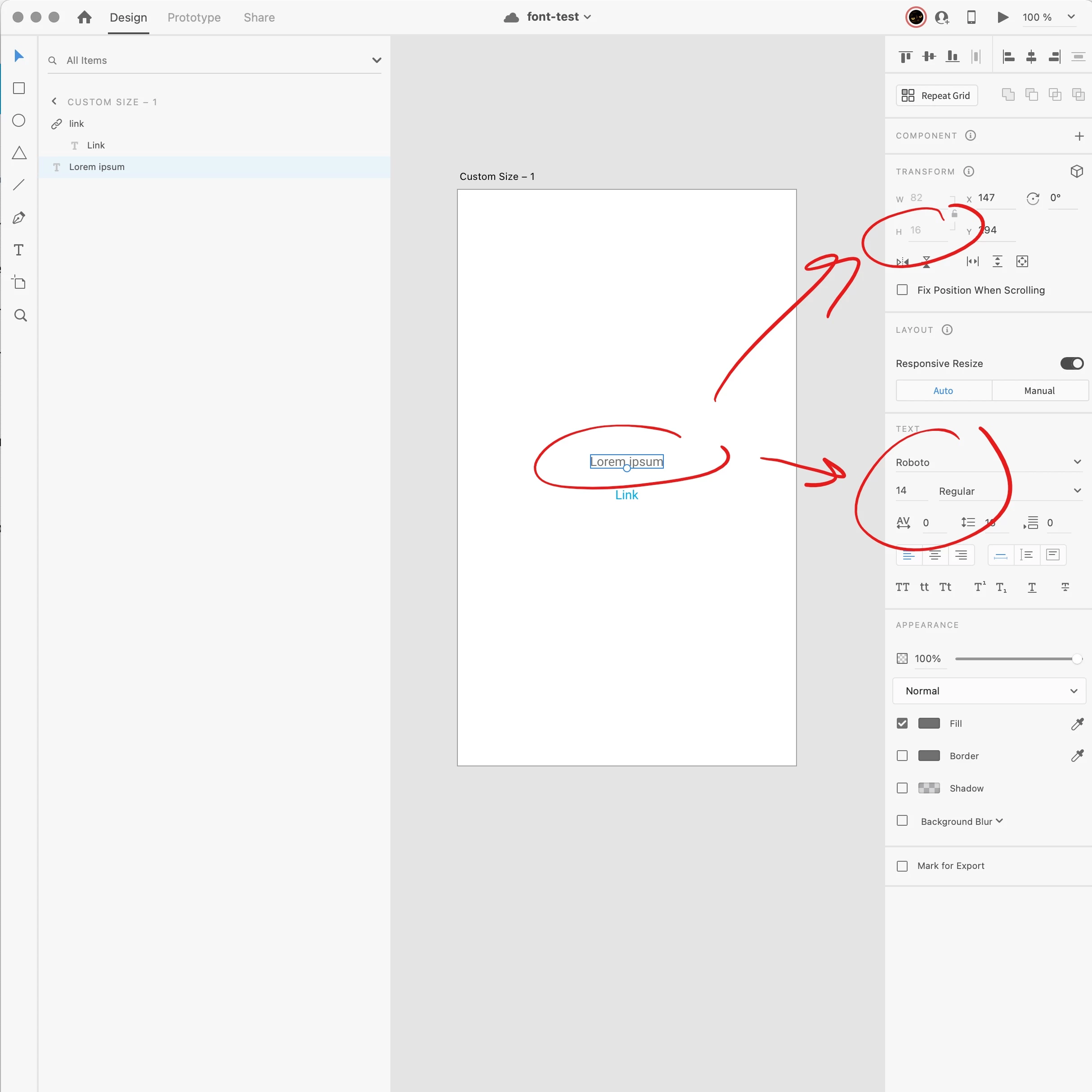
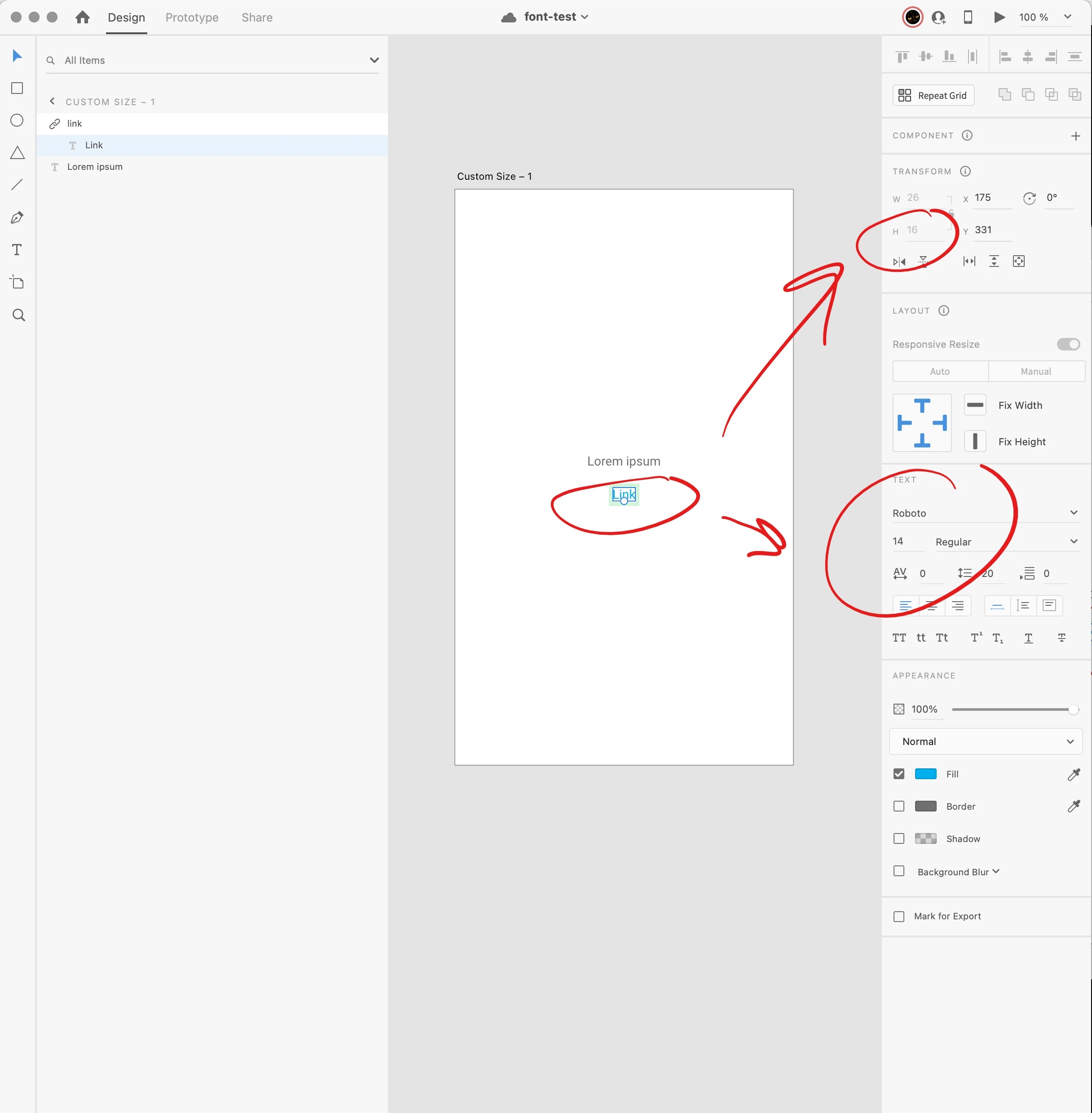
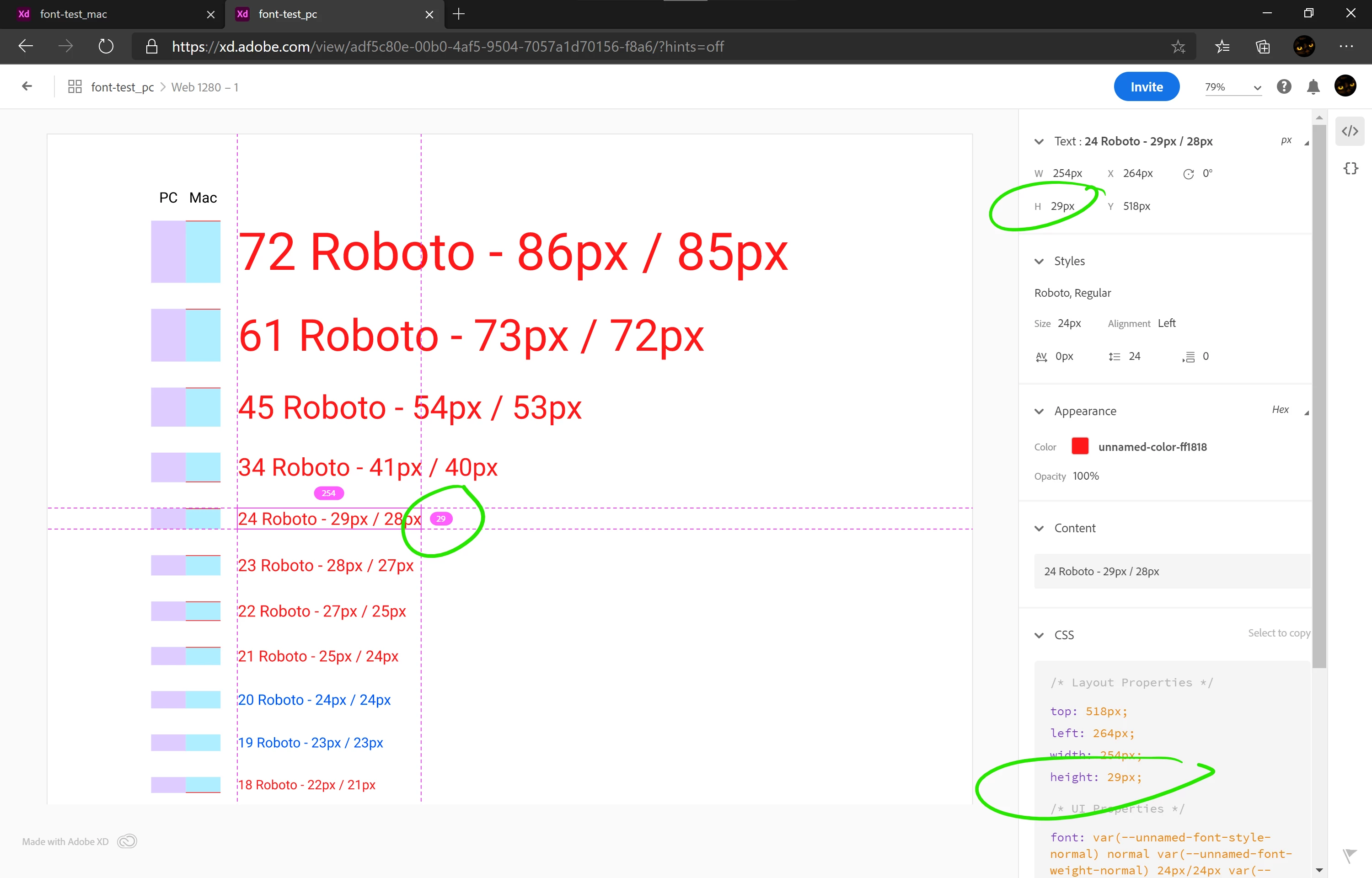
After a long testing we found out that this difference was not consistent along different sizes of Roboto font. We made this comparison in a cloud file, both saved it as local file and created links with Design Specs.
I've marked font sizes that don't match with red color and on the left I marked the height difference with red. Here you can clearly see that the difference may differ from 0 to 2 pixels and it can be at the top, or at the bottom, or both.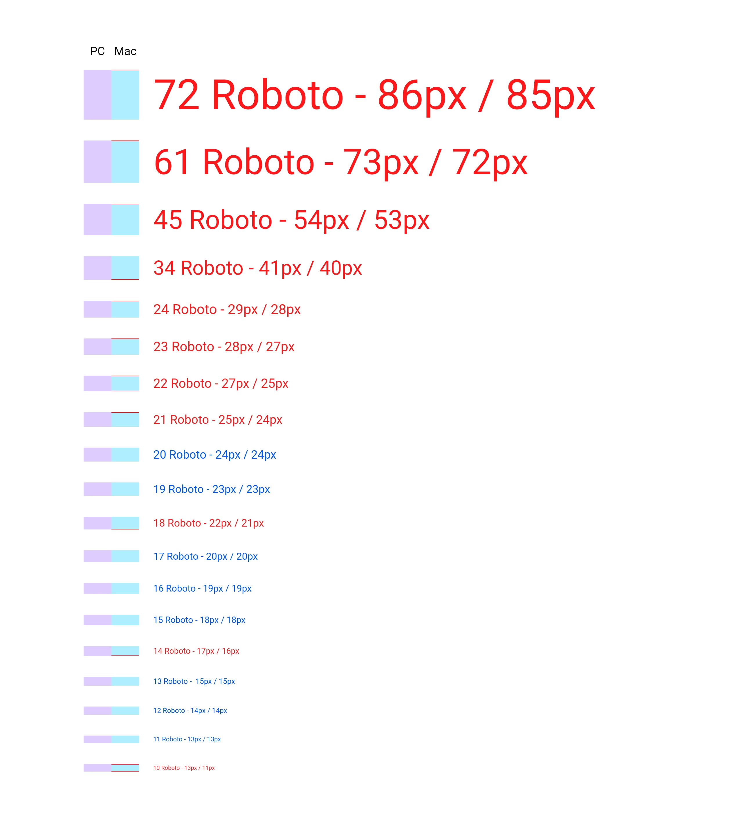
Link generated on a PC:
https://xd.adobe.com/view/adf5c80e-00b0-4af5-9504-7057a1d70156-f8a6/
Link generated on a Mac:
https://xd.adobe.com/view/2d51b57d-8586-454b-8e90-a347d7e6ab61-7802/
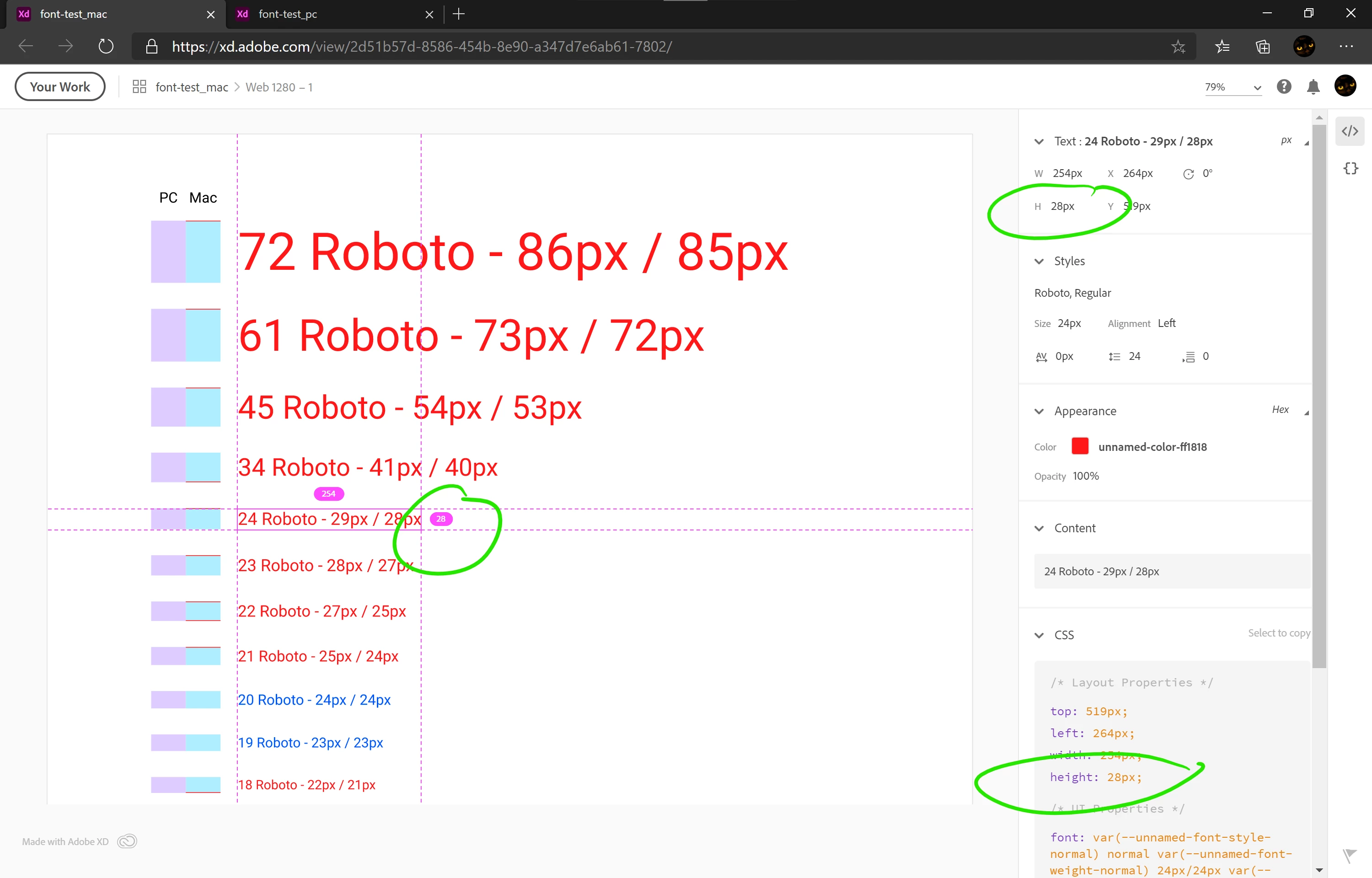
As you can see even in Design Specs the same text has different height depending on what platform it was generated on.
Here are both files:
https://1drv.ms/f/s!Atd7YEzqP5IVloJ6InkDpM9TpUtoDg
They both look exactly the same when are opened on the same platform.
This is a huge problem because I can't find any plausible workaround to make our Design Specs to be the same. It's very confusing both for designers and for developers. And after discussing this issue with our developers today, it appears that they already had a problem of different buttons being different heights that they had to fix. They thought I was just making small mistakes - it really hurts my reputation.
Roboto from Adobe Typekit is not an option, because it's way outdated and our developers use Google's version:
- Roboto from Google is v2.137 from 2017
- Roboto from Adobe is v2.001047 from 2015.
This is not the first report of the problem (it was reported year and a half ago) and there is no solution yet:
https://community.adobe.com/t5/adobe-xd/font-height-issues-moving-from-mac-pc/m-p/10553699?page=1
Adobe posts a lot of articles, videos and tutorials about design systems and enhanced collaboration. But we can't use neither of them because the same file opened in co-editing displays differently on PC vs Mac and the same components from our Libraries have different heights. This is not what I expect from a professional-grade software from such a huge developer as Adobe.
This is one example of a feature request that would eliminate this problem and was marked as FEATURE-COMPLETED:
Snap text box edges to edge of text – Adobe XD Feedback : Feature Requests & Bugs (uservoice.com)
But this "completed" feature is not what we were asking for - it's a totally different feature: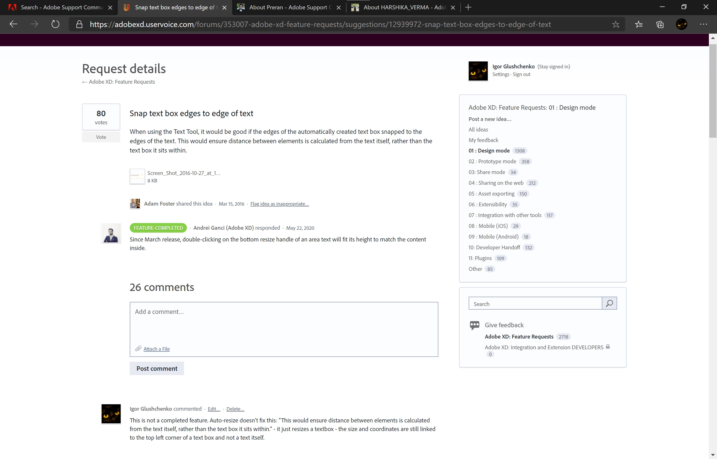
I've spent several months building our design system and now it's useless, and our developers and other coworkers think that I'm always making mistakes. This is not acceptable.
I hope this issue will be fixed soon because we can't work this way on a project where only a small part occupies 590 artboards and Library consists of 300+ elements.
