Copy link to clipboard
Copied
Hi everybody!
I'm having a strange problem with fullscreen, only on chrome, only on my ultra-widescreen monitor,
I'm doing my best effort to describe this, but not sure
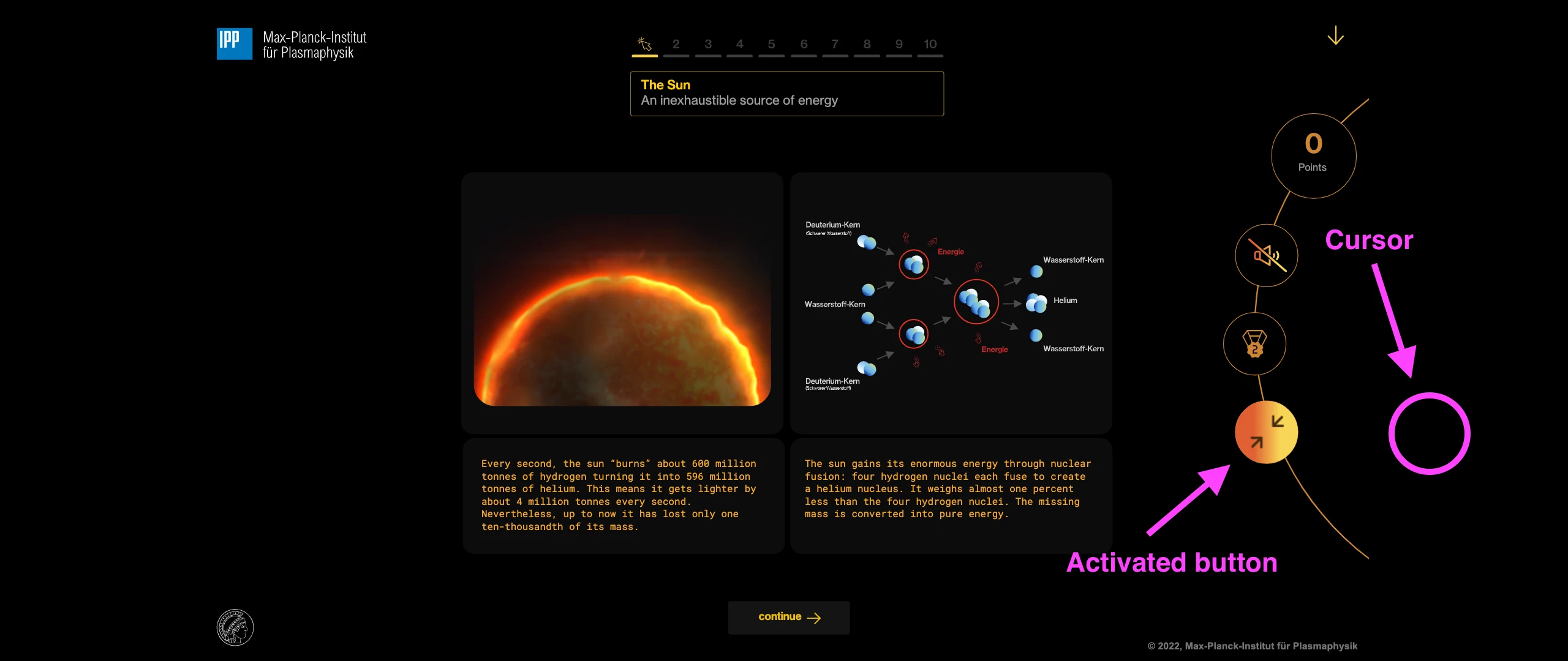
Once I fullscreen on chrome and on ultra-widescreen, all the active area buttons feel stretched to fill with of my canvas area but it doesn't match the design:
Does anyone have any idea, a clue even an anecdote with something similar?
I'm having a hard time to find a fix for this, but have no idea how to describe the problem or which sentences to use to google for better results.
Here is an example to test it
http://fullscreenfalopa.netlify.app
I get this only on chrome (and chromium based browsers)
Is quite more evident on ultra widescreen
Thanks, and sorry for my lack of explanation
Copy link to clipboard
Copied
Hi.
I'm not sure if I get the issue.
Do you want your design to take up all the available width?
Please let us know.
Regards,
JC
Copy link to clipboard
Copied
Is the button a simple button, or are you using your own code to decide when the cursor is over the button?
If it's your own code, there may be problems that could be solved with use of globaltolocal or localtoglobal. Read about those here:
Copy link to clipboard
Copied
Colling and JoãoCésar, Thank you for your time!
Those are actual adobe animate buttons, with their 4 frames states
I've been doing more tests and I think the problem is the hit tests of all buttons are streched out to fill the space of the fullscreen but the graphics maintain their aspect ratio
A quick drawn:
Imagine you stretch your canvas but maintain scales to not deform the image,
but on this chrome fullscreen bug, I got the image in his original proportions but the active states of each button stretched all together, if I still lack on explaining the bug, I could do a canvas and video capture if someone is interested on it
Thank you!!