Exit
  • Global community
    • Language:
      • Deutsch
      • English
      • Español
      • Français
      • Português
  • 日本語コミュニティ
  • 한국 커뮤니티
0

FLA fonts created under WIN look at the MAC badly, have bad spacing between lines.

New Here ,
Nov 11, 2016 Nov 11, 2016

Does anyone know how to properly open FLA in OS to look properly? Projects are processed on a PC and MAC, we need to jump between platforms.

Animate.png

(black MAC, red WIN)

So far we have failed to find a solution. 😞

150
Translate
Report
Community guidelines
Be kind and respectful, give credit to the original source of content, and search for duplicates before posting. Learn more
community guidelines
Community Expert ,
Nov 11, 2016 Nov 11, 2016

there are different leading settings demonstrated.  double check that.

Translate
Report
Community guidelines
Be kind and respectful, give credit to the original source of content, and search for duplicates before posting. Learn more
community guidelines
New Here ,
Nov 11, 2016 Nov 11, 2016
LATEST

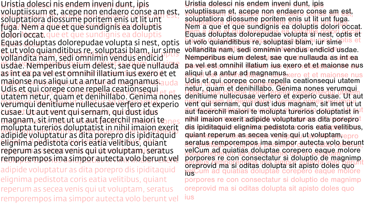
Yes, that is precisely the problem. Leading is the same, just as it highlighted the difference between opening the FLA between WIN and MAC.

I created a text box in the Win in 2 layers and the lower (red), I converted to curves. That same FLA I opened below the MAC and the resulting difference is in the picture.

Translate
Report
Community guidelines
Be kind and respectful, give credit to the original source of content, and search for duplicates before posting. Learn more
community guidelines