
Missing feature? Aligning Timeline buttons along the bottom of the tool bar.
Hello!
My brother (known as "Rocket Chris" on these forums) and I are newcomers to Adobe Animate after animating in Flash for over a decade. It's such a powerful tool, but we're definitely having some growing pains.
To that effect, I notice that all the timeline buttons have been moved from the bottom of the timeline toolbar, to the top.
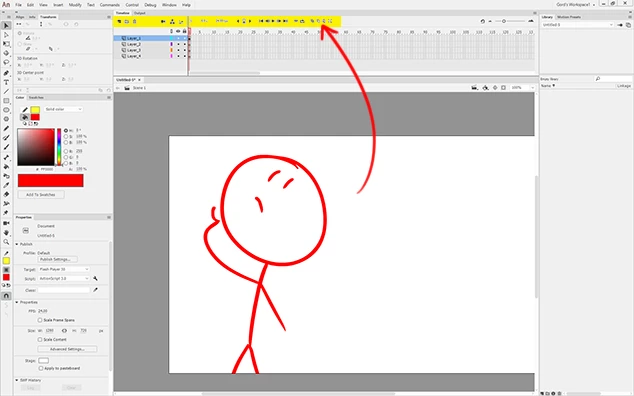
Because I'm working in the 'Classic' workspace, the placement of these buttons along the top is a bit problematic because I'm having to reach over all my layers whenever I want to use them.
It felt much more effiecient having the buttons run along the bottom, so I could rapidly go from working on the stage, then say add a layer, then get back to work, without the stack of layers getting in the way.
I know this is only a problem because I'm working the the "Classic" workspace. . . which puts the timeline at the top of the screen. . . but because all the timeline buttons run along the top of the toolbar, the "Classic" layout doens't feel very good for it's intended audience (old-timers like me!)
I would love an option to pop those buttons along the bottom.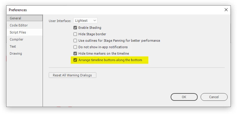
This way, no matter how you decide to layout your screen, you can make sure you have quick access to those buttons.
Let me know what you think, or if you have any other solution around this. Thanks! 🙂
