- Home
- Captivate
- Discussions
- Highlight Boxes Not Staying in Place
- Highlight Boxes Not Staying in Place
Highlight Boxes Not Staying in Place
Copy link to clipboard
Copied
Hello. I have completed a long Captivate project. A colleague and I have tested it several times and it looks great. However, when a stakeholder views it, she claims the red highlight boxes are not where I had placed them.
What is the issue? Do I need to secure them in place using coordinates?
Thanks for your help.
Copy link to clipboard
Copied
Is this a responsive project or normal one?
Ask the colleague to check whether her browser ZOOM percentage is the same as your's (ideally 100%) and also check her Windows > Settings > Display percentage. Perhaps that is throwing out positioning.
Copy link to clipboard
Copied
I believe this project is responsive.
This project was created by another designer who left before I was hired late last year. Unfortunately, I inherited the redesign of this project and the 250 slides within it. I am relatively new to Captivate; I had only used it twice when I was training in college. So, it is very challenging to edit someone else's work.
How can I tell if the original project was responsive?
Copy link to clipboard
Copied
Show a screenshot of the editing environment. If it is responsive it will probably be using Fluid Boxes. You should see this above the stage in that case:
Copy link to clipboard
Copied

I don't think this is responsive based on your screenshot.
Copy link to clipboard
Copied
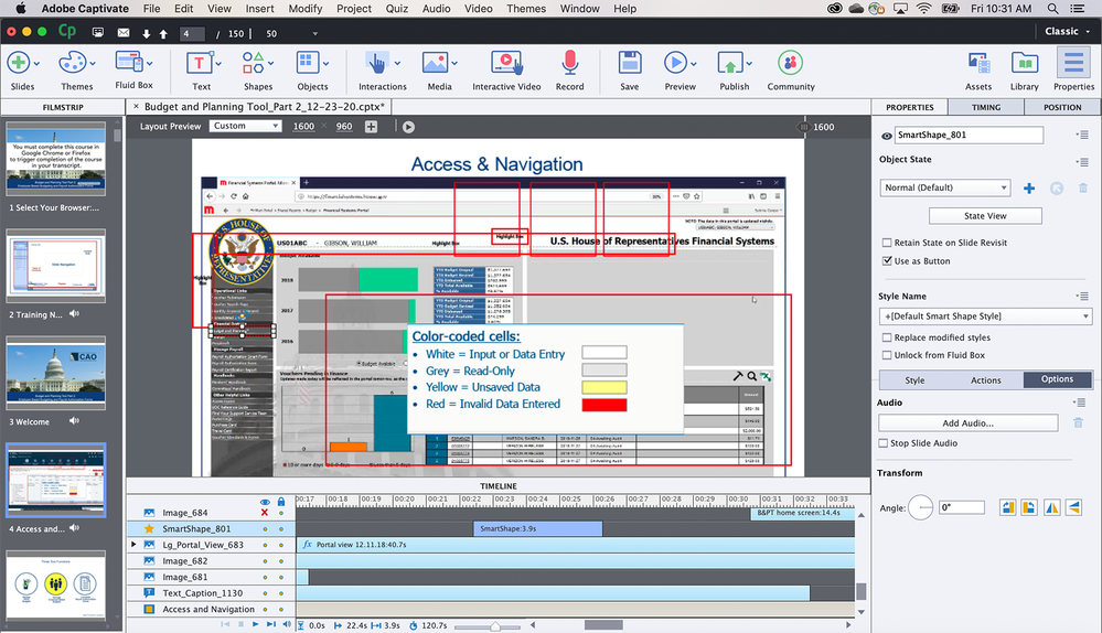
The environment is showing a Responsive project with Fluid Boxes.
BUT! The Timeline doesn't show any fluid box. Moreover there is a Click box which is an object that is not allowed in a normal Fluid box. You show the Position Properties panel. That was inherited from the older Breakpoint views workflow for responsive projects. It was added recently to make it possible to realize some slides which are not very suitable for Fluid boxes (like a slide video or interactive video). The designer has used this to set up a normal slide... should have switched to the Breakpoint views in that case.
You talked about a Highlight Box in your original question, but in this screenshot you have selected a Click box which is something totally different. You have problems when this click box is moving, indeed, because its position should have been linked to the position of the image under the click box. That has not been done by the designer, would even have been unnecessary if he had used the image as button instead of a combi click box + image (which is an outdated workflow). Since it is impossible to use stacked objects in a fluid box, you would have to recreate this slide from scratch using one object (image as button).
Sorry for that long comment, I didn't mention all the problem you may have. This project needs fixes which are IMO impossible for a newbie developer in Captivate. You are asked to fly an airplane because you are skilled on a bike. I have managed people, find this irresponsible from your manager.
Copy link to clipboard
Copied
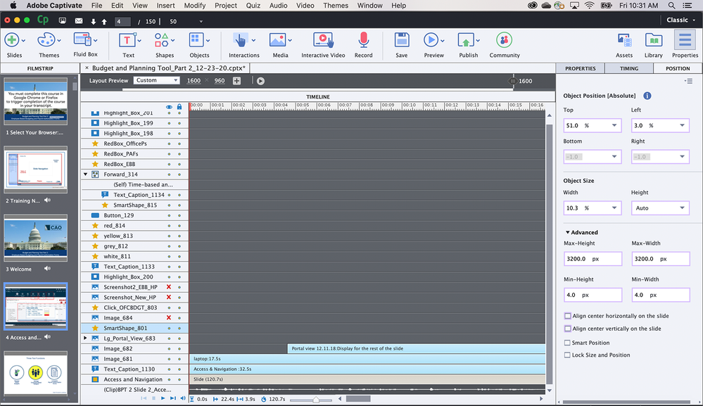
Thank you for your help. Below you will see additional screenshots. The stakeholder specifically said the red box in the left-hand navigation column was out of position. I have also included the timeline. As you can see, the original designer had a lot of elements on this slide.
Copy link to clipboard
Copied
A Fluid Boxes project without Fluid Boxes? You understand my frustration I hope? Be sure, I can imagine how you feel as new developer as well. Slide is full of stacked objects. Highlight box is normally also excluded from Fluid Boxes because it is stacked on top of some other object. This project cannot work properly on all devices, because the setup is totally awry.
If it had been a Breakpoint views project, the look of the editing environment would have been different, and then Position properties were really important. Not for a Fluid Boxes project where most locations and size should be done with Fluid Boxes. You don't have any Fluid Box.
I'm sorry, but is impossible to solve your very big problem just by answering questions in this forum. It is not ONE problem. If this project needs to be responsive, it has to be redesigned from scratch, or you have to convert it to a Breakpoint Views project from the Project menu. In that case you have to set up 3 to 5 Breakpoint views, using the inheritance from desktop to smaller resolutions and the Position Properties.
Copy link to clipboard
Copied
Thank you for your help. I was given this project with a very tight deadline. My suggestion was to redesign it from scratch, but I was told to just revise what already existed. I did the best I could. The stakeholder has said that she's having better success viewing the project once she adjusted her zoom settings in the browser. But not every user is going to think of resizing the browser.
Copy link to clipboard
Copied
I realise you have been dumped in the deep end of the pool here and it's not really your fault, but there are several issues you need to be aware of.
You can convert a normal project into a responsive project but you cannot convert from responsive back to a normal project format again.
From your screenshots it is evident that the previous designer didn't really understand when to use responsive and when it would be better to just stick with normal. This has been a common problem because the marketing hype from Adobe would lead e-learning developers to believe that responsive is a superior way to go, when in fact there are several downsides to it. You should only use responsive when the circumstances demand it.
Trying to make a responsive project behave the same way as a normal project is not going to work. With normal projects your stage area is a fixed height and width and your objects placed on screen will stay where you placed them unless you are using Effects to animate them. Your current issue with object placement is entirely due to the fact that your project is responsive.
You are correct in assuming that your end users are NOT going to be happy when told that they need to make changes to their display percentages just to keep everything looking right. One solution is to either spend the time learning about responsive design techniques and then go back and add the fluid boxes that were never used by the previous designer. However, since you are short of time, the better solution is probably just to bite the bullet and start a new 250 slide Normal project and copy paste all elements from current responsive slides over to the new format. Either way you were always going to have to rebuild this project to make it work. Going with a normal project saves you all the extra angst trying to work out how to make responsive work as you wanted.
Apologies for the bad news but that's all I can suggest.
Copy link to clipboard
Copied
Thank you for your advice. Despite the frustration with this project, I at least learned a lot about Captivate. This will be helpful in the future.


