

Multiple choice alignment issue

Copy link to clipboard
Copied
Hi,
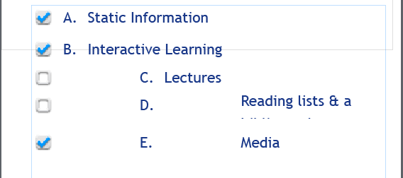
I am currently creating a responsive design for an elearning project using Captivate 8. I have been having issues with the resizing of the multiple choice options. When I resize to the mobile view, Captivate adjusts the alignment of the last 3 options?
I've tried to readjust the size of the text fields, as well as the font size, weight and kerning.
Primary and tablet view work fine though, with this issue only effecting mobile, is it a bug or am I doing something wrong !?
Below is a screenshot


 2
Replies
2
2
Replies
2

Copy link to clipboard
Copied
I am having this issue as well, using radio buttons in multiple choice. I managed to get everything lined up OK in tablet view, but mobile view is a mess. I've looked all over the internet for answers, and it seems this is an ongoing problem since early versions of Captivate. The only answer I found which seemed to help anyone (but not me) was to uncheck Autosize Captions in Preferences (which I never had checked). I'm using the latest version of Captivate. Please, if anyone has any ideas or workarounds, I need to get this fixed!
Copy link to clipboard
Copied
Wow, I think I might have just discovered a possible solution. I checked "Show Device Height" on mobile view, and pulled down the height to about 562px, and the problem seems to have cleared up! I'm not sure how this will really look on a mobile device, but I had to share this as a possible solution to try! Hope it works!

Get ready! An upgraded Adobe Community experience is coming in January.
Learn more
 AdChoices