Copy link to clipboard
Copied
hey all,
I am designing something for a CD cover that is going to be printed at a print shop, They say they want their images in CMYK and prefer it in a PDF or highest quality JPEG....
So I have been working in CMYK, everything looks fine in photoshop, but when I save out to a JPG the whole thing gets dark and colours get horribly over saturated.
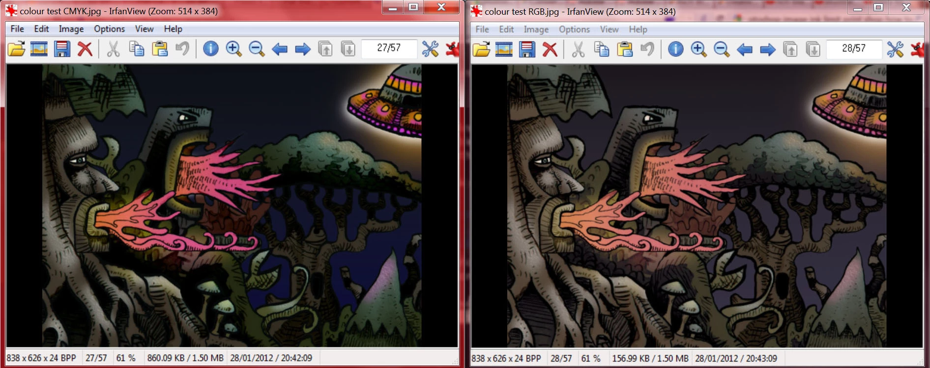
here you can see the image on the left is what happens when I save out directly from my CMYK file in photoshop. there is a big loss in detail in the darker areas and colours are over saturated. the image on the right is what I get if I convert to mode>RGB and then save the JPG. .. . .this is what I want it to look like....
my problem is the print shop requests the image in CMYK, but I want them to print like it looks in the RGB version
any help would be greatfully appreciated! Thankyou!
also here are the actual .jpegs as saved from photoshop
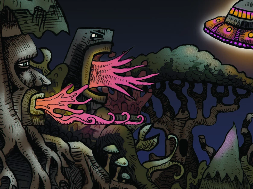
the CMYK version:
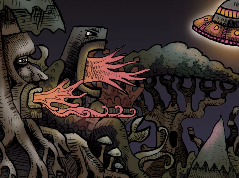
and the RGB version:
edit: I don't know too much about colour profiles, and the print shop hasn't provided one on their site, so I picked the default one - Working CMYK, U.S WebCoated (SWOP v2)
edit: these are the file formats the printers say they take on their site:
PDF - 300 dpi - (preferred), Tiff, Highest resolution JPG, EPS
I don't really have any experience with the other formats but I presume I would get the same colour results
Copy link to clipboard
Copied
RGB and CMYK will probably not be exactly the same color.
JPEG is a lossy compressed format, does not save layers or transparency so you may not see the same photo when saved.
Can you use a TIFF? That is a much better format and all shops should be able to use it.
Copy link to clipboard
Copied
yeah I can use a TIFF, I just saved one from CMYK to try it out but the colours and contrast are still just as bad as in the jpeg example I provided
Copy link to clipboard
Copied
I would definitely contact the print shop. They might, or might not, use the CMYK profile, that you chose, and their specs. will be what you want. Any good print shop will be glad to furnish you with what they want.
Now, the CMYK gamut is different from the RGB gamuts. Certain colors will never look the same. Greens are perfect examples. That is just how it is, when using inks on paper vs glowing pixels on a monitor.
Good luck, and either e-mail, or phone the shop. They should be very happy to help, as it will give you the best possible job.
Hunt
Copy link to clipboard
Copied
Copy link to clipboard
Copied
Thanks, I will contact the shop and hope they can give me an ICC profile, although I would have thought it would have been on their site somewhere if they had one.
But this still doesnt explain why my image looks good inside photoshop (working in CMYK) and then only looks awful when I open up the (jpeg/tiff) in any other program/browser..... I gather its probably something to do with the working profile applied by photoshop? How do I know which one the printers are going to see?
Copy link to clipboard
Copied
Many browsers are not color balanced as is Photoshop. So in all likelyhood it will look different.
Copy link to clipboard
Copied
And most other applications can't read CMYK JPEG, much less preview it correctly.
Copy link to clipboard
Copied
"But this still doesnt explain why my image looks good inside photoshop (working in CMYK) and then only looks awful when I open up the (jpeg/tiff) in any other program/browser....."
That reads like a colour management issue to me. Perhaps there's no embedded ICC profile in the saved image,
or perhaps the application used to view is not colour managed?
I hope this helps
neil barstow, colourmanagement net :: adobe forum volunteer:: co-author: 'getting colour right'
google me "neil barstow colourmanagement" for lots of free articles on colour management
Copy link to clipboard
Copied
I recommend converting a copy of your .psd over to cmyk profile. You may see some adjustment at that point in your colors. Open levels, and play with adjustments (sometimes just making it a little lighter helps) until you get it close to what you want.
Rasterize all text layers to ensure fonts are embedded and save as pdf. If you have a newer version of Photoshop, you may be able to select the specifications of the final pdf. If high quality print is an option, it is what I recommend.
Copy link to clipboard
Copied
I take it the entire file is from Photoshop? The print vendor wants hiRes PDF CMYK. Simple enough in Photoshop. However, it appears you have a conflict in the conversion from RGB to CMYK, specifically a gamut clip in your shadows. You do not mention what RGB space the original is in, just that you are going to SWOP CMYK. I'd be interested in knowing a few things up front:
1.) How many layers involved?
2.) What are your application Color Settings? Is "Desaturate Monitor Colors" > selected?
3.) What is the bit depth of the original? 16 or 8?
Try flattening a "copy" of the original, in the copy assign or apply an Adobe RGB profile to it. In your Color Settings, honor profiles when converting to CMYK in order to maximize the conversion gamut. I believe you can still adjust the image in the PDF format as suggested already. If, for whatever reason, you get the clip in the PDF generating, you may have to adjust the levels and curves to get back the shadow detail. That said, I have not encountered such a dramatic conversion mess as what you are showing in your thumbs. Hope this helps.
Copy link to clipboard
Copied
i wasn't able to follow this entire thread, but generally, from photoshop
Edit> Convert to Profile> Destination Space: (the CMYK profile your printer recommends)
if your printer 'genius' is clueless, US Web Coated SWOP v2 is a good bet
if your color shifts on the monitor when you Convert RGB to CMYK profiles in photoshop, you need to read up on Out of Gamut colors, Gamut Warning and Soft Proofing in photoshop
>>this still doesnt explain why my image looks good inside photoshop (working in CMYK) and then only looks awful when I open up the (jpeg/tiff) in any other program/browser
aside from Mr. Cox pointed out about CMYK .jpg — only applications that read embedded profiles (or assume the correct source profile by default) will display or print the color as photoshop does
probably saving in .tif for the printer is also a good idea (.jpg degrades pixel quality)
you could also setup the Conversion in a PDF (beware of behind-the-scenes jpg compression and mysterious profile issues tho)...but i would certainly NOT rasterise any type/text that you want vector sharp on the printed piece, and scream bloody murder if the print 'genius' drags your .pdf into photoshop and ruins your vector type sharpness
Copy link to clipboard
Copied
Thanks all for the replies.
Just to be clear the file is already in CMYK (U.S web coated SWOPv2), I understand now its probably smarter to work in RGB and then convert at the end but hadn't done so in this case.
If I change image mode to RGB (or vice versa) i notice a tiny shift in the colours on my monitor but nothing as dramatic as what im seeing in those CMYK Jpeg/TIFF's.
John Danek -
there are probably more than 20 layers in there, my colour settings should all be default because ive never even looked in there before, but here is a screenshot of the dialogue box
and the bit depth is 8-bits per channel
If I save it out as a CMYK .pdf then it looks fine, presumably because im opening it in Adobe acrobat reader so it can see the embedded profile. So I think this is the problem after all, thanks Chris Cox and gator soup for clearing that up!
I have emailed the printers and asked if they can read my embedded profiles correctly with their software (presumably they can) and asked for them to recommend an ICC colour profile but have yet to hear back from them.
Copy link to clipboard
Copied
Hello
I have the same problem. I think it's all about the JPEG format which can read cmyk colors. I saved the file as PDF and there was no problem with the colours. so maybe try to send the file as PDF.
Copy link to clipboard
Copied
Calibrate your monitor for surprise, switch to ICC for printers from DNG to CMJ(N). If the settings do not suit you, go to Photoshop and the Camera Raw filter.
Copy link to clipboard
Copied
I work at printer center. And the problem (as I see)
Is/was your image viewer.
Those image viewers don't support cmyk (even if its a tiff), and the colors get over saturated when seen in screen and sometimes even changing the levels of the colors if sent to print with that image viewer.
I recommend just a jpeg at hi-res cmyk or pdf o any type (whiles its in cmyk the files itself)
If you had problem viewing the file in pdf it must be some other problem.
But looks like a normal not supporting CMYK program.
You can try it sometimes with your phone, they normally don't accept cmyk files and they show an error or a over saturated image.
hope it helps
Copy link to clipboard
Copied
hi dear,
exactly the same problem i am facing right now dont know what to do
Copy link to clipboard
Copied
First and foremost - find out from your print shop exactly which CMYK color profile they want from you. There is no generic CMYK. If they cannot tell you then find another print shop as they don't know what they are doing.
If they can tell you then you can convert to that specific profile in Photoshop but you may (likely will) find some colours that are available in RGB that are just not printable in CMYK i.e they are outside the gamut of colours available in that CMYK color space. You can preview this before converting by using View Proof Set up and View Proof Colours. You can also turn on and off the gamut warning as an indication of where to look for changes. That way you can make adjustments to those colours and control the inevitable colour change if you are image contains out of gamut colours.
Dave
Copy link to clipboard
Copied
Hi
CMYK has a reduced gamut and tonal range compared to most RGB colourspaces, so many would agree with your decision to work on your design in CMYK -
But that’s only a good idea if you are very careful with saturation and total density and that can be quite hard to grasp and easy to get wrong.
Working inside a CMYK colourspace its pretty easy to break the total inklimit rules and make a file that's awful when printed.
The CMYK print process may only be targeted for files with a max ink of, say 280. If in any area of he image your total breaks that limit, your image when printed is toast.
Working in RGB but with View / proof setup / custom : choose CMYK profile, Relative Colrimetric [with black point compensation] - also check 'ink black' is far safer. Gamut warning will help you too, try to avoid creating areas that are out of gamut.
why?
when you convert from RGB to CMYK then the ink levels are calculated to stay within the limits prescribed.
You mention the image looks fine in Photoshop - then saving as a Jpeg and that’s when the tonal issues arise,
how are you viewing the Jpeg?
If its viewed in a non colour managed application like Windows Images then there's the problem.
If Photoshop [which has good colour management] shows your file is fine [on a properly calibrated screen], it IS fine
I hope this helps
if so, please "like" my reply and if you're OK now, please mark it as "correct", so that others who have similar issues can see the solution
thanks
neil barstow, colourmanagement.net :: adobe forum volunteer
[please do not use the reply button on a message in the thread, only use the one at the top of the page, to maintain chronological order]
Copy link to clipboard
Copied
In addition, most standard image viewers have no CMYK support at all. It may display, but with unpredictably scrambled colors.
If it looks good in Photoshop (and the CMYK profile is the correct one!), trust that. As Neil points out, take extreme care to not exceed the total ink limit for that particular profile. That will cause ink smearing and drying problems.
Copy link to clipboard
Copied
I've found this workflow to work best for most images that look washed out after CMYK conversion:
I've felt that the issue is mainly contrast.
Colors won't be same as RGB, but if you get the contrast right, the image at least doesn't look flat/washed out.
Copy link to clipboard
Copied
Increasing inks after conversion is risky! Make sure you're not exceeding TAC (total ink limit) anywhere.
A better way is to work in RGB, and calibrate your monitor to a black level that visually matches max ink for that process. A test print of anything will work, as long as you have full black in it.
Then you can see how it works in real time, what you see is what you get, and you don't risk exceeding TAC.
Copy link to clipboard
Copied
Hi
That is a very risky strategy and best avoided without high levels of expertise. Increasing ink values after conversion can result in ink running on press and sheets sticking together, 'set off' and even showthough.
neil barstow, colourmanagement.net :: adobe forum volunteer
[please do not use the reply button on a message in the thread, only use the one at the top of the page, to maintain the thread title and the chronological order]
Copy link to clipboard
Copied
Hi
D.Fosse wrote: Increasing inks after conversion is risky! Make sure you're not exceeding TAC (total ink limit) anywhere.
That’s right, its very risky. And hard to control, CMYK colour correction isn't impossible, but its highly skilled and super risky.
Work in RGB, get the right CMYK ICC profile from your printshop, convert at after all colour correction is done, That’s the safe way.
I hope this helps
if so, please "like" my reply
neil barstow, colourmanagement.net :: adobe forum volunteer
[please do not use the reply button on a message in the thread, only use the one at the top of the page, to maintain the thread title and the chronological order]
Copy link to clipboard
Copied
RGB will look like RGB on a monitor. CMYK will look like CMYK on a print. Neither will look like entirely like itself in the other's medium. Usign a design app in CMYK mode is the closest you're going to get to seeing CMYK on a screen and once you screenshot or save it you will be looking at a conversion (different formats & viewers will display different types of images with different color profiles differently...). Learning to process colors for print is an artform like learning to color grade a film knowing that it will be shown on a variety of different monitors from LED projectors to maybe even an old 20" CRT. It takes some trial, a decent amount of error, and tons of observation.