Exit
  • Global community
    • Language:
      • Deutsch
      • English
      • Español
      • Français
      • Português
  • 日本語コミュニティ
  • 한국 커뮤니티
1

I have to save as CMYK for print, but the colours are out of whack..

Participant ,
Jan 28, 2012 Jan 28, 2012

hey all,
I am designing something for a CD cover that is going to be printed at a print shop, They say they want their images in CMYK and prefer it in a PDF or highest quality JPEG....
So I have been working in CMYK, everything looks fine in photoshop, but when I save out to a JPG the whole thing gets dark and colours get horribly over saturated. colour test imbalance.jpg
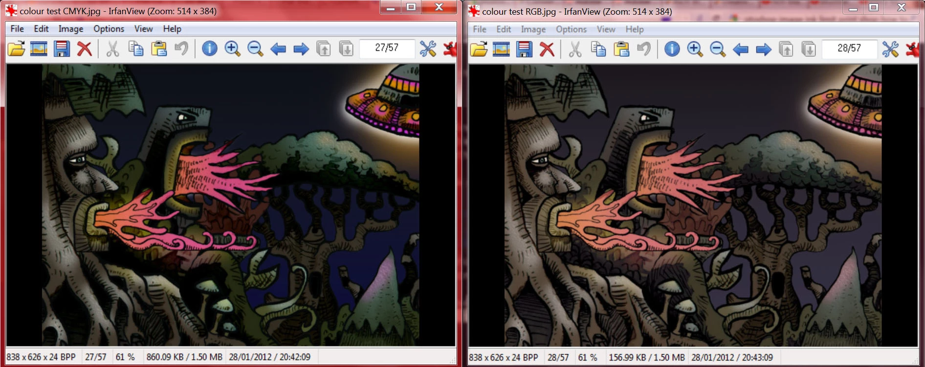
here you can see the image on the left is what happens when I save out directly from my CMYK file in photoshop. there is a big loss in detail in the darker areas and colours are over saturated. the image on the right is what I get if I convert to mode>RGB and then save the JPG. .. . .this is what I want it to look like....

my problem is the print shop requests the image in CMYK, but I want them to print like it looks in the RGB version
any help would be greatfully appreciated! Thankyou!

also here are the actual .jpegs as saved from photoshop
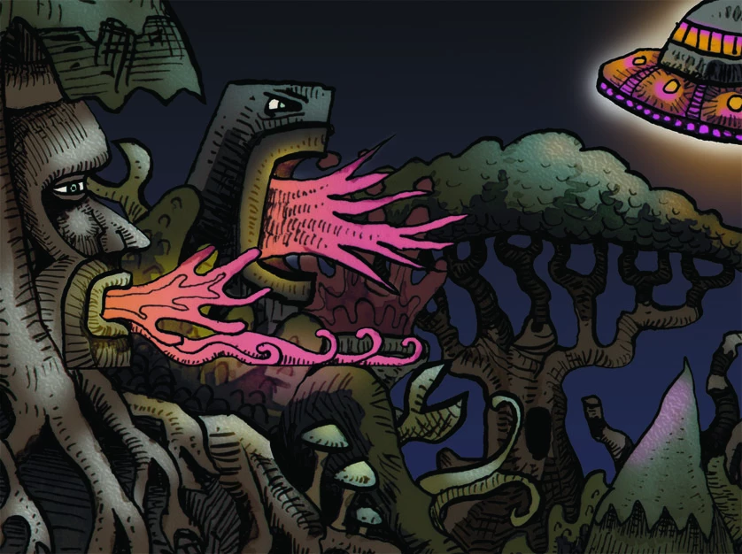
the CMYK version:

colour test CMYK.jpg

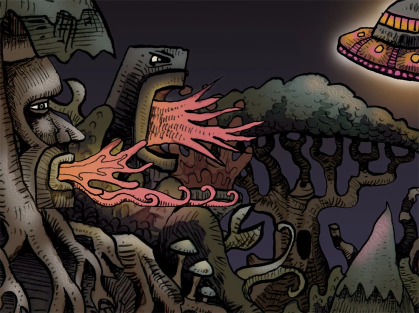
and the RGB version:

colour test RGB.jpg

edit: I don't know too much about colour profiles, and the print shop hasn't provided one on their site, so I picked the default one - Working CMYK, U.S WebCoated (SWOP v2)

edit: these are the file formats the printers say they take on their site:
PDF - 300 dpi - (preferred), Tiff, Highest resolution JPG, EPS

I don't really have any experience with the other formats but I presume I would get the same colour results

173.1K
Translate
Report
Community guidelines
Be kind and respectful, give credit to the original source of content, and search for duplicates before posting. Learn more
community guidelines
New Here ,
Oct 03, 2022 Oct 03, 2022

RGB will look like RGB on a monitor.  CMYK will look like CMYK on a print.  Neither will look like entirely like itself in the other's medium.  Usign a design app in CMYK mode is the closest you're going to get to seeing CMYK on a screen and once you screenshot or save it you will be looking at a conversion (different formats & viewers will display different types of images with different color profiles differently...).  Learning to process colors for print is an artform like learning to color grade a film knowing that it will be shown on a variety of different monitors from LED projectors to maybe even an old 20" CRT.  It takes some trial, a decent amount of error, and tons of observation.

Translate
Report
Community guidelines
Be kind and respectful, give credit to the original source of content, and search for duplicates before posting. Learn more
community guidelines
Community Expert ,
Oct 03, 2022 Oct 03, 2022

To get a reliable preview of how something will print, calibrate your monitor to a white and black point that visually matches the paper and print process. For offset print, that means a black point as high as perhaps 1.2 cd/m², which is very much higher than any monitor's native black point (normally 0.1-0.3).


The importance of the black point is underrated. It has a huge impact on the overall look of the image. Unless you match monitor black to max ink, you will almost certainly be disappointed when you see the final printed result.

Translate
Report
Community guidelines
Be kind and respectful, give credit to the original source of content, and search for duplicates before posting. Learn more
community guidelines
LEGEND ,
Oct 03, 2022 Oct 03, 2022

Yes; the importance of black:

http://digitaldog.net/files/BlackisBack.pdf

Author “Color Management for Photographers" & "Photoshop CC Color Management/pluralsight"
Translate
Report
Community guidelines
Be kind and respectful, give credit to the original source of content, and search for duplicates before posting. Learn more
community guidelines
Guide ,
Oct 04, 2022 Oct 04, 2022

First, I would ask your print shop which CMYK profile is the correct one for their print process.  The one you chose is in what Adobe calls "North American prepress defaults" color settings but unfortunately probably has nothing to do with most printers' printing process unless you are printing a magazine.    Something like GraCol 2013 would probably be more appropriate and not lose so much contrast and detail.  Not all CMYK is the same.  Each is created based on a different printing process and has a different gamut size.  


The most interesting thing about your post to me is that your RGB and CMYK screenshots do not match.  Telling me you have an issue in your workflow.  When converted (Except for saturated, out-of-gamut RGB colors, the conversion should appear close on a calibrated monitor.  


ICC programmer and developer, Photographer, artist and color management expert, Print standards and process expert.
Translate
Report
Community guidelines
Be kind and respectful, give credit to the original source of content, and search for duplicates before posting. Learn more
community guidelines
LEGEND ,
Oct 04, 2022 Oct 04, 2022
quote

The most interesting thing about your post to me is that your RGB and CMYK screenshots do not match.  Telling me you have an issue in your workflow.  When converted (Except for saturated, out-of-gamut RGB colors, the conversion should appear close on a calibrated monitor.  


By @Bob_Hallam


That is an issue with his screen captures and where they were applied, NOT the actual images. Open both in Photoshop, the CMYK is tagged and looks very, very close to the sRGB image:

CMYK and sRGB on calibrated dispaly and proper screen shot CMSCMYK and sRGB on calibrated dispaly and proper screen shot CMS


The OP writes (10 years ago):
"everything looks fine in photoshop, but when I save out to a JPG the whole thing gets dark and colours get horribly over saturated".


Yes, Photoshop is doing the preview correctly, as seen above. The JPEG viewed somewhere else, likely without color management, looks awful; that's the big issue here. But considering when the OP asked.....

Author “Color Management for Photographers" & "Photoshop CC Color Management/pluralsight"
Translate
Report
Community guidelines
Be kind and respectful, give credit to the original source of content, and search for duplicates before posting. Learn more
community guidelines