- Home
- Color Management
- Discussions
- Re: You are going down a road that requires you to...
- Re: You are going down a road that requires you to...
Monitor Calibration Eizo EV2736W
Copy link to clipboard
Copied
Hello,
I'm looking to calibrate my, almost old, Eizo FlexScan EV2736W. I seriously tried to understand how but the more I read the more I’ve been confused. I tried to see if my monitor has a built-in sensor, but I didn’t find a solution, so I was thinking to buy one, but I found people that recommend a Datacolor SpyderX Pro, other people the EIZO EasyPIX, etc etc. So, can please someone tell me what exactly I have to do?
I also tried to lunch the Color Navigator 7 software but it doesn't find the monitor that is linked to my Macbook pro mid 2014 via mini DP. Do I need another connection via USB?
This calibration seems impossible to me, I can't waste too much time to learn all this staff.
Thank you so much.
Copy link to clipboard
Copied
Neil, Since his goal is to "Print more" What he needs to do is use that lab's profile for the Destination in his process. Without that this will be a very long and painful trial and error for him. Just calibrating to "nothing" and going for a "Good looking display" will not accomplish his goals.
ICC programmer and developer, Photographer, artist and color management expert, Print standards and process expert.
Copy link to clipboard
Copied
Bob,
I never suggested he went for a "good looking display" that would be a totally ridiculous approach.
Printing more yes, but not offset.
Yes, he should use the Labs print profile when softproofing and maybe even adjust his display whitepoint to match the lab paper.
I think it's time for me to bow out of this thread now.
neil barstow, colourmanagement.net :: adobe forum volunteer
[please do not use the reply button on a message in the thread, only use the one at the top of the page, to maintain chronological order]
Copy link to clipboard
Copied
Neil,
no you didn't say good looking display. But if all you are telling the OP to do is get a good white point and have general guidelines for the rest how close to a truly calibrated display are they going to get? Without a true white point (print paper color) and profile for that process there is no aims for their process. No way to do anything else without that. You can't check color or contrast or even white point. So all the OP has is a good looking display.
ICC programmer and developer, Photographer, artist and color management expert, Print standards and process expert.
Copy link to clipboard
Copied
Hello Everyone!
The i1 Display Pro has been delivered and, after different tests, I'm here to update you and ask for new advices if you've time.
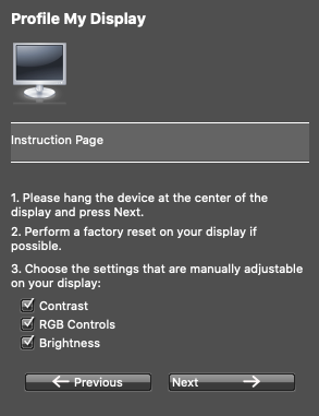
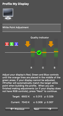
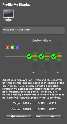
I would like to have your opinion on these two different tests I did with two different softwares:
Copy link to clipboard
Copied
i1Profiler, at the end it seems tending to the green and not contrasted. Compared to a Macbook Pro 2014 the white is definitely greenish.
Copy link to clipboard
Copied
DisplayCAL, in my opinion, it seems more correct, slightly on yellow compared to the Macbook Pro retina but extremely similar.
Copy link to clipboard
Copied
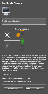
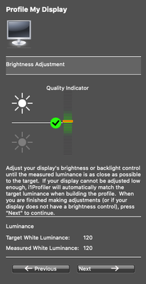
First of all you need to dial down the white level to around 120 cd/m². Do this with the monitor's OSD controls for brightness, while monitoring with the i1Profiler software. The software has a function for this, shown in one of your screenshots.
The reason you should do this natively in the monitor, instead of letting the calibration tables knock the brightness down, is that the latter operates at 8 bit color depth, and any brightness reduction eats from that limited bit depth. The result is increased risk of banding (stairstepping) in smooth gradients.
There is no particular reason to accept the white point color that the software presents you with. If it's too yellow, adjust it towards blue. You want it to look neutral white, as if you looked at a piece of white paper. A white piece of paper is your visual reference. Do this in the monitor's OSD controls too.
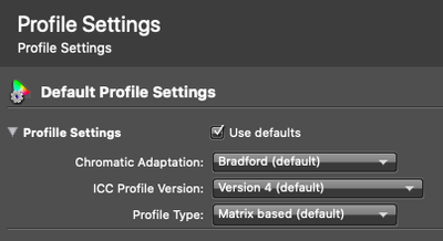
I see i1Profiler is set to version 4 profiles. While that usually works well, some applications may have problems with that. Version 2 is normally safer if you run into issues.
Then, when all this is done, run the calibration and profiling.
Copy link to clipboard
Copied
Hello Fosse, some questions in my last post. If you have the time and the patience to help me again...
Thank you so much!
Copy link to clipboard
Copied
Ok, that's to be expected with a "General calibration" method. Unless you have a proof to match it will be a bit of guesswork to adjust the white point of your display. That is why I recommended having a standard proof and CMYK profile. Without this your guessing. As Mr. Fosse suggested try a different color temperature. Yes, he's correct in that you want to calibrate to the monitor's native white point, but getting there without a proof is more difficult.
I do not recommend a generic color temperature, nor do I recommend a generic brightness. The reason being that color temperature and brightness are environmental factors that none of us can know, but you.
So Brightness can be adjusted by checking the ambient light check box in the calibration dialog. That will get you close the correct monitor brightness and color temp to the ambient light you have now. Then since measurement doesn't equal visual in these situations, just take note of where the monitor is calibrated when it completes. cd/m2 brightness and kelvin. Then tweak that and you will be close. I have the same monitor, but am in a 5000k ISO standard lighting situation as the adapted white and have calibrated proofs to match, so for me dropping a proof in a light booth and checking and adjusting the monitors color temp to the CMYK standard profile displayed on Absolute colorimetric rendering is the easiest way to get to the monitors whitepoint. Checking the shadow and highlight detail on the display to the standard proof provides an easy way to tweak the brightness to get you to the proof.
ICC programmer and developer, Photographer, artist and color management expert, Print standards and process expert.
Copy link to clipboard
Copied
Hello Bob, some doubts on my tests in my latest post, if you have time...
Thank you so much!
Copy link to clipboard
Copied
I agree with D. Fosse,
Try a white luminance target level around 120 Cdm2 - your room light should be subdued which would make that acceptable.
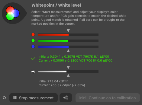
The "whitepoint" if targeted to the native white colour of the screen may be too cool (blueish) - if you see that when allowing native whitepoint (as you appear to have done which seems to have given you a result of 7061 K) then I suggest testing 6000 K as a whitepoint target, just as a starting point..
With 'whitepoint' higher numbers are colder / bluer - lower are warmer - more yellow / orange (that’s a subtle tint of course) .
You may need to tweak and iterate the calibration to find a white that matches that of your printed images.
The generally usable range for whitepoint is between 5000K and 6500K so stay between those parameters unless you have a very good reason to stray outside that range.
5000K is close to D50
6500K is close to D65
definitely try a V2 profile rather than V4
I hope this helps
neil barstow, colourmanagement.net :: adobe forum volunteer
[please do not use the reply button on a message in the thread, only use the one at the top of the page, to maintain chronological order]
Copy link to clipboard
Copied
Hello NB, ok, I'm trying with your suggestions now.
For you aswell, if you have some time and still whant to help me, some news in my latest post.
Thank you so much!
Copy link to clipboard
Copied
Hello to all!
I hope you guys are doing good and safe.
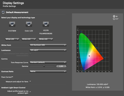
I reset again the monitor and the native color profile of the monitor to try again with these settings:
- White point D65, you all said to try with a different color temperature, do I have to put it here right? There is an option also to measure this with ambient light or a peace of paper, should these be other solutions?
- Luminance 120 cd/m2.
- Gamma standard 2,20.
- Contrast Ratio measured with a black patch on the screen, shuld I use the "Native" option?
- Measure and adjust for flare, not checked because I'm in almost darkness to make this calibration.
- Ambient Light Smart Control, not checked because to do this calibration I switched off all the lights and the other screens, should I activate it later?
- Profile settings, I changed just the Version 2.
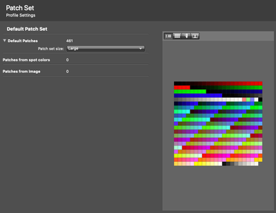
- Patch set size Large 461.
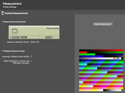
- RGB monitor settings to match the software suggestion: R97 - G100 - B94.
At the end, is still too green to me.
I will try again with DisplayCall now in a different User profile.
Thank you so much guys!
Copy link to clipboard
Copied
New test still with i1Profiler, the only things I changed are:
- White Point Daylight Temperature 6000.
- Contrast Ratio Native.
- RGB monitor settings to match the software suggestion: R98 - G99 - B90.
But at the end, when I save the color profile, everything become too yellow/green.
Copy link to clipboard
Copied
Yes, that's expected given the advice you are being given. Sorry. Use V4 profiles they will be the most accurate. The contrast ratio is native that's fine. But try just calibrating to the native ambient light. Using the ambient light option in the software. 120 cd/m2 is very bright and will wash out the color in a dim room. Change that to 100 and see if the contrast is closer. Adjust this value if the shadows are still too open to be less bright. or you can brighten the room a bit if that's an option Moving the white point back towards 6500k will make it bluer and back towards 5000k will be more yellow.
ICC programmer and developer, Photographer, artist and color management expert, Print standards and process expert.
Copy link to clipboard
Copied
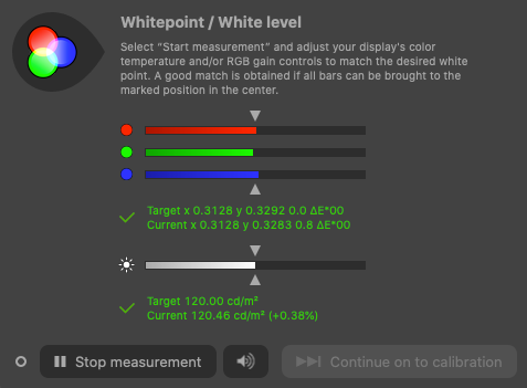
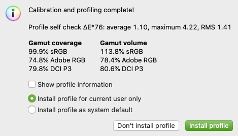
DisplayCAL test.
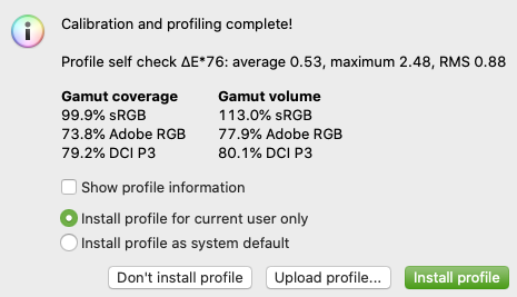
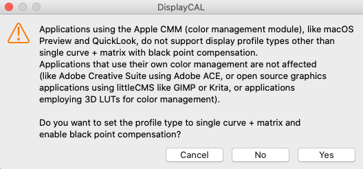
It seems much better but still a bit yellow compared to the MacbookPro where the whites seems more white. Can I just change the RGB values on the screen to match that or is an error and is better to do again the calibration from the beginning?
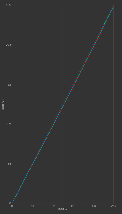
All the details attached here:
Here I selected YES.
RGB monitor settings to match the software suggestion: R97 - G100 - B92..
Here is the result.
Copy link to clipboard
Copied
I can't find a solution. From 5000k to 6000k the white is too yellow, from 6500k to 7500k is too green. The only way to have the white point white is to set the white point to Native, but I don't think is correct. I tryed with DisplayCal, also with i1Profiler but at the end the white is never correct even if I try to calibrate the RGB manually to match the color temperature.
It is more than 12 hours 😞
Copy link to clipboard
Copied
There's an environmental factor here that is making your displays appear green. So as I said to use the ambient light control in the Xrite software to help tame that, and if it can't look to replacing the lights in your environment with 5000k lamps. One of the issues here is that you may be visually adapted to another source. Thus the reason to only have one display calibrating and do not compare it to another. Just compare it to a proof under standard illumination using Photoshop using the paper simulation option with the profile from the lab your using. Anything else is just fishing around. Monitors are tougher to color manage than proofs because they emit light. Our eyes must choose to adapt and will if the monitor is brighter than the ambient light. but it will be more difficult in comparison if your Mac book pro is used in comparison and it is brighter.
ICC programmer and developer, Photographer, artist and color management expert, Print standards and process expert.
Copy link to clipboard
Copied
So here's the problem. You are being given advice from three people. One has been saying the same thing all along (me) the other 2 have convincingly disagreed, and you have not gotten your monitor calibrated following their directions. As both of these gentlemen believe they are right and do not want you to listen to my advice, that makes it very difficult for me to help you. So I would ask that you try my suggestions. It may be unpopular with these two gents, but in my opinion, you would have been done. I personally do not agree with the method of shouting down another answer then end up agreeing with it partially. Still trying to help you through the flack. Give what I said a try please, I'm sure it will work. I have set up commercial monitor-based proofing systems for one of the largest printing companies globally and this method will work if you do not have a bad environment that requires some adjustment first. Neutral dim controlled lighting is important. No windows. Go back through what I have said. You will see continuity there, and find success.
ICC programmer and developer, Photographer, artist and color management expert, Print standards and process expert.
Copy link to clipboard
Copied
Hey Bob,
no worryes, I'm trying every solution.
The issue is that I'm in a sort of open space, I'm trying to do this calibration hiding all the lights and unfortunately I can not change my lighting. Where can I find the Photoshop paper simulation? How can I display it correctly if my monitors are not calibrated?
Copy link to clipboard
Copied
Hello Bob,
I tryed this:
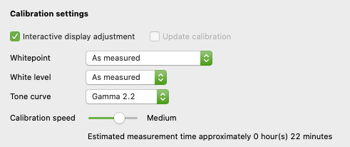
White point "Measured" in a normal working scenario, Luminance 100, Gamma 2,2, Version 4, Matrix Based.
But it tourned out too contrasted green/yellow. Another thing is that I can not leave the i1Display always on on the desk.
One consideration, I measured my MacBook Pro white point and is around 6800K, why is allways looking good to me in all the environments?
Copy link to clipboard
Copied
The green cast is the monitor white point. Your tests showed that a good white point for your environment was 7033K so that is the color that appears white in your environment. The environment is orange and the white point is purple and somehow they cancel and create the appearance of white. So use that 7033k with a v4 profile. Contrast can be reduced by increasing brightness as I said. Now changing that opens up shadow details, so unless you have a visual guide ( A print) to let you know when brightness is correct it will not be possible without trial and error to determine what the correct brightness is. The reason any number this group or myself could suggest may not work well is that we do not know the brightness of your environment. The reason I asked you to measure it and include Ambient Smart Control is it will get you close. It may not be "perfect" but at least you know what numbers it came up with and can adjust from there. No need to leave the device on your desk. After the profile is made it is not adjusted dynamically. So the ambient measurement is just used to set the monitors white point and brightness. As I said its a starting point.
Now the MacBook Pro has very different display technology than the monitor you are trying to calibrate. Much of what Apple is doing there is run by my friend Gabriel Marcu who developed the latest XPS displays. So I can tell you that the backlight of the Mackbook Pro (If yours has one) is not close to the native color temp of the monitor your calibrating. The device you are measuring with is only a colorimeter and can not show you all of the spectra in either white point you are visually comparing. So you have to trust that the spectral power distribution of both displays is different (very different) and Apple has done their homework on how to design displays to be used in a wide range of environments so they still produce a visual match.
ICC programmer and developer, Photographer, artist and color management expert, Print standards and process expert.
Copy link to clipboard
Copied
I would suggest two things at this point:
- leave DisplayCal out of it for now. Close it and forget it. It's advanced and complex software with a lot of options that will only confuse you now.
- also close down i1Profiler and delete all profiles. Start from scratch. Set a white point in the monitor that looks neutral to you. Use the on-screen menus in the monitor. Nevermind what the settings and numbers end up as, just get it to look right.
Next, start the pre-calibration function in i1Profiler where you set luminance while the software monitors the level. You still adjust it with the monitor's on-screen controls, but the software measures and reports as you go. Again, a good starting point is 120 cd/m².
When this is finished, the monitor itself should be set up correctly. Now the calibration and profiling can start, while using the white point already set in the monitor.
The white point then needs to be set to "native" in the software, both for luminance and color (temperature).
Copy link to clipboard
Copied
The standard way to do it is to set the monitor white point to be a visual match to paper white. This should be done with the monitor's on-screen menus, to avoid eating out of the limited bit depth in the video card pipeline. If you use calibration tables to reduce brightness from 240 down to 120, that's one full bit right there, and you're left with a 7 bit video signal to the panel. That's the reasoning behind this.
The same principle applies to white point temperature (color). It should not be done in the calibration tables if it can be avoided. The calibration tables should do as little as possible. Do it in the monitor itself if at all possible.
Then leave the software to "native" white point. It has already been adjusted elsewhere.
All this is much simpler in high-end monitors with fully integrated calibration software, such as Eizo ColorEdge or NEC Spectraview. There, any setting you make in the software is performed in the monitor's internal processor, in high bit depth, not in the video card. That makes a huge difference. But when genuine hardware calibration is not available, like here, then you have to take some precautions.
Ambient light controls in calibration software is generally regarded as very dangerous and not recommended.
Copy link to clipboard
Copied
Hello Fosse,
so, this is what I did following your suggestions:
- Deleted all the profiles.
- Reset the monitor colors.
- Set the monitor color profile to the original one from the manifacture that it always seems tending to magenta.
- I let come in some light through the window (2pm) and setted up the white point of the monitor, with the monitor controls, to match a white paper that I have here, is just a normal white board, I have nothing else but it seems pure white to me. RGB values: 95 - 100 - 96.
- With the i1Profiler software setted up the luminance to 120 cd/m2.
- i1Profiler settings set to: White point "Native"; Luminance "Native"; Gamma Standard 2,20; Contrast Ratio "Native"; Flare Correct NO; Ambient Smart Control NO; Profile Settings Adaptation "Bradford", "Version 2", "Matrix Based"; Patches "Large 461".
- Darkened the window and all light sources.
- Run the measurement.
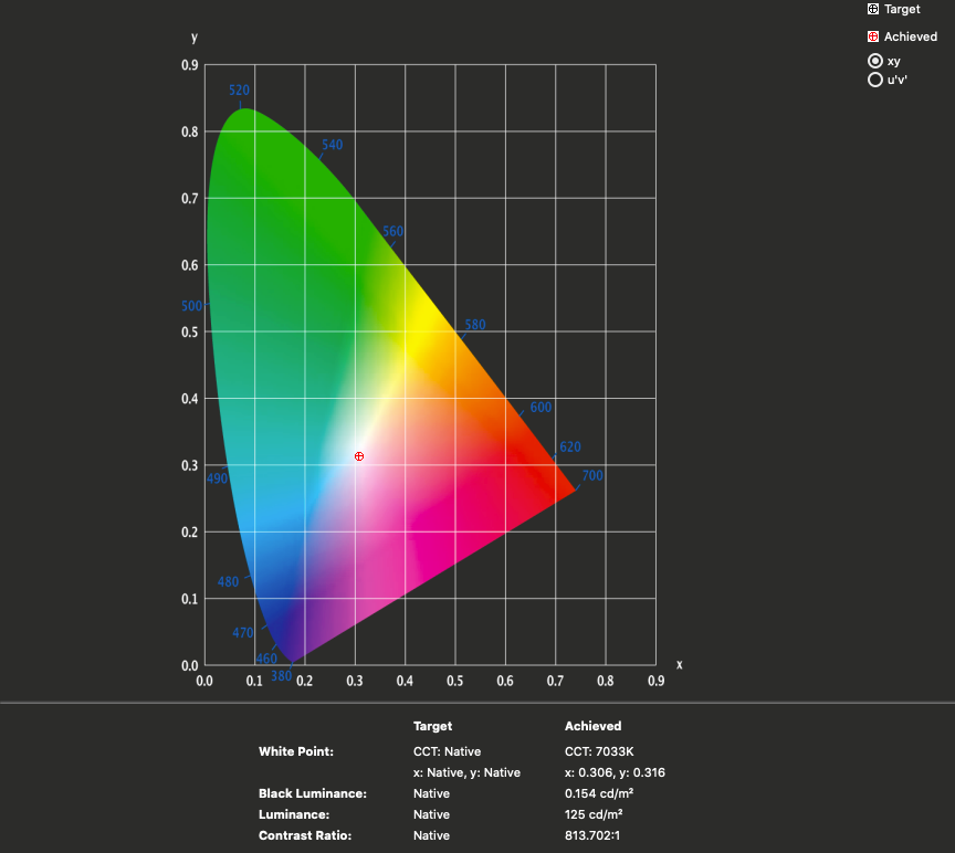
At the end it seems fine to me, but I'm wondering if the White point Achived is correct, CCT: 7033K.
As NB__colourmanagement said yesterday: "The generally usable range for whitepoint is between 5000K and 6500K so stay between those parameters unless you have a very good reason to stray outside that range.".
Find more inspiration, events, and resources on the new Adobe Community
Explore Now

