• Global community
    • Language:
      • Deutsch
      • English
      • Español
      • Français
      • Português
  • 日本語コミュニティ
    Dedicated community for Japanese speakers
  • 한국 커뮤니티
    Dedicated community for Korean speakers
Exit
2

Pantone color looks different after upgrading Illustrator...?

Community Beginner ,
Aug 07, 2013 Aug 07, 2013

Copy link to clipboard

Copied

I just upgraded from Illustrator CS5 to Illustrator CC.  I just noticed that the pantone colors look different - and print different.  I opened on old file from Illustrator CS5 that had this pantone color (Pantone 179), and I opened a new file that was created in CC that has the exact same pantone color.  Illustrator CC is showing them differently on the screen, and when I send them to print (I work for a large format printing company that needs pantones to be accurate), the colors look different.

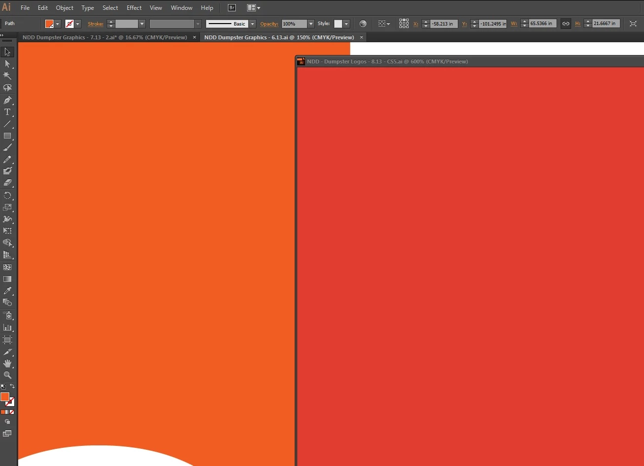
See the image I attached below - both of those colors are set at Pantone 179.  When I print them, they look exactly like they appear on the screen - one of them much more red than the other.  The one on the left is how it is supposed to appear, and that file was set up in Illustrator CS5.  The one on the right was cut and paste from the file on the left into a new file and saved in Illustrator CC.  Nothing else was changed.

Please help me get this problem resolved - this is going to cause a lot of problems for me if I can't get this fixed.

Thank you

UPDATE: I just tried converting the pantones to CMYK to see what happens.  The original file (the one on the left in the photo attached) converted Pantone 179 to C: 0, M: 79, Y: 100, K: 0.  However, the CC file (the one on the right in the attached photo) converted the same Pantone to C: 0, M: 90.56, Y: 82.8, K: 0.

Josh
Pantone Problem in Illustrator CC.jpg

Views

34.6K

Translate

Translate

Report

Report
Community guidelines
Be kind and respectful, give credit to the original source of content, and search for duplicates before posting. Learn more
community guidelines
Guest
Aug 08, 2013 Aug 08, 2013

Copy link to clipboard

Copied

So, you are sending a Spot color file to what, a standard print driver or are you using a RIP+Print solution?  What exactly are you using as a large format printer?  I am guessing you are using a RIP that does the conversion from Spot 179 to CMYK.  Alot of how color is displayed depends on your calibration and color settings.  However, Pantone has recently reformulated many of the spot colors and has also decided to display color as LAB formulations.  This is creating a stir in the industry where many users like yourself are getting mixed results.  Here is what I would do.  Create a duplicate file and also create a new swatch in CMYK that equals the previous CMYK eqivalents: C=0%, M=  79%, Y=100%, K=0%.  Assign that color to your previous Spot elements on all new files. 

Votes

Translate

Translate

Report

Report
Community guidelines
Be kind and respectful, give credit to the original source of content, and search for duplicates before posting. Learn more
community guidelines
Explorer ,
Aug 12, 2013 Aug 12, 2013

Copy link to clipboard

Copied

Beginning with Adobe CS6, the PANTONE PLUS SERIES libraries are stored in L*a*b* color space.  L*a*b* is the base color space used in color-management workflow, and should provide far more accurate onscreen simulation, as well as consistency in output using a color-managed workflow.

Prior to CS6, the PANTONE spot color libraries were stored in CMYK color space, which tended to make the onscreen display of colors quite muted and lifeless. 

Wherever possible, you should consider updating your legacy files with swatches taken from the updated PANTONE PLUS SERIES colors, for most accurate color reproduction.

Best regards,

John Stanzione

Manager - Technical Support

Pantone, LLC

Votes

Translate

Translate

Report

Report
Community guidelines
Be kind and respectful, give credit to the original source of content, and search for duplicates before posting. Learn more
community guidelines
Guest
Aug 12, 2013 Aug 12, 2013

Copy link to clipboard

Copied

I have to admit, after pulling out one of my printed Pantone Solid Coated swatch books and holding it up to the post's screen shot, the LAB version of 179 looks more accurate on screen. I wonder if this exposes a new trend in abandoning official hardcopy proofs in favor of consumerish on-screen softproofing.  I keep reading where users are finding differences in their print proofs in addition to on-screen differences in appearance(s).  I do not feel any more assured, each time you post into ( John Stanzione ) these forums with your explanations of a total shift in just about everyone's workflow(s).  I mean, justifying a huge swing in color reproduction, because color in CMYK is "muted and lifeless" ( last time I checked, CMYK or any other color for that matter has no life, does not have a pulse, and does not walk down the street on their own ).  But, you have to admit, each color is going to appear slightly different on each monitor, calibrated or not.  And, therefore, should never be relied on in critical color decisions.  When you have an accurate color in LAB on screen, but prints radically different, you've bounced the problem from one color space to another.  Couple that with legacy files that printed accurately in the previous workflow, but now does not, you've contributed to a major failure in the color reproduction process.  I've read where other users are trying to re-establish their older CMYK by dumping the + Series in favor of older CMYK swatch libraries because they are unable to find a successful workaround.  You might want to take another look at the logistics behind your decision(s).  At a minimum, users are asking for a solid workflow scenario from you and, to date, I have not seen one.  Perhaps you could release a white paper on the many, many issues surrounding the + Series approach and how it works in older, as well as newer workstations and software.  If you have that document in the Pantone library, please send us a link so we can read it.

Votes

Translate

Translate

Report

Report
Community guidelines
Be kind and respectful, give credit to the original source of content, and search for duplicates before posting. Learn more
community guidelines
Guest
Sep 05, 2013 Sep 05, 2013

Copy link to clipboard

Copied

I second John Danek's request.

Votes

Translate

Translate

Report

Report
Community guidelines
Be kind and respectful, give credit to the original source of content, and search for duplicates before posting. Learn more
community guidelines
Community Expert ,
Sep 19, 2013 Sep 19, 2013

Copy link to clipboard

Copied

Using Lab values for Pantone solid ink definitions isn't really new. Photoshop has always used Lab values for solid ink systems—Pantone, Toyo, HKS are all Lab definitions in PS.

InDesign CS3 made CMYK definitions optional via Ink Manager's Use Standard Lab values for Spots. The CS6 solid ink libraries always return Lab values even when Use Lab is unchecked. You can get the old solid libraries from earlier versions, load them and uncheck Use Lab and get the old device dependant CMYK definitions.

If you want to use the solid ink system to choose predefined CMYK process builds that simulate a solid ink spot color, you can still use PANTONE + Color Bridge which are defined as process CMYK. The problem with any predefined CMYK simulation is there has to be an assumption about the press conditions for the simulation to be accurate—the simulation might work for US SWOP but does it work for US Sheetfed.

When you have an accurate color in LAB on screen, but prints radically different

If you use the solid ink Lab defintions and convert to CMYK for process printing and the color is wrong, you might question whether the output CMYK profile is correct for the press conditions.

Votes

Translate

Translate

Report

Report
Community guidelines
Be kind and respectful, give credit to the original source of content, and search for duplicates before posting. Learn more
community guidelines
New Here ,
Jul 03, 2014 Jul 03, 2014

Copy link to clipboard

Copied

Hello John,

When you asked for "a solid workflow scenario", are referring to a "universal CMYK builds"?.

Like, Rob Day said, CMYK values, without any reference to a print condition is useless and is not a solid reference as for accurate color simulation. About Pantone + Color Bridge, this is the same, there is NO reference printing condition supplied with it. Just words sating that it is printed to" international standards".

I’ve made several tests with Pantone + libraries and I can tell you that I got better color simulation with Lab reference compared to supplied Pantone + Color Bridge CMYK builds. These CMYK builds are not usable with ANY default ICC profiles supplied with Adobe app.

The other problem is the way Adobe makes default color conversions from Lab to working CMYK color space. Users have to be aware about how such conversions are done under the hood (rendering intent, etc.)

Regards,

Louis Dery

Votes

Translate

Translate

Report

Report
Community guidelines
Be kind and respectful, give credit to the original source of content, and search for duplicates before posting. Learn more
community guidelines
Community Beginner ,
Jul 02, 2014 Jul 02, 2014

Copy link to clipboard

Copied

Can anyone tell me why the the same pms color in CC Indesign and CC Illustrator look completely different?

Votes

Translate

Translate

Report

Report
Community guidelines
Be kind and respectful, give credit to the original source of content, and search for duplicates before posting. Learn more
community guidelines
Community Expert ,
Jul 03, 2014 Jul 03, 2014

Copy link to clipboard

Copied

Can anyone tell me why the the same pms color in CC Indesign and CC Illustrator look completely different?

Are the colors from the new Pantone + Solid books—when you double-click the swatch in Swatches panel is it a Lab definition?

If you are converting to process via Ink Manager are ID's and AI's document CMYK profiles the same?

Votes

Translate

Translate

Report

Report
Community guidelines
Be kind and respectful, give credit to the original source of content, and search for duplicates before posting. Learn more
community guidelines
New Here ,
Sep 09, 2014 Sep 09, 2014

Copy link to clipboard

Copied

I am a designer and have been having horrific problems with the adobe suite since cs6. Colors between programs are off where they were not before and overall all colors seem muted.

Can someone explain why if I look at a PMS color from a real paper pantone book and then choose the exact same PMS color on screen the colors are horribly off.

And yes I do have my monitors calibrated.

Why are we having so much trouble with color. I would assume AI comes already setup to handle PMS colors right?

How am I supposed to save out a .jpg flat of a design and send it to a client if it looks completely off?

Votes

Translate

Translate

Report

Report
Community guidelines
Be kind and respectful, give credit to the original source of content, and search for duplicates before posting. Learn more
community guidelines
New Here ,
Oct 30, 2014 Oct 30, 2014

Copy link to clipboard

Copied

I have been having similar issues, and it is causing HUGE problems, and entire job runs are being rejected by the customer. I am not located near the print house, so I do not see the jobs I send to print. Been doing this process for over a decade without issue, now - disaster. Trying to find a solution is quite aggravating, Adobe is not in the least bit helpful, and the only way to get any information is from other users. I used to love Adobe, but over the last several years I have developed a hatred for them that was usually reserved for Microsoft.

Votes

Translate

Translate

Report

Report
Community guidelines
Be kind and respectful, give credit to the original source of content, and search for duplicates before posting. Learn more
community guidelines
Community Expert ,
Oct 30, 2014 Oct 30, 2014

Copy link to clipboard

Copied

Trying to find a solution is quite aggravating, Adobe is not in the least bit helpful, and the only way to get any information is from other users.

Pantone has clarified the distinction between a solid ink spot color and a CMYK process simulation of a solid ink by introducing the Pantone Color Bridge libraries (CP and UP suffix). If your workflow is to spec CMYK color from the solid ink libraries you now have the option to choose Pantone's recommended CMYK simulation via Color Bridge.

The conversion to process via Pantone + Solid is color managed and the best results depend on the correct profile and rendering intent being chosen. If your job is all process and you don't like color managed conversions, start using the Color Bridge CMYK builds.

and entire job runs are being rejected by the customer

No proof?

Votes

Translate

Translate

Report

Report
Community guidelines
Be kind and respectful, give credit to the original source of content, and search for duplicates before posting. Learn more
community guidelines
Explorer ,
Jan 26, 2015 Jan 26, 2015

Copy link to clipboard

Copied

No proof? Please tell me what proof accurately represents ink on paper --  other than a press proof --  and who does those any more? Proofs are now electronic pdfs or digital prints, neither are particularly accurate for the many reasons noted in this thread.

Color management is a huge issue and neither Pantone nor Adobe has been forthcoming or helpful. Pantone wants to continue pushng out new colors and products that generate income, and Adobe is simply not cutover-focused. Look at the self-serving subscription model they have adopted that holds users hostage to monthly fees if they want to access their own files. But that's another thread. I agree with damiendg.

Votes

Translate

Translate

Report

Report
Community guidelines
Be kind and respectful, give credit to the original source of content, and search for duplicates before posting. Learn more
community guidelines
Community Expert ,
Jan 27, 2015 Jan 27, 2015

Copy link to clipboard

Copied

If we are talking about process CMYK, I get  accurate digital proofs from my highend printers all the time—they are certainly accurate enough to catch any significant color problem before going on press and are as good as the old film based systems like MatchPrint.

The only change with CS6 and later is the clear distinction between Pantone solid spot colors (Pantone Solid+) and CMYK simulations of those colors (Pantone Color Bridge+). Picking a solid spot color that might not even be in the CMYK gamut for a process color job, and then converting it to process on export or print adds an unnecessary layer to color management and is simply bad practice.

For true spot color jobs, the new Solid+ library Lab definitions are considerably more accurate than the legacy CMYK definitions when the color is used correctly—that is output as a separate plate and printed with the solid ink. A solid spot ink has no relationship to CMYK, so it shouldn't be defined as CMYK. Photoshop has been using Lab definitions since version 7.

If for some reason you think it is a good idea to reference solid inks for a CMYK job, Pantone continues to provide predefined CMYK simulation mixes as process color in the Color Bridge+ libraries. If you are not happy with Color Bridge, there's nothing stopping you from loading the legacy libraries into your Swatch Libraries to get the pre CS6 color definitions.

Votes

Translate

Translate

Report

Report
Community guidelines
Be kind and respectful, give credit to the original source of content, and search for duplicates before posting. Learn more
community guidelines
Community Expert ,
Jan 28, 2015 Jan 28, 2015

Copy link to clipboard

Copied

Votes

Translate

Translate

Report

Report
Community guidelines
Be kind and respectful, give credit to the original source of content, and search for duplicates before posting. Learn more
community guidelines
New Here ,
Apr 29, 2024 Apr 29, 2024

Copy link to clipboard

Copied

Tell me you have never worked with inks. Solid colours vs CMYK.

Votes

Translate

Translate

Report

Report
Community guidelines
Be kind and respectful, give credit to the original source of content, and search for duplicates before posting. Learn more
community guidelines
Community Expert ,
Apr 29, 2024 Apr 29, 2024

Copy link to clipboard

Copied

This thread is getting on for 10 years old and please explain what you mean by "solid colours" – do you mean "spot colours"?

Votes

Translate

Translate

Report

Report
Community guidelines
Be kind and respectful, give credit to the original source of content, and search for duplicates before posting. Learn more
community guidelines
Community Expert ,
Apr 29, 2024 Apr 29, 2024

Copy link to clipboard

Copied


@Derek Cross  schrieb:

This thread is getting on for 10 years old and please explain what you mean by "solid colours" – do you mean "spot colours"?


That's the name of the Pantone spot libraries.

Votes

Translate

Translate

Report

Report
Community guidelines
Be kind and respectful, give credit to the original source of content, and search for duplicates before posting. Learn more
community guidelines
Community Expert ,
Apr 29, 2024 Apr 29, 2024

Copy link to clipboard

Copied

That's true, but I'm not sure that's what the OP meant in this context.

Votes

Translate

Translate

Report

Report
Community guidelines
Be kind and respectful, give credit to the original source of content, and search for duplicates before posting. Learn more
community guidelines
Community Expert ,
Apr 30, 2024 Apr 30, 2024

Copy link to clipboard

Copied

LATEST

Tell me you have never worked with inks. Solid colours vs CMYK.


Yes. Pantone’s Solid Ink Spot color .acb libraries have been defined as Lab Color since 2012.


solid.png

Votes

Translate

Translate

Report

Report
Community guidelines
Be kind and respectful, give credit to the original source of content, and search for duplicates before posting. Learn more
community guidelines
Community Beginner ,
Sep 05, 2015 Sep 05, 2015

Copy link to clipboard

Copied

I agree Josh, what the hell are Adobe doing to correct this major issue. The main problem here is when older files are broought into new CC files and the Pantone colour is split to CMYK for 4 colour printing. This changes the colour totally. In fact the only way to get a colour match is to convert the older truer (client approved) spot colours and convert these to CMYK. This keeps the colour true to what clients have had before. Also why are not all of the Pantone Plus Series (coated and uncoated) swatches not in the Creative Suite colour books. This has been an error since CS6. Come on Adobed, it is designers who buy your applications, we need you to fix this MAJOR issue!

Votes

Translate

Translate

Report

Report
Community guidelines
Be kind and respectful, give credit to the original source of content, and search for duplicates before posting. Learn more
community guidelines
Community Expert ,
Sep 05, 2015 Sep 05, 2015

Copy link to clipboard

Copied

The main problem here is when older files are broought into new CC files and the Pantone colour is split to CMYK for 4 colour printing

For legacy files, where a Pantone spot color is defined as CMYK, a solution would be to set the Color Type of the Pantone swatch to Process. In that case the legacy swatch CMYK values will be output assuming there's no profile conflict when it is placed in ID.

Also why are not all of the Pantone Plus Series (coated and uncoated) swatches not in the Creative Suite colour books. This has been an error since CS6. Come on Adobed, it is designers who buy your applications, we need you to fix this MAJOR issue!

The Pantone libraries are a third party plugin, the color definitions and swatches are provided by Pantone not Adobe, so the missing colors are a Pantone decision—you can get them from Pantone. I doubt that there will be a move back to CMYK definitions for spot colors. If you want single CMYK process simulations of the solid ink spot colors you'll have to start using the Bridge Libraries.

Votes

Translate

Translate

Report

Report
Community guidelines
Be kind and respectful, give credit to the original source of content, and search for duplicates before posting. Learn more
community guidelines
Community Beginner ,
Sep 05, 2015 Sep 05, 2015

Copy link to clipboard

Copied

But why change something that has worked so well for so many years. Example, client meeting, they select a Pantone colour. You are showing this on screen, it's not there, this is a massive fail for Adobe I am afraid! As per my original comment. Adobe applications are bought in large by us designers, this is a massive oversight. Pantone colours are Pantone colours, that's the whole point that what we show from book and calibrated mac screens, which are then set via litho impression for client consistency. It's a bit like trying to reinvent the wheel! Why?, is the question. I know Pantone have made a complete cock up with the new Pantone + Series, now we have to use an index at the back of the book to find colours. What is wrong with chronological numbering. I guess European interference may have something to do with this. They have broken something that worked perfectly before.

Votes

Translate

Translate

Report

Report
Community guidelines
Be kind and respectful, give credit to the original source of content, and search for duplicates before posting. Learn more
community guidelines
Community Expert ,
Sep 05, 2015 Sep 05, 2015

Copy link to clipboard

Copied

But why change something that has worked so well for so many years.

I don't think it worked that well for printing and displaying solid inks (Pantone's reason for being). There should be a distinction between printing a solid ink spot color, and printing a CMYK process simulation of that color. Prior to CS6 you couldn't make that distinction.

In the legacy system there were 4 solid ink books PANTONE Solid, Matte, Uncoated, and Solid to Process. All 4 books used the same CMYK definitions even though in the printed swatch books and when printed on press as spots they would have different appearances! And on top of that you can't define a solid ink spot color in a CMYK space because no CMYK inks would be used on press to print the color.

So with the legacy books we had this problem with a color like PANTONE Purple, which is way out of any normal CMYK gamut, but is defined as CMYK 38|88|0|0 in all 4 books. It could never get displayed correctly as a spot. The Lab defined Pantone + version (below the 4 different swatches with the same color values) doesn't get clipped by the CMYK space and is a much more accurate display:

Screen Shot 2015-09-05 at 11.36.02 AM.png

The new Pantone+ books can display those distinctions. Pantone Purple will change in appearance when it is printed as a solid ink color on coated vs. uncoated paper. And it is not in the CMYK gamut so the process CMYK simulation mix should also display differently because that's what will happen on press. The Bridge mix will also correctly respond to your document's CMYK profile because it has the process CMYK definition:

Screen Shot 2015-09-05 at 11.14.12 AM.png

But there's nothing forcing you to use the new + swatches—they're just swatches. You can remove the Pantone+ books and install the legacy books and use the old CMYK definitions.

Votes

Translate

Translate

Report

Report
Community guidelines
Be kind and respectful, give credit to the original source of content, and search for duplicates before posting. Learn more
community guidelines
Community Beginner ,
Sep 05, 2015 Sep 05, 2015

Copy link to clipboard

Copied

I think you have missed the original point made Rob. The actual Pantone colours have shifted in new versions of Creative Suite (from 6 onwards).

Addign older Pantone colours into new files shifts the colour. PS, I have fixed the missing Pantone colours from pantone swatches. Will give an update if i can fix this Pantone colour switch issue. PS Coated and Uncoated are different, hence the 2 different Pantone books to allow for ink sitting on top of coated and absorbing into uncoated stocks.  We are talking about the new Pantone + Series here. Have to use the latest colour books and applications otherwise you are out of date.

Votes

Translate

Translate

Report

Report
Community guidelines
Be kind and respectful, give credit to the original source of content, and search for duplicates before posting. Learn more
community guidelines