Answered
Photos look different on my phone compared to photos on the computer.
Hi Guys,
I edit my photos in either Lightroom or Photoshop. The photos look vibrant and colourful on my PC, as per the editing I had done. But when I save these photos in my S9-Plus, they look colourless and weird.
Can someone please help me here? Do I have to save the files differently once I edit the photo in Photoshop or Lightroom?
Example 1 -
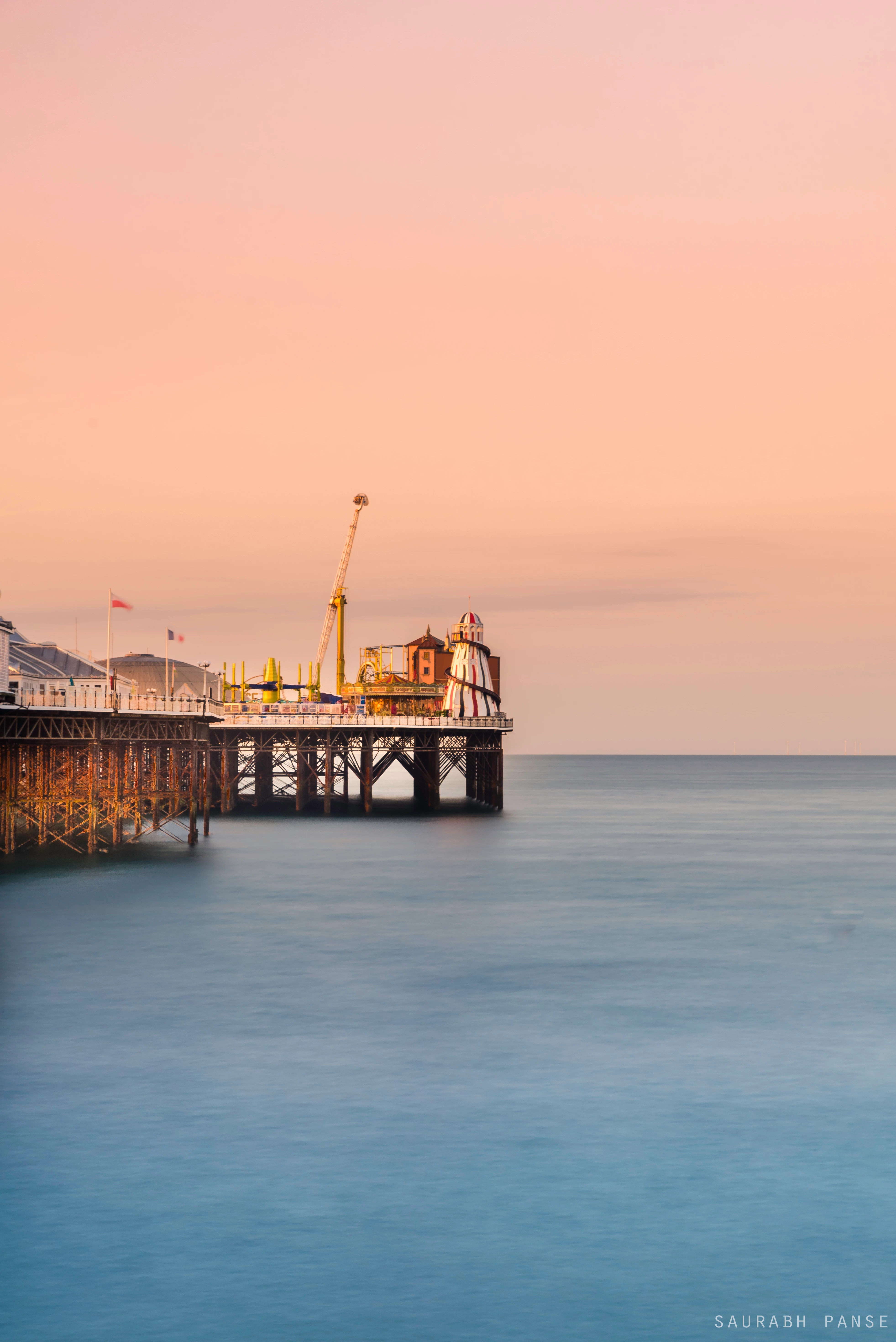
The photo on PC -
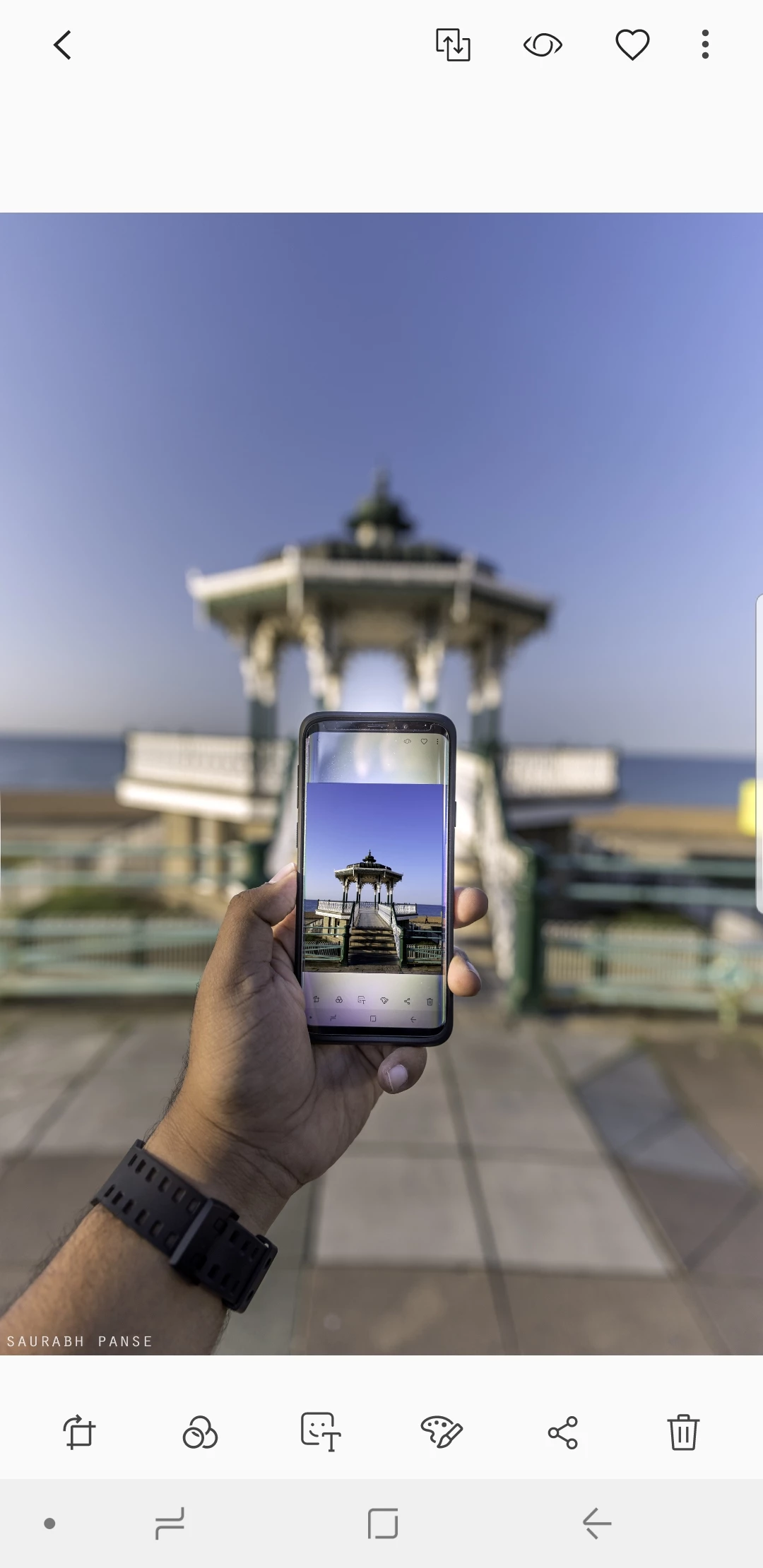
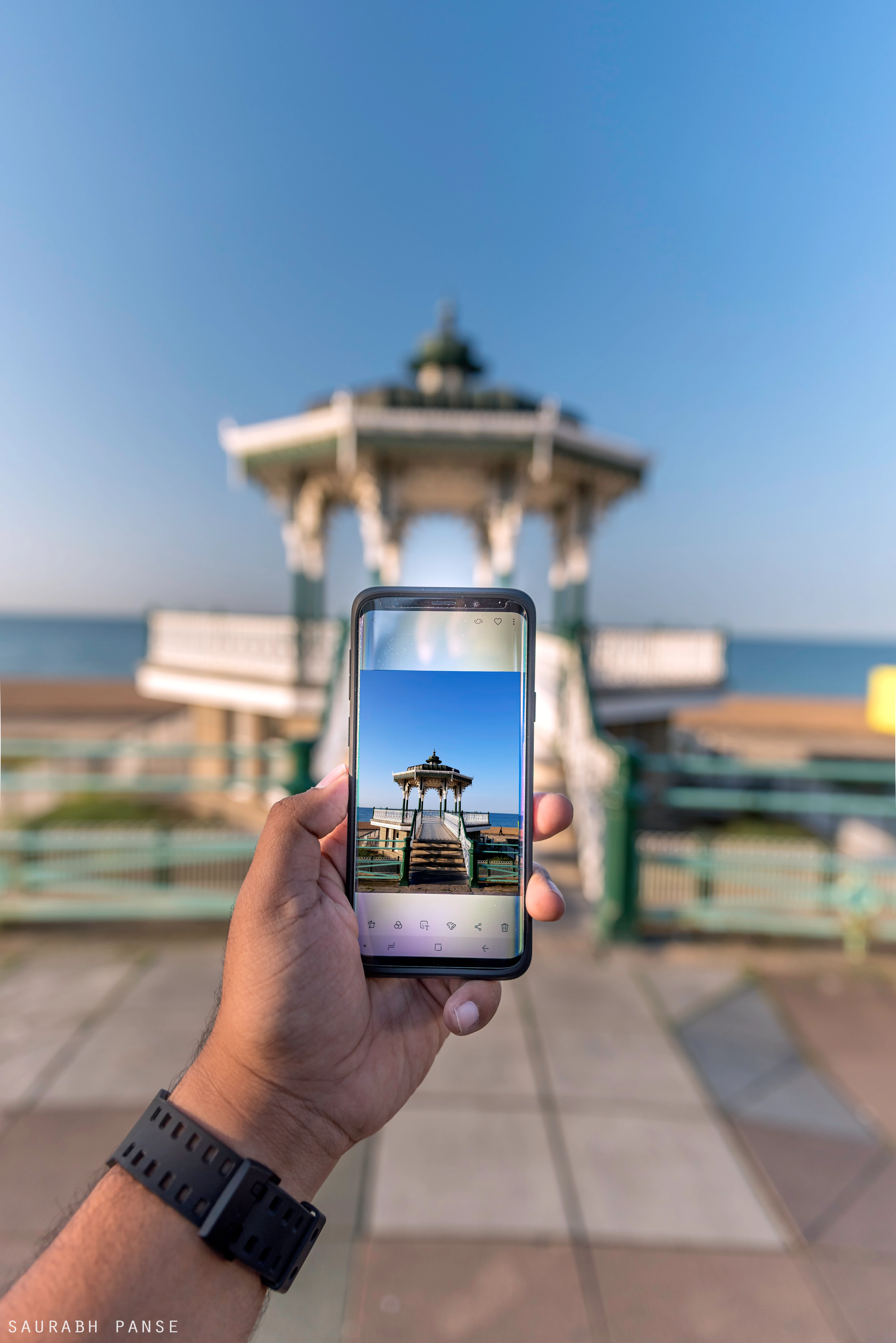
Photo/Screenshot from my Samsung S9Plus -
---------------------------------------------------------------------------------------------------------------------------------------------------------------------------
Example 2 -
The photo on my PC -
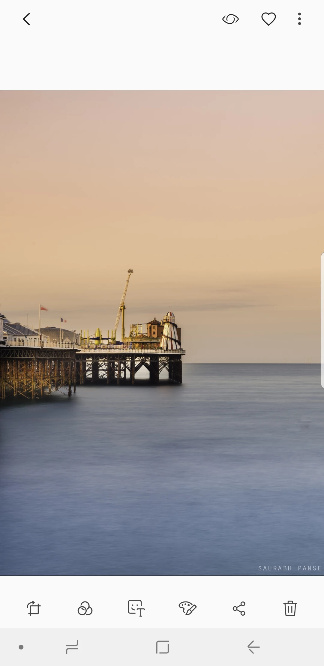
Screenshot from my Samsung S9Plus-