 Adobe Community
- Home
- Color Management
- Discussions
- Re: Photos look different on my phone compared to ...
- Re: Photos look different on my phone compared to ...

Copy link to clipboard
Copied
Hi Guys,
I edit my photos in either Lightroom or Photoshop. The photos look vibrant and colourful on my PC, as per the editing I had done. But when I save these photos in my S9-Plus, they look colourless and weird.
Can someone please help me here? Do I have to save the files differently once I edit the photo in Photoshop or Lightroom?
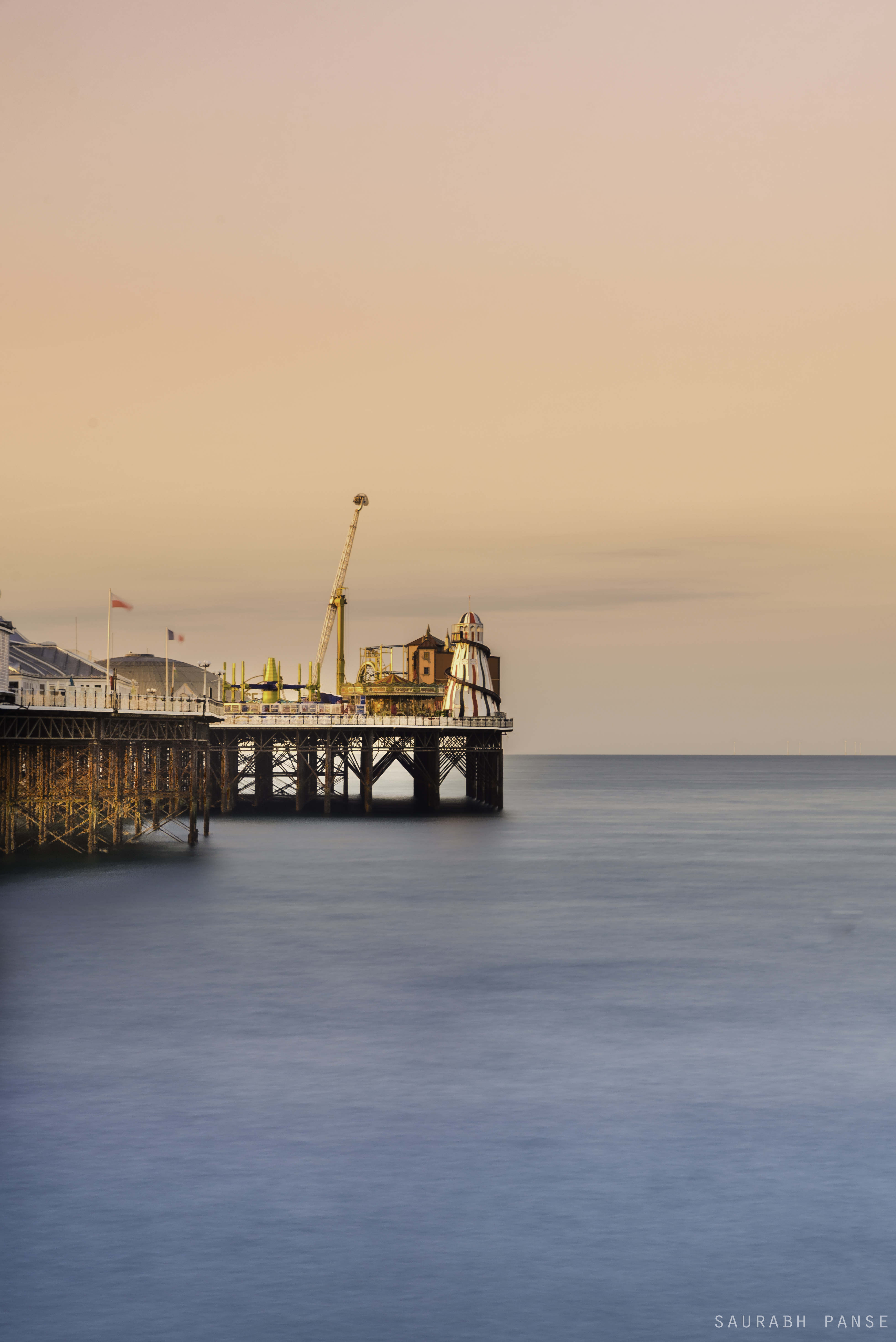
Example 1 -
The photo on PC -
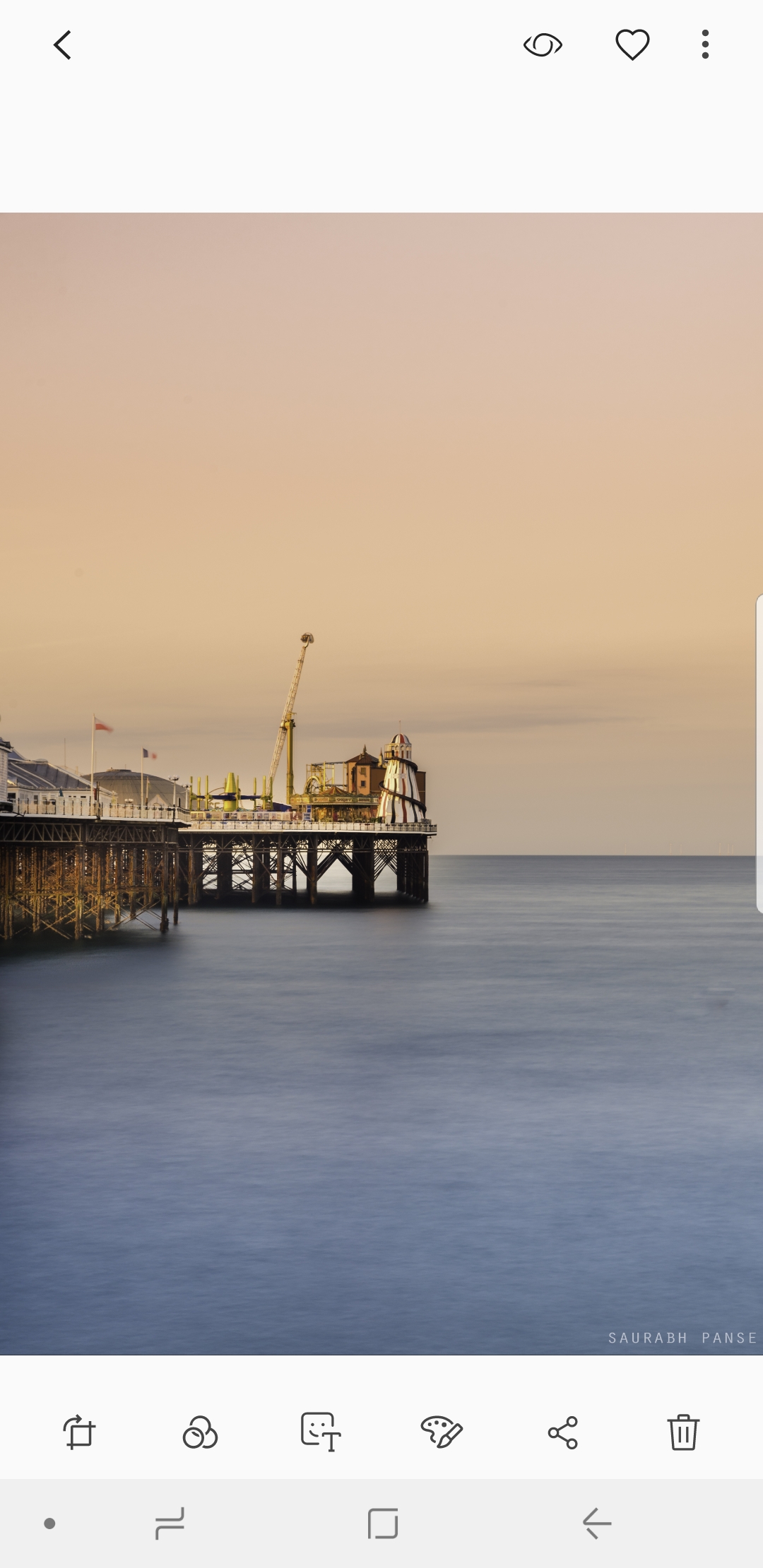
Photo/Screenshot from my Samsung S9Plus -
---------------------------------------------------------------------------------------------------------------------------------------------------------------------------
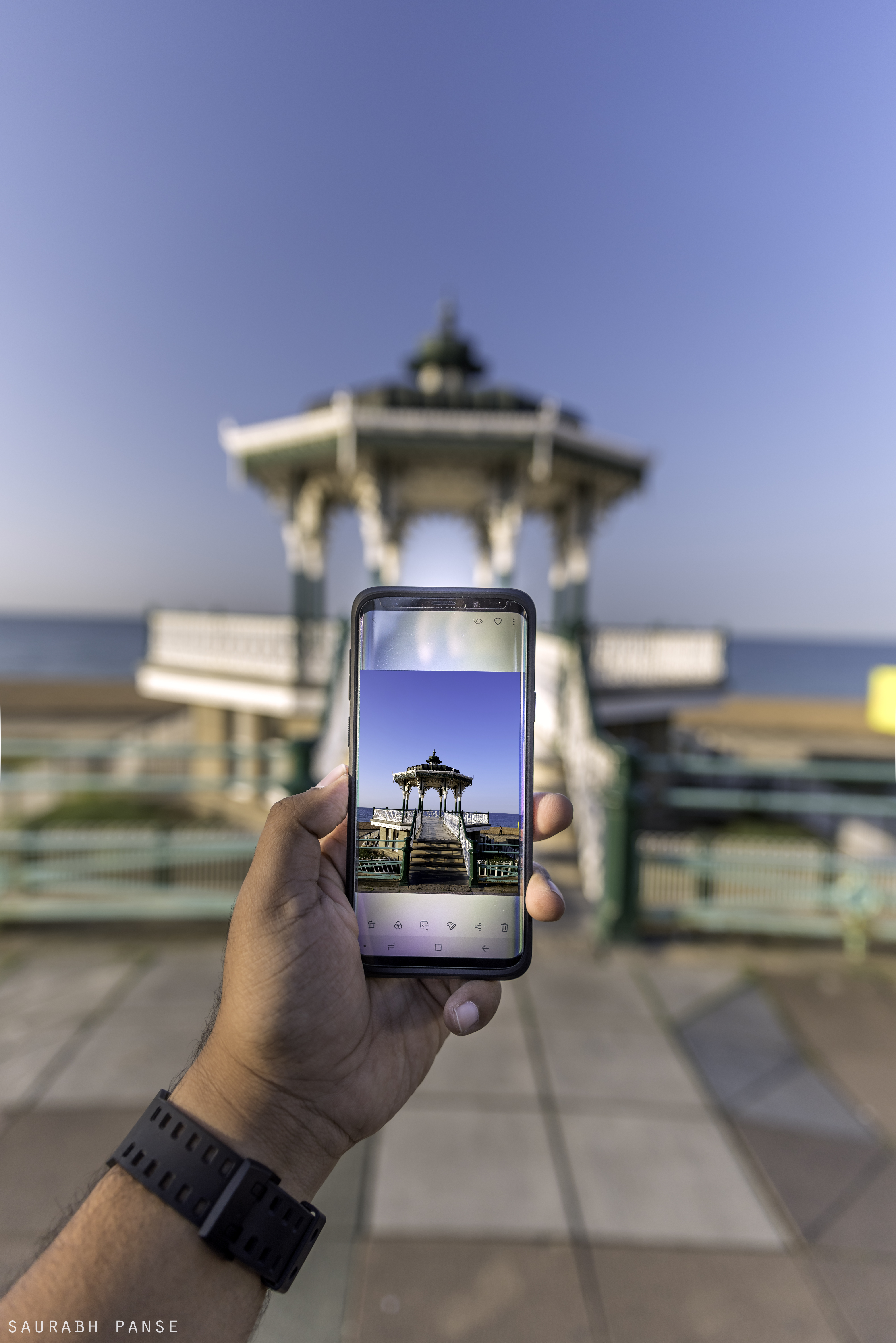
Example 2 -
The photo on my PC -
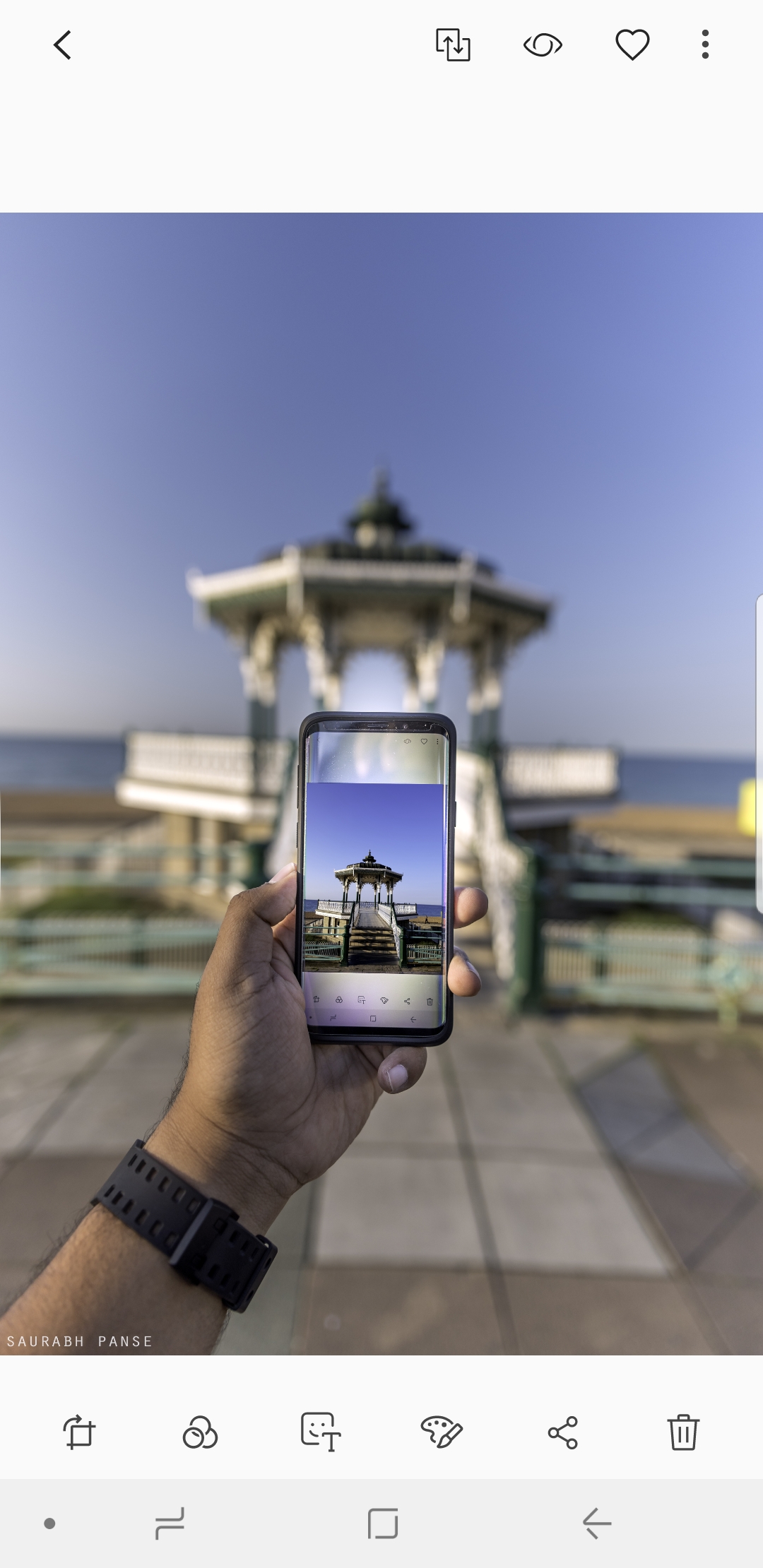
Screenshot from my Samsung S9Plus-


 1 Correct answer

Hi
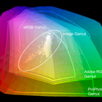
The explanation is in the way colours are stored in the image. Each pixel stores the colour as three numbers representing Red, Blue and Green. However what actual colour is represented by each number depends on the colour profile. Your original document is using a profile called ProPhoto.
Photoshop is colour managed. It uses the color profile embedded in the document to tell it how to use the RGB numbers that make up each pixel and correctly display it on your monitor (using the monitor color p
... 67
Replies
67
67
Replies
67

Copy link to clipboard
Copied
There's nothing wrong with the phone unless it was sold as a color managed device. Color management doesn't magically make things right on random screens. But your question is IMPOSSIBLE to answer. If you've done everything it stands to reason that anything we suggest you have already done, and we'd just be wasting your time.

Copy link to clipboard
Copied
So why black shows up so badly?
Copy link to clipboard
Copied
That is what I am asking about, it could be something about adjusting shadows maybe.
Copy link to clipboard
Copied
Post an image that you believe shows incorrectly and we can give feedback. Anything else is theoretical.
Dave

Copy link to clipboard
Copied
I found your issue is you didn't Color Space from Adobe RGB to SRGB in export setting that's y your photo's color changes and less vibrant. Never forget change Color space and every phone or computer only capable for sRGB.
Copy link to clipboard
Copied
There are many millions of phones (and displays) with wider color gamuts and not sRGB color gamuts; like every iPhone from the 6 on.

Copy link to clipboard
Copied
True, and one day we'll maybe be able to place P3 images online (profile embedded of course) this P3 image works pretty well on mu iOS devices, matching to my calibrated Eizo quite successfully. Mind you an sRGB version does too.
I hope this helps
neil barstow, colourmanagement net :: adobe forum volunteer:: co-author: 'getting colour right'
google me "neil barstow colourmanagement" for lots of free articles on colour management

Copy link to clipboard
Copied
Hi,
I do the same while exporting the photo from Photoshop. I always select convert to sRGB and embedded profile option but still my photos look warmer and oversaturated on the phone.
Copy link to clipboard
Copied
Your phone may not be calibrated and your computer monitor may also not be calibrated so that is to be expected.
Copy link to clipboard
Copied
Hi,
I do the same while exporting the photo from Photoshop. I always select convert to sRGB and embedded profile option but still my photos look warmer and oversaturated on the phone.
By @ravikiran267176250ipr
Converting to sRGB alone isn't enough. You need full-color management, a calibrated and profiled display, and applications that understand color management.
See:
sRGB urban legend & myths Part 2
In this 17-minute video, I'll discuss some more sRGB misinformation and cover:
When to use sRGB and what to expect on the web and mobile devices
How sRGB doesn't insure a visual match without color management, how to check
The downsides of an all sRGB workflow sRGB's color gamut vs. "professional" output devices
The future of sRGB and wide gamut display technology
Photo print labs that demand sRGB for output
High resolution: http://digitaldog.net/files/sRGBMythsPart2.mp4
Low resolution on YouTube: https://www.youtube.com/watch?v=WyvVUL1gWVs

Copy link to clipboard
Copied
"I do the same while exporting the photo from Photoshop. I always select convert to sRGB and embedded profile option but still my photos look warmer and oversaturated on the phone. "
In testing (and asking others) I've found that modern handhelds seem to be remarkably consistent from one to the next, even across brands.
I made this testimage for phone testing: please try it, it has the P3 ICC profile embedded.
May I suggest you open it in a web browser on a few mobile devices and compare?
If the handheld device is OK (it probably is) then maybe your own computer display screen calibration is at fault?
If I open that image on an iPhone and on my mac with calibrated high-end graphic arts spec Eizo monitor display it matches remarkably well.
Of course handheld luminance can vary but generally that’s all that does vary one to the next (on recent models)
I hope this helps
neil barstow, colourmanagement net :: adobe forum volunteer:: co-author: 'getting colour right'
google me "neil barstow colourmanagement" for lots of free articles on colour management
Copy link to clipboard
Copied
Copy link to clipboard
Copied
One thing to check, especially on Samsung phones and tablets, is the mode the display is set to. For example, looking at the Samsung S9 on the DisplayMate tests, it can be set to four different modes that all look different:
- Adaptive Display. Uses full hardware color gamut (wider than P3), and uses adaptive real time processing to “make the image look better” based on content. The adaptive processing might potentially make an image look better on that phone than anywhere else, but can also mean on that phone, an image won’t match how it looks anywhere else. DisplayMate says Adaptive Display is how it works out of the box, and that the white point is adjustable (yet another way for the display to look different than other displays).
- AMOLED Cinema. Constrains the display to DCI-P3 wide color gamut, optimized for movies.
- AMOLED Photo. Constrains the display to Adobe RGB wide color gamut, optimized for photos.
- Basic. Constrains the display to the small sRGB color gamut.
So if you are trying to get the closest match to another display, one of the first things you want to do is make sure the phone’s display setting is consistent with whatever other display you are wanting to it to match. If for example you are editing on a very common sRGB computer display, and you copy the image to your phone and it’s set to Adaptive Display with its wider gamut and its automatic extra layer of image processing, of course it isn’t going to look the same. And if the phone or app isn’t color managed, that’s another variable that can screw things up, especially on the wide gamut color modes.
Copy link to clipboard
Copied
Hi Conrad,
"One thing to check, especially on Samsung phones and tablets, is the mode the display is set to."
that's very useful, I suggest if the OP uses my phone testimage [I sent links earlier] and uses the Adobe RGB version in Photoshop on the computer then they should be able to select from those options to get best match.
That would be very useful but only IF the main computer screen is accurate - i.e. correctly calibrated and profiled.
I hope this helps
neil barstow, colourmanagement net - adobe forum volunteer - co-author: 'getting colour right'
google me "neil barstow colourmanagement" for lots of free articles on colour management
Copy link to clipboard
Copied
Neil brings up an important point in that luminance or display brightness varies between devices. The display type will also affect the devices ability to match one to another. The important point about display brightness is that Color Gamut is directly affected by display brightness. If all other variables are the same a device at high brightness will appear more colorful.

Copy link to clipboard
Copied
I'm new to this in lightroom but a quick temporary fix I did was, if you have an nvidia graphics card, go to the nvidia graphics settings and change the vibrancy way down to match your phones colors. I did a side by side with an image within the creative cloud and it worked out fine. If you don't have a nvidia graphics card, and only have an Intel intergrated graphics one, just go to its graphics settings and lower the saturation. There's no vibrancy. I haven't found a good real simple answer that can quickly change this as I found out the hard way that the images are different coloring from monitor and phone.

Copy link to clipboard
Copied
@Martin33078556j871 schrieb:
go to the nvidia graphics settings and change the vibrancy way down to match your phones colors. I did a side by side with an image within the creative cloud and it worked out fine.
If you won't ever send anything for professional print and only do work for you and your family for private use, then you can totally go ahead with this. But paying clients might not like the idea that you cannot have any idea about how colors really look after doing what you described.
Copy link to clipboard
Copied
Adjusting you computer screen to match your phone is really bad advice and goes against all the principles of colour management. You have created a closed system that looks OK between those two devices. It may make the images on your screen match your phone, but it will also mean that every other image you view on that computer screen is now off. It also means if you send an image elsewhere, including to a printer, it will look off as it as been adjusted on a deliberately maladjusted screen.
Use proper colour management on your computer, with a monitor profile that matches your actual screen. That way you know your images are adjusted correctly. Then send it with an attached image profile and if your phone can colour manage at all it will use the profile. If the phone cannot do this properly, converting the exported image to the phones' currently set profile before sending may help (see advice from Conrad above).
Dave
 AdChoices