

- Home
- Dreamweaver
- Discussions
- Aligning responsive textcontent in a row
- Aligning responsive textcontent in a row
Aligning responsive textcontent in a row

Copy link to clipboard
Copied
I wonder if anyone could help me to solve a problem in Dreamweaver CC? The problem is that I can't align some textcontent with a colored background in the bottom with other content in a row. The sketch illustrates what I mean. I have tried with 100vh but that doesn't work, and I've tried with grid-containers, but though I have a margin on the right side the content flows outside it. What shall I do? I'm not using pixelheight because I want it to flow when resizing browswers.
Any suggestion how to code this right?


 17
Replies
17
17
Replies
17

Copy link to clipboard
Copied
I can think of two methods to do this, css flexbox and css grid layouts.
Looking at your layout grid notes for the code, it looks like you are using, (or wish to use) bootstrap, so I will wait for another forum member to suggest a bootstrap method before proceeding further with my suggestion, as Dreamweaver does not support the requirerments for using flexbox or css grid layouts without making you 'jump through hoop' unnecessarily.

Copy link to clipboard
Copied
You would need to manually upgrade to Bootstrap 4 beta because it's not included in DW yet. Bootstrap 4 uses newer Flexbox layouts but Bootstrap 3x does not.
Flexbox allows you to vertically align inline and inline table elements to top, middle, bottom or baseline.
https://v4-alpha.getbootstrap.com/utilities/vertical-align/
It also supports equal height columns
Equal Height Columns Example for Bootstrap
To start using Bootstrap 4 in your projects, replace the Bootstrap 3 scripts with the following hosted on CDNs.
<!--Latest Bootstrap 4 CSS-->
<link href="https://maxcdn.bootstrapcdn.com/bootstrap/4.0.0-beta/css/bootstrap.min.css" rel="stylesheet" integrity="sha384-/Y6pD6FV/Vv2HJnA6t+vslU6fwYXjCFtcEpHbNJ0lyAFsXTsjBbfaDjzALeQsN6M" crossorigin="anonymous">
<!--First jQuery then Popper then Bootstrap-->
<script src="https://code.jquery.com/jquery-3.2.1.min.js" integrity="sha256-hwg4gsxgFZhOsEEamdOYGBf13FyQuiTwlAQgxVSNgt4=" crossorigin="anonymous"></script>
<!--Popper JS-->
<script src="https://cdnjs.cloudflare.com/ajax/libs/popper.js/1.11.0/umd/popper.min.js" integrity="sha384-b/U6ypiBEHpOf/4+1nzFpr53nxSS+GLCkfwBdFNTxtclqqenISfwAzpKaMNFNmj4" crossorigin="anonymous"></script>
<!--Latest Bootstrap 4 JS-->
<script src="https://maxcdn.bootstrapcdn.com/bootstrap/4.0.0-beta/js/bootstrap.min.js" integrity="sha384-h0AbiXch4ZDo7tp9hKZ4TsHbi047NrKGLO3SEJAg45jXxnGIfYzk4Si90RDIqNm1" crossorigin="anonymous"></script>
Nancy
Copy link to clipboard
Copied
I was hoping for someone to suggest a none flexbox/grid method 
LOL
Copy link to clipboard
Copied
pziecina wrote
I was hoping for someone to suggest a none flexbox/grid method
LOL
Switch to InDesign and export to PDF.

Copy link to clipboard
Copied
pziecina wrote
I was hoping for someone to suggest a none flexbox/grid method
LOL
This seems to suggest that there are no other ways to construct the planned layout than CSS Grid, I will not add the single dimensional Flexbox in this context.
Surprise surprise, there are two other non-JavaScript ways to achieve this, namely
- HTML Table
- CSS Table
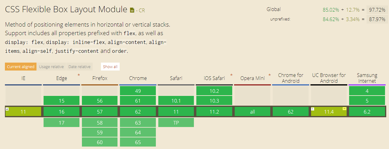
The following shows the browser support for CSS Table (2-dimensional)

and this is for CSS Grid (2-dimensional)
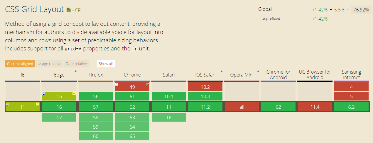
and for those that believe that Flexbox (1-dimensional) is the way to go
Copy link to clipboard
Copied
And you would recommend html tables?
The comment was ment as a joke, but unlike most experts and the W3C you still hold to the fallacy that flexbox can only be used for 1 dimensional layouts.
Please read up on the specs, read what Rachael Andrews has to say, and most other people who use flexbox to create 2 dimensional layouts. It is obvious you like many who cannot use Flexbox are stuck in the past, that is why Dw is dying.
I give up with this forum, Dw and people like yourself Ben.
Copy link to clipboard
Copied
And you would recommend html tables?
No
The comment was ment as a joke, but unlike most experts and the W3C you still hold to the fallacy that flexbox can only be used for 1 dimensional layouts.
Please read up on the specs, read what Rachael Andrews has to say, and most other people who use flexbox to create 2 dimensional layouts.
This is what Rachael Andrews says
Flexbox is essentially for laying out items in a single dimension – in a row OR a column. Grid is for layout of items in two dimensions – rows AND columns.
As for
It is obvious you like many who cannot use Flexbox are stuck in the past, that is why Dw is dying.
this is another unsubstantiated statement.
Copy link to clipboard
Copied
Just to add to my previous answer, in the past half year or so, I have been using CSS Grid for my layout and Flexbox for my fallbacks.
The following shows this fact which is used on BoK | Meet the BunchOKids :
.content {
display: flex;
flex-flow: row wrap;
display: grid;
grid-template-columns: 100%;
grid-template-areas:
"main-area"
"right-sidebar";
>.col-main {
flex: 1 100%;
grid-area: main-area;
}
>.col-right {
flex: 1 100%;
grid-area: right-sidebar;
}
@include media-breakpoint-up(md) {
grid-template-columns: 70% 30%;
grid-template-areas:
"main-area right-sidebar";
>.col-main {
flex: 1 0;
}
>.col-right {
flex: 1 0;
}
}
}
Again, I would love to know where the information, that I do not/cannot use Flexbox, came from.
Copy link to clipboard
Copied
I was joking when I said InDesign to PDF.
It's true you can make equal height columns with CSS Tables. I have done this in the past but I'd be reluctant to keep using it now.
Equal Height CSS Columns in Bootstrap - https://alt-web.com/
Nancy
Copy link to clipboard
Copied
Alright, but how do I do to upgrade Bootstrap?
Copy link to clipboard
Copied
mia@design4u2.se wrote
Alright, but how do I do to upgrade Bootstrap?
- Read my Reply #2 again. Replace Bootstrap 3 with Bootstrap 4 scripts.
- Also read the Bootstrap 4 documentation below.
http://blog.getbootstrap.com/2017/08/10/bootstrap-4-beta/
Nancy
Copy link to clipboard
Copied
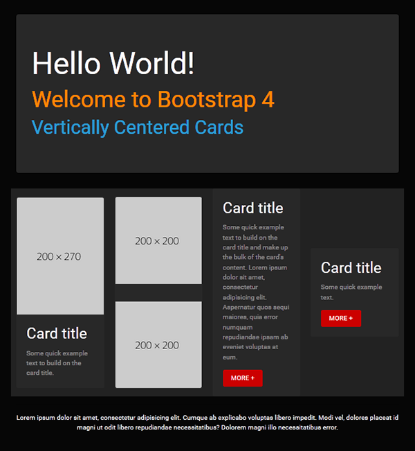
Below is a quick mockup with BS4 and vertically centered cards.
<!doctype html>
<html lang="en">
<head>
<meta charset="utf-8">
<title>Bootstrap 4: Cards Demo</title>
<meta name="viewport" content="width=device-width, initial-scale=1">
<meta http-equiv="X-UA-Compatible" content="IE=edge">
<!--BOOTSTRAP CYBORG THEME-->
<link rel="stylesheet" href="https://maxcdn.bootstrapcdn.com/bootswatch/4.0.0-beta.2/cyborg/bootstrap.min.css">
<style>
html, body {height: 100% }
</style>
</head>
<body>
<!--begin top nav bar-->
<nav class="navbar navbar-expand-lg navbar-dark bg-default">
<!-- Brand -->
<a class="navbar-brand" href="#">Brand Name or Logo</a>
<!-- Toggler/collapsibe Button -->
<button class="navbar-toggler" type="button" data-toggle="collapse" data-target="#collapsibleNavbar"> <span class="navbar-toggler-icon"></span> </button>
<!-- Navbar links -->
<div class="collapse navbar-collapse" id="collapsibleNavbar">
<ul class="navbar-nav ml-auto">
<li class="nav-item active"> <a class="nav-link" href="#">THIS PAGE</a> </li>
<li class="nav-item"> <a class="nav-link" href="#">MENU 2</a> </li>
<li class="nav-item"> <a class="nav-link" href="#">MENU 3</a> </li>
<li class="nav-item"> <a class="nav-link" href="#">MENU 4</a> </li>
<li class="nav-item"> <a class="nav-link" href="#">MENU 5</a> </li>
</ul>
</div>
<!--/TOP NAV--></nav>
<div class="container">
<div class="jumbotron center-block">
<h1 class="text-white">Hello World!</h1>
<h2 class="text-warning">Welcome to Bootstrap 4</h2>
<h3 class="text-primary">Vertically Centered Cards </h3>
</div>
<div class="row row-eq-height bg-dark">
<!--BEGIN 4 COLUMNS & CARDS-->
<div class="col-sm-6 col-lg-3 align-self-center">
<div class="card h-100"> <img class="card-img-top" src="https://dummyimage.com/200x270" alt="Card image">
<div class="card-body">
<h4 class="card-title">Card title</h4>
<p class="card-text">Some quick example text to build on the card title.</p>
<!--/card-body--></div>
<!--/card--></div>
<!--/col--></div>
<div class="col-sm-6 col-lg-3 align-self-center">
<div class="card h-100"> <img class="card-img-top" src="https://dummyimage.com/200x200" alt="Card image">
<p> </p>
<img class="card-img-bottom" src="https://dummyimage.com/200x200" alt="Card image">
<!--/card--></div>
<!--/col--></div>
<div class="col-sm-6 col-lg-3 align-self-center">
<div class="card h-100">
<div class="card-body">
<h4 class="card-title">Card title</h4>
<p class="card-text">Some quick example text to build on the card title and make up the bulk of the card's content. Lorem ipsum dolor sit amet, consectetur adipisicing elit. Aspernatur quos sequi maiores, quia error numquam repudiandae ipsam ab eveniet voluptas at eum.</p>
<a href="#" class="btn btn-danger">MORE +</a>
<!--/card-body--></div>
<!--/card--></div>
<!--/col--></div>
<div class="col-sm-6 col-lg-3 align-self-center">
<div class="card h-100">
<div class="card-body">
<h4 class="card-title">Card title</h4>
<p class="card-text">Some quick example text.</p>
<a href="#" class="btn btn-danger">MORE +</a>
<!--/card-body--></div>
<!--/card--></div>
<!--/col--></div>
<!--/row--></div>
<hr>
<footer class="row">
<p class="text-center text-light">Lorem ipsum dolor sit amet, consectetur adipisicing elit. Cumque ab explicabo voluptas libero impedit. Modi vel, dolores placeat id magni ut odit libero repudiandae necessitatibus? Dolorem magni illo necessitatibus error.</p>
</footer>
<!--/container--></div>
<!--First jQuery then Popper then Bootstrap-->
<script src="https://code.jquery.com/jquery-3.2.1.min.js" integrity="sha256-hwg4gsxgFZhOsEEamdOYGBf13FyQuiTwlAQgxVSNgt4=" crossorigin="anonymous"></script>
<!--Popper JS-->
<script src="https://cdnjs.cloudflare.com/ajax/libs/popper.js/1.11.0/umd/popper.min.js" integrity="sha384-b/U6ypiBEHpOf/4+1nzFpr53nxSS+GLCkfwBdFNTxtclqqenISfwAzpKaMNFNmj4" crossorigin="anonymous"></script>
<!--Latest Bootstap 4 JS-->
<script src="https://maxcdn.bootstrapcdn.com/bootstrap/4.0.0-beta/js/bootstrap.min.js" integrity="sha384-h0AbiXch4ZDo7tp9hKZ4TsHbi047NrKGLO3SEJAg45jXxnGIfYzk4Si90RDIqNm1" crossorigin="anonymous"></script>
</body>
</html>
Nancy

Copy link to clipboard
Copied
Yeah, that's easy to do using any workflow method but as you will see you first image box is much taller than the other 2 images boxes and what happens when or if you require more information in the text panels - the images, if they are inline images will split apart, so in my opinion while you can 'force' a look for presenation purposes, it's unworkable in the real world. Infact that doesnt really address anything, according to the visual the OP posted.
Copy link to clipboard
Copied
I know it isn't exactly what the OP ordered. Designing responsively for the web is never the same as designing for print. Compromises come with the territory. This is just one of many possibilities.
Copy link to clipboard
Copied
I used a grid system for the page. It will align the content, but doesn't really act responsive. So I think I have to do that manually for the mediasizes. There is some other stuff going on that I don't really like, like it puts an extra row under the grid. I follower this tutorial and made the boxes in the same style as he does 23:11 in the video https://www.youtube.com/watch?v=jV8B24rSN5o
Copy link to clipboard
Copied
The problem with the layout as l see it is the 2 images in column 2 will govern what the equal height columns will be so they along with the image in column 1 will have to be background images otherwise that layout is impossible using any method.
Once the OP accepts that we can debate which method is best to use.
Copy link to clipboard
Copied
mia@design4u2.se wrote
What shall I do?
Give up - that layout is in no way achievable for a webpage in any shape or form, using any method unless you are prepared to use backgound images which will grow and reduce according to the amount of text you pile into the 3 text boxes, so your carefully crafted dtp 'square image' box layout approach will fail.
Part of the job of a web-developer is to quickly access a situation and be aware of what will work and what won't work. That is perhaps why you find that nearly all websites look similar in construction because I believe we have arrived at a point where an optimum layout has been discovered, which is now being deployed by millions of web-developers..
Get ready! An upgraded Adobe Community experience is coming in January.
Learn more
 AdChoices