

- Home
- Dreamweaver
- Discussions
- Re: Bootstrap - How do I align images to be next t...
- Re: Bootstrap - How do I align images to be next t...

Copy link to clipboard
Copied
Hi there.

This is my site at the moment. I want to put an image in the space I've left between each segment of text.
For example, in this space.

Whenever I try, however, I can never accomplish this. I tried to find a list of div information, because I don't understand bootstrap just yet, but couldn't. I'm using the starter template.


 1 Correct answer

IF you want to maintain a flush left-margin on the text and not for the text to wrap around the image then here's a solution below. If you just want the text to wrap around the image then you just need class="pull-left" on the images.
<!DOCTYPE html>
<html>
<head>
<meta charset="utf-8">
<meta name="viewport" content="width=device-width, initial-scale=1">
<title>Bootstrap</title>
<!-- Latest compiled and minified CSS -->
<link rel="stylesheet" href="https://maxcdn.bootstrapcdn.com/bootstrap/3.3.7/css/bootstrap.min.css
...
 7
Replies
7
7
Replies
7
Copy link to clipboard
Copied
IF you want to maintain a flush left-margin on the text and not for the text to wrap around the image then here's a solution below. If you just want the text to wrap around the image then you just need class="pull-left" on the images.
<!DOCTYPE html>
<html>
<head>
<meta charset="utf-8">
<meta name="viewport" content="width=device-width, initial-scale=1">
<title>Bootstrap</title>
<!-- Latest compiled and minified CSS -->
<link rel="stylesheet" href="https://maxcdn.bootstrapcdn.com/bootstrap/3.3.7/css/bootstrap.min.css">
<style>
.staff {
width: 90%;
margin: 0 auto;
}
.staff img {
max-width: 40%;
}
.staff h4, .staff p {
margin-left: 44%;
}
@media screen and (max-width: 1200px) {
.staff .col-md-4 {
margin-top: 20px;
}
}
@media screen and (max-width: 480px) {
.staff img {
max-width: 100%;
margin: 0 0 30px 0;
}
.staff h4, .staff p {
margin-left: 0;
}
}
</style>
<body>
<div class="container-fluid">
<div class="row staff">
<div class="col-md-4 pull-left">
<img src="http://lorempixel.com/400/400/animals" class="pull-left"/>
<h4>Reece</h4>
<p>Web developer and api designer. Also designed the whitelist and authentication system</p>
<p>Web developer and api designer. Also designed the whitelist and authentication system</p>
<p>Web developer and api designer. Also designed the whitelist and authentication system</p>
<p>Web developer and api designer. Also designed the whitelist and authentication system</p>
</div>
<!-- end col-4 -->
<div class="col-md-4 pull-left">
<img src="http://lorempixel.com/400/400/animals" class="pull-left"/>
<h4>Aklixio</h4>
<p>He started the Axtrivys project with one goal in mind: to make the simplest, most powerfull script that any person could get.</p>
<p>He started the Axtrivys project with one goal in mind: to make the simplest, most powerfull script that any person could get.</p>
<p>He started the Axtrivys project with one goal in mind: to make the simplest, most powerfull script that any person could get.</p>
</div>
<!-- end col-4 -->
<div class="col-md-4 pull-left">
<img src="http://lorempixel.com/400/400/animals" class="pull-left"/>
<h4>Wally</h4>
<p>Wally helps out here and ther with stuff, and is generally annoying. He made most of the gui.</p>
<p>Wally helps out here and ther with stuff, and is generally annoying. He made most of the gui.</p>
<p>Wally helps out here and ther with stuff, and is generally annoying. He made most of the gui.</p>
<p>Wally helps out here and ther with stuff, and is generally annoying. He made most of the gui.</p>
</div>
<!-- end col-4 -->
</div>
<!-- end row staff -->
</div>
<!-- end container-fluid -->
<!-- jQuery library -->
<script src="https://ajax.googleapis.com/ajax/libs/jquery/1.12.4/jquery.min.js"></script>
<!-- Latest compiled JavaScript -->
<script src="http://maxcdn.bootstrapcdn.com/bootstrap/3.3.7/js/bootstrap.min.js"></script>
</body>
</html>
Copy link to clipboard
Copied
Cheers man!


Copy link to clipboard
Copied
See screenshot.
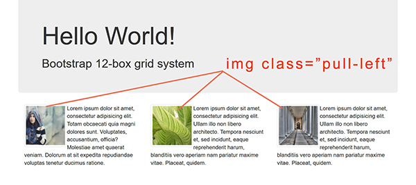
Also add clearfix class to any tag after the floated text. See my code below.
<!doctype html>
<html lang="en">
<head>
<meta charset="utf-8">
<title>Bootstrap 3.3.7 Starter</title>
<meta name="viewport" content="width=device-width, initial-scale=1">
<meta http-equiv="X-UA-Compatible" content="IE=edge">
<!--Bootstrap CSS-->
<link rel="stylesheet" href="https://maxcdn.bootstrapcdn.com/bootstrap/3.3.7/css/bootstrap.min.css" integrity="sha384-BVYiiSIFeK1dGmJRAkycuHAHRg32OmUcww7on3RYdg4Va+PmSTsz/K68vbdEjh4u" crossorigin="anonymous">
</head>
<body>
<div class="container">
<div class="row">
<div class="jumbotron">
<h1>Hello World!</h1>
<h2>Bootstrap 12-box grid system</h2>
</div>
</div>
<div class="row">
<div class="col-md-4"> <img class="pull-left img-thumbnail" src="https://placeimg.com/100/100/people" alt="...">
<p>Lorem ipsum dolor sit amet, consectetur adipisicing elit. Totam obcaecati quia magni dolores sunt. Voluptates, accusantium, officia? Molestiae amet quaerat veniam. Dolorum at sit expedita repudiandae voluptas tenetur ducimus ratione.</p>
<p class="clearfix"></p>
</div>
<div class="col-md-4"> <img class="pull-left img-thumbnail" src="https://placeimg.com/100/100/nature" alt="...">
<p>Lorem ipsum dolor sit amet, consectetur adipisicing elit. Ullam illo non libero architecto. Tempora nesciunt et, sed incidunt, eaque reprehenderit harum, blanditiis vero aperiam nam pariatur maxime vitae. Placeat, quidem.</p>
<p class="clearfix"></p>
</div>
<div class="col-md-4"> <img class="pull-left img-thumbnail" src="https://placeimg.com/100/100/arch" alt="...">
<p>Lorem ipsum dolor sit amet, consectetur adipisicing elit. Ullam illo non libero architecto. Tempora nesciunt et, sed incidunt, eaque reprehenderit harum, blanditiis vero aperiam nam pariatur maxime vitae. Placeat, quidem.</p>
<p class="clearfix"></p>
</div>
<!--/row--></div>
<!--container--></div>
<!--latest jQuery 3-->
<script src="https://code.jquery.com/jquery-3.2.1.min.js" integrity="sha256-hwg4gsxgFZhOsEEamdOYGBf13FyQuiTwlAQgxVSNgt4=" crossorigin="anonymous"></script>
<!--Bootstrap JS-->
<script src="https://maxcdn.bootstrapcdn.com/bootstrap/3.3.7/js/bootstrap.min.js" integrity="sha384-Tc5IQib027qvyjSMfHjOMaLkfuWVxZxUPnCJA7l2mCWNIpG9mGCD8wGNIcPD7Txa" crossorigin="anonymous"></script>
</body>
</html>
Copy link to clipboard
Copied
That's probably what the OP is aiming for but from the image they posted it looks like they are trying to insert the images outside of the text columns, so the text if it it exceeds past the image doesnt wrap around the image. That could be deliberate or as a result of not knowing what they are doing.
Copy link to clipboard
Copied
For visual interest, I would use contextual panels (BS3) or cards (BS4) with images above or below text.

Copy link to clipboard
Copied
https://forums.adobe.com/people/Nancy+OShea wrote
For visual interest, I would use contextual panels (BS3) or cards (BS4) with images above or below text.
If that's what the OP wants. All they seem to want at the moment is the image to go to the left of the text, either with the text wrappng around it or as suggested in the image they posted, not.
If I was a mind-reader I could tell you but I'm not although sometimes in this forum it would be benefical to be so.

Copy link to clipboard
Copied
omg! thank you guys! this is what i was looking for
Find more inspiration, events, and resources on the new Adobe Community
Explore Now
 AdChoices