pziecina
Legend
February 14, 2017
Question

COT: css grid layouts update

  • February 14, 2017
  • 10 replies
  • 5349 views

COT = Completely Of Topic

Just though I would let those interested know that the css grid layouts spec has been updated, and that a few features may be 'ignored' in order to speed up making it a recommendation -

https://www.w3.org/TR/2017/CR-css-grid-1-20170209/

Currently FF has 9 more features in order to be compliant, and Chrome 7 features.

The features, at risk of dropping, (probably will be) are -

Which basically means that, FF has 3 in order to pass, and Chrome 1.

Also I would like to explain, (sorry Ben, no insult intended) what the specs meen when they say flexbox is one direction, and grids 2 dimension, and it has nothing to do with how one uses them, but how one defines them.

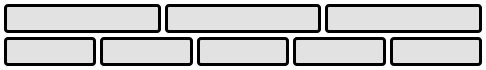
If you look at the 2 following diagrams -

An example of flex layout: two rows of items, the first being three items a third of the space each, and the second being five items, a fifth of the space each. There is therefore alignment along the row axis, but not along the column axis. Exemplary Flex Layout Example

An example of grid layout: two rows of items, the first being four items—the last of which spans both rows, and the second being two items—the first of which spans the first two columns— plus the spanned item from the first row. Exemplary Grid Layout Example

You will I hope see the meaning, but for those who do not, it is the alignment of the containers, flexbox does not allow someone to tell the flex child item to span 2x the vertical space, without extra css and possibly html mark-up, css grids does this without extra mark-up -

The W3C specs says -

Although many layouts can be expressed with either Grid or Flexbox, they each have their specialties. Grid enforces 2-dimensional alignment, uses a top-down approach to layout, allows explicit overlapping of items, and has more powerful spanning capabilities. Flexbox focuses on space distribution within an axis, uses a simpler bottom-up approach to layout, can use a content-size–based line-wrapping system to control its secondary axis, and relies on the underlying markup hierarchy to build more complex layouts. It is expected that both will be valuable and complementary tools for CSS authors.

As an aside -

If the css grid features are to be 'dropped' as the specs say they may, then there is likely that both flexbox and grids will become recommendations at roughly the same time.

This topic has been closed for replies.

10 replies

pziecina
pziecinaAuthor
Legend
April 5, 2017

This is getting repetitious.

The latest update to iOS (10.3), also now includes support.

Nancy OShea

I don't know if you remember posting the caniuse usage data, a few weeks back, and me saying that it will be 80% by the end of this years, and then posting that I though caniuse is not really representative of what we can actually use anymore?

Well the latest stats, I think confirm both, with support now being 37%,

http://caniuse.com/#feat=css-grid

At this rate we should be able to use css grid layouts, without any problems by November, (some hope ).

Nancy OShea
Community Expert
Community Expert
April 5, 2017

Global = 37%

US =  34.5%

I don't know where Can I Use derive their data.    But I feel like old devices & browsers which many people still use BTW, are holding us all back.   I'm the 1st to admit  that I don't upgrade OSs on my older mobile devices because it's a mixed bag of tricks.  Sometimes it's OK but quite often it's catastrophic and the device stops working.   So I don't mess with it.  I'm sure I'm not alone.

Nancy

Nancy O'Shea— Product User & Community Expert
pziecina
pziecinaAuthor
Legend
April 5, 2017

I'm still running iOS 6 on my iPod touch, and I still have a smartphone that uses Android 2.2, both of which only support the old original version of flexbox, and will never support css grids.

If I was developing a public commercial site, I would use all these shiny new features with caution. The problem is users need to have support in programs like Dw, just so they can develop and exchange ideas on 'how to use' fallbacks, and Dw will not support the features, until users can actually use them without any requirement for a fallback, (javascript or other).

Even if a lot of what they do include will not work without javascript.

pziecina
pziecinaAuthor
Legend
April 3, 2017

Now for some news I can say.

Microsoft have begun work on updating the MS Edge implementation of css grid layouts, so it complies with the 'recommendation' specs.

pziecina
pziecinaAuthor
Legend
March 30, 2017

Sorry, was not allowed to say my previous post, (now deleted)

BenPleysier
Community Expert
Community Expert
March 30, 2017

Wappler is the DMXzone-made Dreamweaver replacement and includes the best of their powerful extensions, as well as much more!
pziecina
pziecinaAuthor
Legend
March 28, 2017

A list apart, now has an article on converting a site, (using) css grids -

https://alistapart.com/article/practical-grid

BenPleysier
Community Expert
Community Expert
March 28, 2017

Thank you for the article. I immediately felt at home when I read

I fiddled with a flexbox layout at one point as an experiment, but never shipped it, because it felt clumsy to be using a one-dimensional layout tool to manage a two-dimensional layout. I probably should have converted the navigation bar to flexbox, but I got distracted by something else and never returned to the effort.

Continuing reading the article, after having paused at the above sentence, I became very disappointed when I noticed that Eric did not utilise the strongest GRID-feature, namely grid-template-*.

Wappler is the DMXzone-made Dreamweaver replacement and includes the best of their powerful extensions, as well as much more!
pziecina
pziecinaAuthor
Legend
March 28, 2017

BenPleysier  wrote

Continuing reading the article, after having paused at the above sentence, I became very disappointed when I noticed that Eric did not utilise the strongest GRID-feature, namely grid-template-*.

I think he was trying to make it compatible with IE browsers, without the use of @support or additional mark-up.

I have looked at the creation of IE fallback if someone uses the grid-template feature, and even though I will not say with 100% certainty it can be done, I do think, (95% certain) that it is possible, if a visual or js code generation tool was used to create the layout initially.

As for flexbox, let's say I disagree with yourself and Erics views

pziecina
pziecinaAuthor
Legend
March 14, 2017

Only one more update after this -

Firefox and Chrome now pass all tests for css grid layouts, so it can now proceed to 'Recommendation' status -

https://www.w3.org/TR/css-grid-1/

When it can actually be used without fallback, and how you get experience in using it, those are the real questions.

EDIT: Chrome and Opera latest desktop version both enabled by default, and latest Chrome and Opera Android apps have support.

Legend
March 14, 2017

And Safari............. where does that fit into the picture or are we still waiting for that to support the table tag?

pziecina
pziecinaAuthor
Legend
March 14, 2017

Safari desktop 10.1 support grid layouts, and the next major iOS update will include Safari iOS with grid layout support

pziecina
pziecinaAuthor
Legend
March 7, 2017

css grid layouts just moved to the release version of firefox, (v52) and the next version of Chrome/Opera will also move it from behind the flag.

Safari (v10.1) and IE/Edge no flag required. So as far as desktop goes, I think we can say, 'that's it'.

pziecina
pziecinaAuthor
Legend
March 7, 2017

One other update, Firefox prior to V52 only required 9 items fixed, (Chrome already now fully compliant) in order for the level 1 spec to move to recommendation status.

Firefox has also started work on the next level specs, (level 2) and is starting work on sub-grids.

pziecina
pziecinaAuthor
Legend
February 17, 2017

If anyone is interested, you can get an idea of using grids for layout from -

http://gridbyexample.com/examples/

And to give credit to where I found the link -

https://webflow.com/blog/18-web-design-trends-for-2017

(Just for you OS, read section 9 )

Legend
February 17, 2017

pziecina  wrote

And to give credit to where I found the link -

https://webflow.com/blog/18-web-design-trends-for-2017

(Just for you OS, read section 9 )

Right, but I think that will fall on deaf ears and we will see a lot of twirling and whirling for no specific reason other than it can be 'easily' done, nightmare. Its already happening in all these pre-built templates which are available for a few dollars.

pziecina
pziecinaAuthor
Legend
April 6, 2017

If l was in the DW development team l would start considering right now how grid is going to be integrated into DW plus postCSS  plus a few others, not leave it until the horse has bolted and its playing catch up again.

Having said that all IDEs and editors have their failures. Can you believe the one lm using now whilst it supports postCSS doesnt support the Autoprefixer plugin, the most popular postCSS plugin? I guess they think all developers are using sass or less maybe. Sure l can grunt and gulp but l dont do that kind of thing. l like neatly packaged plugins that just work without jumping through hoops to get something critical into the workflow.

Im finding more and more reasons why grid is going to be so important in the future as layouts need to conform to different devices and components need to be located to different areas of the layout. You can do that so much more effectively with a truely  interchangable and flexible layout method. Flex is good but it largely works by being constricted to parent containers.

Not sure I will still be doing this commercially when grid finally gets pushed to production status but its going to be a game changer for those still in it as is a nice simple prefixer.

Ooops forgot DW has  no support for Flexbox yet, better start at the beginning.


Dw's code editor does support flexbox, but not very well, and can produce none complient code, for those interested try the following, (also happens in Brackets) -

type flex-flow, you will then be given a list of 'options' including wrap, and nowrap. This means you can insert in the css -

flex-flow: wrap row;

If you look at the specs, this is none complient css, as they are in the reverse order to the specification.

Then of course the only option Dw has for including any vendor prefixed code is sass/less, and i'm not going to repeat what i think of that.

pziecina
pziecinaAuthor
Legend
February 14, 2017

For anyone interested I have posted an idea -

https://forums.adobe.com/ideas/5178

The idea is to reintroduce the Grid visual aid to Dw. In testing I found that had this old feature been available it would have simplified the creation of css grids/flexbox/multi-column.

Used with a css designer implementation of the css coding, then this is the simplest way I have found to help create the above, (I created my own background grid in Dw 2017, not needed if we have this back).

Nancy OShea
Community Expert
Community Expert
February 14, 2017

When you say Grid visual aid, you don't mean the Fluid Grid Layout tools do you?

Nancy    

Nancy O'Shea— Product User & Community Expert
pziecina
pziecinaAuthor
Legend
February 14, 2017

No. CS6 had a number of visual aids that one could use for layouts, these included a grid system that allowed you to set the number of horizontal and vertical lines that should make up the grid. This was then presented as an overlay in design view.

There was also a guid feature that one could drag into any position from the top and side of design view, same one uses in indesign.

Inspiring
February 14, 2017

Paula,

You couldn't be "completely off topic" if you tried. Thanks for taking the time to write this mini-tutorial. Always enjoy and appreciate what you have to say. (That last bit goes the same for Nancy, Ben, Jon, Os, Rob, Peran, and Murray.)

Chris

BenPleysier
Community Expert
Community Expert
February 14, 2017

Thank you for that Paula. At least I was right about one thing, they complement each other and I can't wait for their complete arrival. Exciting times ahead.

Edit:

I was too quick off the mark. The spec expressly states that Grid is two-dimensional and that Flexbox focuses on space distribution within one axis either horizontal or vertical. The engineering mind in me says that this translates to uni-directional.

Having said that, I do not care about the semantics, I am looking forward to the future.

Wappler is the DMXzone-made Dreamweaver replacement and includes the best of their powerful extensions, as well as much more!
pziecina
pziecinaAuthor
Legend
February 14, 2017

Even the W3C keeps amending how the try to clarify the 1/2 dimensional aspect, and they still cannot find a clear way that define exactly what they mean. Having written specs I can sympathise with them, but I still laugh when I read how they try and write it .

Just as a little update.

If Dw does not include better flexbox/grid/multi-column support in the next version, then I will post a link to the code I am using to modify the css designer to do so. It is not complete yet, as I am trying to think of the best way to include both the new and old, (IE) syntax, but I may have to make them separate selections. Flexbox and multi-column is complete though, and with vendor prefix support.

Legend
February 14, 2017

Who wants to use flex, grid or multi column when you can use tables so  l was recently informed.