

- Home
- Dreamweaver
- Discussions
- Creating a "shaded" web background color?
- Creating a "shaded" web background color?

Copy link to clipboard
Copied
I so enjoy the fact that I can use different background colors on each of my website's pages. The different web colors look particularly good when I look at my website from my iPhone, but have noticed that on my desktop, the same colored space to the left and to the right of my copy is a little bland and boring. I'm looking to find a way to add some shading or texture to my pages like I'm showing here to add a little more interest and variety. Is there a way to create such a shade in Dreamweaver?
Thanks.


 1 Correct answer

CSS Gradient is all code. It's not a jpg or png image so DPI and size are irrelevant.
Permalink - use to edit and share this gradient: http://colorzilla.com/gradient-editor/#f1e767+0,feb645+100;Yellow+3D
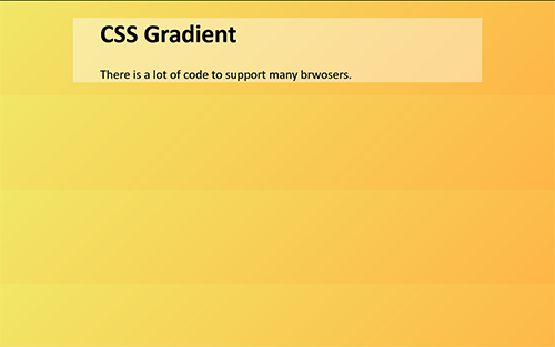
HTML Code Demo:
<!doctype html>
<html lang="en">
<head>
<meta charset="utf-8">
<title>CSS Gradient</title>
<style>
body {
background: rgb(241,231,103); /* Old browsers */
background: -moz-linear-gradient(-45deg, rgba(241,231,103,1) 0%, rgba(254,182,69,1) 100%); /* FF3.6-15 */
background: -webki
... 4
Replies
4
4
Replies
4

Copy link to clipboard
Copied
Use a css radial gradient for the background image -

Copy link to clipboard
Copied
You can't really ensure that your color schemes will display with the same vibrancy, intensity, hue, contrast, tint, et al, that you design on all devices and monitors. No two monitors are really calibrated exactly the same, unless you own both of them and have performed the calibration yourself. And even then, the difference in the monitors will mean they won't be exact matches.
Also, end users may or may not have adjusted the default factory settings of their monitors, which will render the colors differently. Older monitors will not necessarily have the same brilliance as when first new. Different mobile screens are similarly going to display only an approximation of your colors. LCD is going to be different from retina. All you can do is make color look as good as you can on you own equipment and hope deviations across the world of equipment in use won't be too severe.
To help illustrate some of my points, here's a true story: I once had to replace a monitor after many years of service, as the phosphors ceased to render the color and brightness. At the store, I chose to buy a monitor that looked as good as my dying one had before it entered its death knell. Got it home, set it up, and it wasn't as bright nor did it render colors accurately. Whites, for example, were bluish gray and very dim. No amount of tweaking could correct it. Ended up returning it for another one which proved to perform to my standards.
Chris
Copy link to clipboard
Copied
If I attempt to experiment with creating several different colored radial backgrounds in my Corel Draw program, what size and DPI would you recommend?
Copy link to clipboard
Copied
CSS Gradient is all code. It's not a jpg or png image so DPI and size are irrelevant.
Permalink - use to edit and share this gradient: http://colorzilla.com/gradient-editor/#f1e767+0,feb645+100;Yellow+3D

HTML Code Demo:
<!doctype html>
<html lang="en">
<head>
<meta charset="utf-8">
<title>CSS Gradient</title>
<style>
body {
background: rgb(241,231,103); /* Old browsers */
background: -moz-linear-gradient(-45deg, rgba(241,231,103,1) 0%, rgba(254,182,69,1) 100%); /* FF3.6-15 */
background: -webkit-linear-gradient(-45deg, rgba(241,231,103,1) 0%, rgba(254,182,69,1) 100%); /* Chrome10-25,Safari5.1-6 */
background: linear-gradient(135deg, rgba(241,231,103,1) 0%, rgba(254,182,69,1) 100%); /* W3C, IE10+, FF16+, Chrome26+, Opera12+, Safari7+ */
filter: progid:DXImageTransform.Microsoft.gradient( startColorstr='#f1e767', endColorstr='#feb645', GradientType=1 ); /* IE6-9 fallback on horizontal gradient */
}
/**DEMO**/
.container {
background: rgba(255,255,255,0.4);
width: 65%;
margin: 0 auto;
padding: 0 5%;
}
</style>
</head>
<body>
<div class="container">
<h1>CSS Gradient</h1>
<p>There is a lot of code to support many browsers.</p>
</div>
</body>
</html>
That's all there is to it.
Find more inspiration, events, and resources on the new Adobe Community
Explore Now
 AdChoices