


Copy link to clipboard
Copied
When i use Dream Weaver to write code for my website, in the css file it won't respond to any changes that i make to the padding on any of my images. yesterday i saved it and it looked fine but that was because it wasn't actually responding to the padding changes that i made and it made everything i did wrong. i'm still unable to solve this issue.


 1 Correct answer

You would replace your "work" div and contents (designs, photographs and videos containers) with everything from inside the <body> tags of the example code (not including the <body> tags themselves). Then add the example code's css to the end of your stylesheet and delete the css you have for those items as well.
 18
Replies
18
18
Replies
18
Copy link to clipboard
Copied
Negative values are not allowed with CSS padding properties.
Maybe you meant to use negative margins?
Negative margins can be used, but can cause their own problems. What are you trying to do exactly?
Copy link to clipboard
Copied
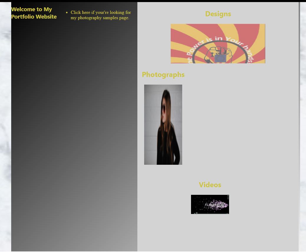
i want to get the image that appears underneath or at the bottom to align next to the image of the girl but i have tried many different ways and it won't go up. any ideas? thanks!
Copy link to clipboard
Copied
OK, that shouldn't be too terrible, you just have some code that's conflicting with what you're doing that maybe isn't shown in your post.
Could we see the entire code for the page?
Copy link to clipboard
Copied
A link to your work would be best, but if you don't have it online yet, copy/paste all the code from the page into the forum.
Don't use email, it won't come through.
Copy link to clipboard
Copied
This is my entire css code for my index minus the header and footer and navigation css pages.
@charset "UTF-8";
/* CSS Document */
/*Written by Isabel*/
ul a {
text-decoration: none;
font-family: "Liberation Serif", Times, "Times New Roman", "serif";
color: #CDC441;
margin: auto;
padding-left: -3%;
}
ul a:hover, a:active {
color: white;
text-decoration: underline;
}
h1 {
color: white;
font-family: "Gill Sans MT", "Myriad Pro", "DejaVu Sans Condensed", Helvetica, Arial, "sans-serif";
text-decoration: none;
}
.container{
background-color:#27D0F4;
background: -webkit-linear-gradient(left top, #000000, #ffffff);
font-family: helvetica, "Segoe UI", "DejaVu Sans", "Trebuchet MS", Verdana, "sans-serif";
height:490px;
padding-bottom:0%;
padding-left:6%;
padding-right:6%;
padding-top:6%;
display:block;
}
.work{
background-color: lightgray;
width:100.5%;
padding-right: -25px;
padding-left: -25px;
overflow:auto;
text-align:center
}
.work a{
text-decoration:none;
color: #006699;
font-family:Segoe, "Segoe UI", "DejaVu Sans", "Trebuchet MS", Verdana, "sans-serif";
}
.work a:hover{
opacity:0.5;
}
.work1{
display:inline-block;
height:30%;
overflow:hidden;
float:left;
padding-left: 1px;
}
.work2{
width:30%;
display:inline-block;
height:50%;
overflow:hidden;
padding-right: 360px;
padding-left: 2px;
float: middle;
}
.workthird{
width:30%;
display:inline-block;
height:50%;
overflow:hidden;
padding-left: -30%;
text-decoration: none;
float: right;
padding-bottom: -30px;
position: relative;
}
h3{
font-family:Segoe, "Segoe UI", "DejaVu Sans", "Trebuchet MS", Verdana, "sans-serif";
color:#CDC441;
font-style:normal;
text-decoration: none;
}
h2{
color: #CDC441;
text-decoration: none;
text-align: center;
}
Copy link to clipboard
Copied
I'm sorry, I meant the entire code for the page, all css and html (a link is best).
Copy link to clipboard
Copied
sorry, its not live yet so i can't link but here it is:
html page:
<!doctype html>
<html>
<head>
<meta charset="utf-8">
<title>Home</title>
<link href="css/indexhome.css" rel="stylesheet" type="text/css">
<link href="css/navigationbar.css" rel="stylesheet" type="text/css">
<link href="css/headerandfooter.css" rel="stylesheet" type="text/css">
</head>
<header>
<div class="header">
<img src="images/profilepic.jpg" alt="profile picture" class="rotateimg180">
<h1>Isabel Hartnett</h1>
<div class="navigationbar" id="portfolionavbar">
<a href="index.html">Home</a> | <a href="aboutme.html">About Me</a> | <a href="designpage.html">Design Work</a> | <a href="photographypage.html">Photography Work</a> | <a href="media1.html">Media Work</a>
</div>
</div>
</header>
<body>
<body background="images/background1.jpg" alt="homepagebackground">
<div class="container">
<h3>Welcome to My Portfolio Website</h3>
<ul>
<a href="photographypage.html"><li>Click here if your're looking for my photography samples page.</li></a>
</ul>
<div class="work">
<div class="work1">
<a href="design.html">
<h2>Designs</h2>
<img src="images/designwork2.JPG" alt="poster design" width="60%" height="300">
</a>
</div>
<a href="photography.html">
<div class="work2">
<h2>Photographs</h2>
<img src="images/photography.jpg" alt="photography logo" width="80%" height="300"></div>
</a>
</div>
<a href="media.html">
<div class="workthird">
<h2>Videos</h2>
<img src="images/video.jpg" alt="video logo" width="90%"></div>
</a>
</div>
</body>
<footer>
<div>
</div>
<div class="footer">
<p><small> © copyright Isabel
<strong>Email</strong> (email address)</small></p>
</div>
</footer>
</body>
</html>
css pages
index css:
@charset "UTF-8";
/* CSS Document */
/*Written by Isabel*/
ul a {
text-decoration: none;
font-family: "Liberation Serif", Times, "Times New Roman", "serif";
color: #CDC441;
margin: auto;
padding-left: -3%;
}
ul a:hover, a:active {
color: white;
text-decoration: underline;
}
h1 {
color: white;
font-family: "Gill Sans MT", "Myriad Pro", "DejaVu Sans Condensed", Helvetica, Arial, "sans-serif";
text-decoration: none;
}
.container{
background-color:#27D0F4;
background: -webkit-linear-gradient(left top, #000000, #ffffff);
font-family: helvetica, "Segoe UI", "DejaVu Sans", "Trebuchet MS", Verdana, "sans-serif";
height:490px;
padding-bottom:0%;
padding-left:6%;
padding-right:6%;
padding-top:6%;
display:block;
}
.work{
background-color: lightgray;
width:100.5%;
padding-right: -25px;
padding-left: -25px;
overflow:auto;
text-align:center
}
.work a{
text-decoration:none;
color: #006699;
font-family:Segoe, "Segoe UI", "DejaVu Sans", "Trebuchet MS", Verdana, "sans-serif";
}
.work a:hover{
opacity:0.5;
}
.work1{
display:inline-block;
height:30%;
overflow:hidden;
float:left;
padding-left: 1px;
}
.work2{
width:30%;
display:inline-block;
height:50%;
overflow:hidden;
padding-right: 360px;
padding-left: 2px;
float: middle;
}
.workthird{
width:30%;
display:inline-block;
height:50%;
overflow:hidden;
padding-left: -30%;
text-decoration: none;
float: right;
padding-bottom: -30px;
position: relative;
}
h3{
font-family:Segoe, "Segoe UI", "DejaVu Sans", "Trebuchet MS", Verdana, "sans-serif";
color:#CDC441;
font-style:normal;
text-decoration: none;
}
h2{
color: #CDC441;
text-decoration: none;
text-align: center;
}
header and footer css:
@charset "UTF-8";
/* CSS Document */
/*written by Isabel*/
header{
background-color: black;
font-family:Segoe, "Segoe UI", "DejaVu Sans", "Trebuchet MS", Verdana, "sans-serif";
color:white;
position:absolute;
left:0%;
right:0%;
top:0%;
text-align:center;
padding-bottom:2%;
overflow:hidden;
margin:auto;
height:180px;
width:1280px;
}
.header{
width:1280px;
margin:auto;
padding-bottom:3%;
padding-top:0.1%
}
.rotateimg180 {
-webkit-transform:rotate(270deg);
}
header img{
border-radius:50%;
width:15%;
border-style:solid;
border-width:2px;
border-color:white;
float:left;
margin-left:4%;
margin-top:1%;
margin-bottom:2%;
padding: 0.3%;
}
h1{
font-size:500%;
margin-left:10%;
margin-right:15%;
margin-bottom:1%;
margin-top:3.5%;
}
body{
background-color:#FFFFFF;
width:1280px;
padding-top:210px;
padding-bottom:2%;
padding-left:0%;
padding-right:0%;
height:100%;
margin:auto;
}
footer{
background: -webkit-linear-gradient( bottom, #000000, #ffffff);
color:#CDC441;
font-family:Segoe, "Segoe UI", "DejaVu Sans", "Trebuchet MS", Verdana, "sans-serif";
position:fixed;
bottom:0%;
left:0%;
right:0%;
text-align:center;
font-style:normal;
width:100%;
margin:auto;
font-size:100%;
padding-top:-1%;
padding-bottom:-3%;
}
.footer{
margin:auto;
padding-left:26%;
padding-right:26%;
}
navigation bar css:
@charset "utf-8";
/* CSS Document */
/*written by Isabel*/
.navigationbar{
background-color: black;
margin-left: 10%;
margin-right: 15%;
padding-top: 1px;
padding-bottom: 1px;
color: white;
overflow: hidden;
}
.navigationbar a{
text-decoration: none;
color: white;
font-size: 160%;
display: inline-block;
border: solid;
border-color: black;
border-width: 1px;
padding-left: 5px;
padding-right: 7px;
}
.navigationbar a:hover{
background-color: gray;
color: white;
font-style: italic;
font-family: "helvetica";
}
.navigationbar a:active{
background-color: lightgray;
color: #FFFFFF;
}

Copy link to clipboard
Copied
Is this what you're trying to do?

Bootstrap 4 Responsive Layout. Copy & paste code into a new, blank document.
<!doctype html>
<html lang="en">
<head>
<meta charset="utf-8">
<title>Bootstrap 4 Starter Page</title>
<meta charset="utf-8">
<meta http-equiv="X-UA-Compatible" content="IE=edge">
<meta name="viewport" content="width=device-width, initial-scale=1">
<!--Bootstrap 4 CSS-->
<link href="https://maxcdn.bootstrapcdn.com/bootstrap/4.0.0-beta/css/bootstrap.min.css" rel="stylesheet" integrity="sha384-/Y6pD6FV/Vv2HJnA6t+vslU6fwYXjCFtcEpHbNJ0lyAFsXTsjBbfaDjzALeQsN6M" crossorigin="anonymous">
<style>
body { padding-top: 3.5rem }
/**placeholder image**/
.jumbotron {
background: url(https://placeimg.com/1200/500/arch) no-repeat center center fixed;
background-size: cover;
}
.jumbotron > .container {
background: rgba(0,0,0,0.5);
padding: 3%;
color: #FFF
}
</style>
</head>
<body>
<nav class="navbar navbar-light navbar-expand-md bg-light justify-content-center fixed-top"> <a class="navbar-brand" href="#">Brand / Logo </a>
<button class="navbar-toggler" type="button" data-toggle="collapse" data-target="#navbarsExampleDefault" aria-controls="navbarsExampleDefault" aria-expanded="false" aria-label="Toggle navigation"> <span class="navbar-toggler-icon"></span> </button>
<div class="collapse navbar-collapse" id="navbarsExampleDefault">
<ul class="navbar-nav mr-auto">
<li class="nav-item active"> <a class="nav-link" href="#">Home <span class="sr-only">(current)</span></a> </li>
<li class="nav-item"><a class="nav-link" href="#">Menu 1</a></li>
<li class="nav-item"><a class="nav-link" href="#">Menu 2</a></li>
<li class="nav-item"><a class="nav-link" href="#">Menu 3</a></li>
<li class="nav-item"><a class="nav-link" href="#">Menu 4</a></li>
</ul>
</div>
</nav>
<main role="main">
<!-- Main jumbotron for a primary marketing message or call to action -->
<div class="jumbotron">
<div class="container">
<h1 class="display-3">Hello, world!</h1>
<p>This is a template for a simple marketing or informational website. It includes a large callout called a jumbotron and three supporting pieces of content. Use it as a starting point to create something more unique.</p>
<p><a class="btn btn-primary btn-lg" href="#" role="button">Learn more »</a></p>
</div>
</div>
<div class="container">
<!-- Example row of columns -->
<div class="row">
<div class="col-md-4">
<h2>Column 1</h2>
<img class="img-thumbnail" src="https://placeimg.com/400/300/nature" alt="placeholder">
<p>Donec id elit non mi porta gravida at eget metus. Fusce dapibus, tellus ac cursus commodo, tortor mauris condimentum nibh, ut fermentum massa justo sit amet risus. Etiam porta sem malesuada magna mollis euismod. Donec sed odio dui. </p>
<p><a class="btn btn-primary" href="#" role="button">View details »</a></p>
</div>
<div class="col-md-4">
<h2>Column 2 </h2>
<img class="img-thumbnail" src="https://placeimg.com/400/300/arch" alt="placeholder">
<p>Lorem ipsum dolor sit amet, consectetur adipisicing elit. Debitis necessitatibus, tempora, aperiam expedita ullam laudantium consequuntur quos commodi maiores possimus fugit pariatur aspernatur sit quae, voluptates nisi earum aliquid placeat!Donec id elit non mi porta gravida at eget metus. </p>
<p><a class="btn btn-primary" href="#" role="button">View details »</a></p>
</div>
<div class="col-md-4">
<h2>Column 3</h2>
<img class="img-thumbnail" src="https://placeimg.com/400/300/tech" alt="placeholder">
<p>Donec sed odio dui. Cras justo odio, dapibus ac facilisis in, egestas eget quam. Fusce dapibus, tellus ac cursus commodo, tortor mauris condimentum nibh, ut fermentum massa justo sit amet risus. Etiam porta sem malesuada magna mollis euismod. Donec sed odio dui. </p>
<p><a class="btn btn-primary" href="#" role="button">View details »</a></p>
</div>
</div>
<hr>
</div><!-- /container -->
</main>
<footer class="container-fluid bg-dark">
<div class="row">
<div class="col text-center text-light">
<p>© Company Name 2017-2018</p>
</div>
</div>
</footer>
<!-- Bootstrap core JavaScript
Placed at the end of the document so tpages load faster -->
<!--latest jQuery Core-->
<script src="https://code.jquery.com/jquery-3.2.1.min.js" integrity="sha256-hwg4gsxgFZhOsEEamdOYGBf13FyQuiTwlAQgxVSNgt4=" crossorigin="anonymous"></script>
<!--Popper JS-->
<script src="https://cdnjs.cloudflare.com/ajax/libs/popper.js/1.11.0/umd/popper.min.js" integrity="sha384-b/U6ypiBEHpOf/4+1nzFpr53nxSS+GLCkfwBdFNTxtclqqenISfwAzpKaMNFNmj4" crossorigin="anonymous"></script>
<!--latest Bootstrap 4 JS-->
<script src="https://maxcdn.bootstrapcdn.com/bootstrap/4.0.0-beta/js/bootstrap.min.js" integrity="sha384-h0AbiXch4ZDo7tp9hKZ4TsHbi047NrKGLO3SEJAg45jXxnGIfYzk4Si90RDIqNm1" crossorigin="anonymous"></script>
</body>
</html>
Copy link to clipboard
Copied

i just want that 'its magic' image to align next to the girl and the code that you supplied me with is too confusing for me to work out. any ideas?
Copy link to clipboard
Copied
So, do you want the Videos header and image in the same container as the Designs and Photographs headers and images?
Your code is kind of all over the place, but the .workthird <div> would need to be moved inside and to the end of the work <div>. Right now, the workthird <div> appears in the html after the container that holds the other two categories, so it appears below them in the layout.
Copy link to clipboard
Copied
Here's something a bit simpler for those 3 images using css flex. Swap in your own images and link them (not their <div>)..
<!doctype html>
<html lang="en-us">
<head>
<title>Layout with Flex</title>
<meta charset="utf-8">
<style>
.flexcontainer {
display: -ms-flex;
display: flex;
background-color:lightgray;
max-width:980px;
margin:0 auto;
}
.box {
width: 33%;
display: -ms-flex;
display: flex;
-ms-flex-direction: column;
flex-direction: column;
-ms-justify-content: space-between;
justify-content: space-between;
padding: 5px;
margin: 5px;
text-align: center;
}
.box img {
max-width: 100%;
}
</style>
</head>
<body>
<div class="flexcontainer">
<div class="box">
<h2>Designs</h2>
<div>
<img src="images/96.png" alt="Designs Image">
</div>
</div>
<div class="box">
<h2>Photographs</h2>
<div>
<img src="images/72.png" alt="Photographs Image">
</div>
</div>
<div class="box">
<h2>Videos</h2>
<div>
<img src="images/72.png" alt="Videos Image">
</div>
</div>
</div>
</body>
</html>
Copy link to clipboard
Copied
do i take my original div classes links? and place these ones instead ? i'm confused how to do this because when i do it doesn't look right at all.
Copy link to clipboard
Copied
You would replace your "work" div and contents (designs, photographs and videos containers) with everything from inside the <body> tags of the example code (not including the <body> tags themselves). Then add the example code's css to the end of your stylesheet and delete the css you have for those items as well.
Copy link to clipboard
Copied
ok thanks it works fine now 
Copy link to clipboard
Copied
Copy link to clipboard
Copied
Your CSS code is very messed up.
Copy link to clipboard
Copied
its because dream weaver wasn't responding to the changes that i made in the css file so it look fine then i closed it and open it the next day and it was as you said 'messed up'

Copy link to clipboard
Copied
an image is an inline element... so it doesn't have any padding vertically.. at least it doesn't interact with any siblings elements... it just have an horizontal padding... so if you want to add vertical padding to your image, you first will have to cast it to an inline-block, or a block element... depending on the main goal...
then your .wordthird class has some errors in it... you should remove the padding-left and padding-bottom that are negative... negative value are not allowed. The text-decoration should be applied to the anchor element and not to the container
your HTML contains some errors too, your anchor closing tag is above the closing DIV it should be after....
 AdChoices