- Home
- Dreamweaver
- Discussions
- Re: Dreamweaver and responsive images.
- Re: Dreamweaver and responsive images.
Copy link to clipboard
Copied
Hi All. I'm wondering what the point is of Dreamweaver's responsive image on the Bluetooth insert button. Does anyone bother to use it?
 2 Correct answers
I'm only trying to swap the same image but at different sizes using srcset and sizes.
You either use just the 1 image to cater for all browser viewport widths in which case you dont need to swap it, just make it responsive by either using Bootstraps 'img-fluid' class or your own css class - no srcset needed.
srcset requires a set of different sized images to serve out to the browser at different browser viewport widths. This is to either reduce bandwidth/download consumption, especially on smar
...SRCSET:
1 image at 4 different sizes = 4 images created by you in Photoshop.
BOOTSTRAP:
class="img-fluid" = 1 image that shrinks to fit smaller devices.
Copy link to clipboard
Copied
Sorry, I don't know what you mean. Can you post a screenshot?
Copy link to clipboard
Copied
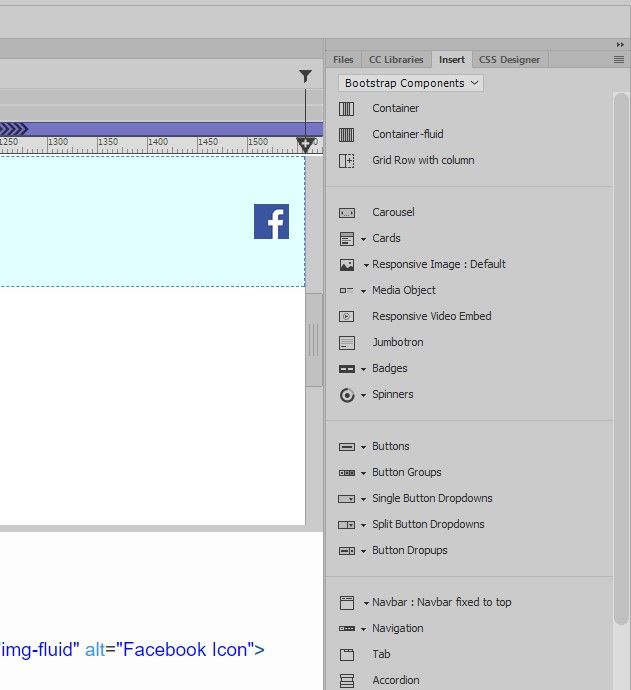
Hi Nancy. I have a screenshot below. I am learning about srcset and sizes to make an image responsive. In Dreamweaaver 2021 I learned to go to the insert panel, make sure bootstrap components is selected then click on responsive images. Then I got to thinking why would I bother to use this? What is the point as it does not make the image responsive for all screens.
Copy link to clipboard
Copied
'srcset' and 'responsive' images are different.
srcset uses a set of different sized images for browser viewports of various widths:
https://www.w3schools.com/tags/tryit.asp?filename=tryhtml5_picture
A responsive image is just one that is set as a percentage width which will reduce and enlarge according to the size of the browser viewport width.
Neither Dreamweaver or Bootstrap, as far as I know, has an option to include srcset - you have to introduce that manually into your code.
Bootstraps css utility class 'img-fluid' will effectively not allow the image to grow any wider than its parent container or browser viewport width. The image will reduce in size as the container or viewport width is reduced. Not really sure that you will see too much difference when 'img-fluid' is applied to a small Facebook logo. The effect would be more obvious on larger images.
Copy link to clipboard
Copied
Right I understand this. I got side tracked with the picture element when I had previously posted this https://community.adobe.com/t5/dreamweaver/hero-image/td-p/11763304 - hence my question why bother with insert, bootstrap components and inserting a responsive image.
Its ok because now I understand the picture, srcset and sizes elements much much better! LOL I understand the differences as well.
I appreciate your help.
Copy link to clipboard
Copied
You're talking about apples and oranges. The Bootstrap utility classes for making one image fluid on different viewports is NOT the same thing as SRCSET.
Bootstrap classes rescale the image to fit smaller screens with CSS. The HTML SRCSET attribute allow you to list alternative images (which you create in Photoshop) for viewing on smaller devices.
Copy link to clipboard
Copied
Ok. Thank you.
Copy link to clipboard
Copied
Nancy. I guess I am confused a bit. I don't need to use the picture element because I am not swapping out different images at different sizes. I'm only trying to swap the same image but at different sizes using srcset and sizes. Does that make sense?
Copy link to clipboard
Copied
I'm only trying to swap the same image but at different sizes using srcset and sizes.
You either use just the 1 image to cater for all browser viewport widths in which case you dont need to swap it, just make it responsive by either using Bootstraps 'img-fluid' class or your own css class - no srcset needed.
srcset requires a set of different sized images to serve out to the browser at different browser viewport widths. This is to either reduce bandwidth/download consumption, especially on smart phones or possible a different sized image would look better at different browser viewport widths, it might be taller for instance.
I think the resource that I linked to may be confusing you as it shows different images being swapped (that is only to make it clear that the images are actually swapping). The image can of course be the same but different dimensions which are more appropriate for different devices.
Copy link to clipboard
Copied
Hi Osgood. I placed the image like this image I am working on like this:
<div class="container-fluid">
<div class="row"><img src="images/undernavbar.jpg" class="img-fluid" alt="Blue Wave Line Under Navigation Bar"> </div>
</div>
It works fine. Thing is, the undernavbar.jpg disappears when I view site on my phone.
Any suggests will be much appreciated.
Copy link to clipboard
Copied
SRCSET:
1 image at 4 different sizes = 4 images created by you in Photoshop.
BOOTSTRAP:
class="img-fluid" = 1 image that shrinks to fit smaller devices.
Copy link to clipboard
Copied
Thank you for the clarification Nancy. As usual you are right on target.

