Welcome to the weird, wonderful and complex world of Bootstrap. Example below, if you can live with it then youre a better person than I am. I'd rather write my own code any day than use this tripe of a framework where half the time its a complete guessing game as to what selectors to use to change anything.
You should make sure the css goes in an independent stylesheet linked to your page which comes AFTER the default bootstrap.css file. Never touch the default bootstrap stylesheet unless you know exactly what you are doing. It looks to me like you may already have an independent stylesheet as you have managed to change some of the properties.
<!doctype html>
<html>
<head>
<meta charset="utf-8">
<title>Bootstrap Demo</title>
<meta name="viewport" content="width=device-width, initial-scale=1">
<meta http-equiv="X-UA-Compatible" content="IE=edge">
<script src="http://code.jquery.com/jquery-latest.min.js">
</script>
<!--Bootstrap-->
<link rel="stylesheet" href="http://maxcdn.bootstrapcdn.com/bootstrap/3.2.0/css/bootstrap.min.css">
<script src="http://maxcdn.bootstrapcdn.com/bootstrap/3.2.0/js/bootstrap.min.js"></script>
<style>
body {
font-family: helvetica, sans-serif;
font-size: 18px;
}
.nav_holder {
background-color: #06C;
padding: 10px 0;
text-align: center;
}
/* BUTTON DEFAULT */
.btn.btn-default {
border: 2px solid #fff;
font-size: 16px;
background-color: transparent!important;
color: #fff;
border-radius: none!important;
}
/* CHANGE BUTTON DEFAULT PROPERTIES ONCLICK */
.dropdown-toggle:active, .open .dropdown-toggle {
background: #80aaff !important;
color:#fff !important;
border: 2px solid #fff!important;
}
/* CLEAR BORDER AND SHADOW ON MENU HOLDER */
.dropdown-menu {
border: none!important;
-webkit-box-shadow: none!important;
box-shadow: none !important;
margin: 20px 0 0 0;
padding: 0;
}
/* STYLE ANCHOR TAGS IN DROPDOWN MENU */
.dropdown-menu > li > a {
background-color: #80aaff;
font-size: 16px;
color: #fff;
margin: 0 0 4px 0;
border-radius: 8px;
display: block;
padding: 10px 0;
text-align: center;
}
/* ANCHOR HOVER COLOR */
.dropdown-menu > li > a:hover {
background-color: #66F;
color: #fff;
}
.caret {
margin: 0 0 0 10px!important;
display: inline-block;
}
</style>
</head>
<body>
<div class="nav_holder">
<div class="btn-group" role="group">
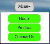
<button id="btnDropdown1" type="button" class="btn btn-default dropdown-toggle" data-toggle="dropdown" aria-haspopup="true" aria-expanded="false">Menu<span class="caret"></span></button>
<ul class="dropdown-menu" aria-labelledby="btnDropdown1">
<li><a href="#">Home</a></li>
<li><a href="#">Product</a></li>
<li><a href="#">Contact Us</a></li>
</ul>
</div>
</div>
</body>
</html>


 AdChoices