Participating Frequently
December 20, 2016
Answered

DW2017 Increase contrast in app

  • December 20, 2016
  • 3 replies
  • 1262 views

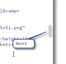
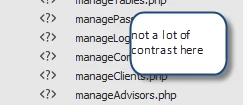
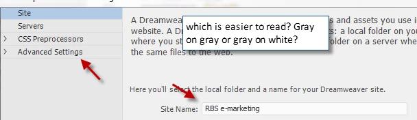
I'm as "hip" as the next guy and appreciate gray on gray type ... but only for about 10 minutes. For those of us who have to use an application for real work, the ultra-low contract of the new Dreamweaver is really hard on the eyes. Trying to read gray type against a gray background gets tiring really fast.

Question:

Is there any way to turn up the contrast (either black type or a white background) for the frame elements in DW2017?

Although it appears to be slightly less buggy (not a very high bar) than DW2015, the new version is a serous step back in terms of usability.

    This topic has been closed for replies.
    Correct answer Preran

    Maybe my eyes are old, or I spend the entire day in front of a screen... but here are a couple of suggestions of where the ultra-low contrast in DW is really not very "serious user" friendly.

    The scroll bar on the file listing has nearly zero contract with the background:

    Source edit (light):

    How many different scroll bars styles do we need on one screen? What do the different style scroll bars mean?

    And

    If I had to pick one... stick with style 2... that is the Windows standard.

    Why dark gray on light gray?

    More low contrast

    How many colors/themes can we have going on here?

    Gray on gray; gray on black; random?

    Wonder what these lines (barcode?) means in the source scroll bar?

    It looks like the program was designed to demo well and not built for all day use.


    Please upvote the idea on this page. Code View Contrast – Adobe Dreamweaver CC: Feature Ideas and canvass for it to help the team prioritize your request. .

    Thanks,

    Preran

    3 replies

    Nancy OShea
    Community Expert
    Community Expert
    December 20, 2016

    A dark UI is all I use now.  For me, it's much easier on the eyes.

    I also use high contrast code colors.

    The 4 steps to create custom code colors are described below in reply #2.

    Re: DW2017 Token inspector not working?

    Nancy

    Nancy O'Shea— Product User & Community Expert
    SuhasYogin
    Adobe Employee
    Adobe Employee
    December 22, 2016

    Hi Ken,

    Could I request you to share more screenshots where you feel we need to improve the contrast of the app?

    Thanks for reporting these - we're definitely listening!

    Cheers,

    Suhas Yogin

    Preran
    Community Manager
    PreranCommunity ManagerCorrect answer
    Community Manager
    January 3, 2017

    Maybe my eyes are old, or I spend the entire day in front of a screen... but here are a couple of suggestions of where the ultra-low contrast in DW is really not very "serious user" friendly.

    The scroll bar on the file listing has nearly zero contract with the background:

    Source edit (light):

    How many different scroll bars styles do we need on one screen? What do the different style scroll bars mean?

    And

    If I had to pick one... stick with style 2... that is the Windows standard.

    Why dark gray on light gray?

    More low contrast

    How many colors/themes can we have going on here?

    Gray on gray; gray on black; random?

    Wonder what these lines (barcode?) means in the source scroll bar?

    It looks like the program was designed to demo well and not built for all day use.


    Please upvote the idea on this page. Code View Contrast – Adobe Dreamweaver CC: Feature Ideas and canvass for it to help the team prioritize your request. .

    Thanks,

    Preran

    Jon Fritz
    Community Expert
    Community Expert
    December 20, 2016

    Go to Edit > Preferences > Interface to change the settings. Right now, there are 4 application themes and two code themes.

    The link given by ankushr40215001 is for further modifying the code theme.

    klubarAuthor
    Participating Frequently
    December 20, 2016

    The link you provided doesn't change the contrast of the DW elements. For example, I've selected dark (or light it doesn't matter), and the DW elements like the local/remote file list is still gray type against a gray background. The DW menus have a little more contrast, but they are still gray type against a slightly lighter gray background. None of the frame elements have any contrast. The scroll bar in the local/remote file listing has zero contrast.

    Windows provides a control panel to customize elements like scroll bars, colors and contrast. No reason for DW to invent its own incompatible options.

    Here's an example of gray-on-gray.

    Pretty hard to read after three or four hours. Not a friendly option for slightly vision impaired or tired eyes. A "what were they thinking?"

    K

    Jon Fritz
    Community Expert
    Community Expert
    December 20, 2016

    I don't like the limitation of the 4 options either and hopefully they do something about it in a future release.


    It's one of several cosmetic issues with the program that people have brought up since CC2017 came out.

    ankushr40215001
    Inspiring
    December 20, 2016

    Hi kluber,

    See this post which could provide an answer to your query - Learn how you can customize the colors of your code elements in Dreamweaver.

    Let me know if this helps.

    Regards,

    Ankush