Exit
  • Global community
    • Language:
      • Deutsch
      • English
      • Español
      • Français
      • Português
  • 日本語コミュニティ
  • 한국 커뮤니티
0

Expected RBRACE

Contributor ,
Oct 08, 2018 Oct 08, 2018

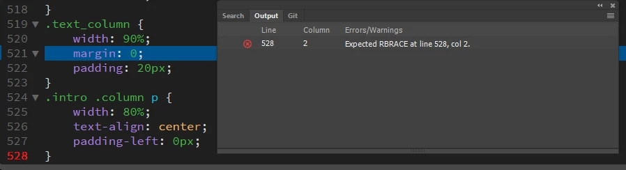
Can anyone tell me why I get this error:

screen_2018-10-08 23.38.02.jpg

Thanks

10.7K
Translate
Report
Community guidelines
Be kind and respectful, give credit to the original source of content, and search for duplicates before posting. Learn more
community guidelines

correct answers 1 Correct answer

LEGEND , Oct 09, 2018 Oct 09, 2018

You are missing the closing brace from all your media-queries.

From -

/* Mobile */

@media (max-width: 320px) {

.logo {

    width: 100%;

Onwards

Translate
Community Expert ,
Oct 08, 2018 Oct 08, 2018

Is there an unclosed media query above the code you showed us?

Nancy O'Shea— Product User, Community Expert & Moderator
Translate
Report
Community guidelines
Be kind and respectful, give credit to the original source of content, and search for duplicates before posting. Learn more
community guidelines
Contributor ,
Oct 08, 2018 Oct 08, 2018

There is indeed, but if I remove it from this on line 512

screen_2018-10-09 01.26.57.jpg

I get an LBRACE on 513 instead

screen_2018-10-09 01.27.17.jpg

I can live with it as my page works fine as is.

I just wanted to be tidy.

Translate
Report
Community guidelines
Be kind and respectful, give credit to the original source of content, and search for duplicates before posting. Learn more
community guidelines
Community Expert ,
Oct 08, 2018 Oct 08, 2018

The code should look like

@media (min-width: 768px) and (max-width: 1096px) {

     ......

     style rules that ar subjected to this media query

     ......

} /*closing bracket*/

Wappler is the DMXzone-made Dreamweaver replacement and includes the best of their powerful extensions, as well as much more!
Translate
Report
Community guidelines
Be kind and respectful, give credit to the original source of content, and search for duplicates before posting. Learn more
community guidelines
LEGEND ,
Oct 09, 2018 Oct 09, 2018

What do you have on line 529?

If it is not a closing brace then that is why you are getting the error. A lot of the time, and especially when writing media-querys and @support rules Dw's linting will show you an incorrect error message.

Translate
Report
Community guidelines
Be kind and respectful, give credit to the original source of content, and search for duplicates before posting. Learn more
community guidelines
LEGEND ,
Oct 09, 2018 Oct 09, 2018

pziecina  wrote

If it is not a closing brace then that is why you are getting the error. A lot of the time, and especially when writing media-querys and @support rules Dw's linting will show you an incorrect error message.

Excellent!! Well Done! Brackets throws in a lot of wobblies too for perfectly good css I seem to remember. Even Wappler does for certain pre-fix flex attributes, I saw this morning.

I suspect most editors are sharing third party validators that rarely get updated.

Translate
Report
Community guidelines
Be kind and respectful, give credit to the original source of content, and search for duplicates before posting. Learn more
community guidelines
Contributor ,
Oct 09, 2018 Oct 09, 2018

pziecina there is no line 529. It stops at 528

As I said earlier, I don't have an issue. I just wanted to clean things up. If it's just a Dreamweaver glitch, I'll live with it.

Thanks for helping.

Translate
Report
Community guidelines
Be kind and respectful, give credit to the original source of content, and search for duplicates before posting. Learn more
community guidelines
Community Expert ,
Oct 09, 2018 Oct 09, 2018

Looking at

screen_2018-10-09 01.26.57.jpg

There should be a line #529 containing a closing curly brace ('}')

Wappler is the DMXzone-made Dreamweaver replacement and includes the best of their powerful extensions, as well as much more!
Translate
Report
Community guidelines
Be kind and respectful, give credit to the original source of content, and search for duplicates before posting. Learn more
community guidelines
LEGEND ,
Oct 09, 2018 Oct 09, 2018

BigDingus  wrote

pziecina there is no line 529. It stops at 528

Then that is your problem. If you look at Bens answer you will see that a media-query is a self contained statement and just like any other css rule it requires both an opening AND closing brace. Your css closing brace on line 528 is only closing that css statment, NOT the media-query.

Translate
Report
Community guidelines
Be kind and respectful, give credit to the original source of content, and search for duplicates before posting. Learn more
community guidelines
Contributor ,
Oct 09, 2018 Oct 09, 2018

That's the problem Ben. when I do that Dreamweaver shows a problem. (See 1st imag)

Translate
Report
Community guidelines
Be kind and respectful, give credit to the original source of content, and search for duplicates before posting. Learn more
community guidelines
Contributor ,
Oct 09, 2018 Oct 09, 2018

I gave it a go guys. The fault just moved.

screen_2018-10-09 13.24.50.jpg

Translate
Report
Community guidelines
Be kind and respectful, give credit to the original source of content, and search for duplicates before posting. Learn more
community guidelines
LEGEND ,
Oct 09, 2018 Oct 09, 2018

Move the line 529 brace to be directly below the line 528 brace then press return/enter and then save.

Is it then showing an error?

Translate
Report
Community guidelines
Be kind and respectful, give credit to the original source of content, and search for duplicates before posting. Learn more
community guidelines
Community Expert ,
Oct 09, 2018 Oct 09, 2018

Instead of a bunch of pictures of various sections of your code, please copy/paste the entire code of the file to a forum response. Don't use email to do it, the code won't come through.

If DW is giving a bogus error, the contributors here can then take a look at the entire code and find the actual error in a couple seconds.

Translate
Report
Community guidelines
Be kind and respectful, give credit to the original source of content, and search for duplicates before posting. Learn more
community guidelines
Contributor ,
Oct 09, 2018 Oct 09, 2018

Gave it a try pziecina but just the same.

Seeing the code with colours can be easier sometimes.

Jon the full CSS code:

@charset "UTF-8";

.body {

    font-family: Brush Script MT, cursive; font-size: 40px; font-style: normal; font-variant: normal; font-weight: 700;

    margin: 0;

    margin-bottom: 20px;

    background-color: #191717;

}

.container {

    margin-left: 0 auto;

    margin-right: 0 auto;

    background-color: #191717;

}

.PageTitle {

    position:absolute;

    text-align: center;

    margin: 0 auto;

    width: 100%;

    top: 160px;

    border: none;

    outline: none;

    background-color: transparent;

    color: #FFFFFF;

    font-size: 60px;

    Z-index: 1;

    opacity: 0.5;

}

.Page {

    align-content: center;

    font-family: Cambria, "Hoefler Text", "Liberation Serif", Times, "Times New Roman", "serif";

    font-size: 25px;

}

.tabs {

    border-radius: 20px;

    margin-bottom: 40px;

    padding-top: 20px;

    padding-bottom: 20px;

    height: 60px;

    border: 1px solid #FFFFFF;

    text-align: center;

    vertical-align: middle;

    width: 99%;

    margin-top: 25px;

    margin-left: 6px;

    margin-right: 6px;

    font-family:  Cambria, "Hoefler Text", "Liberation Serif", Times, "Times New Roman", "serif";

    font-size: 25px;

    color: #BCB9B9;

}

.h1 {

    margin-top: 80px;

    width: 100%;

    background-color:#191717;

    font-family:  Cambria, "Hoefler Text", "Liberation Serif", Times, "Times New Roman", "serif";

    font-size: 25px;

    color: #BCB9B9;

    text-align: center;

    padding-top: 0px;

    float: left;

}

.header {

    padding-top: 0px;

    width: 100%;

    height: auto;

    padding-bottom: 0px;

    background-color: #191717;

    text-align: center;

    font-size: 80px;

    font: italic;

    letter-spacing: 10px;

    color: #BCB9B9;

    border-bottom: 2px solid #BCB9B9;

}

/* Slideshow container */

.slideshow-container {

  max-width: 1000px;

  position: relative;

    margin-top: 30px;

  margin: auto;

}

/* Next & previous buttons */

.prev, .next {

  cursor: pointer;

  position: absolute;

  top: 50%;

  width: auto;

  padding: 16px;

  margin-top: -22px;

  color: white;

  font-weight: bold;

  font-size: 50px;

  transition: 3.6s ease;

  border-radius: 0 3px 3px 0;

}

.next {

  right: 0;

  border-radius: 3px 0 0 3px;

}

.prev:hover, .next:hover {

  background-color: rgba(0,0,0,0.8);

}

.fade {

  -webkit-animation-name: fade;

  -webkit-animation-duration: 1.5s;

  animation-name: fade;

  animation-duration:1.5s;

}

@-webkit-keyframes fade {

  from {opacity: .4}

  to {opacity: 1}

}

@keyframes fade {

  from {opacity: .4}

  to {opacity: 1}

}

/* On smaller screens, decrease text size */

@media only screen and (max-width: 300px) {

  .prev, .next,.text {font-size: 11px}

}

.logo {

    font-family: "Lemon Jelly Personal Use";

    margin-left: auto;

    margin-right: auto;

    text-align: center;

    padding-top: 15px;

    vertical-align: middle;

}

.text_column {

    width: 100%;

    text-align: left;

    font-weight: lighter;

    line-height: 25px;

    float: left;

    padding-left: 20px;

    padding-right: 20px;

    color: #BCB9B9;

}

.intro {

    background-color: #191717;

    padding-bottom: 35px;

}

.img-circle {

    border-radius:25%;

}

.column {

    margin-top:20px;

    width: 25%;

    height: 300px;

    padding-left: 20px;

    background-color:#191717;

    text-align: center;

    padding-top:40px;

    float: left;

}

.column2 {

    margin-top: 20px;

    width: 65%;

    height: 300px;

    padding-left: 40px;

    background-color:#191717;

    font: italic;

    font-family:  Cambria, "Hoefler Text", "Liberation Serif", Times, "Times New Roman", "serif";

    font-size: 25px;

    color: #BCB9B9;

    text-align: left;

    padding-top: 0px;

    margin-left: 30px;

    float: left;

}

.intro {

    display: inline-block;

    background-color: #191717;

}

.intro .column h3 {

    color: #BCB9B9;

    text-align: center;

}

.intro .column p {

    color: #BCB9B9;

    font: bolder;

    font-size: large;

}

.gallery {

    vertical-align: top;

    clear: both;

    display: inline-block;

    background-color: #191717;

    padding-bottom: 35px;

    padding-top: 0px;

    margin-bottom: 0px;

    width: 100%;

}

.gallery > div {

    display: inline-block;

    display: -moz-inline-box;

    display: inline; /* For IE7 */

    zoom: 1

        0.; /* Trigger hasLayout */

    margin-left: 2%;

    width: 20%;

    text-align: center;

}

.thumbnail {

    width: 25%;

    height: 180px;

    text-align: center;

    float: left;

    margin-top: 0px;

    background-color: #191717;

    padding-bottom: 20px;

    margin-left: 0%;

    margin-right: 0%;

    border-radius: 0px;

    padding-top: 40px;

    border-bottom: 4px solid #BCB9B9;

}

.thumbnail2 {

    width: 25%;

    height: 600px;

    text-align: center;

    float: left;

    margin-top: 0px;

    background-color: #191717;

    padding-bottom: 20px;

    margin-left: 0%;

    margin-right: 0%;

    border-radius: 0px;

    padding-top: 40px;

    border-bottom: 4px solid #BCB9B9;

}

.gallery .thumbnail2 h4 {

    margin-top: 0px;

    margin-bottom: 0px;

    color: #BCB9B9;

    text-align: center;

    text-decoration: underline;

    letter-spacing: 4px;

    padding-left: 20px;

    padding-right: 20px;

}

.gallery .thumbnail2 p {

    margin-bottom: 30px;

    width: auto;

    height: auto;

    color: #BCB9B9;

    font-family: Cambria, "Hoefler Text", "Liberation Serif", Times, "Times New Roman", "serif";

    font-size: 20px;

    text-align: left;

    letter-spacing: 2px;

    padding-left: 20px;

    padding-bottom: 20px;

}

.gallery .thumbnail h4 {

    margin-top: 0px;

    margin-bottom: 0px;

    color: #BCB9B9;

    text-align: center;

    text-decoration: underline;

    letter-spacing: 4px;

    padding-left: 20px;

    padding-right: 20px;

}

.gallery .thumbnail p {

    margin-bottom: 30px;

    width: auto;

    height: auto;

    color: #BCB9B9;

    font-family: Cambria, "Hoefler Text", "Liberation Serif", Times, "Times New Roman", "serif";

    font-size: 20px;

    text-align: left;

    letter-spacing: 2px;

    padding-left: 20px;

    padding-bottom: 20px;

}

.cards {

    width: 100%;

    height: 230px;

    max-width: 400px;

    opacity: 1.0;

}

.intro .column p {

    padding-left: 30px;

    padding-right: 30px;

    text-align: justify;

    line-height: 25px;

    font-weight: bolder;

    margin-left: 20px;

    margin-right: 20px;

    width: 80%;

    margin-top: 4%;

}

.button {

    width: 440px;

    margin-top: 12px;

    margin-right: auto;

    margin-bottom: auto;

    margin-left: auto;

    padding-top: 10px;

    padding-right: 10px;

    padding-bottom: 20px;

    padding-left: 10px;

    text-align: center;

    vertical-align: middle;

    border-radius: 80px;

    text-transform: uppercase;

    font-weight: bold;

    letter-spacing: 6px;

    border: 1px solid #FFFFFF;

    transition: all 0.83s linear;

}

a {

    color: #BCB9B9;

}

.button:hover {

    background-color: #FF0000;

    color: #BCB9B9;

    cursor: pointer;

    font-family: Cambria, "Hoefler Text", "Liberation Serif", Times, "Times New Roman", serif;

}

.hero_header {

    color: #BCB9B9;

    text-align: center;

    margin: 0;

    letter-spacing: 10px;

}

.copyright {

    font-family:  Cambria, "Hoefler Text", "Liberation Serif", Times, "Times New Roman", "serif";

    font-size: 30px;

    text-align: center;

    height: 40px;

    padding-top: 20px;

    padding-bottom: 20px;

    background-color: #717070;

    color: #FFFFFF;

    text-transform: uppercase;

    font-weight: lighter;

    letter-spacing: 10px;

    border-top-width: 2px;

}

.WebDesign {

    float: right;

    font-size: 8px;

    letter-spacing: 2px;

    padding-top: 10px;

    padding-right: 50px;

}

.footer {

    font-family:  Cambria, "Hoefler Text", "Liberation Serif", Times, "Times New Roman", "serif";

    font-size: 20px;

    background-color: #191717;

    padding-top: 0px;

    padding-bottom: 60PX;

}

.profile {

    width: 60%;

}

.gallery .thumbnail .tag {

    color: #FFFFFF;

    padding-bottom: 4px;

    padding-top: 4px;

    text-align: left;

    padding-left: 20px;

    padding-right: 20px;

}

.back-to-top {

    position: fixed;

    width: 150px;

    bottom: 60px;

    right: 130px;

    border: none;

    outline: none;

    background-color: transparent;

    color: #FFFFFF;

    cursor: pointer;

    padding: 15px;

    border-radius: 30px;

    font-size: 18px;

    Z-index: 99;

}

.back-to-top:hover {

    background-color: transparent;

    border: 2px solid #BCB9B9;

}

/* Mobile */

@media (max-width: 320px) {

.logo {

    width: 100%;

    text-align: center;

    margin-top: 13px;

    margin-right: 0px;

    margin-bottom: 0px;

    margin-left: 0px;

}

.text_column {

    width: 100%;

    text-align: justify;

    padding: 0;

}

.intro .column p {

    width: 80%;

    margin-left: 0px;

}

.text_column {

    padding-left: 20px;

}

.thumbnail {

    width: 100%;

}

.column {

    width: 100%;

    margin-top: 0px;

}

.hero_header {

    padding-left: 10px;

    padding-right: 10px;

    line-height: 22px;

    text-align: center;

}

/* Small Tablets */

    @media (min-width: 321px)and (max-width: 767px) {

.logo {

    width: 100%;

    text-align: center;

    margin-top: 13px;

    margin-right: 0px;

    margin-bottom: 0px;

    margin-left: 0px;

}

.text_column {

    width: 100%;

    text-align: left;

    padding: 0;

}

.thumbnail {

    width: 100%;

}

.column {

    width: 100%;

    margin-top: 0px;

}

.thumbnail {

    width: 100%;

}

.text_column {

    padding-left: 20px;

    padding-right: 20px;

    width: 90%;

}

.column {

    width: 100%;

    margin-left: 0px;

    margin-right: 0px;

}

.profile {

    width: 100%;

}

.intro .column p {

    width: 90%;

    text-align: center;

    padding-left: 0px;

}


/* Small Desktops */

        @media (min-width: 768px) and (max-width: 1096px) {

.text_column {

    width: 100%;

}

.thumbnail {

    width: 48%;

}

.text_column {

    width: 90%;

    margin: 0;

    padding: 20px;

}

.intro .column p {

    width: 80%;

    text-align: center;

    padding-left: 0px;

}

Translate
Report
Community guidelines
Be kind and respectful, give credit to the original source of content, and search for duplicates before posting. Learn more
community guidelines
LEGEND ,
Oct 09, 2018 Oct 09, 2018

You are missing the closing brace from all your media-queries.

From -

/* Mobile */

@media (max-width: 320px) {

.logo {

    width: 100%;

Onwards

Translate
Report
Community guidelines
Be kind and respectful, give credit to the original source of content, and search for duplicates before posting. Learn more
community guidelines
Contributor ,
Oct 09, 2018 Oct 09, 2018

It was that simple. Thanks pziecina

Translate
Report
Community guidelines
Be kind and respectful, give credit to the original source of content, and search for duplicates before posting. Learn more
community guidelines
LEGEND ,
Oct 09, 2018 Oct 09, 2018

Thanks, and don't worry, I suspect every one of us has done that at some time.

Translate
Report
Community guidelines
Be kind and respectful, give credit to the original source of content, and search for duplicates before posting. Learn more
community guidelines
Contributor ,
Oct 09, 2018 Oct 09, 2018
LATEST

I've been trying to learn CSS and HTML for weeks now. Getting there. Hiding from java !!!

So no doubt you'll be getting pestered from me again.

Ta everyone.

Translate
Report
Community guidelines
Be kind and respectful, give credit to the original source of content, and search for duplicates before posting. Learn more
community guidelines