BenPleysier
Community Expert
Community Expert
January 29, 2017
Question

Float, Inline-block, Flexbox, Table and Grid - which one?

  • January 29, 2017
  • 8 replies
  • 5348 views

A lazy Sunday afternoon, decide to experiment with different layout methods

The code

<!doctype html>

<html>

<head>

  <meta charset="utf-8">

  <title>Untitled Document</title>

  <style>

  body {

  background: #222;

  color: white;

  font-weight: 300;

  font-family: sans-serif;

  font-size: 85%;

  line-height: 1.4;

  margin: 0;

  padding: 1rem;

  }

  body h2 {

  font-weight: 500;

  margin: 0 0 0.5rem 0;

  }

  body a {

  color: white;

  align-content:

  }

  body [class*='-block'] {

  background: green;

  padding: 1rem;

  max-width: 20rem;

  margin: 0 0 1rem 0;

  }

  .float-block {

  overflow: hidden;

  }

  .float-block img {

  width: 75px;

  float: left;

  }

  .float-block> div {

  width: calc(100% - 75px - 1rem);

  float: right;

  }

  .inline-block {}

  .inline-block> img {

  /* defaults to inline-block */

  width: 75px;

  margin: 0 calc(1rem - 4px) 0 0;

  /* remove strange white space */

  }

  .inline-block> div {

  display: inline-block;

  vertical-align: top;

  width: calc(100% - 75px - 1rem);

  }

  .flex-block {

  display: flex;

  align-items: flex-start;

  }

  .flex-block> img {

  width: 75px;

  margin: 0 1rem 0 0;

  }

  .flex-block> div {

  flex: 1;

  }

  .table-block {

  display: table;

  }

  .table-block> img {

  display: table-cell;

  width: 75px;

  margin: 0 1rem 0 0;

  }

  .table-block> div {

  display: table-cell;

  vertical-align: top;

  }

  .grid-block {

  display: grid;

  grid-template-columns: 75px auto;

  grid-template-rows: auto;

  grid-column-gap: 1rem;

  }

  .grid-block> img {

  align-self: start;

  }

  .grid-block> div {

  vertical-align: top;

  }

  </style>

</head>

<body>

  <div class="float-block">

  <img src="http://lorempixel.com/output/abstract-q-c-75-70-5.jpg" alt="">

  <div>

  <h2>Float</h2>

  <p>Lorem ipsum dolor sit amet, consectetur adipisicing elit. Nisi voluptate iure nostrum debitis quae nihil, id fugiat consequatur quo, laborum, non eligendi dolore expedita minima voluptates repudiandae</p>

  </div>

  </div>

  <div class="inline-block">

  <img src="http://lorempixel.com/output/abstract-q-c-75-70-5.jpg" alt="">

  <div>

  <h2>Inline</h2>

  <p>Lorem ipsum dolor sit amet, consectetur adipisicing elit. Nisi voluptate iure nostrum debitis quae nihil, id fugiat consequatur quo, laborum, non eligendi dolore expedita minima voluptates repudiandae</p>

  </div>

  </div>

  <div class="flex-block">

  <img src="http://lorempixel.com/output/abstract-q-c-75-70-5.jpg" alt="">

  <div>

  <h2>Flexbox</h2>

  <p>Lorem ipsum dolor sit amet, consectetur adipisicing elit. Nisi voluptate iure nostrum debitis quae nihil, id fugiat consequatur quo, laborum, non eligendi dolore expedita minima voluptates repudiandae</p>

  </div>

  </div>

  <div class="table-block">

  <img src="http://lorempixel.com/output/abstract-q-c-75-70-5.jpg" alt="">

  <div>

  <h2>Table</h2>

  <p>Lorem ipsum dolor sit amet, consectetur adipisicing elit. Nisi voluptate iure nostrum debitis quae nihil, id fugiat consequatur quo, laborum, non eligendi dolore expedita minima voluptates repudiandae</p>

  </div>

  </div>

  <div class="grid-block">

  <img src="http://lorempixel.com/output/abstract-q-c-75-70-5.jpg" alt="">

  <div>

  <h2>Grid</h2>

  <p>This example needs a Grid-aware browser to render as intended, see <a href="https://developers.google.com/web/updates/2014/03/Get-on-the-CSS-Grid" target="_blank">Get on the CSS Grid!</a>

  </p>

  </div>

  </div>

</body>

</html>

The result

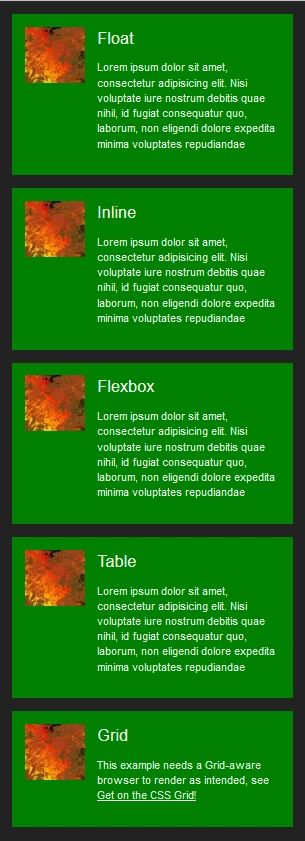
After much discussion in various topics, I am wondering what the feeling of this forum is regarding the correct layout method.

For my input, I regard each method as being the correct one, I tend to use the one that is most convenient at the time. Having said that, I also think that Table the easiest one is to work with. Strange that Table has never been considered as a viable layout mechanism.

    This topic has been closed for replies.

    8 replies

    pziecina
    Legend
    January 30, 2017

    Floats are now included in the Updated 2.1 specs in regards to positioning, because of css exclusions -

    https://www.w3.org/TR/css3-exclusions/

    Exclusions where originally called 'positioned floats' in the original draft, and must be declared as floated elements for them to work. Currently it is only implemented in IE10+, but other browsers, (except FF) are working on an implementation.

    pziecina
    Legend
    January 29, 2017

    BenPleysier

    just a though Bem.

    Given all the discussions over the last few months, (or maybe that should be years) why are you asking this question?

    After all, we have covered all this previously.

    pziecina
    Legend
    January 29, 2017

    Remember your complaint about flexbox being only one direction, and the link to the article you used that said do not use?

    Well the author wrote another article 5 months later saying use -

    https://jakearchibald.com/2014/dont-use-flexbox-for-page-layout/

    Legend
    January 29, 2017

    BenPleysier wrote:

    Strange that Table has never been considered as a viable layout mechanism.

    I think it has by any developer that has a reasonable insight into coding. I was using it to resolve certain layout issue before Flex came along and I know of many a good developer that still use it frequently, although I'm not sure why now to be honest, given Flex can do it much better, maybe they don't want to pack their css with vendor prefixes, that's the only real reason  I can think why I would want to use 'table' over 'flex', unless I needed to support a lesser browser, but that decsion has to be made by the individual.

    I'll go with flex as its here an now, suits my workflow and I like to try and remain current. I dont think theres any point in putting off what can be used today until tomorrow or next year, once something has major browser support and those browsers that dont support are insignificant regarding user numbers, move on.

    pziecina
    Legend
    January 29, 2017

    As a thought on which layout to use, and i have said this often over a number of years.

    Without support in whatever editor or ide, only professional coders will use ithe newer layou methods, this efectively means 90% of web or app creators have no idea how to use anything beyond floats.

    pziecina
    Legend
    January 29, 2017

    As Rob says, it all depends on the layout, and mix and match of layout methods has been the norm for the last few years.

    One layout method you did not mention is multi-column, which i have found essential for layouts with lots of text, no matter which main layout method one decides to use.

    As a little bit of history though. The reason table layouts never recieved the attention they deserved, was because of a bug in Chrome and Android browsers, which was not fixed until the same version that introduced the the 'new' flexbox syntax. Effectively placing all the attention on flexbox.

    Of course all new layout methods that would not work in IE8, without a polyfill or falback css, many talked down as unworkable, or not untill 2021, to complexed and every other objection one can think of was put forward.

    All the objections and reasons for not using anything new, has left us with a situation of some coders using the new methods, and not enough overall experiance of their use(s) making its way into public forums such as this.

    Rob Hecker2
    Legend
    January 29, 2017

    Your example is very simple, so it hardly puts any method to the test. If you make it a requirement to horizontally align the elements, then most of those methods will drop out and flexbox will prevail.

    Another criteria to play with would be responsiveness. Here again flexbox has capabilities other methods don't have.

    ALsp
    Legend
    January 29, 2017

    Rob Hecker2 wrote:

    Another criteria to play with would be responsiveness. Here again flexbox has capabilities other methods don't have.

    For anyone knowledgeable to even know there are so many methods... making any one of the responsive is extremely easy... especially considering that you would need to write extra CSS and likely at least one media query even for a flexbox design.

    pziecina
    Legend
    January 30, 2017

    Paula said:

    As for floats with divs, anyone still using them for layout, is now doing the equivelent of using html tables for layout.

    According to the Specs, 'The table element represents data with more than one dimension, in the form of a table.'

    There is no such semantic problem using floats.

    Paula said:

    Given all the discussions over the last few months, (or maybe that should be years) why are you asking this question?

    As I said, I was having a lazy Sunday afternoon, getting psyched up for the great match between Roger Federer and Raphael Nadal. Normally I would not be able to afford the time to muck around, but this time I decided to have some private 'fiddle' time. I came with a very simple little layout, commonly used as 'display' boxes. I then decided to style the display box using different styling techniques and ask the forum for their input.

    I now have that input and the general consensus is that Flexbox should be used because of

    • vertical alignment
    • responsiveness
    • workflow

    I can accept that and would agree with that were it not for the alternatives, some of which have the same advantages and are easier to work with and understand.

    Should we just write these alternatives off or should we, to quote Al Sparber, be glad to have more tools in our toolbox?


    I have said it before, and Al has also said it before -

    use whatever method feels right for what you are doing. Different layout types can be used together.

    The only item that is not a layout method acording to the W3C is using floats for layout, that is 100% a hack, that we have been forced to use as no alternative was available to use, now there is.

    Relisticaly, except for personal sites, css grid layouts will not be fully usable for 2-4 years.. That does not mean that one should not use it until then, just that one must check the layout also works if grids is not supported.

    As for pixel perfect layouts, one may say that to a client, but don't expect me to belive it is possible in rwd.

    ALsp
    Legend
    January 29, 2017

    I think you answered most of your questions :-)

    We use display: table in some products, primarily to support equal height columns. Your use of it is perfectly reasonable. One thing that might be helpful is to set the table parent to "table-layout: fixed", which allows all modern browsers to scale images using max-width... among other things.