- Home
- Dreamweaver
- Discussions
- How do i make a background image in a div with a h...
- How do i make a background image in a div with a h...
How do i make a background image in a div with a h1 on top?
Copy link to clipboard
Copied
IV'E WORKED OUT HOW TO DO IT! IN CASE YOU'RE CURIOUS, MAKE THE H1 ELEMENT: POSITION: RELATIVE, THEN ADJUST IT TO THE POSITION YOU WANT BY USING TOP, LEFT, RIGHT, BOTTOM. IT WILL NATURALLY GO OVER THE BACKGROUND IMAGE, SO JUST PLACE IT WHEREVER YOU WANT. GOOD LUCK!
Before i start, please make your answer simple. I'm still fairly new to this and i struggle to understand things when they aren't super straight forward. Also the more visual the example, the better! Okay, so here's my problem.
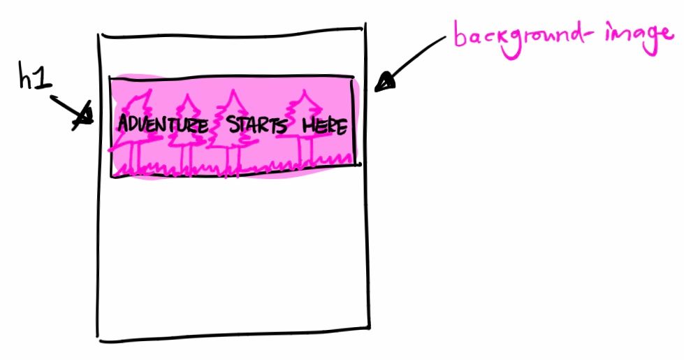
I'm going to insert a drawing iv'e made of what i want to achieve. I made a div with the background-image inside AND the h1, but when i adjusted the padding, it only affected the h1. Because this happened, i thought maybe the background-image would have to be in a seperate div from everything else entirally? So i can edit all of it's sizes and dimentions?? Again, please keep your answers simple and straight forward. I really struggle to understand explanations when they use terms i don't understand. I'm not saying this to moan, i just find it really hard!!! Iv'e tried to understand div's and parent containers etc but it's all quite confusing, maybe someone could give me a real basic definition? Is a div naturally a parent container? And then the body is the parent container of the div????
Copy link to clipboard
Copied
Hello ,
please load this website in question to your server and send us a link to it, no matter how it looks like, because we can analyze in a better way.
Hans-Günter
Copy link to clipboard
Copied
Copy & paste the following code into a new, blank document. SaveAs css_grids_test.html and preview in mobile devices and real browsers at various viewport widths.
<!doctype html>
<html lang="en">
<head>
<meta charset="utf-8">
<title>CSS Grids - vertical centering</title>
<meta name="viewport" content="width=device-width, initial-scale=1">
<meta http-equiv="X-UA-Compatible" content="IE=edge">
<style>
body, html {
margin: 0;
height: 100%;
display: grid;
background: #333 url(https://placeimg.com/1200/900/nature) no-repeat center center;
background-size: cover;
}
main {
padding: 2%;
width: 80%;
text-align: center;
margin: auto;
background-color: rgba(0,0,0,0.5);
color: #FFF;
}
</style>
</head>
<body>
<main>
<h3>Welcome to CSS Grids!</h3>
<p>I'm vertically & horizontally centered text over a full-sized page background image.</p>
</main>
</body>
</html>
No positioning needed and no animals were harmed.
Copy link to clipboard
Copied
What you are asking is for someone to teach you css, (by that I mean to tell you the definitions) which is not what happens here. The place to go for such is the W3C css pages where you can read them for yourself.
As far as div goes, (and to get you started) see -
css visual formatting model level 2.1
That is just for starters, and there are other 'models' such as css flexbox and css grid layouts.
Find more inspiration, events, and resources on the new Adobe Community
Explore Now


