

- Home
- Dreamweaver
- Discussions
- how to space 5 pictures evenly on 1 row?
- how to space 5 pictures evenly on 1 row?

Copy link to clipboard
Copied
I have 5 small pictures that all need to display symmetrically spaced on the same row of a page. Each picture will have one word printed beneath it representing the pictures. What is the best way to construct this setup as far as the div structure?
I assume create a table is not a good idea as this would not be a responsive design.


 1 Correct answer

You mean somethink like -
http://www.pziecina.com/Adobe/lightbox/lightbox.html
The above uses flexbox, but you can change how the images and captions are displayed, (number of, and alignment) just by using the flexbox alignment properties, and varying the way each element should grow/shrink using the flex-basis property.
The article linked to by Jon, will give you the basics of using flexbox.
 9
Replies
9
9
Replies
9
Copy link to clipboard
Copied
What do you wish the images to do if the screen size becomes smaller, (or even larger) than the initial 5 images.
Possibilities are -
images automatically resize, (larger or smaller)
images flow to another row
number of images reduces/increases.
You can do all of the above using css Flexbox, css grid layouts and 'old fashioned' float based css.
Divs, articles, picture or some other element are all possible, as they are just the container and depending on how you wish the images to 'behave' as listed above will determine the type of css layout you can use.
Copy link to clipboard
Copied
If the screen size becomes smaller I would wish the images (and their caption underneath) resize as much as possible until there is not enough space and then they would go below to the next row and space out as much as possible evenly.
Copy link to clipboard
Copied
You mean somethink like -
http://www.pziecina.com/Adobe/lightbox/lightbox.html
The above uses flexbox, but you can change how the images and captions are displayed, (number of, and alignment) just by using the flexbox alignment properties, and varying the way each element should grow/shrink using the flex-basis property.
The article linked to by Jon, will give you the basics of using flexbox.
Copy link to clipboard
Copied
Thank you Jon and pziecina for responding.
Yes that lightbox example displays the behavior I need to achieve.
I need one row with two items spaced evenly and centered; followed by one row with 1 item centered; followed by one row with the five images spaced evenly and centered.
I will use the source page for this lightbox example as a guide to try to create this behavior and check back in. Thanks for giving me a path to get there.
Copy link to clipboard
Copied
Hi,
Does this page look like it is responsively adjusting correctly?
I think I need to work on creating media queries to have the red HR that divides the first two Our Mission and Our Vission boxes go away at certain breakpoints once the page shrinks. I need to do the same with Our Values on the line below.

Copy link to clipboard
Copied
CSS Flex would work well for this and is relatively easy to pick up if you already have a decent handle on CSS properties.
Here's a quick tutorial...
Copy link to clipboard
Copied
Forgot to add -
If you use the html picture element, (or even just srcset) it is possible to display a different image depending on the size of the element in the viewport, using the media-query structure for those elements which are part of the html, (not css media-querys).

Copy link to clipboard
Copied
If you're using a Bootstrap responsive layout, this is done very easily with an inline-list of images.
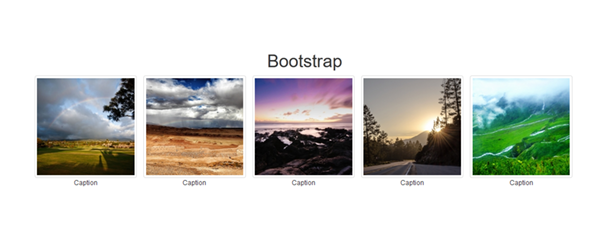
<!doctype html>
<html lang="en-US">
<head>
<meta charset="utf-8">
<title>Bootstrap 3.3.7 Starter</title>
<meta name="viewport" content="width=device-width, initial-scale=1">
<meta http-equiv="X-UA-Compatible" content="IE=edge">
<!-- Latest compiled and minified Bootstrap CSS-->
<link rel="stylesheet" href="https://maxcdn.bootstrapcdn.com/bootstrap/3.3.7/css/bootstrap.min.css" integrity="sha384-BVYiiSIFeK1dGmJRAkycuHAHRg32OmUcww7on3RYdg4Va+PmSTsz/K68vbdEjh4u" crossorigin="anonymous">
</head>
<body>
<h1 class="text-center">Bootstrap</h1>
<div class="container">
<div class="row">
<!--Begin thumbnails-->
<ul class="list-inline text-center">
<li> <img class="img-thumbnail" src="https://placeimg.com/200/200/nature/1"><br>
Caption</li>
<li><img class="img-thumbnail" src="https://placeimg.com/200/200/nature/2"><br>
Caption</li>
<li><img class="img-thumbnail" src="https://placeimg.com/200/200/nature/3"><br>
Caption</li>
<li><img class="img-thumbnail" src="https://placeimg.com/200/200/nature/4"><br>
Caption</li>
<li><img class="img-thumbnail" src="https://placeimg.com/200/200/nature/5"><br>
Caption</li>
</ul>
<!--/row--></div>
<!--/container--></div>
<!--latest jQuery 3-->
<script src="https://code.jquery.com/jquery-3.2.1.min.js" integrity="sha256-hwg4gsxgFZhOsEEamdOYGBf13FyQuiTwlAQgxVSNgt4=" crossorigin="anonymous"></script>
<!--Bootstrap-->
<script src="https://maxcdn.bootstrapcdn.com/bootstrap/3.3.7/js/bootstrap.min.js" integrity="sha384-Tc5IQib027qvyjSMfHjOMaLkfuWVxZxUPnCJA7l2mCWNIpG9mGCD8wGNIcPD7Txa" crossorigin="anonymous"></script>
</body>
</html>
If you want to expand this into an image viewer, see my tutorial below.
Bootstrap Modal + Carousel Gallery - https://alt-web.com/
Nancy

Copy link to clipboard
Copied
So josh i guess your question has been answered, yea? Did you use flexbox or bootstrap? I am trying to solve the same issue here..
Find more inspiration, events, and resources on the new Adobe Community
Explore Now
 AdChoices