Exit
  • Global community
    • Language:
      • Deutsch
      • English
      • Español
      • Français
      • Português
  • 日本語コミュニティ
  • 한국 커뮤니티
0

jQuery mobile with Bootstrap 4 Desktop best practice

Community Beginner ,
Oct 12, 2018 Oct 12, 2018

Thanks for looking at this post and all your expertise,

I have this website http://inventoryvideos.fairwaysit.com

I made a Mobil site for it:  http://2inventory.fairwaysit.com

I used the ‘window.location’ script to call the Mobil site from small screens.  It works well on my iPhone.

After researching Mobil versions for desktop sites, I learned that using two separate sites is not an efficient way to accomplish responsiveness.  One writing coming from the experts on this venue years ago.

So, I made a Mobil page for the desktop site.  I’m trying to use the same script ‘window.location’ to call the Mobil page for small screens.  It does not work.  I made sure all files are uploaded to the server properly.  The error message is ‘cannot find server’ after a long wait.

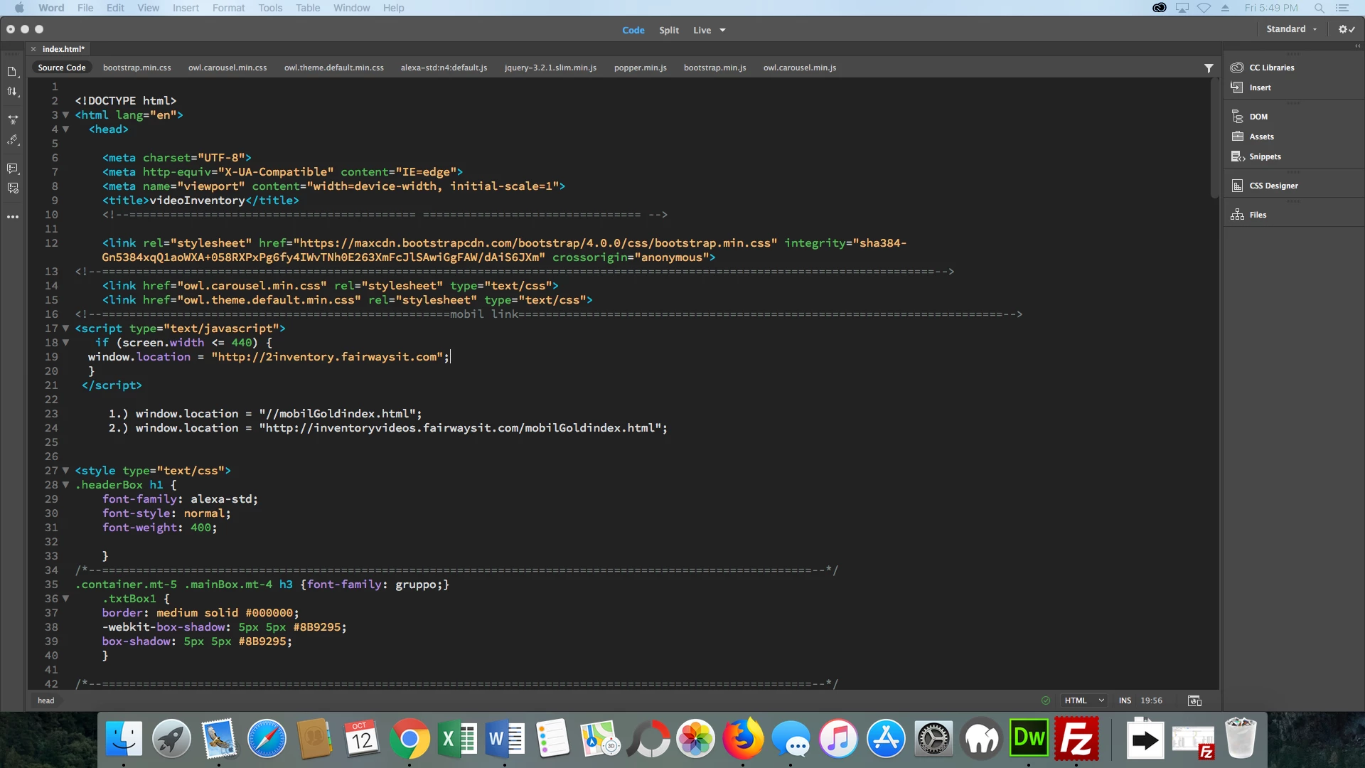
Is the ‘window.location’ script wrong for switching to Mobil pages within the same site ?  I typed two versions of the code(address) I used in the window.locaton script to go to the Mobil page on small screens.  I pasted it below the script tag for your review (attached pic).  Is there something wrong with either version of the code?

Screen Shot 2018-10-12 at 5.49.05 PM.png

Can Bootstrap grid with jQuery setups like ‘page’ ‘content’ ect. work in the same file?

A lot of questions…….sorry, I really appreciate your assistance and any suggestions you can offer.   jw

1.0K
Translate
Report
Community guidelines
Be kind and respectful, give credit to the original source of content, and search for duplicates before posting. Learn more
community guidelines

correct answers 1 Correct answer

Community Expert , Oct 12, 2018 Oct 12, 2018

I build 1 website with Bootstrap's responsive grid system that fits xs, sm, md, lg and xlg devices.   You cannot combine Bootstrap with jQuery Mobile layouts.  But you should use jQuery's core library with Bootstrap..

Redirect scripts to the mobile URL are not a good approach and will often fail with some devices.

Create a new site called myTestSite.

CC-localsite.jpg

Use one of the Bootstrap starter templates in Dreamweaver CC.   Go to File > New > Starter Templates.  Pick one and hit the CREATE button.

CC-StarterPage.jpg

Save file

...
Translate
Community Expert ,
Oct 12, 2018 Oct 12, 2018
LATEST

I build 1 website with Bootstrap's responsive grid system that fits xs, sm, md, lg and xlg devices.   You cannot combine Bootstrap with jQuery Mobile layouts.  But you should use jQuery's core library with Bootstrap..

Redirect scripts to the mobile URL are not a good approach and will often fail with some devices.

Create a new site called myTestSite.

CC-localsite.jpg

Use one of the Bootstrap starter templates in Dreamweaver CC.   Go to File > New > Starter Templates.  Pick one and hit the CREATE button.

CC-StarterPage.jpg

Save file as index.html and preview in browsers by adjusting the viewport size.

Have fun!!

Nancy O'Shea— Product User, Community Expert & Moderator
Translate
Report
Community guidelines
Be kind and respectful, give credit to the original source of content, and search for duplicates before posting. Learn more
community guidelines