Hello again Osgood,
I have included your code in the meta tag. I supposed it could be integrated in the existing one after a semicolon; . Was that wrong? Or should I have made a second meta tag?
Anyway, the stacking still does not work and I appreciate that you are willing to investigate a full page from my website, for example www.saevfors.se/contact.html All pages except the index.html (named Rationale) are based on the template Saevfors_temp_May 2021.dwt with the meta tag. This platform does not accept *.txt files apparently so I have to paste the text in full here below.
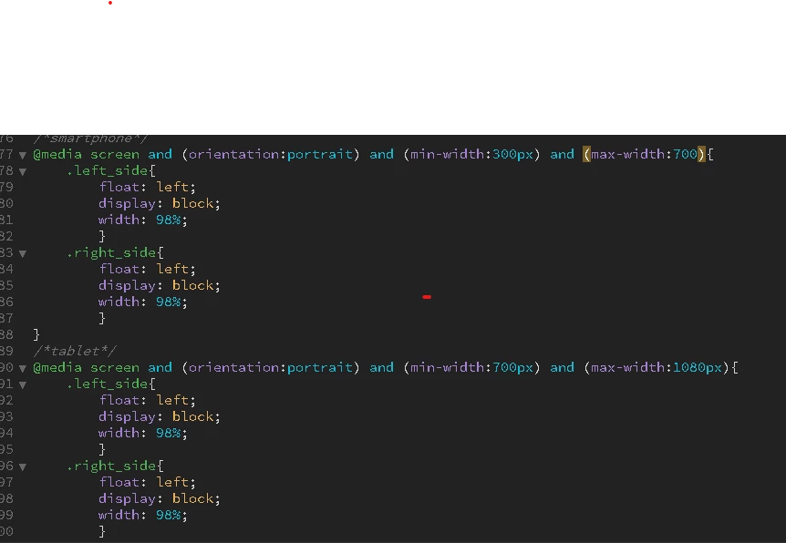
I have now made only one Media Query for both Phone and Tablet supposed to stack vertically up to the 768px limit.
I attach again the CSS with the last updates.
Again, thanks for your support,
Ingemar
<!DOCTYPE html PUBLIC "-//W3C//DTD XHTML 1.0 Transitional//EN" "http://www.w3.org/TR/xhtml1/DTD/xhtml1-transitional.dtd">
<html xmlns="http://www.w3.org/1999/xhtml">
<head>
<meta http-equiv="Content-Type" content="text/html; charset=utf-8"; name="viewport" content="width=device-width,initial-scale=1"/>
<title>Saevfors, bamboo, DRR</title>
<style type="text/css">
@1552174 url("../Ing22Nov.css");
.footer {
font-family: Verdana, Geneva, sans-serif;
font-size: 14px;
color: #003;
background-color: #C96;
font-style: italic;
margin: 0;
width: 92%;
alignment-adjust: central;
padding-left: 10px;
padding-right: 0px;
border-radius: 10;
text-align: center;
}
a:visited {
background-color: #6F9;
}
.LOGO {
font-family: Vijaya;
font-size: 48px;
margin-right: 0px;
float: none;
margin-left: 60px;
padding-top: 10px;
}
.clear {
clear: both;
}
</style>
<style type="text/css">
<!--
-->
</style>
</head>
<div class="LOGO"> Saevfors Consulting</div>
<div class="wrapper"><!-- TemplateBeginEditable name="navbar_edit" -->
<ul class="nav">
<li><a href="#">Rationale</a></li>
<li><a href="#"> Contact </a></li>
<li><a href="#">Bamboo</a></li>
<li><a href="#">Archives</a></li>
</ul>
<!-- TemplateEndEditable -->
<div class="clear"></div>
<div class="left_side"><!-- TemplateBeginEditable name="Left_side_left" --><!-- TemplateEndEditable --></div>
<div class="right_side"><!-- TemplateBeginEditable name="right_edit" --><!-- TemplateEndEditable --></div>
<div class="clear"></div>
<div class="footer">1 June 2021 © Copy with reference to www.saevfors.se | ingemar@saevfors.se | All rights reserved</div>
</div>
</html>
Unfortunately your code is too far 'damaged' to repair so what I suggest is start over. I have produced a basic responsive code template, where your columns will stack at 768px on tablet (see code below). As an indication the background color of the 2 columns will change at 768px - you can delete the background colors from the media query, they are set just for visually purposes only.
All you need to do is feed in your required content into the 2 columns and style it. I would suggest DONT add any more css to the responsive template as without good css coding knowledge you will easily 'damage' the existing css and it will become unresponsive again. Link a seperate css stylesheet to the template and use that to style the content in the column.
NOTE: I have obscured your email address xxxxxx@xxxxxxxxx in the code to prevent bots harvesting it in the forum so you need to reapply your correct email address.
<!DOCTYPE html>
<html>
<head>
<meta http-equiv="Content-Type" content="text/html; charset=utf-8"; name="viewport" content="width=device-width,initial-scale=1"/>
<title>Saevfors, Bamboo, DRR</title>
<style>
* {
box-sizing: border-box;
}
body {
background-repeat: repeat-x;
font-family: "Times New Roman", Times, serif;
font-size: 18px;
font-weight: bold;
background-color: #8EBC48;
color: #FFF;
background-image: url('http://www.saevfors.se/Images/Home_page_bckgr.jpg');
}
/* Logo */
.logo {
width: 95%;
margin: 0 auto;
padding: 20px 0;

}
.logo h1 {
font-family: Vijaya;
font-size: 48px;
text-align: center;
margin: 0;
padding: 0;
}
/* Wrapper */
.wrapper {
font-family: Verdana, Geneva, sans-serif;
font-size: 20px;
color: #000;
width: 95%;
background-color: #FFF;
margin: 0 auto 0 auto;
}
/* Navigation */
.nav {
list-style: none;
margin: 0;
padding: 0;
text-align: center;
background-color: #9F0;
}
.nav li {
display: inline-block;
min-width: 8em;
margin: 0;
padding: 0;
text-align: center;
padding: 8px 15px;
}
.nav li a:link,
.nav li a:visited {
background-color: rgb(204,153,51);
color: rgb(85, 85, 102);
display: block;
padding: 5px;
text-decoration: none;
font-weight: bold;
border-radius: 3px;
-webkit-box-shadow: 3px 3px 3px 3px rgba(43, 43, 77, 0.5);
-moz-box-shadow: 3px 3px 3px 3px rgba(43, 43, 77, 0.5);
box-shadow: 3px 3px 3px 3px rgba(43, 43, 77, 0.5);
margin: 0 0 0.2em 0;
}
.nav li a:hover {
background-color: rgba(255,153,0,0.8);
color: rgb(43, 43, 77);
}
a:visited {
background-color: #6F9;
}
/* Left side */
.left_side {
padding: 10px;
float: left;
width: 48%;
font-family: Gotham, "Helvetica Neue", Helvetica, Arial, sans-serif;
font-size: 14px;
color: #000;
background-color: #EFEFE0;
font-style: normal;
font-weight: 300;
}
/* Right side */
.right_side {
padding: 10px;
float: right;
font-family: Gotham, "Helvetica Neue", Helvetica, Arial, sans-serif;
font-size: 14px;
color: #333;
background-color: #EFEFE0;
font-weight: normal;
width: 48%;
}
/* footer */
.footer {
font-family: Verdana, Geneva, sans-serif;
font-size: 14px;
color: #003;
background-color: #C96;
font-style: italic;
text-align: center;
padding: 15px;
}
/* Clear floats */
.clear {
clear: both;
}

/*Smartphone and tablet*/
@media screen and (max-width:768px){
.left_side{
float: none;
width: 100%;
background-color: yellow;
}
.right_side{
float: none;
width: 100%;
background-color: #00aeff;
}
}
</style>
</head>

<body>
<div class="logo"><h1>Saevfors Consulting</h1></div>
<div class="wrapper">
<ul class="nav">
<li><a href="index.html" >Rationale</a></li>
<li><a href="#"><span class="focus"> Contact</span> </a></li>
<li><a href="Bamboo.html">Bamboo</a></li>
<li><a href="Archives.html">Archives</a></li>
</ul>
<div class="clear"></div>


<div class="left_side">
<p>Left content goes here</p>
</div>

<div class="right_side">
<p>Right content goes here</p>
</div>
<div class="clear"></div>

<div class="footer">1 June 2021 © Copy with reference to www.saevfors.se | xxxxxxx@xxxxxxx.xxx | All rights reserved</div>

</div>
</body>

</html>


 AdChoices