 Adobe Community

Copy link to clipboard
Copied
Hello,
I have a website with a few tables. The biggest table is 3 columns, of course this does not display correctly on an iPhone, as the table gets cut off and you would have to scroll. Ideally, I would love for the table to appear in mobile with each column beneath the one above. Any other method would do.
My website is www.nobsphones.com. If someone could take a look and help me out. (Keep in mind, I don't know much about bootstrap, java, etc) I am kind of feeling my way through this, but would be very appreciative for some help.
Thank you


 1 Correct answer
Here's an example :
...
<html>
<head>
<style>
table {
border: 1px solid #ccc;
border-collapse: collapse;
margin: 0;
padding: 0;
width: 100%;
table-layout: fixed;
}
table caption {
font-size: 1.5em;
margin: .5em 0 .75em;
}
table tr {
background-color: #f8f8f8;
border: 1px solid #ddd;
padding: .35em;
}
table th, table td {
padding: .625em;
text-align: center;
}
table th {
font-size: .85em;
letter-spacing: .1em;
text-transform: uppercase;
}
@media screen and (max-width: 600px) {
table {
border: 0
 14
Replies
14
14
Replies
14
Copy link to clipboard
Copied
Here's an example :
<html>
<head>
<style>
table {
border: 1px solid #ccc;
border-collapse: collapse;
margin: 0;
padding: 0;
width: 100%;
table-layout: fixed;
}
table caption {
font-size: 1.5em;
margin: .5em 0 .75em;
}
table tr {
background-color: #f8f8f8;
border: 1px solid #ddd;
padding: .35em;
}
table th, table td {
padding: .625em;
text-align: center;
}
table th {
font-size: .85em;
letter-spacing: .1em;
text-transform: uppercase;
}
@media screen and (max-width: 600px) {
table {
border: 0;
}
table caption {
font-size: 1.3em;
}
table thead {
border: none;
clip: rect(0 0 0 0);
height: 1px;
margin: -1px;
overflow: hidden;
padding: 0;
position: absolute;
width: 1px;
}
table tr {
border-bottom: 3px solid #ddd;
display: block;
margin-bottom: .625em;
}
table td {
border-bottom: 1px solid #ddd;
display: block;
font-size: .8em;
text-align: right;
}
table td::before {
content: attr(data-label);
float: left;
font-weight: bold;
text-transform: uppercase;
}
table td:last-child {
border-bottom: 0;
}
}
</style>
</head>
<body>
<table>
<caption>
Accounts Summary
</caption>
<thead>
<tr>
<th scope="col">Account</th>
<th scope="col">Due Date</th>
<th scope="col">Amount</th>
<th scope="col">PERIOD</th>
</tr>
</thead>
<tbody>
<tr>
<td data-label="Account">JOE BLOGGS</td>
<td data-label="Due Date">04/10/2018</td>
<td data-label="Amount">1,090</td>
<td data-label="Period">03/08/2018 - 03/09/2018</td>
</tr>
<tr>
<td scope="row" data-label="Account">JOHN SMITH</td>
<td data-label="Due Date">03/10/2018</td>
<td data-label="Amount">2,653</td>
<td data-label="Period">02/08/2018 - 02/09/2018</td>
</tr>
<tr>
<td scope="row" data-label="Account">SARAH JONES</td>
<td data-label="Due Date">03/10/2018</td>
<td data-label="Amount">1,171</td>
<td data-label="Period">02/08/2018 - 02/09/2018</td>
</tr>
<tr>
<td scope="row" data-label="Acount">JIM MCDOWELL</td>
<td data-label="Due Date">02/10/2018</td>
<td data-label="Amount">899</td>
<td data-label="Period">01/08/2018 - 01/09/2018</td>
</tr>
</tbody>
</table>
</body>
</html>
Copy link to clipboard
Copied
I updated that example a tad so you can copy and paste into a blank document and see how it works firstly, then look at applying similiar to the tables on your site.
If you need more specifics, post back & I'm sure somebody will be able to help you 
Copy link to clipboard
Copied
That is a great example, thanks.
What I was thinking, and I don't know if it's possible, was a table where you see three columns next to each other, left to right. But, on mobile those same columns are now stacked, top to bottom. (So everything is on a smaller screen, but there is no need to scroll.
I know that in your example, there is no need to scroll, but it also makes the text small, and even smaller the more content there is.
Copy link to clipboard
Copied
this bit:
table td {
border-bottom: 1px solid #ddd;
display: block;
font-size: .8em;
text-align: right;
}
change the font-size as required
Copy link to clipboard
Copied
You can also want to play with the breakpoint:
@media screen and (max-width: 600px) {
Depending on the font-size, amount of text in the table etc you may want to adjust '600px'
Copy link to clipboard
Copied
Thank you, this is a big help
Copy link to clipboard
Copied
Here slightly revised so you can control font size better:
<style>
table {
border: 1px solid #ccc;
border-collapse: collapse;
margin: 0;
padding: 0;
width: 100%;
table-layout: fixed;
}
table caption {
font-size: 1.5em;
margin: .5em 0 .75em;
}
table tr {
background-color: #f8f8f8;
border: 1px solid #ddd;
padding: .35em;
}
table th, table td {
padding: .625em;
text-align: center;
font-family: Helvetica, Arial, "sans-serif";
font-size: 1.1em;
}
table th {
font-weight: bold;
letter-spacing: .1em;
text-transform: uppercase;
}
@media screen and (max-width: 600px) {
table {
border: 0;
}
table caption {
font-size: 1.3em;
}
table thead {
border: none;
clip: rect(0 0 0 0);
height: 1px;
margin: -1px;
overflow: hidden;
padding: 0;
position: absolute;
width: 1px;
}
table tr {
border-bottom: 3px solid #ddd;
display: block;
margin-bottom: .625em;
}
table td {
border-bottom: 1px solid #ddd;
display: block;
font-family: Helvetica, Arial, "sans-serif";
font-size: .7em;
text-align: right;
}
table td::before {
content: attr(data-label);
float: left;
font-weight: bold;
text-transform: uppercase;
}
table td:last-child {
border-bottom: 0;
}
}
</style>

Copy link to clipboard
Copied
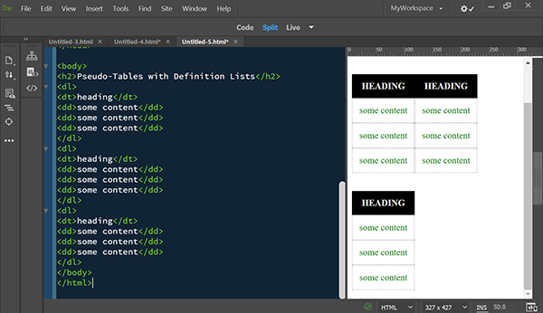
I try to avoid tables if possible. But when you can't, there are Bootstrap responsive tables. Or you can use definition lists to create faux tables. You can see the JS Fiddle below.
https://jsfiddle.net/NancyO/SxGNV/
Copy link to clipboard
Copied
The Bootstrap solution is horrible ... Horizontal scrolling?
The OP indicates they have table markup already hence the solution offered ...

Copy link to clipboard
Copied
I agree with Energize about the Bootstrap solution. It's not only horrible, it's behind the times. That said, I may have missed something here, but the OP's page does not look like we're dealing with converting a data table. It looks like he is using tables for design, in which case, perhaps we should be steering him to a page-layout solution - other than Bootstrap, of course.
Copy link to clipboard
Copied
It looks to me as if the OP is using Bootstrap 4 and jQuery 3.2. No markup was posted so it's unclear if these are data tables or not. Obviously, tables for layout are unacceptable for modern responsive design.

Copy link to clipboard
Copied
Nancy,
I can see you like to get the last word as always and are trying to have some sort of pointless p*ssing contest again ...
The OP was happy with the answer and it was marked as correct (not by me I might add), I just don;t know what all this other stuff is about ...
The bootstrap table solution is horrible, any horizontal scrolling imo is not good but imagine if there's a fair bit of data in that table and viewing on small 320 wide screen, that would be a terrible solution. I just think the Bootstrap responive table solution is not good at all even if your using the Bootstrap framework.
Copy link to clipboard
Copied
Energize wrote
Nancy,
I can see you like to get the last word as always and are trying to have some sort of pointless p*ssing contest again ...
I'm not sure what I did that got your knickers in such a tight knot. I have no problem with your correct answer. I was merely responding to the OP's follow-up questions in reply #3.
"What I was thinking, and I don't know if it's possible, was a table where you see three columns next to each other, left to right. But, on mobile those same columns are now stacked, top to bottom. (So everything is on a smaller screen, but there is no need to scroll."
You can do that with definition lists styled to look like tables as mentioned in reply #8. On smaller viewports, the defintion list columns break to a 2nd row.
Responsive tables with collapsing flexbox columns or rows are also possible.
Accessible, Simple, Responsive Tables | CSS-Tricks
And the OP went on to say...
"I know that in your example, there is no need to scroll, but it also makes the text small, and even smaller the more content there is."
See my approach for Scaling Fonts for Any Size Screen below.
<!doctype html>
<html lang="en">
<head>
<meta charset="UTF-8">
<meta http-equiv="X-UA-Compatible" content="IE=edge">
<meta name="viewport" content="width=device-width, initial-scale=1">
<title>Scale Fonts for Any Size Screen</title>
<style>
body {
margin: 0 auto;
width: 80%;
font-family:
Calibri, Candara, Segoe, Segoe UI, Optima, Arial, sans-serif;
/**font size grows 1px for every 100px of viewport width**/font-size: calc(14px + 1vw);
/** line-height grows with font size, an additional 0.1em + 0.5px per 100px of the viewport**/
line-height: calc(1.1em + 0.5vw);
}
</style>
</head>
<body>
<h2>Heading 2</h2>
<p>Lorem ipsum dolor sit amet, consectetur adipisicing elit. Consectetur nostrum similique, dolores enim quam provident, deserunt tempora molestias. Nisi laboriosam quam dolor, officia magni error? Sint nihil dolore debitis doloremque.</p>
</body>
</html>
Copy link to clipboard
Copied
Just proving my poiint yet again ...
Thread locked, OP answered and happy with solution but yet you're still wanting to get the last word in & I'm the one who's supposed to have an issue!
Points scoring as usual, I really don't know what your issue is... Pointless other than you really, really have to have the last word don't you for some reason?
 AdChoices