Copy link to clipboard
Copied
After reading several posts, I am still no wiser to understanding why when I add padding to a text inside a div - it's moving the div outside the fluid grid layout.
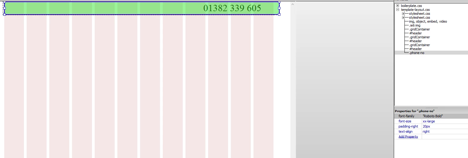
I read one post that mentions I should add padding to the actual text using a new css rule, rather than adding the padding to the actual div itself - which I have tried to do, with no joy. The padding applied is still moving the div outside the fluid grid layout...
If anyone can point me in the right direction, I would very much appreciate it. Thank you.
/* Desktop Layout: 769px to a max of 1232px. Inherits styles from: Mobile Layout and Tablet Layout. */
@media only screen and (min-width: 769px) {
.gridContainer {
width: 89.0217%;
max-width: 1232px;
padding-left: 0.4891%;
padding-right: 0.4891%;
margin: auto;
}
#header {
clear: both;
float: left;
margin-left: 0;
width: 100%;
display: block;
background-color: #EDEDED;
}
}
.phone-no {
font-family: "Roboto Bold";
font-size: xx-large;
text-align: right;
padding-right: 20px;
}
This will help you understand Box Sizing | CSS-Tricks In other words, add box-sizing to your CSS rules.
Copy link to clipboard
Copied
This will help you understand Box Sizing | CSS-Tricks In other words, add box-sizing to your CSS rules.
Copy link to clipboard
Copied
Thank you Ben.
So, adding the below code to my css layout, allows me to use padding, without moving the div outside the grid?
It appears to have done the trick.
Thanks again.
html { box-sizing: border-box; } *, *:before, *:after { box-sizing: inherit; }
Copy link to clipboard
Copied
FYI: Don't tamper with the Fluid Grid CSS code. It's very temperamental.
Use a separate stylesheet for your custom styles.
Nancy
Copy link to clipboard
Copied
Thank you Nancy. I've taken it out and put it on a separate stylesheet. Hopefully it hasn't caused any problems with messing around with it.
Copy link to clipboard
Copied
Think I spoke too soon. ![]()
It worked fine during the test stage, but when I applied it to my actual page... it no longer seems to be working. I keep trying to retrace my steps, but I can't figure out why this worked the first time I tried.
This is the div I am working with:
The style I've applied:
And the box-sizing code that I have attached as a new stylesheet:
Copy link to clipboard
Copied
I think my warnings came too late ![]()
What I meant was do NOT under any circumstances modify the Fluid Grid Layout CSS with Designer Panels. You run the risk of corrupting the whole thing. Which is why FGLayouts are dead now. Adobe removed them from CC 2017 (good riddance Fluid Grids).
If you want to add padding to a div put it -- along with your text styles -- in your custom.css file.
Nancy
Copy link to clipboard
Copied
Fluid Grids are dead now?
It's the only way I know how to create a desktop/mobile response website.
Thanks for getting back to me though. Will need to look into figuring out what I'm to do now.
Copy link to clipboard
Copied
Look at Bootstrap. It's much more than a responsive framework. It comes chock full of other wonderful goodies for making responsive menus, Carousel sliders, buttons, modal windows, progress bars, responsive videos, tabbed panels and more....
Dreamweaver integrated Bootstrap into DW CC to replace the legacy Fluid Grid Layouts feature. The starter pages are all you need to get going with Bootstrap.

Once saved, DW creates assets folders in your local site folder.

Copy link to clipboard
Copied
Thank you Nancy. It does sound very appealing.
I think it's about time I put CS6 to bed, and go with CC instead. Just looking at the subscription plans now. ![]()
Copy link to clipboard
Copied
Try it for 7-days before you buy. It's very different from CS6.
Download and install a Creative Cloud trial
Nancy
Copy link to clipboard
Copied
It's ok, I have already committed. But wow, it isn't half different. Best I get on with tutorial videos then ![]()
Copy link to clipboard
Copied
CS6 is approx 7 versions behind this new one.
Get ready! An upgraded Adobe Community experience is coming in January.
Learn more