Hosun
Inspiring
June 15, 2019
Answered

padding

  • June 15, 2019
  • 1 reply
  • 998 views

Hi,

I am making a hamburger menu.

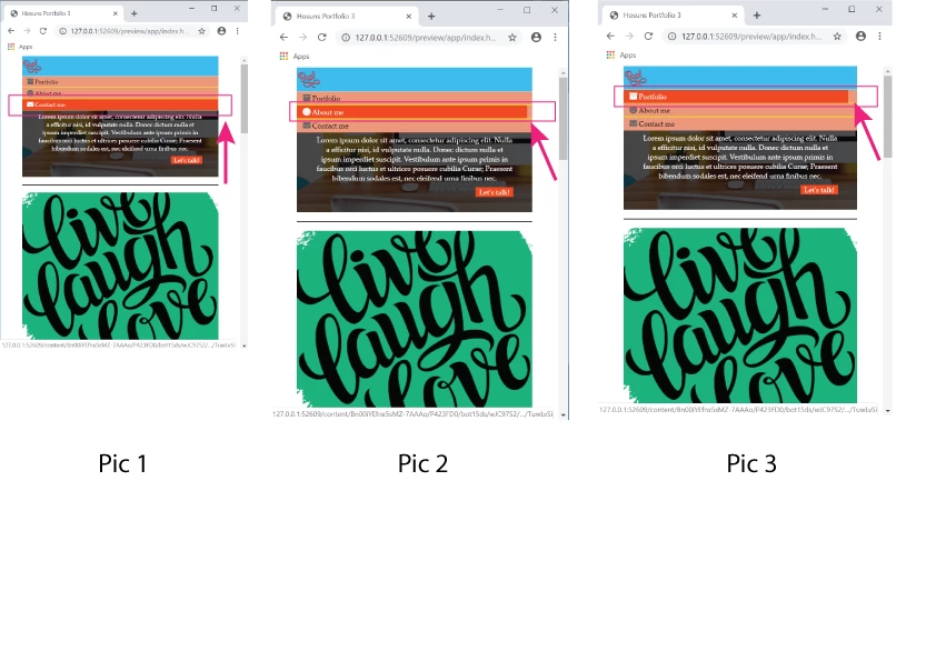
Upon hover, "orange" doesn't snap to "salmon", as seen in Pic 2 and Pic 3.

How can I make it happen?

Hosuns Portfolio 3

Hosun Kang

This topic has been closed for replies.
Correct answer B i r n o u

the A tag is an inline TAG, so the hover state just reflect the only string content of it... one of the approach that could fill up all the available space of the parent container, will be to change the display of the A Tag... using a display inline-block, or block value could do the job

an other approach will be to move the :hover pseudo element on th LI Tag instead of keeping it on the A Tag only

1 reply

B i r n o u
B i r n o uCorrect answer
Legend
June 15, 2019

the A tag is an inline TAG, so the hover state just reflect the only string content of it... one of the approach that could fill up all the available space of the parent container, will be to change the display of the A Tag... using a display inline-block, or block value could do the job

an other approach will be to move the :hover pseudo element on th LI Tag instead of keeping it on the A Tag only

Hosun
HosunAuthor
Inspiring
June 15, 2019

Hi,

Thank you very much for your reply.

I have one more question.

What is ul li a:focus ? (It makes no difference with or without it.)

ul li a:hover,

ul li a:focus {

color: white;

background-color: orangered;

}

Hosuns Portfolio 3

Hosun Kang

Legend
June 18, 2019

Hi,

Thank you very much for your info.

That was my issue, which was very difficult to explain with a few words.

I think I encounter the same problem again.

In Tablet View, I set

      display: inline-block;

to make "ul" in a column.

In Mobile View, there was a problem and I adjusted padding.

But there was a problem, as seen in the picture below.

How would I do?

Hosuns Portfolio 4

Hosun Kang


In your 500px media query add the property marked in red below:

.site-nav ul {

flex-direction: column;

width: 100%;

}

Also in that media query I'm not sure why you have a right padding of 290px set on the anchor tag:

.site-nav a {

font-size: 14px;

padding: 10px 290px 10px 15px;

width: 100%;

border-bottom: 1px solid black;

}

Just set it to 15px, the same as the left-padding:

.site-nav a {

font-size: 14px;

padding: 10px 15px 10px 15px;

width: 100%;

border-bottom: 1px solid black;

}