

- Home
- Dreamweaver
- Discussions
- Re: Preview on device is different than actual web...
- Re: Preview on device is different than actual web...

Copy link to clipboard
Copied
Hello,
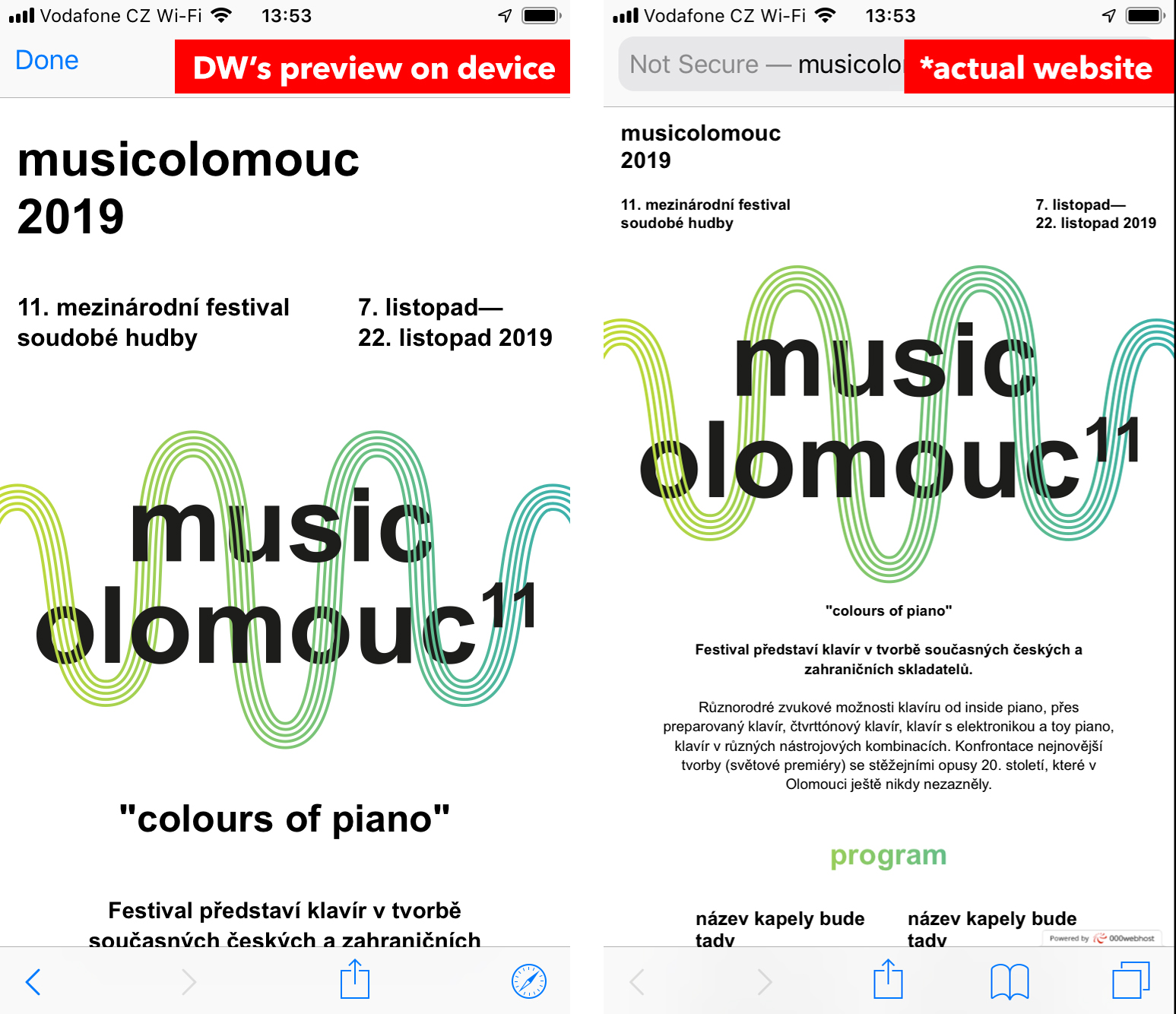
I have a problem that I don't know how to resolve. When I preview my website on device (iPhone 6) using the Dreamweaver, the website acutally looks nice because I used some media queries. But when I publish my site to actual hosting the website looks completely different than the preview shown in Dreamweaver. Is there a way to preserve the same form as shown in the preview on device in Dreamweaver? I attached screenshots of my phone so you can see what I am talking about.
Thanks for help
Andrej


 1 Correct answer

Have you included the following meta tag?
<meta name="viewport" content="width=device-width, initial-scale=1, shrink-to-fit=no">
 3
Replies
3
3
Replies
3
Copy link to clipboard
Copied
Have you included the following meta tag?
<meta name="viewport" content="width=device-width, initial-scale=1, shrink-to-fit=no">
Copy link to clipboard
Copied
Oh my god, it was the exact thing which I haven't done. 
Thank you so much for your help!
Andrej

Copy link to clipboard
Copied
Hi Andrej,
Thanks for reaching out. From what I understand, you have created a website in Dreamweaver which shows fine on Device Preview but changes after publishing. In addition to what Ben has suggested, please try these steps: -
- Try validating your code errors and fix the errors (if any) from the following links:-
- HTML code errors: The W3C Markup Validation Service
- CSS code error: The W3C CSS Validation Service
2. Once you are done, try to check your website on different browsers.
Let us know if it works.
Thanks,
Harshika
Find more inspiration, events, and resources on the new Adobe Community
Explore Now
 AdChoices