problems with coding sticky footer
Copy link to clipboard
Copied
I just updated my first website, which was a combo of bootstrap and my own coding. I updated the footer in the template to include favicons and a background color. I used CSS and flexbox to position my text with the favicons. Everything looked fine until I realized that the footer was only "sticky" when there was alot of content on the page. In the emptier pages, the footer floats to the top.
good page: https://www.drct.com/
not good: https://www.drct.com/search.html
I tried adding a footer class called "footer-main", toggling the position..absolute, relative, fixed, etc. That worked with one page, but not with the other. I actually did figure this problem out on my other website, but that was a different design without bootsrap. Is there any quickfix, without messing up the entire website? Is there a bootstrap footer class that will do some magic? Please excuse my coding. This was my first website from a year ago. The footer styles are mostly in "footer.css". Thanks for any feedback.
Copy link to clipboard
Copied
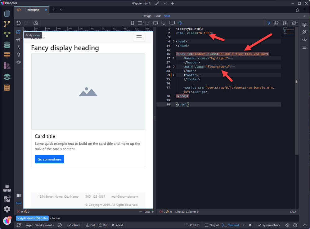
There are three parts as shown in the following screen capture
Copy link to clipboard
Copied
I tried your suggesiton, with no luck. Pretty much the same result as before. Thanks for trying though.
Copy link to clipboard
Copied
I just updated my first website, which was a combo of bootstrap and my own coding. I updated the footer in the template to include favicons and a background color. I used CSS and flexbox to position my text with the favicons. Everything looked fine until I realized that the footer was only "sticky" when there was alot of content on the page. In the emptier pages, the footer floats to the top.
good page: https://www.drct.com/
not good: https://www.drct.com/search.html
I tried adding a footer class called "footer-main", toggling the position..absolute, relative, fixed, etc. That worked with one page, but not with the other. I actually did figure this problem out on my other website, but that was a different design without bootsrap. Is there any quickfix, without messing up the entire website? Is there a bootstrap footer class that will do some magic? Please excuse my coding. This was my first website from a year ago. The footer styles are mostly in "footer.css". Thanks for any feedback.
By @default0vaokg78cv42
On the 'search.html' page, which doesnt observe the footer at the bottom of the browser window in cases where the content is not enough to push it to the bottom of the browser window you need to make some minor updates to your css.
Add :
body {
height: 100vh;
display: flex;
flex-direction: column;
}
footer-info {
margin-top: auto;
}
OR if you want to deploy the Bootstrap utilitiy classes, which do the same thing:
add:
class="d-flex flex-column vh-100" to the opening <body> tag and add mt-auto to the existing footer-info class.
Bens solution will also work but you need to add another wrapper div to contain your main content on the search.html and set its css to flex: 1; This results in the wrapper div consuming all the extra vertical space left over, after taking into account your nav and footer and is a recognised solution.
How you choose to proceed is up to you.......there is never usually one solution to a problem. If possible I tend to try and construct with as few <divs> as I can, which in my opinion makes the code more managable in the long term. However should you need to have a background color consuming all the extra vertical space or a background image then the wrapper div would be a more solid approach.
Until you become something of an 'expert' and are able to figure these issues out for yourself and how YOU feel which best suits YOU and the objective it will be a bit problematical. I follow many so-called 'expert' you-tube channels, with 100s of thousands of subscribers, which in my opinion are sometimes feeding over-kill solutions to unsuspecting newbies.
Copy link to clipboard
Copied
Thanks, I tried both on test pages. No luck. It works on the empty page, but not on the full page. On the full page, the footer rides up to the middle. I did chage the div to a footer, by the way. I must be doing something wrong. Perhaps the new body class is being overridden by what I aldready have. I will keep trying. My website design is a product of "expert youtube videos". I wish there were better resources, more easily found. Books I find on Amazon are either outdated, too simplistic, or not specific to my questions. The computer section at our B&N has been mostly discontinued. I look for answers on google search, I see mostly software and services they are trying to push..not much coding info. I plan to do a redesing evetually to clean up the code. Do you remcomment any particular book?
Copy link to clipboard
Copied
Do you actually want a 'sticky' footer? This is a footer which sticks to the bottom of the browser window in ALL cases, whether the main content exceeds the height of the browser window (the footer will still be visible and stick to the bottom of the browser window while the main content scrolls) and also when the main content doesn't exceed the height of the browser window or do you just want a footer which adheres itself to the bottom of the browser window ONLY when the main content is not sufficient enough to push it to the bottom of the browser window?
Copy link to clipboard
Copied
Good point. I just want a footer which adheres itself to the bottom of the browser window ONLY when the main content is not sufficient enough to push it to the bottom of the browser window. I have that on another website. I made it work. It's ok, but not perfect. I have to scroll to see it, when there is not much content.
By @default0vaokg78cv42
So using the exact same code from your search.html page and adding the Bootstrap utility classes to the body tag and the mt-auto class to the existing footer-info class, as outlined in a previous post, here is the code:
This should work. If you are saying it doesnt then maybe you have a copy of an old version of the page stored in the browsers cache. I've just xxxxx out the email address in the footer to avoid spam harvetsers.
<!doctype html>
<html lang="en"><!-- InstanceBegin template="/Templates/nuclear-responsive.dwt" codeOutsideHTMLIsLocked="false" -->
<head>
<meta charset="UTF-8">
<!-- InstanceBeginEditable name="EditRegion-meta-tag" -->
<meta name="description" content="Direct Scientific Search Page">
<!-- InstanceEndEditable -->
<meta name="author" content="Aaron Anderson">
<meta http-equiv="X-UA-Compatible" content="IE=edge">
<meta name="viewport" content="width=device-width, initial-scale=1.0">
<link href="https://www.drct.com/css/bootstrap-4.4.1.css" rel="stylesheet" type="text/css">
<link href="https://www.drct.com/css/main.css" rel="stylesheet" type="text/css">
<link href="https://www.drct.com/css/radiation-survey-meter-images.css" rel="stylesheet" type="text/css">
<link href="https://www.drct.com/css/footer.css" rel="stylesheet" type="text/css">
<!-- InstanceBeginEditable name="doctitle" -->
<title>Direct Scientific Search</title>
<!-- InstanceEndEditable -->
<!-- InstanceBeginEditable name="head" -->
<!-- InstanceEndEditable -->
</head>
<body class="d-flex flex-column vh-100">
<!--
<body style="padding-top: 70px"> -->
<nav class="navbar fixed-top navbar-expand-lg navbar-dark bg-primary"> <a class="navbar-brand" href="#">Direct Scientific</a>
<button class="navbar-toggler" type="button" data-toggle="collapse" data-target="#navbarSupportedContent1" aria-controls="navbarSupportedContent1" aria-expanded="false" aria-label="Toggle navigation"> <span class="navbar-toggler-icon"></span> </button>
<div class="collapse navbar-collapse" id="navbarSupportedContent1">
<ul class="navbar-nav mr-auto">
<li class="nav-item active"> <a class="nav-link" href="index.html">Home <span class="sr-only">(current)</span></a> </li>
<li class="nav-item dropdown"> <a class="nav-link dropdown-toggle" href="dss/instrumentation.html" id="navbarDropdown2" role="button" data-toggle="dropdown" aria-haspopup="true" aria-expanded="false">Instrumentation</a>
<div class="dropdown-menu" aria-labelledby="navbarDropdown2">
<a class="dropdown-item" href="radiation-detectors.html">Survey Meters</a>
<a class="dropdown-item" href="dss/INSTRUMENTATION/dosimetry.html">Dosimeters</a>
<a class="dropdown-item" href="radiation-portal-monitors.html">Portal Monitors</a>
<a class="dropdown-item" href="Area_Monitors.html">Area / Waste Monitors</a>
<a class="dropdown-item" href="air-sampling.html">Air Sampling</a>
<a class="dropdown-item" href="tritium-detection.html">Tritium Detection</a>
<div class="dropdown-divider"></div>
<a class="dropdown-item" href="nuclear-instrument-brands.htm">All Brands</a>
</div>
<li class="nav-item dropdown"> <a class="nav-link dropdown-toggle" href="radiation-shielding.html" id="navbarDropdown3" role="button" data-toggle="dropdown" aria-haspopup="true" aria-expanded="false">Shielding</a>
<div class="dropdown-menu" aria-labelledby="navbarDropdown3">
<a class="dropdown-item" href="radiation-shielding/lead-products.html">Lead Products</a>
<a class="dropdown-item" href="radiation-shielding/shielded-containers.html">Shielded Containers</a>
<a class="dropdown-item" href="radiation-shielding/medical-shielding.html">Medical Shielding</a>
<a class="dropdown-item" href="radiation-shielding/beta-shiedling.html">Beta Shielding</a>
<a class="dropdown-item" href="radiation-shielding/radiography-ndt.html">Radiography/NDT</a>
<a class="dropdown-item" href="radiation-shielding/nuclear-energy.html">Nuclear Energy</a>
<div class="dropdown-divider"></div>
<a class="dropdown-item" href="radiation-shielding.html">All Shielding</a>
</div>
<li class="nav-item active"> <a class="nav-link" href="radioactive-sources.html">Sources<span class="sr-only">(current)</span></a> </li>
<li class="nav-item dropdown"> <a class="nav-link dropdown-toggle" href="dss/accessories.html" id="navbarDropdown1" role="button" data-toggle="dropdown" aria-haspopup="true" aria-expanded="false">Accessories</a>
<div class="dropdown-menu" aria-labelledby="navbarDropdown1">
<a class="dropdown-item" href="fume-hoods.html">Fume Hoods</a>
<a class="dropdown-item" href="dss/accessories/beakers.htm">Marinelli Beakers</a>
<a class="dropdown-item" href="dss/accessories/hazard-signage.html">Hazard Signage</a>
<a class="dropdown-item" href="dss/herculite/herculite.htm">Herculite</a>
<a class="dropdown-item" href="HEPA-Vacuums.html">HEPA Vacs</a>
<div class="dropdown-divider"></div>
<a class="dropdown-item" href="dss/accessories.html">More Accessories</a>
</div>
<li class="nav-item active"> <a class="nav-link" href="search.html">Search<span class="sr-only">(current)</span></a> </li>
<li class="nav-item active"> <a class="nav-link" href="contact.html">Contact<span class="sr-only">(current)</span></a> </li>
</ul></div>
</nav>
<!-- InstanceBeginEditable name="EditRegion1" -->
<div class="box1"><h1>Search </h1>
</div>
<!-- InstanceEndEditable --><!-- InstanceBeginEditable name="EditRegion2" -->
<div class="box2">
<h2> Enter keyword or model number:</h2>
<form style="margin-top: 4px; margin-left: auto; margin-right: auto; display: block; text-align: center; float: none;" action="https://search.freefind.com/find.html" method="get" accept-charset="utf-8" target="_self">
<input type="hidden" name="si" value="7297240">
<input type="hidden" name="pid" value="r">
<input type="hidden" name="n" value="0">
<input type="hidden" name="_charset_" value="">
<input type="hidden" name="bcd" value="÷">
<input type="text" name="query" size="15">
<input type="submit" value="search">
</form>
</div>
<!-- InstanceEndEditable -->
<div class="footer-info mt-auto">
<div class="faviconGrid">
<div class="favicon">
<p class="favic">
<strong>Direct Scientific</strong> <a class="footer-info" href="https://www.drct.com">www.drct.com</a><br>
<strong>Email:</strong> <a class="footer-info" href="mailto:xxxxx@xxxx.com">xxxxx@xxxx.com</a><br>
<strong>tel.</strong> (310) 589-0601
</p></div>
<div class="favicon">
<div class="flexbox-favicons nuclear-instruments-darken-img"> <a href="https://www.linkedin.com/in/directscientific/" target="_blank"><img class="flexbox-favicons-item flexbox-favicons-item-1" src="images/nuclear/favicon/linkedin-favicon.png" width="129" height="129" alt="linkedin"></a>
<a href="https://www.youtube.com/@directscientific4550" target="_blank"><img class="flexbox-favicons-item flexbox-favicons-item-2" src="images/nuclear/favicon/youtube-favicon.png" width="129" height="129" alt="youtube"></a>
<a href="https://twitter.com/directsci" target="_blank"><img class="flexbox-favicons-item flexbox-favicons-item-3" src="images/nuclear/favicon/twitter-favicon.png" width="129" height="129" alt="twitter"></a>
<a href="https://www.facebook.com/directscientific" target="_blank"><img class="flexbox-favicons-item flexbox-favicons-item-4" src="images/nuclear/favicon/facebook-favicon.png" width="129" height="129" alt="facebook"></a>
</div>
</div></div>
</div>
<script src="https://www.drct.com/js/jquery-3.4.1.min.js"></script>
<script src="https://www.drct.com/js/popper.min.js"></script>
<script src="https://www.drct.com/js/bootstrap-4.4.1.js"></script>
</body>
<!-- InstanceEnd --></html>
Copy link to clipboard
Copied
That appears to work, thanks. i will test and try implementing it.
Copy link to clipboard
Copied
I got it to work, thankfully. I had a problem adding padding, but I fixed it using seperate class for a top border. My challenge now is with footer color. It's a container, to be specific. In desktop view, it is visible, but the color disappears in mobile view. the class i used for the footer background color is:
.footer-info {background-color:lightblue;
margin-top: auto;}
Please advise. Thanks.
Copy link to clipboard
Copied
This sounds to me like a css view port height issue which mobile device browsers have.
Try:
body {
min-height: 100vh;
min-height: -webkit-fill-available;
}
html {
height: -webkit-fill-available;
}
Copy link to clipboard
Copied
Thanks, I gave it a shot. It did not work.
Copy link to clipboard
Copied
Thanks, I gave it a shot. It did not work.
By @default0vaokg78cv42
Alright, well the issue is definitely associated with the css height: 100vh;
Try a javascript solution (see below), seems to be popular and this issue is well documented as a problem connected with the information bars on mobile browsers.
First remove 'vh-100' from the pages body tag so it looks like:
<body class="d-flex flex-column">
Add the javascript block of code below above the link to the jquery-3.4.1.min.js file which is at the foot of the pages code:
<script>
const setDocumentHeight = function() {
const docHeight = document.documentElement;
docHeight.style.setProperty('--document-height' , `${window.innerHeight}px`)
}
window.addEventListener('resize' , setDocumentHeight);
setDocumentHeight();
</script>
Then add the below css code directly below the link to your footer.css file:
<style>
:root {
--document-height: 100%;
}
body {
height: var(--document-height);
}
</style>
Copy link to clipboard
Copied
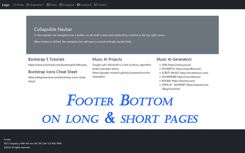
FOOTER BOTTOM ON LONG & SHORT PAGES - Works in Bootstrap 4 or 5.
Step #1 add classes to <body> tag.
<body class="d-flex flex-column min-vh-100">
Step #2 add class to <footer> or its parent <container> if you use one.
<footer class="mt-auto">
That's all there is to it. 🙂
By @Nancy OShea
I think we already solved that a few hours ago, using the exact same principles, but thanks for the clarification...........its a slow day around here, gets slower each day, I think, as DWs time runs out. What are we going to do to amuse ourselves.....hummm.
Copy link to clipboard
Copied
It's slow everywhere. Maybe due to Spring Break and the epic snow pack.
Some mountain residents in California have had no services for more than a month An otherwise 20 min road trip down the mountain takes 4 hours by escorted car caravans to minimize risk of avalanche. Kids can't get to school. Power & Internet services are cut off. People are still digging out from under snow. It's incredible how much impact one brutal winter can have on infrastructure.
We live well below the snow line. But we've been pounded by successive atmospheric rivers and bomb cyclones. Our power & Internet have been intermittent. The Los Angles area was hit by a rare EF1 Tornado. Flooding has forced multiple road closures. Many homes & hillsides are lost to landslides. And it doesn't stop here. This atmospheric mess is moving across the country...
By @Nancy OShea
We dont get much up-to-date information over here in the UK, apart from the initial upheaval caused by the unusual weather over there. Its like its disappeared and everything is just as it was prior, much like Turkey - Im sure its still pretty bad over in that part of the world after the quake...........unfortunately out of sight out of mind I guess......hummm.
Copy link to clipboard
Copied
If you're interested, I have a thread in The Lounge with pictures.
Copy link to clipboard
Copied
If you're interested, I have a thread in The Lounge with pictures.
By @Nancy OShea
Thankfully us down in the South of the UK haven't had a lot of snow this year. Shortly before Christmas that kept us in our houses for a few days and about 2 weeks ago but that was all gone the following day! Up North I think they have had it worse but I don't care lol - I'm not up there!
Copy link to clipboard
Copied
thanks very much. good to see you again.
Copy link to clipboard
Copied
I got it to work, thankfully. I had a problem adding padding, but I fixed it using seperate class for a top border. My challenge now is with footer color. It's a container, to be specific. In desktop view, it is visible, but the color disappears in mobile view. the class i used for the footer background color is:
.footer-info {background-color:lightblue;
margin-top: auto;}
Please advise.
Copy link to clipboard
Copied
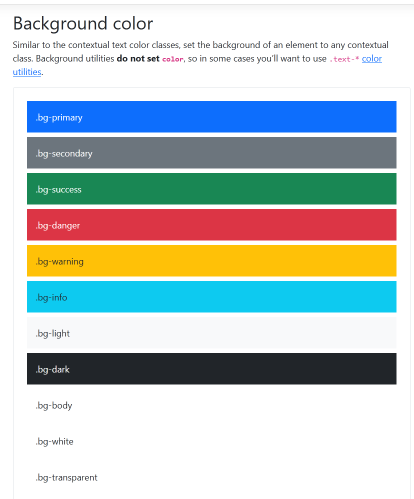
Bootstrap already contains built-in classes for changing bg colors. Get familliar with the built-in classses. It will speed up your production time so you can concentrate less on CSS styles & more on content.
Bootstrap Color Classes:
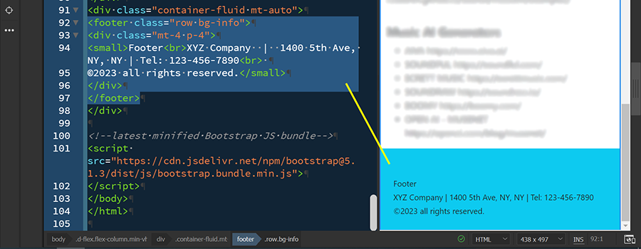
Result of adding bg-info to footer row.
Copy link to clipboard
Copied
Bootstrap already contains built-in classes for changing bg colors.
By @Nancy OShea
Its NOT a case of changing the background color, the problem is the footer disappears in mobile browsers as a result of them having additional information bars which don't take into account when the css vh height property is used.
There are several hit and miss vanilla css solutions - the javascript one which I posted seems as though it might have more of a chance of working as it calculates the height of the device window.
I've only tried it on Android and it works in Chrome. I have no idea if it will work on an Apple device running Safari or in Firefox - needs testing.
Copy link to clipboard
Copied
It just started to work, out of the blue. no idea why. Problem solved. You mentioned that Dreamweaver is being phased out. What will replace it? Also, right now I am using zen cart for online shopping api. It's not too bad, but the shipping algorithm is severly limited. do you have any suggestions for something better?
Copy link to clipboard
Copied
Look at WooCommerce -- makers of a very popular shopping cart plugin for WordPress.
AFAIK, there are no plans for a Dreamweaver replacement unless you go to a 3rd party solution.
CODE EDITORS:
-- Codespaces (free, browser-based) - https://github.com/features/codespaces
-- Nova (Mac only, formerly called Coda) - https://nova.app/
-- Pinegrow - https://pinegrow.com/
-- Sublime Text - http://www.sublimetext.com/
-- Visual Studio Code (free) - https://code.visualstudio.com/
-- Wappler ~ Visual Web App Builder - https://wappler.io/
============
ONLINE SITE BUILDERS:
-- Squarespace - https://www.squarespace.com/
-- Webflow - https://webflow.com
-- Wix - https://www.wix.com/
-- WordPress (open source) - https://wordpress.org/
Hope that helps.
-
- 1
- 2
Find more inspiration, events, and resources on the new Adobe Community
Explore Now


