Copy link to clipboard
Copied
Hello all,
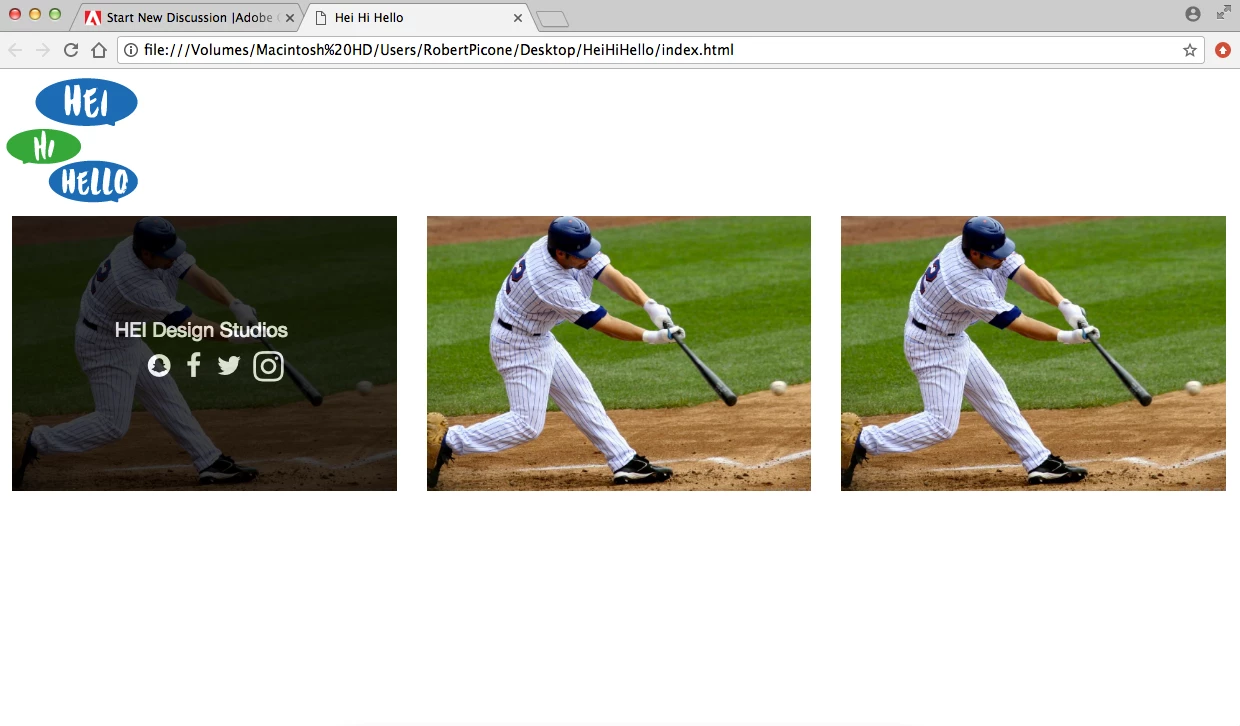
So followed a tutorial to create a hover effect over an image to show information and social medias that are hyperlinked to their respective pages. It is working perfectly fine, but in the code to create the hover it had me put the image and overlay hover effect inside a container. I don't want t have the look of a container and want it to spread the full width of the page and have no space in between the images so this is where i am stuck! If i change the container class to container fluid it messes with the main container-fluid class i have wrapped around everything, and also makes the images full screen when i want to keep them in their respective columns that i have coded. VIEW TUTORIAL FOLLOWED HERE: Tryit Editor v3.4
Here are some screenshots and some HTML and CSS! Any help is appreciated.
<body class="wrapper">
<div class="container-fluid">
<header>
<img src="images/HEI-HI-HELLO-Logo-small.png" class="img-responsive" alt="Placeholder image">
</header>
<div class="row-fluid">
<div class="col-xs-12 col-sm-6 col-md-6 col-lg-4">
<div class="container">
<img src="images/Screen Shot 2017-05-04 at 2.45.18 PM.png" alt="Avatar" class="image img-responsive imagefill">
<div class="overlay">
<div class="text">HEI Design Studios <br>
<i class="fa fa-snapchat fa-lg" style="color:white;"></i>
<a href="https://www.facebook.com/heidesignstudios/">
<i class="fa fa-facebook fa-lg" style="color:white;"></i></a>
<i class="fa fa-twitter fa-lg">
<i class="fa fa-instagram fa-lg"></i></i></div>
</div>
</div>
</div>
.container {
position: relative;
margin: 0px;
padding: 0px;
width: 100%;
}
.image {
display: block;
width: 100%;
height: auto;
}
.overlay {
position: absolute;
top: 0;
bottom: 0;
left: 0;
right: 0;
height: 100%;
width: 100%;
opacity: 0;
transition: .5s ease;
background-color: #000000;
}
.container:hover .overlay {
opacity: .75;
}

You want something like this?

In this example, I re-purposed BS Tooltips to create the overlays. NOTE: this should work equally well for touch screens but I have not tested it yet.
<!doctype html>
<html>
<head>
<meta charset="utf-8">
<title>Bootstrap Tooltips Demo</title>
<meta name="viewport" content="width=device-width, initial-scale=1">
<meta http-equiv="X-UA-Compatible" content="IE=edge">
<!-- Latest compiled and minified Bootstrap CSS-->
<link rel="stylesheet" href="https://maxcdn.bootstrapcdn.com/bootstrap/3.3.7/css/bootstrap.min.css
...Copy link to clipboard
Copied
Are you using Bootstrap?
Nancy
Copy link to clipboard
Copied
yes i am using bootstrap!
Copy link to clipboard
Copied
I dont really understand what it is you want to do. Do you want the overlay to cover all 3 images that you show?
Where's the code for the other 2 images, have you removed that?
Copy link to clipboard
Copied
I only included the code for the first image because the code is the exact same fore the next 2! I don't want to overlay all 3 images to answer your other question too. What my problem is, is that as you can see those images are all in a container and the container is the class that has the overlay effect on it. I don't want the container, i want the images to stretch the full width of the columns and their to be absolutely no space in between the images nor outside the images. If you still do not understand I will do a small sketch of some sort to show you how i want the page to look.
Copy link to clipboard
Copied
robertpiconedesigns wrote
I only included the code for the first image because the code is the exact same fore the next 2! I don't want to overlay all 3 images to answer your other question too. What my problem is, is that as you can see those images are all in a container and the container is the class that has the overlay effect on it. I don't want the container, i want the images to stretch the full width of the columns and their to be absolutely no space in between the images nor outside the images. If you still do not understand I will do a small sketch of some sort to show you how i want the page to look.
Right ok, I get it
Nancy will solve this one. Its a case of removing the padding that Bootstrap sets for the column gutters. I cant remember off hand without delving into the Bootstrap css, its not something I'm keen on using.
Copy link to clipboard
Copied
You want something like this?

In this example, I re-purposed BS Tooltips to create the overlays. NOTE: this should work equally well for touch screens but I have not tested it yet.
<!doctype html>
<html>
<head>
<meta charset="utf-8">
<title>Bootstrap Tooltips Demo</title>
<meta name="viewport" content="width=device-width, initial-scale=1">
<meta http-equiv="X-UA-Compatible" content="IE=edge">
<!-- Latest compiled and minified Bootstrap CSS-->
<link rel="stylesheet" href="https://maxcdn.bootstrapcdn.com/bootstrap/3.3.7/css/bootstrap.min.css" integrity="sha384-BVYiiSIFeK1dGmJRAkycuHAHRg32OmUcww7on3RYdg4Va+PmSTsz/K68vbdEjh4u" crossorigin="anonymous">
<!--FONT AWESOME ICONS-->
<link rel="stylesheet" href="https://cdnjs.cloudflare.com/ajax/libs/font-awesome/4.7.0/css/font-awesome.min.css">
<style>
/**Custom CSS - no padding, margins or borders around images**/
.col-sm-4 {padding:0; margin:0;}
.img-thumbnail {border:none; padding:0}
/**custom CSS for tooltip overlays**/
figure {
position: relative;
cursor: pointer;
}
div[role='tooltip2'] {
position: relative;
z-index: 1;
}
figcaption {
position: absolute;
top: 0;
left: 0;
background: rgba(0,0,0,0.70);
width: 100%;
height: 100%;
z-index: 2;
text-align: center;
display: none;
}
figcaption h4 {
margin-top: 20%;
font-size: 3vw;
color: gold;
text-shadow: 1px 2px 2px #333;
}
figcaption p {
font-size: 2vw;
line-height: 1;
color: #FFF;
}
/* Special Rules for mobile, adjust as needed*/
@media only screen and (max-width: 768px) {
figcaption h4 {
margin-top: 25%;
font-size: 6vw
}
figcaption p { font-size: 4vw }
}
</style>
</head>
<body>
<div class="container">
<div class="row">
<div class="col-sm-4">
<figure> <img class="img-thumbnail" src="http://lorempixel.com/600/400/nature/4/" alt="...">
<figcaption>
<h4>Heading 4</h4>
<p><i class="fa fa-lg fa-snapchat"></i>
<i class="fa fa-lg fa-facebook"></i>
<i class="fa fa-lg fa-twitter"></i>
<i class="fa fa-lg fa-instagram"></i></p>
</figcaption>
</figure>
</div>
<div class="col-sm-4">
<figure> <img class="img-thumbnail" src="http://lorempixel.com/600/400/nature/5/" alt="...">
<figcaption>
<h4>Heading 4</h4>
<p><i class="fa fa-lg fa-snapchat"></i>
<i class="fa fa-lg fa-facebook"></i>
<i class="fa fa-lg fa-twitter"></i>
<i class="fa fa-lg fa-instagram"></i></p>
</figcaption>
</figure>
</div>
<div class="col-sm-4">
<figure> <img class="img-thumbnail" src="http://lorempixel.com/600/400/nature/6/" alt="...">
<figcaption>
<h4>Heading 4</h4>
<p><i class="fa fa-lg fa-snapchat"></i>
<i class="fa fa-lg fa-facebook"></i>
<i class="fa fa-lg fa-twitter"></i>
<i class="fa fa-lg fa-instagram"></i></p>
</figcaption>
</figure>
</div>
</div>
</div>
<!--minified jQuery-->
<script src="https://code.jquery.com/jquery-1.12.2.min.js" integrity="sha256-lZFHibXzMHo3GGeehn1hudTAP3Sc0uKXBXAzHX1sjtk=" crossorigin="anonymous">
</script>
<!--minified Bootstrap-->
<script src="https://maxcdn.bootstrapcdn.com/bootstrap/3.3.7/js/bootstrap.min.js" integrity="sha384-Tc5IQib027qvyjSMfHjOMaLkfuWVxZxUPnCJA7l2mCWNIpG9mGCD8wGNIcPD7Txa" crossorigin="anonymous"></script>
<script>
//INVOKE TOOLTIP2 ON PAGE LOAD
$(document).ready(function() {
$("[rel='tooltip2']").tooltip();
$('figure').hover(function(){
$(this).find('figcaption').slideDown(350);
//.fadeIn(350)
},
function(){$(this).find('figcaption').slideUp(300);
//.fadeOut(300)
});
});
</script>
</body>
</html>
Copy link to clipboard
Copied
Thank you soo much Nancy you nailed it right on the head!
Copy link to clipboard
Copied
Glad to be of help.
Nancy
Find more inspiration, events, and resources on the new Adobe Community
Explore Now