
Answered
Reducing width < 100% shrinks text viewed on
When you reduce width <100%, the text shrinks when viewed on mobile only.
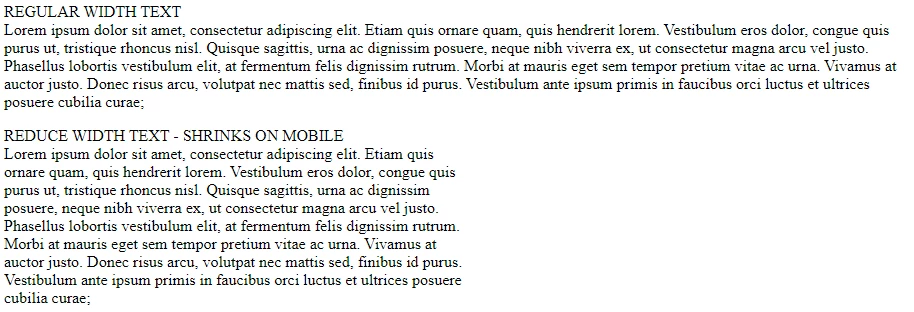
On Regular Display:
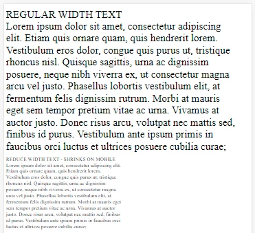
On Mobile Display
I want the reduced-width text to be the same size - How do I do this?
Simple example follows:
_________________________________________
<!doctype html>
<html lang="en">

<head>
    <meta charset="utf-8">
    <meta name="viewport" content="width=device-width, initial-scale=1.0">
    <title>Test Reduced Width</title>
    <style>
        .reducedwidth {
            width: 50%;
        }
    </style>
</head>

<body>
    <p>REGULAR WIDTH <BR>
        Lorem ipsum dolor sit amet, consectetur adipiscing elit. Etiam quis ornare quam, quis hendrerit lorem.
        Vestibulum eros dolor, congue quis purus ut, tristique rhoncus nisl. Quisque sagittis, urna ac dignissim
        posuere, neque nibh viverra ex, ut consectetur magna arcu vel justo. Phasellus lobortis vestibulum elit,
        at fermentum felis dignissim rutrum. Morbi at mauris eget sem tempor pretium vitae ac urna. Vivamus at
        auctor justo. Donec risus arcu, volutpat nec mattis sed, finibus id purus. Vestibulum ante ipsum primis
        in faucibus orci luctus et ultrices posuere cubilia curae; </p>

    <p class="reducedwidth">REDUCE WIDTH TEXT - SHRINKS ON MOBILE<BR>
        Lorem ipsum dolor sit amet, consectetur adipiscing elit. Etiam quis ornare quam, quis
        hendrerit lorem.
        Vestibulum eros dolor, congue quis purus ut, tristique rhoncus nisl. Quisque sagittis, urna ac dignissim
        posuere, neque nibh viverra ex, ut consectetur magna arcu vel justo. Phasellus lobortis vestibulum elit,
        at fermentum felis dignissim rutrum. Morbi at mauris eget sem tempor pretium vitae ac urna. Vivamus at
        auctor justo. Donec risus arcu, volutpat nec mattis sed, finibus id purus. Vestibulum ante ipsum primis
        in faucibus orci luctus et ultrices posuere cubilia curae; </p>
</body>

</html>
 AdChoices