• Global community
    • Language:
      • Deutsch
      • English
      • Español
      • Français
      • Português
  • 日本語コミュニティ
    Dedicated community for Japanese speakers
  • 한국 커뮤니티
    Dedicated community for Korean speakers
Exit
0

scroll Tab style tab bar?

Explorer ,
Apr 27, 2019 Apr 27, 2019

Copy link to clipboard

Copied

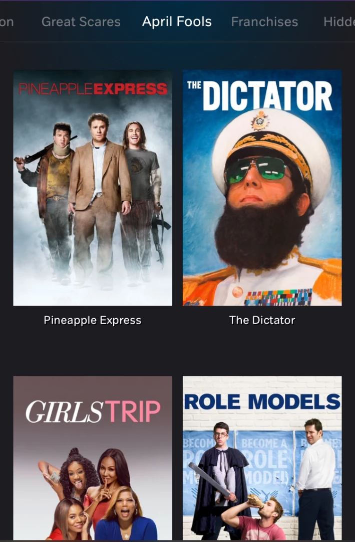
Hi, Im not sure what type of plugin NOWTV use to create this (photo attached below)

At the top,it has a side scroll and when you click on the links it loads as a tab bar on each section.

I'm not sure if there is a plugin similar to this I could use or best way to create this?

(On desktop I'm planning to have 5 images - tablet 4 images and Mobile 2 images per line)

Any thought would be most helpful

Thanks

Tim

IMG_2306 2.png

Views

878

Translate

Translate

Report

Report
Community guidelines
Be kind and respectful, give credit to the original source of content, and search for duplicates before posting. Learn more
community guidelines
Community Expert ,
Apr 27, 2019 Apr 27, 2019

Copy link to clipboard

Copied

See Bootstrap Snippet Thumbnail Carousel using HTML CSS jQuery or Google the subject.

Wappler, the only real Dreamweaver alternative.

Votes

Translate

Translate

Report

Report
Community guidelines
Be kind and respectful, give credit to the original source of content, and search for duplicates before posting. Learn more
community guidelines
LEGEND ,
Apr 27, 2019 Apr 27, 2019

Copy link to clipboard

Copied

Tim,

The image doesnt disclose the functionality. Is there a link to this widget so we can see it in action?

Votes

Translate

Translate

Report

Report
Community guidelines
Be kind and respectful, give credit to the original source of content, and search for duplicates before posting. Learn more
community guidelines
Explorer ,
Apr 28, 2019 Apr 28, 2019

Copy link to clipboard

Copied

I am trying to find a widget that does this action. mov attached so you can see what I'm trying to find: http://www.tcdesignstamford.co.uk/test.mov

IMG_2306 2.png

On a tablet or mobile when you sideswipe, it changes the tab bar and does not move the images as they are set to scroll down the page.

now.png

The code I am using, scrolls at the top but the tabs, you have to be clicked on to change the pages instead of sideswiping it. thats why im trying to find some different code to do this?

also because I have added a panel within the box which will hold an image and text inside the black panel I can't seem to get the panel to repeat so that it flows down the page as shown here. (for some reason it always goes down the page as one row)

any suggestions?

wanted.png

Thanks

Tim

Votes

Translate

Translate

Report

Report
Community guidelines
Be kind and respectful, give credit to the original source of content, and search for duplicates before posting. Learn more
community guidelines
Explorer ,
Apr 28, 2019 Apr 28, 2019

Copy link to clipboard

Copied

this is the code so far but does not really work well....

-----

<!DOCTYPE html>

<html lang="en">

<head>

<meta charset="UTF-8">

<meta http-equiv="X-UA-Compatible" content="IE=edge">

<meta name="viewport" content="width=device-width, initial-scale=1">

<title>Untitled Document</title>

<!-- Bootstrap -->

<meta charset="UTF-8">

<meta name="viewport" content="width=device-width, initial-scale=1.0">

<meta name="viewport" content="width=device-width, minimal-ui">

<title>Untitled Document</title>

<link rel="stylesheet" href="css/bootstrap-4.3.1.css" />

</head>

<style>

.tabbable .nav-tabs {

    overflow-x: auto;

    overflow-y: hidden;

    flex-wrap: nowrap;

    width: 800px;

    margin-left: auto;

    margin-right: auto;

}.search-container {

    background-color: #FFE1E2;

    width: 800px;

    height: 1500px;

    margin-left: auto;

    margin-right: auto;

}

.search-container2 {

    padding-top: 21px;

    padding-left: 23px;

    padding-right: 43px;

}

.fav-delete-button {

    height: 50px;

    margin-left: 119px;

    margin-right: -9px;

    padding-left: 12px;

    margin-top: -13px;

}

.cp-black-panel {

    width: 118%;

    height: 28px;

    padding-top: 10px;

    padding-bottom: 55px;

    padding-left: 14px;

    margin-left: -22px;

    margin-top: 70px;

    margin-bottom: -37px;

    background-color: rgba(0,0,0,0.68);

}.other-shops-services {

    color: rgba(0,0,0,1.00);

    margin-left: 182px;

    margin-top: -371px;

    transform: rotate(90deg);

    width: 0px;

    height: 374px;

    font-size: 18px;

    background-color: rgba(253,0,4,1.00);

}

.search-grey-panel {

    width: 123%;

    height: 0px;

    padding-top: 10px;

    padding-bottom: 55px;

    padding-left: 14px;

    margin-left: -22px;

    margin-top: 58px;

    margin-bottom: -19px;

    background-color: rgba(0,0,0,0.68);

}

.testtest2 {

    width: 118%;

    height: 0px;

    padding-top: 0px;

    padding-bottom: 55px;

    padding-left: 14px;

    margin-left: -22px;

    margin-top: -231px;

    margin-bottom: -19px;

    background-color: rgba(36,153,251,1.00);

}

.login-button-index {

    color: rgba(0,0,0,1.00);

    font-style: italic;

    font-size: 21px;

    width: 70px;

    margin-right: -30px;

    margin-left: -1px;

}

.search-event-name {

    font-size: 16px;

    margin-top: 1px;

    width: 170px;

    color: rgba(255,255,0,1.00);

    text-align: left;

    padding-left: 6px;

    padding-top: 0px;

    line-height: 20px;

    padding-bottom: 3px;

    height: 0px;

}

.alert-panel-green {

    width: 118%;

    height: 0px;

    padding-top: 0px;

    padding-bottom: 55px;

    padding-left: 14px;

    margin-left: -22px;

    margin-top: -223px;

    margin-bottom: -19px;

    background-color: rgba(28,186,84,1.00);

}

.alert-panel-orange {

    width: 118%;

    height: 0px;

    padding-top: 0px;

    padding-bottom: 55px;

    padding-left: 14px;

    margin-left: -22px;

    margin-top: -223px;

    margin-bottom: -19px;

    background-color: #F88826;

}

.alert-panel-light-blue {

    width: 118%;

    height: 0px;

    padding-top: 0px;

    padding-bottom: 55px;

    padding-left: 14px;

    margin-left: -22px;

    margin-top: -223px;

    margin-bottom: -19px;

    background-color: #80C5FE;

}

.black-search-panel {

    width: 118%;

    height: 0px;

    padding-top: 0px;

    padding-bottom: 55px;

    padding-left: 14px;

    margin-left: -22px;

    margin-top: -207px;

    margin-bottom: -19px;

    background-color: rgba(36,153,251,1.00);

}

.cp-top-panel-text {

    color: #E6FF00;

    font-size: 23px;

    text-align: left;

    line-height: 27px;

    margin-top: -4px;

    font-weight: 500;

    margin-left: 9px;

    width: 167px;

    margin-bottom: 14px;

}

.white-text {

    color: #FFFFFF;

}

.yellow-text {

    color: #F2FF00;

}

.cp-link-button {

    color: #FFFFFF;

    font-size: 12px;

    margin-top: -17px;

    margin-left: -7px;

    width: 187px;

}

.line2 {

    font-size: 15px;

    margin-top: -26px;

    margin-left: 7px;

    width: 170px;

    color: rgba(255,255,255,1.00);

    text-align: left;

}

.heart-small {

    height: 50px;

    margin-left: 119px;

    margin-right: -9px;

    padding-left: 12px;

    margin-top: -13px;

}

li.item {

    position: relative;

    overflow: hidden;

    background-color: #F75B5E;

}

.item .bottom-panel {

    bottom: 0;

    position: absolute;

    width: 100%;

    left: 0;

    margin:0;

    height: auto;

}

.item .bottom-panel p {

    margin: 0;

    padding-top: 0px;

    padding-right: 10px;

    padding-left: 10px;

    padding-bottom: 6px;

}

.top-button {

    margin: 0;

    position: absolute;

    right: 14px;

    border-radius: 6px;

}

:root {

  --gutter: 20px;

}

.app {

    padding: var(--gutter) 0;

    display: grid;

    grid-gap: var(--gutter) 0;

    grid-template-columns: var(--gutter) 1fr var(--gutter);

    align-content: start;

}

.app > * {

  grid-column: 2 / -2;

}

.list-button {

    width: 53px;

    margin-left: 1104px;

    margin-top: -20px;

    font-size: 23px;

    margin-bottom: -37px;

    height: 36px;

    font-style: italic;

    visibility: hidden;

}

.app > .full {

    grid-column: 1 / -1;

    margin-bottom: -58px;

    margin-top: 4px;

}

.hs {

    display: grid;

    grid-gap: calc(var(--gutter) / 2);

    grid-template-columns: 10px;

    grid-template-rows: minmax(50px, 1fr);

    grid-auto-flow: column;

  grid-auto-columns: calc(20% - var(--gutter) * 2);

    overflow-x: scroll;

    scroll-snap-type: x proximity;

  padding-bottom: calc(.75 * var(--gutter));

  margin-bottom: calc(-.25 * var(--gutter));

    width: 1200px;

    margin-left: -20px;

}

.hs:before,

.hs:after {

  content: '';

  width: 10px;

}

ul {

    list-style: none;

    padding: 0;

}

h1,

h2,

h3 {

  margin: 0;

}

.app {

    height: 182px;

    /* [disabled]background-color: #DBD0BC; */

    overflow-y: scroll;

    margin-bottom: 57px;

    margin-left: auto;

    margin-right: auto;

    margin-top: 3px;

    clear: right;

    max-width: 1200px;

}

.red-text {

    color: #FF0004;

    font-weight: 600;

}

.hs > li,

.item {

    scroll-snap-align: center;

  padding: calc(var(--gutter) / 2 * 1.5);

    display: table;

    flex-direction: column;

    justify-content: center;

    align-items: center;

    background-color: #CBCBCB;

    border-radius: 8px;

    max-width: 1px;

    background-image: url(../images/demo-image.jpg);

    background-size: cover;

    background-repeat: no-repeat;

}

.item2 {

    scroll-snap-align: center;

  padding: calc(var(--gutter) / 2 * 1.5);

    display: table;

    flex-direction: column;

    justify-content: center;

    align-items: center;

    background-color: #CBCBCB;

    border-radius: 8px;

    max-width: 1px;

    background-size: cover;

    background-repeat: no-repeat;

    width: 259px;

    height: 145px;

    min-width: 174px;

}

.bottom-panel {

    background-color: #FF0004;

    width: 170px;

    height: 42px;

    margin-top: 74px;

}

.top-button {

    background-color: #FB3437;

    width: 29px;

    height: 24px;

    margin-left: 139px;

    margin-top: 4px;

}

.item {

    width: 220px;

    min-width: 174px;

    height: 106px;

    margin-left: 1px;

}

.grey-panel {

    background-color: #000000;

    width: 169px;

    height: 54px;

    margin-left: 0px;

    margin-top: 82px;

    padding-top: var(;

    padding-bottom: --gutter;

    padding-right: --gutter;

}

.side-search-strip {

}.bottom-search-panel {

    height: 93px;

    background-color: #FA2E32;

    border-bottom-left-radius: 10px;

    border-bottom-right-radius: 10px;

}

.add-event-2 {

}

.profile-advert1-text {

}

.profile1-text {

    margin-left: 64px;

    margin-top: 49px;

    margin-bottom: -46px;

}

.admin-welecome-text {

    margin-top: -13px;

    margin-left: -75px;

}

.red-colour-panel {

    background-color: #FF0004;

}

.yellow-colour-panel {

    background-color: #FFFF00;

}

.header-search-container {

    max-width: 800px;

}

.advertising-advert-text {

    margin-left: 198px;

    color: #F1FF00;

}


</style>

<body>

<!-- body code goes here -->

<div class="container-fluid">

<nav class="tabbable font">

<div class="nav nav-tabs" id="nav-tab" role="tablist">

<a class="nav-item nav-link active" id="nav-home-tab" data-toggle="tab" href="#nav-home" role="tab" aria-controls="nav-home" aria-selected="true">Home</a>

<a class="nav-item nav-link" id="nav-profile-tab" data-toggle="tab" href="#nav-profile" role="tab" aria-controls="nav-profile" aria-selected="false">Profile</a>

<a class="nav-item nav-link" id="nav-contact-tab" data-toggle="tab" href="#nav-contact" role="tab" aria-controls="nav-contact" aria-selected="false">Contact</a>

<a class="nav-item nav-link" id="nav-home-tab" data-toggle="tab" href="#nav-home" role="tab" aria-controls="nav-home" aria-selected="true">Home</a>

<a class="nav-item nav-link" id="nav-profile-tab" data-toggle="tab" href="#nav-profile" role="tab" aria-controls="nav-profile" aria-selected="false">Profile</a>

</div>

</nav>

<div class="tab-content pt-2" id="nav-tabContent">

<div class="tab-pane fade show active" id="nav-home" role="tabpanel" aria-labelledby="nav-home-tab">

<div class="search-container">

<div class="search-container2">


<li class="item"><img src="images/no-delete-button.svg" alt="" class="fav-delete-button" />

<div class="search-grey-panel">

<div class="module line-clamp"><p class="search-event-name font">title</p></div>

<p class="line2 text-white2"> </p></div>

</li>

</div>

</div>

</div>

<div class="tab-pane fade" id="nav-profile" role="tabpanel" aria-labelledby="nav-profile-tab">Profile</div>

<div class="tab-pane fade" id="nav-contact" role="tabpanel" aria-labelledby="nav-contact-tab">Contact</div>

</div>

</div>

<!-- jQuery (necessary for Bootstrap's JavaScript plugins) -->

<script src="js/jquery-3.3.1.min.js"></script>

<!-- Include all compiled plugins (below), or include individual files as needed -->

<script src="js/popper.min.js"></script>

<script src="js/bootstrap-4.3.1.js"></script>

</body>

</html>

Votes

Translate

Translate

Report

Report
Community guidelines
Be kind and respectful, give credit to the original source of content, and search for duplicates before posting. Learn more
community guidelines
LEGEND ,
Apr 28, 2019 Apr 28, 2019

Copy link to clipboard

Copied

This is a new one for me, I haven't coded a swiper before There are swiper plugins but I have not seen one which changes to the 'active' tab when you swipe or one which goes to the 'active' panel when you click the tab. Usually they are simple affairs which just swipe an image left or right. Its something I must look into when get the time.

Votes

Translate

Translate

Report

Report
Community guidelines
Be kind and respectful, give credit to the original source of content, and search for duplicates before posting. Learn more
community guidelines
Community Expert ,
Apr 28, 2019 Apr 28, 2019

Copy link to clipboard

Copied

I don't recommend tabbed panels for this.  Just use an ordinary navbar with the  Bootstrap Scrollspy function. As you scroll through a large page of content, the navbar will highlight to show where you are on the page.  Although on websites it's more customary to scroll vertically rather than horizontally.

Bootstrap 4 Scrollspy

Review the Bootstrap grid system.

Bootstrap 4 Grid System

In Bootstrap 4, your content goes inside a container (fixed-width) or container-fluid (full-width) inside rows and cols.

<div class="container-fluid">

<div class="row" id="great-scares">

<div class="col"> something here </div>

<div class="col"> something here </div>

<div class="col"> something here </div>

<div class="col"> something here </div>

<div class="col"> something here </div>

<div class="col"> something here </div>

<div class="col"> something here </div>

<div class="col"> something here </div>

</div>

<div class="row" id="april-fools">

<div class="col"> something here </div>

<div class="col"> something here </div>

<div class="col"> something here </div>

<div class="col"> something here </div>

<div class="col"> something here </div>

<div class="col"> something here </div>

<div class="col"> something here </div>

<div class="col"> something here </div>

</div>

</div>

Of course, you may also use Cards if you wish.

Bootstrap 4 Cards

Nancy O'Shea— Product User, Community Expert & Moderator

Votes

Translate

Translate

Report

Report
Community guidelines
Be kind and respectful, give credit to the original source of content, and search for duplicates before posting. Learn more
community guidelines
Explorer ,
Apr 30, 2019 Apr 30, 2019

Copy link to clipboard

Copied

LATEST

I found some code that allows the tab bar to be moved as a wipe motion which on desktop work then you click on each tab and on mobile and tablets via the swipe motion.

Screenshot 2019-04-30 at 15.15.13.png

example attached: http://www.tcdesignstamford.co.uk/scroll.html

The only problem is when the table resizes the tab section it go onto the second line or text get smaller. instead of just hiding with a hidden side scroll system.

is there a way to do this

any suggestions please?

Tim

Screenshot 2019-04-30 at 15.14.30.png

code attached:

----

<!DOCTYPE html>

<html lang="en">

<head>

</head>

<body>

<style>

@charset "UTF-8";

h1,

h2,

h3,

h4,

h5,

h6 {

  margin: 0;

}

body { font-family:'Roboto'; background-color:#fafafa;}

pre {

  padding: 30px;

  background-color: #ececec;

  white-space: pre-wrap;

  word-wrap: break-word;

  line-height: 1.8;

}

.wrap {

  width: 960px;

  margin: 150px auto;

}

.heading01,

.heading02 {

  color: #247BA0;

  padding-bottom: 0.2em;

  border-bottom: 2px solid #247BA0;

}

.heading01 { margin: 50px 0; }

.heading02 {

  margin: 30px 0;

}

.table01 {

  margin: 30px 0;

  width: 100%;

  border: 1px solid #70C1B3;

  border-width: 1px 0 0 1px;

  border-collapse: collapse;

  overflow-x: scroll;

}

.table01 th,

.table01 td {

  padding: 20px;

  border: 1px solid #70C1B3;

  border-width: 0 1px 1px 0;

  text-align: left;

  vertical-align: top;

  line-height: 1.5;

}

@media (max-width:640px) {

  .wrap {

    width: auto;

    margin: 0;

    padding: 20px 10px;

  }

}

@charset "UTF-8";

.swichtab-controller {

  display: flex;

  flex-flow: row wrap;

  justify-content: space-between;

  margin: 0;

  padding: 0;

  list-style: none;

}

.swichtab-controller > li {

  flex: 1 1 auto;

  border: #70C1B3 1px solid;

  border-width: 1px 1px 1px 0;

}

.swichtab-controller > li:first-child {

  border-width: 1px;

}

.swichtab-controller > li > a {

  display: flex;

  height: 50px;

  align-items: center;

  justify-content: center;

  flex: 1 1 auto;

  color: #70C1B3;

  text-decoration: none;

}

.swichtab-controller > li.is-active > a {

  background-color: #70C1B3;

  color: #fff;

}

.swichtab-contents {

  padding: 20px;

  border: #70C1B3 1px solid;

  border-width: 0 1px 1px 1px;

  overflow: hidden;

}

.swichtab-panel {

  display: none;

}

</style>

<div class="wrap"> <!-- /.swichtab -->

<div class="tabGroup tabGroup2">

<ul class="swichtab-controller">

<li data-swichtab="controller"><a href="#tab1">tab1</a></li>

<li data-swichtab="controller"><a href="#tab2">tab2</a></li>

<li data-swichtab="controller"><a href="#tab3">tab3</a></li>

<li data-swichtab="controller"><a href="#tab4">tab4</a></li>

<li data-swichtab="controller"><a href="#tab5">tab5</a></li>

<li data-swichtab="controller"><a href="#tab6">tab6</a></li>

<li data-swichtab="controller"><a href="#tab7">tab7</a></li>

<li data-swichtab="controller"><a href="#tab8">tab8</a></li>

<li data-swichtab="controller"><a href="#tab9">tab9</a></li>

<li data-swichtab="controller"><a href="#tab10">tab10</a></li>

</ul>

<div class="swichtab-contents">

<div id="tab1" class="swichtab-panel" data-swichtab="target">

<p>Lorem ipsum dolor sit amet, consectetur adipisicing elit, sed do eiusmod tempor incididunt ut labore et dolore magna aliqua. Ut enim ad minim veniam, quis nostrud exercitation ullamco laboris nisi ut aliquip ex ea commodo consequat. Duis aute irure dolor in reprehenderit in voluptate velit esse cillum dolore eu fugiat nulla pariatur. Excepteur sint occaecat cupidatat non proident, sunt in culpa qui officia deserunt mollit anim id est laborum.</p>

</div>

<div id="tab2" class="swichtab-panel" data-swichtab="target">

<p>Lorem ipsum dolor sit amet, consectetur adipisicing elit, sed do eiusmod tempor incididunt ut labore et dolore magna aliqua. Ut enim ad minim veniam, quis nostrud exercitation ullamco laboris nisi ut aliquip ex ea commodo consequat. Duis aute irure dolor in reprehenderit in voluptate velit esse cillum dolore eu fugiat nulla pariatur. Excepteur sint occaecat cupidatat non proident, sunt in culpa qui officia deserunt mollit anim id est laborum.</p>

</div>

<div id="tab3" class="swichtab-panel" data-swichtab="target">

<p>Lorem ipsum dolor sit amet, consectetur adipisicing elit, sed do eiusmod tempor incididunt ut labore et dolore magna aliqua. Ut enim ad minim veniam, quis nostrud exercitation ullamco laboris nisi ut aliquip ex ea commodo consequat. Duis aute irure dolor in reprehenderit in voluptate velit esse cillum dolore eu fugiat nulla pariatur. Excepteur sint occaecat cupidatat non proident, sunt in culpa qui officia deserunt mollit anim id est laborum.</p>

</div>

<div id="tab4" class="swichtab-panel" data-swichtab="target">

<p>Lorem ipsum dolor sit amet, consectetur adipisicing elit, sed do eiusmod tempor incididunt ut labore et dolore magna aliqua. Ut enim ad minim veniam, quis nostrud exercitation ullamco laboris nisi ut aliquip ex ea commodo consequat. Duis aute irure dolor in reprehenderit in voluptate velit esse cillum dolore eu fugiat nulla pariatur. Excepteur sint occaecat cupidatat non proident, sunt in culpa qui officia deserunt mollit anim id est laborum.</p>

</div>

<div id="tab5" class="swichtab-panel" data-swichtab="target">

<p>Lorem ipsum dolor sit amet, consectetur adipisicing elit, sed do eiusmod tempor incididunt ut labore et dolore magna aliqua. Ut enim ad minim veniam, quis nostrud exercitation ullamco laboris nisi ut aliquip ex ea commodo consequat. Duis aute irure dolor in reprehenderit in voluptate velit esse cillum dolore eu fugiat nulla pariatur. Excepteur sint occaecat cupidatat non proident, sunt in culpa qui officia deserunt mollit anim id est laborum.</p>

</div>

<div id="tab6" class="swichtab-panel" data-swichtab="target">

<p>Lorem ipsum dolor sit amet, consectetur adipisicing elit, sed do eiusmod tempor incididunt ut labore et dolore magna aliqua. Ut enim ad minim veniam, quis nostrud exercitation ullamco laboris nisi ut aliquip ex ea commodo consequat. Duis aute irure dolor in reprehenderit in voluptate velit esse cillum dolore eu fugiat nulla pariatur. Excepteur sint occaecat cupidatat non proident, sunt in culpa qui officia deserunt mollit anim id est laborum.</p>

</div>

<div id="tab7" class="swichtab-panel" data-swichtab="target">

<p>Lorem ipsum dolor sit amet, consectetur adipisicing elit, sed do eiusmod tempor incididunt ut labore et dolore magna aliqua. Ut enim ad minim veniam, quis nostrud exercitation ullamco laboris nisi ut aliquip ex ea commodo consequat. Duis aute irure dolor in reprehenderit in voluptate velit esse cillum dolore eu fugiat nulla pariatur. Excepteur sint occaecat cupidatat non proident, sunt in culpa qui officia deserunt mollit anim id est laborum.</p>

</div>

<div id="tab8" class="swichtab-panel" data-swichtab="target">

<p>Lorem ipsum dolor sit amet, consectetur adipisicing elit, sed do eiusmod tempor incididunt ut labore et dolore magna aliqua. Ut enim ad minim veniam, quis nostrud exercitation ullamco laboris nisi ut aliquip ex ea commodo consequat. Duis aute irure dolor in reprehenderit in voluptate velit esse cillum dolore eu fugiat nulla pariatur. Excepteur sint occaecat cupidatat non proident, sunt in culpa qui officia deserunt mollit anim id est laborum.</p>

</div>

<div id="tab9" class="swichtab-panel" data-swichtab="target">

<p>Lorem ipsum dolor sit amet, consectetur adipisicing elit, sed do eiusmod tempor incididunt ut labore et dolore magna aliqua. Ut enim ad minim veniam, quis nostrud exercitation ullamco laboris nisi ut aliquip ex ea commodo consequat. Duis aute irure dolor in reprehenderit in voluptate velit esse cillum dolore eu fugiat nulla pariatur. Excepteur sint occaecat cupidatat non proident, sunt in culpa qui officia deserunt mollit anim id est laborum.</p>

</div>

<div id="tab10" class="swichtab-panel" data-swichtab="target">

<p>Lorem ipsum dolor sit amet, consectetur adipisicing elit, sed do eiusmod tempor incididunt ut labore et dolore magna aliqua. Ut enim ad minim veniam, quis nostrud exercitation ullamco laboris nisi ut aliquip ex ea commodo consequat. Duis aute irure dolor in reprehenderit in voluptate velit esse cillum dolore eu fugiat nulla pariatur. Excepteur sint occaecat cupidatat non proident, sunt in culpa qui officia deserunt mollit anim id est laborum.</p>

</div>

</div>

<!-- /.swichtab-contents -->

</div>

<!-- /.swichtab -->

</div>

<!-- /.wrap -->

<script src="https://code.jquery.com/jquery-3.2.1.min.js" integrity="sha256-hwg4gsxgFZhOsEEamdOYGBf13FyQuiTwlAQgxVSNgt4=" crossorigin="anonymous"></script>

<script src="./src/js/jquery.swichTab.js" charset="utf-8"></script>

<script type="text/javascript">

$('.tabGroup1').swichTab();

$('.tabGroup2').swichTab({

cahngePanel: 'fade',

swiper: true,

index: 2,

});

</script>

<script type="text/javascript">

var _gaq = _gaq || [];

_gaq.push(['_setAccount', 'UA-36251023-1']);

_gaq.push(['_setDomainName', 'jqueryscript.net']);

_gaq.push(['_trackPageview']);

(function() {

var ga = document.createElement('script'); ga.type = 'text/javascript'; ga.async = true;

ga.src = ('https:' == document.location.protocol ? 'https://ssl' : 'http://www') + '.google-analytics.com/ga.js';

var s = document.getElementsByTagName('script')[0]; s.parentNode.insertBefore(ga, s);

})();

</script>

</body>

</html>

-----------

----------

Java scrip code

-------

(function($) {

    $.fn.swichTab = function(options) {

        var elements = this;

        var opts = $.extend({}, $.fn.swichTab.defaults, options);

        elements.each(function() {

            $(this).data('swichTab', new swichTab($(this), opts));

        });

        return this;

    };

    $.fn.swichTab.defaults = {

        cahngePanel: 'toggle',

        swiper: false,

        index: 0,

    };

    function swichTab(elm, opts) {

        var self = this,

            $swichtab = elm,

            $controller = elm.find('[data-swichtab="controller"]'),

            $target = elm.find('[data-swichtab="target"]');

        this.handleEvent = function() {

            // click event

            $controller.on("click", function(e) {

                var i = $(this).index();

                e.preventDefault();

                // cahngePanel

                if (opts.cahngePanel === 'toggle') {

                    $controller.removeClass("is-active");

                    $(this).addClass("is-active");

                    $target.removeClass("is-active").hide().eq(i).addClass("is-active").show();

                } else if (opts.cahngePanel === 'fade') {

                    $controller.removeClass("is-active");

                    $(this).addClass("is-active");

                    $target.removeClass("is-active").hide().eq(i).addClass("is-active").stop().fadeIn();

                }

            });

            // swiper

            if (opts.swiper === true) {

                self.swiper(elm);

            }

        };

        this.swiper = function(elm) {

            var targetLength = $target.length,

                currentIndex = $target.filter('is-active').index(),

                goToIndex = '',

                direction,

                position,

                y1,

                y2;

            function goToPrev() {

                if (currentIndex <= 0) {

                    goToIndex = (targetLength - 1) % targetLength;

                } else {

                    goToIndex = (currentIndex - 1);

                }

                $controller.removeClass('is-active').eq(goToIndex).addClass('is-active');

                $target.removeClass("is-active").hide().eq(goToIndex).addClass("is-active").stop().fadeIn();

                currentIndex = goToIndex;

            }

            function goToNext() {

                goToIndex = (currentIndex + 1) % targetLength;

                $controller.removeClass('is-active').eq(goToIndex).addClass('is-active');

                $target.removeClass("is-active").hide().eq(goToIndex).addClass("is-active").stop().fadeIn();

                currentIndex = goToIndex;

            }

            elm.on('touchstart', onTouchStart);

            elm.on('touchmove', onTouchMove);

            elm.on('touchend', onTouchEnd);

            function onTouchStart(event) {

                y1 = event.originalEvent.touches[0].clientY;

                position = getPositionX(event);

                direction = '';

            }

            function onTouchMove(event) {

                y2 = event.originalEvent.touches[0].clientY;

                if (Math.abs(y1 - y2) < 5) {

                    event.preventDefault();

                }

                if (position - getPositionX(event) > 100) {

                    direction = 'left';

                } else if (position - getPositionX(event) < -100) {

                    direction = 'right';

                }

            }

            function onTouchEnd(event) {

                if (direction == 'right') {

                    goToPrev();

                } else if (direction == 'left') {

                    goToNext();

                }

            }

            function getPositionX(event) {

                return event.originalEvent.touches[0].pageX;

            }

        };

        this.init = function() {

            $controller.eq(opts.index).addClass("is-active").show();

            $target.eq(opts.index).addClass("is-active").show();

            self.handleEvent();

        };

        return self.init();

    }

}(jQuery));

------

------

Votes

Translate

Translate

Report

Report
Community guidelines
Be kind and respectful, give credit to the original source of content, and search for duplicates before posting. Learn more
community guidelines