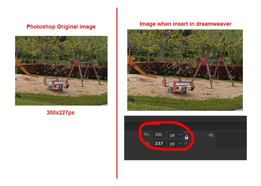
The image is resized
Copy link to clipboard
Copied
Good Morning,
I am having trouble inserting an image. I create the image in Photoshop, save it as jpg and when I insert it into dreamweaver the image appears resized and pixelated. The funny thing is that when I go to the properties, it indicates the width and height correctly. What's going on?
Thanks
Copy link to clipboard
Copied
I don't really know if the picture of the image taken from Photoshop as a screen shot and Dreamweaver screen shot should or would look dimensionally the same size.
What does it look like in the browser when you view it?
Has the image been exported from Photoshop for web or have you saved it as a hi-res image?
Copy link to clipboard
Copied
the image is exported in JPG for web from photoshop and then inserted in dreamweaver.
In the browser it also looks resized but not pixelated, rather blurred.
Copy link to clipboard
Copied
In the browser it also looks resized but not pixelated, rather blurred.
How do you know it looks resized in the browser? Is it busting your layout?
I wouldn't neccesarily compare the size of the image 'visually' in 2 different 'viewers' side-by-side.
However I'm not sure why it should appear pixilated in Dreamweaver.
Maybe you could post a url to the page containing the image, so someone can comment as to whether the image looks blurred to them in their browser/s.
Copy link to clipboard
Copied
What version of DW are you using?
Older versions of DW allowed you to zoom in and out in Live/Design views. You might simply be zoomed in, past 100%.
With Live or Design View in focus, hold Shift and scroll your mouse wheel up or down. Ctrl + - and Ctrl + = also zoom in and out. You can also go to View > Magnification and set it to 100%.
It looks like the latest version has removed this functionality though, so if you're in DW 21, there would have to be something else going on.
Copy link to clipboard
Copied
The version I'm using is the latest one, DW 21. So that's not the problem, but thanks for answering.
Copy link to clipboard
Copied
At 100% magnification, Photoshop displays actual pixels. However browsers on Hi-res/Retinas or 4-5K displays, will upscale to make images and text more readable. Without that extra help, a 300 px wide image looks like a postage stamp. See screenshot.
For better answers, please post the URL to your online site.
Copy link to clipboard
Copied
I can't add the url because it's a project for a client. But regardless of screen type, shouldn't the image look as it is exported from photoshop (without resizing)? Before this didn't happen to me and it is a problem because every I save a photoshop image to place it in dreamweaver it resizes and moves all the tables, the image looks bad... I don't know how to solve it and the solution is quite urgent. Any ideas?
Copy link to clipboard
Copied
If you can't post a link to your work in progress, copy and paste the code of the page, and any .css or .js file attached to it, here in the forum so we can see the code. If the problem isn't a View issue in the browsers or DW, then the answer lies in your code.
Copy link to clipboard
Copied
"I can't add the url because it's a project for a client."
Sure you can. Remove sensitive information. Upload a TEST page to a server-space you control which demonstrates the problem. Remove TEST page from server when your question is answered.
"But regardless of screen type, shouldn't the image look as it is exported from photoshop (without resizing)?"
That all depends on your code and your browser's settings. We're not privy to either.
In most browsers, Ctrl/Cmd + 0 (zero) = normal 100% zoom.
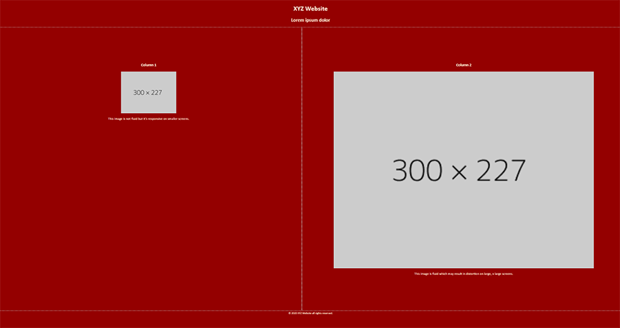
Meanwhile, have a look at this code. Same size images but different CSS.
<!doctype html>
<html lang="en">
<head>
<meta charset="utf-8">
<title>Responsive Image Demo</title>
<meta http-equiv="X-UA-Compatible" content="IE=edge">
<meta name="viewport" content="width=device-width, initial-scale=1">
<style>
body {
margin: 0;
padding: 0;
background: brown;
color: antiquewhite;
text-align: center
}
.flexbox-container {
display: flex;
flex-direction: column;
}

/* Rules for Tablets * Desktops*/
@media only screen and (min-width: 630px) {
.flexbox-container {
flex-direction: row;
justify-content: space-evenly;
}
}
.flexbox-container > div {
flex-grow: 1;
padding: 5%;
border: 1px dotted silver;
}
img {
max-width: 100%; /**won't exceed native file size**/
height: auto;
display: block;
vertical-align: baseline;
margin: 0 auto;
}
.img-fluid {width: 100% /**will exceed native file size**/ }
</style>
</head>
<body>
<header>
<h1>XYZ Website</h1>
<h2>Lorem ipsum dolor</h2>
</header>
<div class="flexbox-container">
<div>
<h3>Column 1</h3>
<img src="https://dummyimage.com/300x227" alt="placeholder">
<p>This image is not fluid but it's responsive on smaller screens.</p>
</div>
<div>
<h3>Column 2</h3>
<img class="img-fluid" src="https://dummyimage.com/300x227" alt="placeholder">
<p>This image is fluid which may result in distortion on large, x-large screens.</p>
</div>
</div>
<footer> <small>© 2020 XYZ Website all rights reserved.</small> </footer>
</body>
</html>


