Copy link to clipboard
Copied
Hello
I've posted a couple of times before but perhaps never properly introduced myself. By the way it's not a current pic of me, I'm sadly way older than that, still missing my youth;)
I'm trying to learn HTML and CSS but finding it a slow process. I've completed a very basic course and have been plowing through the W3Schools and adobe tutorials and while I'm getting a better understanding of the theory, practise is very much a different matter. I'm currently using the latest version of Dreamweaver. I only wish to attain skills for my own personal use, I have no intention of trying to set myself up in any shape or form as a web designer.
I've currently copied and pasted a w3schools template (am I allowed to say that, there weren't any appropriate free adobe ones) into my Dreamweaver application to get some practise and adapted it to suit my needs.
I've uploaded it to a remote server and it appears to work fine on Desktop and iPad but is erratic on iPhones, I have an iPhone 6s but I've tried it on other models and it's the same issue on them all.
It loads and resizes perfectly to fit the screen and initially it'll work for a bit but if I open and close the images repeatedly they eventually start to overlap, this happens on all the pages.
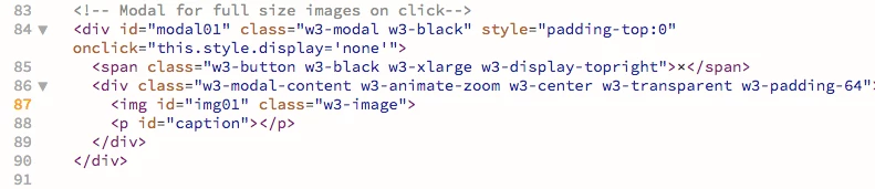
The only errors that appear on my HTML sheet are below

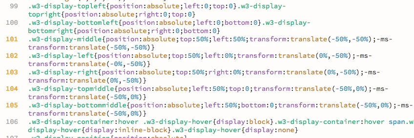
and the only errors on my CSS sheet are below

Would these errors be likely to cause the overlapping of images, see below, on mobile devices?


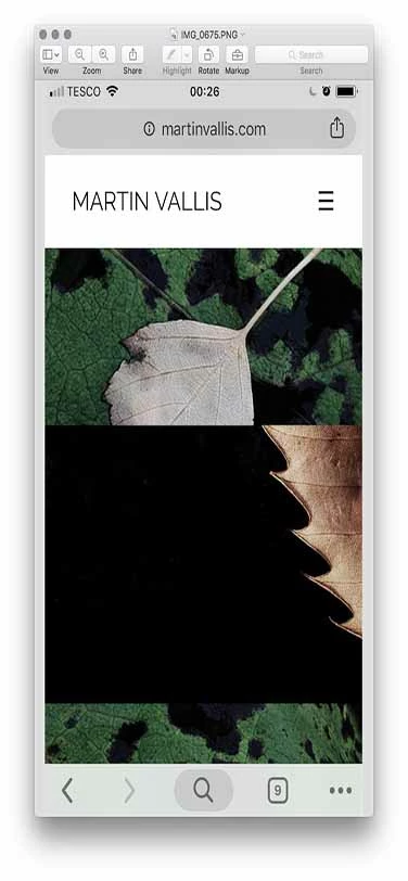
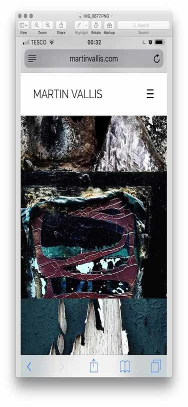
My web address: martinvallis.com
Any thoughts and feedback would be much appreciated.
Thanks in anticipation.
Martin
Copy link to clipboard
Copied
98% of browser rendering problems are code related. An orphaned or missing curly brace will kill all CSS styles below it.
Check CSS
The W3C CSS Validation Service
Check HTML
The W3C Markup Validation Service
Copy link to clipboard
Copied
Many thanks for your response and for the validation links Nancy OShea​
A number of issues occur in HTML all relate to images, see below. While I comprehend the message, as hard as I look I cannot see where the space it refers to is located within the code?
Also in the CSS validation this appears but seems to be a warning rather than an error?

The trouble of course that I'm having along with the website performance on mobiles is my lack of experience in interpreting the process.
Copy link to clipboard
Copied
None of the code include errors, only warnings. The HTML code shows a warning for <img> not containing an 'alt' attribute (see An img element must have an alt attribute · cfjedimaster/brackets-w3cvalidation Wiki · GitHub ), the CSS shows non--compliant prefixes when using '-ms-transform'.
None of these warnings will cause the problem that you are having. The best way for us to help you, is to upload the site and supply the URL to the site.
Copy link to clipboard
Copied
Thanks for your reply BenPleysier​ I appreciate your time. Link below.
Copy link to clipboard
Copied
Absolute positioning can be a little sometimes with phones and small screens. So can transforms and transitions. Also problematic are fixed background images and the background size property. I would say that relying on free templates is usually a very bad idea. But, as Ben said, the only real way to get some help here is going to require that you post a link to your actual page.
And a word to the wise - there is no such thing as a free lunch. You get what you pay for, either in tools or in the investment of your time in learning.
Copy link to clipboard
Copied
Thanks for getting back to me ALsp​ I appreciate your time.
I totally agree with you 'you get what you pay for' but as I said in my original post, I'm basically a beginner, though I have done a course and have been reading tutorials, however I think it's fairly understandable that I choose to experiment with a free template to improve my understanding of the process.
When I feel in a better position to make an informed judgement on the best way for me to proceed based on my skill level, then I have no problem with paying for a responsive template if I feel that may be my best option, while I try to build something from scratch which will obviously take me a lot longer.
Copy link to clipboard
Copied
On the web, folder and file names must not contain spaces or special characters. Where you have this file name:
the dream of life (a.k.a. in the steps of jackson pollock) copy.jpg,
you will need to use F2 in your Files Panel to rename it. And repeat for other file names.
the_dream_of_life_copy.jpg
You can ignore the warnings about browser prefixes. Although they are technically not valid CSS code, they are nevertheless necessary for things to work in all browsers.
Copy link to clipboard
Copied
Thanks Nancy OShea​
Ok, so all my images that contain spaces need to be underscored, do you think that this could be the problem I'm experiencing on mobiles?
Interestingly do you know why it appears to work on Desktops and iPads?
Copy link to clipboard
Copied
Does the W3 Demo work OK on your iPhone? I don't have an iPhone at the moment to test with.
Renaming your images might or might not change how iPhone behaves. But at least your code will be valid
.
Copy link to clipboard
Copied
Hello Nancy
It appears to, I'll get adjusting 79 images
and get back to you, it might not be for a couple of days.
Let's hope that was the problem.
Thank You.
Copy link to clipboard
Copied
Apologies for the delay in getting back to you Nancy OShea​
Having initially said that the original template of which you sent a link worked ok, it did eventually start malfunctioning as per my images posted above.
I've now corrected all the image coding errors and tested the site through the HTML Validator and CSS Validator and the only issue that remains and that we already know about is
Error: Element img is missing required attribute src.
From line 87, column 7; to line 87, column 39
4">↩ <img id="img01" class="w3-image">↩
everything else tests ok. I've tried removing the w3-image text and just leaving the quotation marks but it would appear that this must relate to a rule in the CSS sheet as it does effect image sizing when removed and when put back does correct the sizing.
Despite now having an error free site I'm still experiencing the same problem of images overlapping on my iPhone 6s and other models of iPhone. I haven't checked the site on other brands of mobiles but will try to do so ASAP.
Any other thoughts as to what this could be? As I've already said it works fine on Desktop and iPad.
Link to my site Martin Vallis | Photography
Many thanks for any further support you can offer.
Copy link to clipboard
Copied
martinv44029552 wrote
Having initially said that the original template of which you sent a link worked ok, it did eventually start malfunctioning as per my images posted above.
OK. That tells me the modal viewer is flawed. Try this demo with Fancybox 3.
Alt-Web Demo :: Responsive Masonry Gallery
Copy link to clipboard
Copied
I know Martin is into the free stuff... but the page he linked to is not a masonry grid. Just an FYI
And using the hacks and workarounds required to simulate one (which is impossible to do naturally with CSS) is a bit of overkill. He can do precisely what he wants with a nice, neat, symmetrical Flexbox grid,
Copy link to clipboard
Copied
Oh... and it will be natural responsive on all devices.
Copy link to clipboard
Copied
I'm not pitching a grid layout, Al. I'm asking how the Fancybox3 viewer works on iPhone. That demo was already in place so I'm using it for convenience.
Copy link to clipboard
Copied
I was always under the impression that you can’t run before you can walk ALsp​ we all have to start somewhere even you did at some point!
There is so much to learn and get my head around, in particular what my requirements are for my site, and as I’ve already stated to you, that I’m not specifically into FREE stuff as you put it but wish to know what I’m getting before paying for something that might in the end prove inappropriate. I don’t know what the problem is with that?
This learning is for my own personal use, I’m not trying to set myself up as a designer, so I’m not sure what the problem is, if I try to find the quickest route to do that.
Technology evolves and moves on so quickly, I know that from my own time as a commercial photographer shooting on a Sinar 10x8 camera and using sheet film, the Digital world has decimated my industry and suddenly everyone’s a photographer but hey that’s progress.
I imagine it’s the same in web design there’s a lot more out there than there was and now we can all call ourselves web designers. I’m not trying to do that, I’m just trying to solve a problem the quickest and easiest way that my limited knowledge can comprehend.
I’m grateful for any support that anyone is willing to offer me.
Copy link to clipboard
Copied
Absolutely no offense intended. Whether you realize it or not, I am actually trying to help you. I'm sure Nancy is trying to help you, and I certainly don't expect you to know much about me, but masonry grids are nothing more than a JavaScript parlor trick. and the code-weight is totally unnecessary if the page link you posted is any indication of the images you are actually using. My advice, if you can read between the lines, is simple and always consistent... learn to write CSS. Use extensions to augment your skills, if necessary, or if you've gotten to the point where saving time is worth money. Rely on Bootstrap at your own peril, because the effort required to understand it will leave you in a position where you will never need it.
Amen and good luck ![]()
Copy link to clipboard
Copied
Nancy certainly has been helpful Nancy OShea and apologies @ALsp if I misread your comments but you did appear to be emphasising the ‘free’ comment.
Neither of us know each other and to make assumptions is a bit premature, my decision making is based on the current circumstances I find myself in.
My plan was that perhaps I could have a short term solution, maybe I’m wrong in thinking that, while in the long term learning html and css, which I am, in amongst the other stuff that life throws up.
I hope that clears up any misunderstanding.
Copy link to clipboard
Copied
Hello Nancy OShea​
Thanks for the link and yes it does appear to work on my mobile.
Are you suggesting that the template I’ve been using doesn’t conform for mobile use, even though w3schools are presenting it, as though it does?
Copy link to clipboard
Copied
W3 Schools' CSS Layouts are OK for practice and learning but beyond that... As Al said , you get what you pay for
.
Fancybox 3 (lightbox) viewer is not free. A single commercial license is $29. But it is tested & optimized for mobile devices. And you can do a lot more with it if you dig into the documentation. So there's that to consider.
https://fancyapps.com/fancybox/3/
Copy link to clipboard
Copied
Ok Nancy thanks for this and the advice, I’ll look into it in the morning.
Find more inspiration, events, and resources on the new Adobe Community
Explore Now