Exit
  • Global community
    • Language:
      • Deutsch
      • English
      • Español
      • Français
      • Português
  • 日本語コミュニティ
    Dedicated community for Japanese speakers
  • 한국 커뮤니티
    Dedicated community for Korean speakers
0

What is CSS to reshape a full-page video background?

Enthusiast ,
Jan 27, 2018 Jan 27, 2018

Copy link to clipboard

Copied

I made a Muse page with full page video background and interactive buttons on top of it.  It works great. The video is 1280x720 and the Muse page is 1080x500, the same size as the main website that the Muse page is iframed into it. See image below.

muse-iframe.jpg

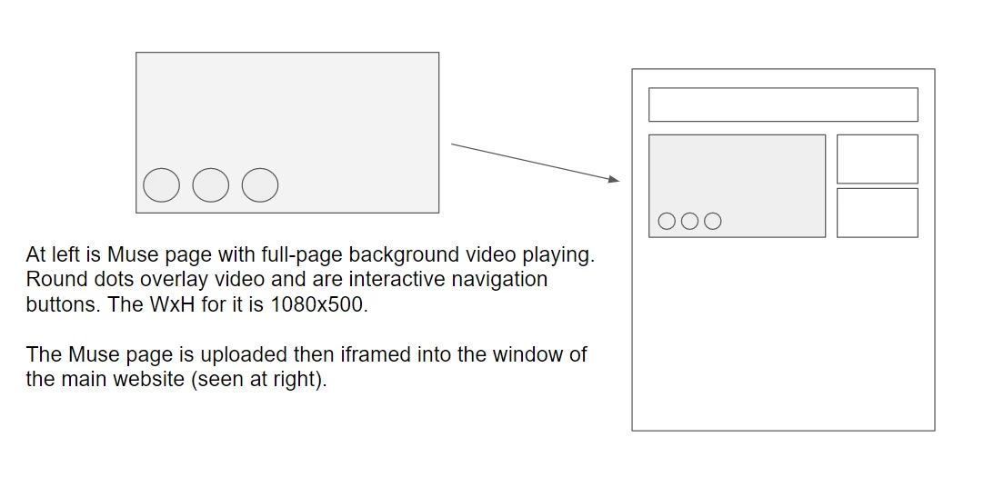
Because the video is an MP4 and needs to hold its aspect ratio, the video pushes the Muse page down so it plays at 1280x720, is correct height. And when the Muse page is iframed the buttons line up exactly like you see in the diagram above at right - the only problem is the video, because it is 720, looks too big for the iframe window.

I thought about just making the video in the upper left of Premiere and keeping all of the action within the 1080x500 - that would probably work.  But what I'm really hoping is if anyone knows any CSS that I can add in the HEAD of the Muse page that will automatically shrink the parameters of the video so that it fits perfectly at 1080x500 and won't look stretched when it's iframed.

The code I added to the Muse page for the video is:

<video width="1080" autoplay loop>

  <source src="bg-video.mp4" type="video/mp4">

</video>

* I know this is may sound like a weird way to do this but the reason is simply because the customer uses for its website a SharePxxxx website publishing system and I have to work within that system's publishing environment. Because Muse is so easy to use, it was easier to just create this quickly in Muse then figure out a way to make it fit in the website "window" as an iframe.

** Just an FYI - this iframe method works great when I originally made the Muse page with a full page photo slideshow as the background instead of the video.  I just ran into this issue when I want to use a video background instead of a photo slideshow.

*** I posted this on the DW forum because this is not really a Muse issue but more of a CSS/DW issue and request.

Any assistance is appreciated.  Thanks.

Views

827
Translate

Report

Report
Community guidelines
Be kind and respectful, give credit to the original source of content, and search for duplicates before posting. Learn more
community guidelines

correct answers 1 Correct answer

Community Expert , Jan 27, 2018 Jan 27, 2018

Sounds way more complicated than it needs to be.  NOTE: No part of this solution uses Muse or Muse generated code.  And no animals were harmed either .

STEP 1 -- THE VIDEO PAGE

Copy & paste this code into video-demo.html.  In case you're wondering, this uses a responsive SVG Play button over the video.    That's why there's extra code.  Incidentally, autoplay and loop are not widely supported.  Don't use them.

<!doctype html>

<html lang="en">

<head>

<meta charset="utf-8">

<title>Video Demo</title>

<styl

...

Votes

Translate
Community Expert ,
Jan 27, 2018 Jan 27, 2018

Copy link to clipboard

Copied

Sounds way more complicated than it needs to be.  NOTE: No part of this solution uses Muse or Muse generated code.  And no animals were harmed either .

STEP 1 -- THE VIDEO PAGE

Copy & paste this code into video-demo.html.  In case you're wondering, this uses a responsive SVG Play button over the video.    That's why there's extra code.  Incidentally, autoplay and loop are not widely supported.  Don't use them.

<!doctype html>

<html lang="en">

<head>

<meta charset="utf-8">

<title>Video Demo</title>

<style>

.video-wrapper {

    position: relative;

}

.video-wrapper > video {

    width: 100%;

    vertical-align: middle;

}

.video-wrapper > video.has-media-controls-hidden::-webkit-media-controls {

    display: none;

}

.video-overlay-play-button {

    box-sizing: border-box;

    width: 100%;

    height: 100%;

    padding: 10px calc(50% - 50px);

    position: absolute;

    top: 0;

    left: 0;

    display: block;

    opacity: 0.95;

    cursor: pointer;

    background-image: linear-gradient(transparent, #000);

    transition: opacity 150ms;

}

.video-overlay-play-button:hover {

    opacity: 1;

}

.video-overlay-play-button.is-hidden {

    display: none;

}

</style>

</head>

<body>

<div class="video-wrapper">

<video src="https://clips.vorwaerts-gmbh.de/VfE_html5.mp4" poster="https://s3-us-west-2.amazonaws.com/s.cdpn.io/3174/poster.png"></video>

</div>

<script>

var videoPlayButton,

    videoWrapper = document.getElementsByClassName('video-wrapper')[0],

    video = document.getElementsByTagName('video')[0],

    videoMethods = {

        renderVideoPlayButton: function() {

            if (videoWrapper.contains(video)) {

                this.formatVideoPlayButton()

                video.classList.add('has-media-controls-hidden')

                videoPlayButton = document.getElementsByClassName('video-overlay-play-button')[0]

                videoPlayButton.addEventListener('click', this.hideVideoPlayButton)

            }

        },

        formatVideoPlayButton: function() {

            videoWrapper.insertAdjacentHTML('beforeend', '\

                <svg class="video-overlay-play-button" viewBox="0 0 200 200" alt="Play video">\

                    <circle cx="100" cy="100" r="90" fill="none" stroke-width="15" stroke="#fff"/>\

                    <polygon points="70, 55 70, 145 145, 100" fill="#fff"/>\

                </svg>\

            ')

        },

        hideVideoPlayButton: function() {

            video.play()

            videoPlayButton.classList.add('is-hidden')

            video.classList.remove('has-media-controls-hidden')

            video.setAttribute('controls', 'controls')

        }

    }

videoMethods.renderVideoPlayButton()

</script>

</body>

</html>

STEP 2 - THE PARENT PAGE WITH IFRAME

Copy & paste this code into video-iframe.html

<!doctype html>

<html lang="en">

<head>

<meta charset="utf-8">

<title>Iframe Page</title>

<style>

.video-container {

    position: relative;

    padding-bottom: 56.25%;

    padding-top: 35px;

    height: 0;

    overflow: hidden;

}

.video-container iframe {

    position: absolute;

    top: 0;

    left: 0;

    width: 100%;

    height: 100%;

}

</style>

</head>

<body>

<div class="video-container">

<iframe src="video-demo.html"></iframe>

</div>

</body>

</html>

And there you have it.  A responsive video and iframe that should fit any size device or web page. 

Nancy O'Shea— Product User, Community Expert & Moderator

Votes

Translate

Report

Report
Community guidelines
Be kind and respectful, give credit to the original source of content, and search for duplicates before posting. Learn more
community guidelines
Enthusiast ,
Jan 27, 2018 Jan 27, 2018

Copy link to clipboard

Copied

OK thanks appreciate it and will try it out.  But as an FYI - there are many, many sites out there that use video backgrounds AND they loop AND they do not have a controller - in other words, they just play as part of a decorative feature.

Votes

Translate

Report

Report
Community guidelines
Be kind and respectful, give credit to the original source of content, and search for duplicates before posting. Learn more
community guidelines
Community Expert ,
Jan 27, 2018 Jan 27, 2018

Copy link to clipboard

Copied

LATEST

Have you tested on mobile devices?  That's where you'll see some problems.   At least if you have a  fallback Play/Pause button,  you're assured all users will be able to see it if they want to.

Autoplay looping videos on iOS and Android with HTML5

Nancy

Nancy O'Shea— Product User, Community Expert & Moderator

Votes

Translate

Report

Report
Community guidelines
Be kind and respectful, give credit to the original source of content, and search for duplicates before posting. Learn more
community guidelines