

- Home
- Dreamweaver
- Discussions
- Coding two images side by side to be responsive
- Coding two images side by side to be responsive
Coding two images side by side to be responsive

Copy link to clipboard
Copied
Hi guys,
I'm struggling to fix two side by side images. I've tried different codes and div, tags but I can't seem to get them to stay on one line and also be responsive for smaller screens/mobile view.
The second image is what I want it to look line in mobile view, with both images on one line
CCS:
divimage-gallery img {
display: block;
float: static;
}
.clear {
clear: both;
height: auto;
max-width: 100%
line-height: 0;
}
and html:
<div class="image-gallery">
<img src="logo.jpg"/><img src="social media.jpg"/>
</div> 
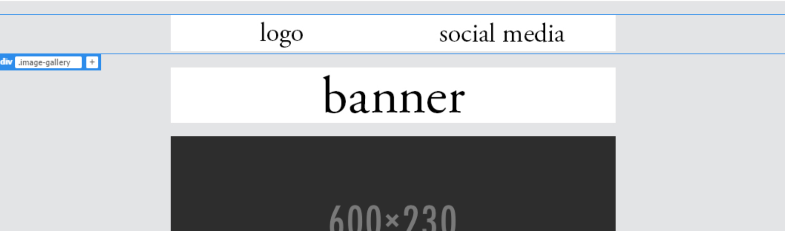
Thank you!


 6
Replies
6
6
Replies
6

Copy link to clipboard
Copied
Instead of using display block and floating the images,
use display: inline-block;

Copy link to clipboard
Copied
You have a fair number of errors in the code snippets you've posted. Is that your actual code, or were the type-os added because you didn't copy/paste to the forum?
Could you post the entire code of the page so we can see what you're actually working with? (better yet, post a link to the page in progress)
Copy link to clipboard
Copied
What is type-os? Apologies, I'm fairly new to using dreamweaver and I'm working from one of the templates
<!doctype html>
<html>
<head>
<meta charset="utf-8">
<!-- utf-8 works for most cases -->
<meta name="viewport" content="width=device-width, initial-scale=1.0">
<!-- Forcing initial-scale shouldn't be necessary -->
<meta http-equiv="X-UA-Compatible" content="IE=edge">
<!-- Use the latest (edge) version of IE rendering engine -->
<title>Mock up</title>
<!-- The title tag shows in email notifications, like Android 4.4. -->
<!-- Please use an inliner tool to convert all CSS to inline as inpage or external CSS is removed by email clients -->
<!-- important in CSS is used to prevent the styles of currently inline CSS from overriding the ones mentioned in media queries when corresponding screen sizes are encountered -->
<!-- CSS Reset -->
<style type="text/css">
/* What it does: Remove spaces around the email design added by some email clients. */
/* Beware: It can remove the padding / margin and add a background color to the compose a reply window. */
html, body {
margin: 0 !important;
padding: 0 !important;
height: auto !important;
width: 100% !important;
}
/* What it does: Stops email clients resizing small text. */
* {
-ms-text-size-adjust: 100%;
-webkit-text-size-adjust: 100%;
}
/* What it does: Forces Outlook.com to display emails full width. */
.ExternalClass {
width: 100%;
}
/* What is does: Centers email on Android 4.4 */
div[style*="margin: 16px 0"] {
margin: 0 !important;
}
/* What it does: Stops Outlook from adding extra spacing to tables. */
table, td {
mso-table-lspace: 0pt !important;
mso-table-rspace: 0pt !important;
}
/* What it does: Fixes webkit padding issue. Fix for Yahoo mail table alignment bug. Applies table-layout to the first 2 tables then removes for anything nested deeper. */
table {
border-spacing: 0 !important;
border-collapse: collapse !important;
table-layout: fixed !important;
margin: 0 auto !important;
}
table table table {
table-layout: auto;
}
/* What it does: Uses a better rendering method when resizing images in IE. */
img {
-ms-interpolation-mode: bicubic;
}
/* What it does: Overrides styles added when Yahoo's auto-senses a link. */
.yshortcuts a {
border-bottom: none !important;
}
/* What it does: Another work-around for iOS meddling in triggered links. */
a[x-apple-data-detectors] {
color: inherit !important;
}
</style>
<!-- Progressive Enhancements -->
<style type="text/css">
/* What it does: Hover styles for buttons */
.button-td,
.button-a {
transition: all 100ms ease-in;
}
.button-td:hover,
.button-a:hover {
background: #f2f3f4 !important;
border-color: #555555 !important;
}
/* Media Queries */
@media screen and (max-width: 600px) {
.email-container {
width: 100% !important;
}
/* What it does: Forces elements to resize to the full width of their container. Useful for resizing images beyond their max-width. */
.fluid,
.fluid-centered {
max-width: auto !important;
height: auto !important;
margin-left: auto !important;
margin-right: auto !important;
}
/* And center justify these ones. */
.fluid-centered {
margin-left: auto !important;
margin-right: auto !important;
}
/* What it does: Forces table cells into full-width rows. */
.stack-column,
.stack-column-center {
display: block !important;
width: 100% !important;
max-width: 100% !important;
direction: ltr !important;
}
/* And center justify these ones. */
.stack-column-center {
text-align: center !important;
}
/* What it does: Generic utility class for centering. Useful for images, buttons, and nested tables. */
.center-on-narrow {
text-align: center !important;
display: block !important;
margin-left: auto !important;
margin-right: auto !important;
float: none !important;
}
table.center-on-narrow {
display: inline-block !important;
}
div.image-gallery {
display: block;
background-color: #cccccc;
}
divimage-gallery img {
display: block;
float: static;
}
.clear {
clear: both;
height: auto;
max-width: 100%
line-height: 0;
}
}
}
</style>
</head>
<body bgcolor="#e3e4e5" width="100%" style="margin: 0;" yahoo="yahoo">
<table bgcolor="e3e4e5" cellpadding="0" cellspacing="0" border="0" height="100%" width="100%" style="border-collapse:collapse;">
<tr>
<td><center style="width: 100%;">
<!-- Visually Hidden Preheader Text : BEGIN -->
<div style="display:none;font-size:1px;line-height:1px;max-height:0px;max-width:0px;opacity:0;overflow:hidden;mso-hide:all;font-family: sans-serif;"> (Optional) </div>
<!-- Visually Hidden Preheader Text : END -->
<!-- Email Header : BEGIN -->
<table align="center" width="600" class="email-container">
<tr> </tr>
</table>
<!-- Email Header : END -->
<!-- Email Body : BEGIN -->
<table cellspacing="0" cellpadding="0" border="0" align="center" bgcolor="#f4fdff" width="600" class="email-container">
<!-- Hero Image, Flush : BEGIN -->
<tr><br>
<td bgcolor="#FFFFFF;"></td>
<div class="image-gallery">
<img src="logo.jpg"/><img src="social media.jpg"/>
</div>
</table>
<div> </div> <img src="banner.jpg" style="display:block; width: 100%; max-width: 600px; height: auto;">
<div> </div>
<img src="../images/Image_600x230.png" alt="alt_text" border="0" align="center" style="width: 100%; max-width: 600px; height: auto;">
<table cellspacing="0" cellpadding="8" border="0" align="center" width="600" class="email-container">
<tbody>
<tr> </tr>
</tbody>
</table>
<table cellspacing="0" cellpadding="7" border="0" align="center" bgcolor="#ffffff" width="600" class="email-container">
<tbody>
<tr></tr>
</tbody>
</table>
</td>
</tr>
<!-- Hero Image, Flush : END -->
<!-- 1 Column Text : BEGIN -->
<tr> </tr>
</table>
<table cellspacing="0" cellpadding="0" border="0" align="center" bgcolor="#ffffff" width="600" class="email-container">
<tr>
</table>
<table cellspacing="0" cellpadding="0" border="0" align="center" bgcolor="#ffffff" width="600" class="email-container">
<tbody>
<tr></tr>
</tbody>
</table>
<table cellspacing="0" cellpadding="0" border="0" align="center" bgcolor="#ffffff" width="600" class="email-container">
<tr>
<td style="padding: 20px; text-align: left; font-family: sans-serif; font-size: 15px; mso-height-rule: exactly; line-height: 20px; color: #0C021B;"> Text text text text text text text text text text text text text text text text text text text<br>
<br> </tr>
<tr> </tr>
</table>
<table cellspacing="0" cellpadding="0" border="0" align="center" bgcolor="#ffffff" width="600" class="email-container">
<tr>
<tr> </tr>
</table>
<table cellspacing="0" cellpadding="0" border="0" align="center" bgcolor="#ffffff" width="600" class="email-container">
<tbody>
<tr> </tr>
</tbody>
</table>
<table cellspacing="0" cellpadding="0" border="0" align="center" bgcolor="#ffb3eb" width="600" class="email-container">
<tbody>
<tr></tr>
</tbody>
</table>
<table cellspacing="0" cellpadding="0" border="0" align="center" bgcolor="#544773" width="600" class="email-container">
<tr>
<td style="padding: 20px; text-align: left; font-family: sans-serif; font-size: 15px; mso-height-rule: exactly; line-height: 20px; color: #0C021B;"><span style="font-weight: bold; color: #FFFFFF;">text<br>
</span> <br>
<span style="color: #FFFFFF">text text text text text text text text text text text text text text text text text text text text.</span><br>
<br>
<!-- Button : Begin -->
<table cellspacing="0" cellpadding="0" border="0" align="center" style="margin: auto">
<tr>
<td style="border-radius: 3px; background: #222222; text-align: center;" class="button-td"></tr>
</table>
<!-- Button : END -->
</tr>
<tr>
</table>
<table cellspacing="0" cellpadding="0" border="0" align="center" bgcolor="#ffffff" width="600" class="email-container">
<tbody>
<tr> </tr>
</tbody>
</table>
<table cellspacing="0" cellpadding="0" border="0" align="center" bgcolor="#ffffff" width="600" class="email-container">
<tbody>
<tr> </tr>
</tbody>
</table>
<table cellspacing="0" cellpadding="0" border="0" align="center" bgcolor="#ffffff" width="600" class="email-container">
<tbody>
<tr></tr>
</tbody>
</table>
<a href="https://intranet.birmingham.ac.uk/as/images/asnewsletter/september-2017/theses-on-shelves-600x300.jp..."></a>
<table cellspacing="0" cellpadding="0" border="0" align="center" bgcolor="#ffffff" width="600" class="email-container">
<tr></tr>
</table>
<table cellspacing="0" cellpadding="0" border="0" align="center" bgcolor="#ffffff" width="600" class="email-container">
<tbody>
<tr> </tr>
</tbody>
</table>
<table cellspacing="0" cellpadding="0" border="0" align="center" bgcolor="#ffffff" width="600" class="email-container">
<tbody>
</tbody>
</table>
<table cellspacing="0" cellpadding="0" border="0" align="center" bgcolor="#ffffff" width="600" class="email-container">
<tr></tr>
</table>
<table cellspacing="0" cellpadding="0" border="0" align="center" bgcolor="#ffffff" width="600" class="email-container">
<tbody>
<tr> </tr>
</tbody>
</table>
<table cellspacing="0" cellpadding="0" border="0" align="center" bgcolor="#ffffff" width="600" class="email-container">
<tbody>
<tr></tr>
</tbody>
</table>
<table cellspacing="0" cellpadding="0" border="0" align="center" bgcolor="#ffffff" width="600" class="email-container">
<tr></tr>
</table>
<!-- Email Body : END -->
<!-- Email Footer : BEGIN -->
<table align="center" width="600" class="email-container">
<tr>
<td style="padding: 40px 10px;width: 100%;font-size: 12px; font-family: sans-serif; mso-height-rule: exactly; line-height:18px; text-align: center; color: #f7a4d;"><br>
<br>
<br>
<br></td>
</tr>
</table>
<!-- Email Footer : END -->
</center></td>
</tr>
</table>
</body>
</html>
Copy link to clipboard
Copied
Type-o = typing mistake.
You have a few errors in your code that will keep it from doing what you expect. First, you are missing something in your img selector: "divimage-gallery img" should have a . between div and image-gallery, so "div.image-gallery img" if you're trying to target <img> tags within the <div class="image-gallery">. Also, "static" isn't a valid option for the float property. That would be correct for the display property. If you don't want something floated, remove the float property, or change it to "none".
Are you trying to create an html email or a web page?
Don't use embedded css (css in the <head> of the document) in html emails, it gets stripped out by a few email clients and will break your email design/layout in your recipient's inbox.
If you're making a web page, don't use the html email templates in DW. They're not fit for real web pages and use outdated coding methods to appease a broader cross section of email clients.
Whether you're attempting an email or a web page will change the code you should be using, and where it's written.
Copy link to clipboard
Copied
Thank you for your help.
Yes I'm creating a template for a newsletter, which is going to be sent through an email application to be viewed on Outlook.

Copy link to clipboard
Copied
See HTML E-Mail & Newsletter Blasts - https://alt-web.com/
For best results, start with an industry tested email template. https://litmus.com/resources/free-responsive-email-templates
Free Responsive Email Templates
See results on various devices:
Nancy
Get ready! An upgraded Adobe Community experience is coming in January.
Learn more
 AdChoices