 Adobe Community

Copy link to clipboard
Copied
Hello
I forgot how to do this to insert an image into a Div area without pushing the text/links up/down out of wack.
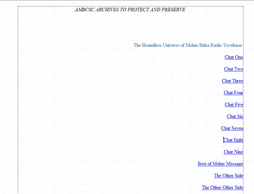
I need to keep the area as we see below with all elements in place, as is, and then insert a photo to fill in the wide space in the middle area and to the left.
Thanks for any advise!
Dreamweaver CS6


 1 Correct answer

Hello Ezad,
as an addition: Do you think about something like this? >>> Text Umfliessen If yes feel free to use my source code by "playing around" with the different parameters.
Hans-Günter
 10
Replies
10
10
Replies
10

Copy link to clipboard
Copied
Have a look at Dreamweaver CS6 Tutorial - Part 14 - Inserting & Importing Images - Creating a Website Course - YouT...
Copy link to clipboard
Copied
The video only showed how to insert a photo.
I need to know how to create a div within a div to hold the photo so as to not disturb the already positioned text and links.
If I simply insert a photo the photo will push down and up the text to make room for the photo.
I am attempting to add a photo without disturbing what is already there / the text and links.
Thanks
Copy link to clipboard
Copied
Hello Ezad,
as an addition: Do you think about something like this? >>> Text Umfliessen If yes feel free to use my source code by "playing around" with the different parameters.
Hans-Günter
Copy link to clipboard
Copied
I needed to study this code to understand how the float with set height and width behaved with text both in the div float and around the div. I found that some text would drift into the div. Then I did find that as I added personal text and personal photos that the divs overlapped. I found that the text outside the div I could fiddle with and make adjustments.
The solution was to simply keep the first div, remove the others divs from this code, and let the photos and text below that div be aligned left; center; right according my intent. This all done as an experiment to see have the div float with text behaved.
What I want to know with the code provided, its div floats and text and so forth, could I put that code, to contain it all, into a container? On my web page at the top I have the navigation bar at 720px. Below that I think having one container with a couple divs and then the text to support my articles (with a few photos) would work.
"I found this code that may work to create in my 'work area' a 'container' to hold the div and text materials."
<html>
  <head>
  ...
  </head>
  <body>
   <div id="container">
  ...
   </div>
  </body>
</html>
"After <div id="container"> ... I would insert this code:"
<div id="container">
<div style="width:450px; height:400px;float:left;margin: 10px;">
Thinking that I would have one container with div and text inside the container.
Am I on the right track in creating a simply web page?
Let me know.
Thanks!

Copy link to clipboard
Copied
Are you doing this as a hobby or do you think you want to do this as a career?
I ask because hobbyists don't need to know the latest web design techniques. But professionals do. And a fixed width website in pixels is not what people expect. People want sites to work well in ALL devices -- desktop, laptops, tablets and mobile phones. To that end, you should learn how to build responsive sites. If you don't want to use a responsive framework like Bootstrap, then you should be learning to code manually with CSS Flexbox & CSS Grids.
A Complete Guide to Flexbox | CSS-Tricks
A Complete Guide to Grid | CSS-Tricks
Alt-Web Design & Publishing ~ Web : Print : Graphics : Media

Copy link to clipboard
Copied
https://forums.adobe.com/people/Nancy+OShea wrote
do you think you want to do this as a career? I ask because hobbyists don't need to know the latest web design techniques. But professionals do.
Being such an ongoing advocate to others, when do you yourself plan on updating your own site to CSS Grid, Flexbox or even update to Bootstrap 4. 
Copy link to clipboard
Copied
I am using BS 4, flexbox and some grid elements in client projects. Haven't had time to think much about my own site. Client projects take priority.
Alt-Web Design & Publishing ~ Web : Print : Graphics : Media
Copy link to clipboard
Copied
I could of wrote that response myself, knew it was coming.
Copy link to clipboard
Copied
With deepest sincerity I appreciate this thoughtful feedback.
I am beyond the age of considering this a career; however being a volunteer worker at this non-profit organization my duty is creating an uncomplicated website with the use of photos and articles. Thus I qualify as a serious amateur.
When I posted originally it was to do with one page in question. I had text photo text photo text photo lined up vertically in a line from the top to the bottom. What I noticed on this page was the large area at the top that I needed to be filled in with a photo to the left as the links were sitting to the right. But I needed to keep text (links) adjacent to the image. Strait forward: Photo left ; links right.
Thus with the use of the div, float left, I inserted an image and the links to the right stayed in place. That's when I got to thinking how best to manage a page using divs and posted again. All in an effort to make best a web page that would look good to the viewer.
What I took notice in the Bootstrap page was how a web page should behave on 'desktop, tablet, mobile phone'
I am willing to learn in order to make best our non profit web site. What I will do is begin the Bootstrap lessons.
I will start with 'getting started' and proceed with their instructions.
Thanks all for posting. The comments are most inspiring.....
Copy link to clipboard
Copied
OK. Keep in mind that Bootstrap 3x uses floats for layouts. Bootstrap 4 uses flexbox layouts. The HTML code classes are slightly different in ver 4 because it's newer and has more features.
DW 2017 & 2018 currently supports only Bootstrap 3x.
Nancy
Alt-Web Design & Publishing ~ Web : Print : Graphics : Media
 AdChoices