

FrameMaker 10 Review

Copy link to clipboard
Copied
Our company uses FrameMaker 7.1 on a steroidal mixture of plugins, Autohotkey scripts, and a home-made toolbar. After trying a demo of FrameMaker 10, we decided not to purchase it. In fact, we were rather shocked at how poorly it was designed.
Here is a list of the grievances that changed our minds:
Thanks to the new interface, there is no colored title bar at the top of the screen (you know, the bar that sort of greys out when the window is inactive?). Since the bar won't change color to reflect whether or not the window is active (it's unvarying silver), you can never tell if the FrameMaker window is active or not. Okay, you can look at whether or not the little red X button in the corner is red or grey, but this just doesn't cut it. When you want to activate the FrameMaker window, you reach automatically for the title bar to click it, only to discover that the title bar is filled up with buttons that will do things if you click on them. So then you divert at the last second and click somewhere in the middle of the document instead. We all learned not to do this early on because if you click in the middle of any open program window you'll probably hit some important button. But with effort and diligence you will unlearn years of experience.
If you make the FrameMaker window halfsize and then try to resize it by dragging the edges of the windows, you'll find that you can resize the left, right and bottom edges, but NOT the top edge. It is astounding that any modern program produced by a major company could lack such basic functionality. And of course, because the title bar is gone, the address display (which used to show the location of the FrameMaker file you were working on) is also gone. The file address now displays as a tooltip that pops up when you hover your mouse over a tab, conveniently blocking the bottom row of most-used editing buttons for 3-4 seconds. The address tooltips will also pop up on top of open menus, hiding the option you are looking for and generally making a nuisance of themselves. The small, closely spaced "File" "Edit" "Format" "View" options that took up so little space in FrameMaker 7.1 are now displayed in a larger font and at more widely spaced intervals so that menus which used to take up half of my header bar now take up two thirds of it. If you work in structured mode and have plugins installed which add extra menu items to the header bar (I have two), you will discover that the FrameMaker window becomes hard to grab and drag if you shrink it down so that it occupies, say, the left half of your monitor. This is because with two extra menus there is only about one square centimeter of free space to click on if you wish to drag said window around the screen; the rest of the grabbable surface is taken up by workspace rearrangement buttons and the new grande-sized menus. The new "header bar" isn't just broad either--it's tall, nearly twice as tall as the old bar that held the "File, Edit, etc." buttons. So apparently Adobe got rid of the title bar just so that they could add extra padding to the "header bar" and give you more space to click on the File button. (On a side note, my own private gripe with the new header bar is that the unique "close, restore down, minimize" buttons in the upper right hand corner of the screen interfere with my 3rd party double monitor software, which normally adds two window management buttons to "move window to other screen" and "maximize window across both desktops." The multimonitor buttons cover up the aesthetically pleasing but nonstandard FrameMaker buttons so that I can no longer minimize FrameMaker normally.)
The FrameMaker 10 interface is colored a grim battleship grey. It is ugly, unfriendly, and wears on the eyes...not unlike the interior of a submarine, except that they started adding color to submarine interiors because they discovered that it wore people's eyes out and demoralized them. Someday we will be able to tell our children that all we had was black and white FrameMaker. In the meantime, it is now harder to tell buttons apart and instant recognition may take awhile to develop. Happy hunting?
There is a ghastly waste of space everywhere. Nearly an inch of seldom-used buttons has been added to the bottom of the paragraph catalogue. This should have been compressed into a one-button "Options" menu. The paragraph designer is fatter and taller than its predecessor, and most of that space is blank. Below each set of paragraph controls there is .5 to 1 inches of nothing. Why the extra padding? Because paragraph designer now must be the same size as the character designer and table designer, since it is supposed to share a common window with them. (Problem: I use the paragraph designer every few minutes, table designer every few hours, and character designer every few days. So in essence the functionality of the most important piece of the system has been sacrificed to accomodate the least important part of it.) You can of course remove paragraph designer from its fellow designers and make it is own separate window again, but this won't get rid of the extra unused space at the bottom and no, you can't resize it. The graphics toolbar too is chubbier for no apparent reason. The Find/Change dialogue box is twice as big as it used to be and the only added functionality is one circular fill-in bubble and word "Map." The Marker dialogue is one third again larger. Now we see why FrameMaker needs a "ui visibility" button that toggles on and off the docked user interface so that you can catch a glimpse of the document or actually do some (gasp) typing. There should probably be a tooltip on the "ui visibility" button to advise the user to turn off the UI if they begin to experience the sensation that the walls are closing in on them.
Where FrameMaker is not too fat, it's too lean. In several high traffic clicking areas the clickable space has been skimped, making it hard and slow to click on the thing you want. If you have to use fine motor control to click a button, then it's too small to be convenient/fast and will be avoided by the user unless necessity compels. And unfortunately, FrameMaker 10 does compel. Paragraph designer no longer has nice, big, easy-to-click tabs. They've been replaced by tiny, hard to click buttons that float in an ocean of unused screen space. (On a side note, there is also a slight loadup lag when you click each button. The Basic and Font buttons are slowest to load, but the hang is there for all of them. Apparently FrameMaker 7.1 = broadband and FrameMaker 10 = dialup.) The document browsing tabs, a truly heavenly feature, are too thin, and their "close" buttons are way too small. The tabs should have the exact same size, style and features as those in Firefox or that other big-name commercial product everybody used to use before the designers got complacent and lost their market share, Internet Explorer. The title bar for undocked palettes is also too thin, particularly for undocked palettes that have been collapsed down to icon size. It is almost impossible to grab the title bar on such collapsed icons without activating the "expand" button. Fortunately, the double dotted line intended for moving icons around in toolbars is grabbable and provides an effective substitute.
The document browsing tabs are missing basic functionality. For example, when you have ten tabs open, they should squeeze down to a smaller size and no longer display the entire title of the document. As it is, you can't even access the tabs that have flowed off the left or right sides of the screen unless you use the dropdown box provided at right. I expect at least as much functionality as I can get from an internet browser.
When you hover over the icons they will switch to colorful versions of themselves...except for the Table Catalogue button, which strangely turns into a colorful version of the Table Designer. (Oh, and there's no improved table navigation in FM 10 either.) The marker box's "Edit Marker" button always looks greyed out and inaccessible, even when it isn't.
Sometimes you can't scroll in the frames; for example, the marker and variable lists occasionally will not allow you to browse through them with the scroll wheel. The scroll wheel, while a little better supported than it used to be, still does not honor the properties set for it in the Control Panel--which is to say that for every flick of the scroll wheel, FrameMaker will only shift the document up/down by one line of text. This is an extremely slow rate when you consider that three lines per scroll is the normal speed.
When you click to place your cursor in the document, the normal text selection cursor turns into an arrow, of all things. (Anomalously, you can still select with it.) It will remain that way until you move the mouse left or right, at which point it will turn back into a text selection cursor. But even if you scroll up and down, it will stay an arrow. This behavior makes it inconvenient to select individual letters (say for fixing typos) because the arrow gets in the way and blocks your view of the text. It is also nonstandard behavior for all the text editors I have ever used.
Try this--open the Find/Replace dialogue. Change the selection box from "To Text:" to "To Character Format." The character format dialogue box will box up. Choose something. Click okay...and watch the character format dialogue box disappear along with the whole Find/Replace dialogue! You'll have to open the dialogue up again if you want to search. Basic functionality broken.
If you have a docked window unfurled and you switch focus to a window outside FrameMaker, the docked window will automatically retract, requiring you to open it again when you return to FrameMaker. If you click in the FrameMaker document (say you want to type) while a docked window is open, the docked window will also automatically retract--a bugger if you still wanted to use it. There should be a "Toggle Persistant" checkbox that lets you decide if you want the window to remain open until you close it manually OR to close it automatically after each use.
FrameMaker is a great program, but flaws are carefully being added to it. The reason for this is that the designers do not ever use FrameMaker themselves. The only way to solve this problem is to uninstall all copies of Word and Wordpad from the computers of everyone involved in the FrameMaker design process, then install copies of FrameMaker 10. Let's see how long it takes them to see the light and put back BASIC FUNCTIONALITY.


 54
Replies
54
54
Replies
54
Copy link to clipboard
Copied
That was it, rlauriston!
My humblest apologies to Adobe...

Copy link to clipboard
Copied
I really disliked the new interface in Frame 9. I used it for many weeks before I came to realize it has many functional advantages. Very significantly, you can customize the workspace to a large degree. Put things where you like them. Maybe some on a second monitor.
As for the User Guide (mentioned in several posts), it's easily available at Help > User Guide.

Copy link to clipboard
Copied
I don't have or want two monitors. So far, I haven't found a way to arrange the FrameMaker 9 / 10 UI elements so they're not getting in each other's way. Nor will they stay where I put them.
Plus there are fundamental bugs in the UI. For example, the FrameMaker Console is always behind the application window, so I have to minimize the application window to see it.
Copy link to clipboard
Copied
You have to save the workspace. Once you do you can reset it to what you saved at any time.

Copy link to clipboard
Copied
The FrameMaker 10 interface does take some getting used to (especially if you are comng from FrameMaker 8), but once you get used to it and get it set up to suit your needs, it does save time, and makes the most used features more easily accessible. However, I too would like to see coloured icons and the ability to change colours in the interface. I'd also like to see the icon buttons in the paragraph designer replaced with text.
Two monitors are definitely the way to go if you can arrange it. I have an older 4:3 monitor set up in portrait mode as my main monitor and a newer widescreen monitor as secondary. I have the book file, paragraph and character catalogs, paragraph/character/table designers, and cross-reference and show/hide conditional text dialogs set up on the seond monitor. That keeps my main monitor free of most of the clutter.
I'm not aware of any good solution for getting Word content into Frame. Somebody who was a wizard with XSLT could probably write a DOCX to MIF converter, but otherwise, I don't know how you would do it. The current import filter is an improvement over previous versions but still requires a lot of manual cleanup.
Regards
Keith
Copy link to clipboard
Copied
"The FrameMaker 10 interface does take some getting used to (especially if you are comng from FrameMaker 8) ..."
There were no major changes to FrameMaker's UI from 5.5.6 (the first version I used) to 8. The new UI introduced in version 9 seems to me unchanged in 10.
I was used to driving FrameMaker primarily from the keyboard. With the new UI, I often seem to end up in situations where the mouse is the only way out.
How do you think the new UI "makes the most used features more easily accessible"?
Copy link to clipboard
Copied
> How do you think the new UI "makes the most used features more easily accessible"?
Well, perhaps I should have said "features that I use most often". 
Regards
Keith
Copy link to clipboard
Copied
Which features were less accessible before?
I used to be able to fit a full page plus page and character catalogs, Find, Marker, and a few other dialogs on a 1280x1024 display, and even on a 1024x768 display it was quite usable.
With FrameMaker 9/10, I can't fit that same stuff on a 1680x1050 display without the dialogs blocking the page. The one time I tried to use a 1024x768 display I found it impossible. This seems absurd to me, since functionally the old and new UI are virtually identical.

Copy link to clipboard
Copied
Robert,
Have you seen RJ Jacquez's webinar on using the new GUI in FM9? He shows the comparison between the old in FM8 and the new FM9 and all of the customizations needed to configure FM to do things your way. It also bothered me at first after some 17 years of FM use (at that point) - old habits die hard. But once I started creating my own workspaces and switching between them, it makes working with FM much easier and cleaner.
Well worth a look at the video: http://tv.adobe.com/watch/tips-and-tricks-for-technical-communicators-to-maximize-productivity/getti...

Copy link to clipboard
Copied
> I used to be able to fit a full page plus page and character catalogs, Find, Marker, and a few other dialogs on a 1280x1024 display, and even on a 1024x768 display it was quite useable.
>
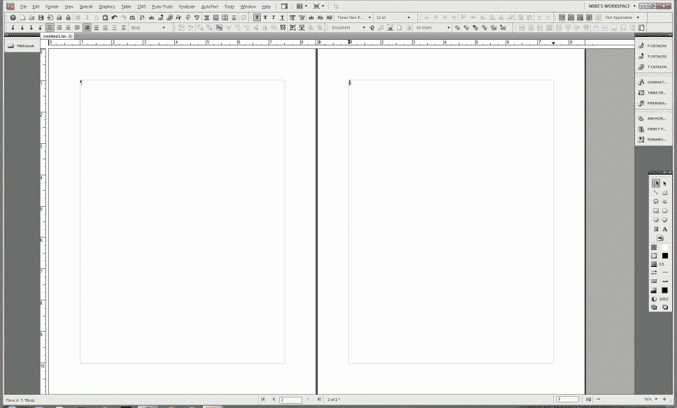
Have you tried using collapsed icons to hold the various panels/pods? They then open with a single click. Here's a graphic of my 24" monitor with a book file on the left, a 2-page spread document in center, and tools, catalogs, designers, and various graphics panels on the right:
You may need to reset some preference settings:
I also highly recommend RJ Jacquez' video on the new interface. I didn't quite get it, either, until I watched it.
Copy link to clipboard
Copied
I want to reduce the number of mouse clicks to zero.

Copy link to clipboard
Copied
Thx to rlauriston for asking...How do you think the new UI "makes the most used features more easily accessible"?
I find FM9 & 10 to be much more accessible.
- The number of modal dialogs has been reduced to maybe 10-15% of previous versions. That means I don't need to use shorcuts to open and close dialogs. They're at the ready in my panels. Do I think they could be more logical? You betcha, but they're much better than before, even as they are.
- So you don't want so many panels??... Save a workspace with whatever you find important, and you won't have FM engineers imposing their preferences upon you.
- Still too many panels??... then find the Hide UI button (up next to the very useful window options button) to declutter and reclutter your screen as needed.
- Since much of my work involves working with others on shared screens (training, template dev, troubleshooting) I find shortcuts nice, but only one way to increase productivity. Panels and workspaces give me a great way to quickly flip back to known layouts after performing rarely-used tasks. Kind of like "reverting" to a clean version of my garage workbench.
- Plus, but autocollapsing and autoexpanding panels, I can simultaneously see many things that in previous versions would have required modal dialogs (like XREFs, Variable defs and usage)
- Moving toward an interface that dovetails with other Adobe products is simply good practice. That FM users must adapt to other common conventions is inconvenient, but in the long-term best interest of all. See Apple's Human Interface Guidelines, and look at how their products successfully leverage UI advances in browser, mail, and iTunes activity.
Adobe TCS certainly has a way to go in terms of UI and User Experience (UX), but I don't see them moving back to early '80's conventions any time soon.
Maybe suggesting improvements to the next version is your best bet, through these forums, your favorite Adobe resources, or by getting involved in the Adobe Prerelase programs.
I personally would like to see RoboHelp adopt the same panel config as Frame and Captivate (which are now roughly in line with Photoshop, Adobe's flagship UI app) as I don't care to memorize different naming conventions, key commands, and behaviors for effectively the same functions in other applications.
***Oh yeah, and I find the tabs and the ability to have my book window and other panels automatically adjust my doc width about 10x more productive than having everything stack on top of itself. If that means the FM Console is relagated to the back seat, then so be it. I only view FM Console when there's a problem, so I don't want it to be in my face anyway.
FrameMaker Course Creator, Author, Trainer, Consultant
Copy link to clipboard
Copied
"The number of modal dialogs has been reduced to maybe 10-15% of previous versions. That means I don't need to use shorcuts to open and close dialogs. They're at the ready in my panels."
The dialogs I use all the time (find, designers, catalogs, marker) were already non-modal and are functionally unchanged. The only changes from 7-8 to 9-10 is that they will no longer stay where I put them and I guess they're bigger, since I can't fit them all on a smaller screen any more.
Copy link to clipboard
Copied
>> The dialogs I use all the time (find, designers, catalogs, marker)
were already non-modal and are
>> functionally unchanged. The only changes from 7-8 to 9-10 is that
they will no longer stay where
>> I put them and I guess they're bigger, since I can't fit them all on
a smaller screen any more.
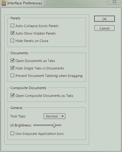
Hmmm... they stay where I put them, and I can put them in different
places for each Workspace set. Perhaps you need to change your Interface
Preferences, as I posted above. In that same message above, I show them
as collapsed buttons, but I have also used workspaces with the pods open
in various places (including on second and third monitors) and they
reopen in the same places every time I restart FM and open a document. I
love it.
Copy link to clipboard
Copied
The pods will stay where I put them, but floating dialogs keep reverting to pods.

Copy link to clipboard
Copied
"I find FM9 & 10 to be much more accessible."
Okay, I'm willing to believe that, and thanks for your detailed responses to others' critiques. I've been a Frame user since version 5, currently using Frame 7.1, but since moving to Win7 (my old XP Dell died), I can't make PDF files. There's probably a fix for that, but Adobe's response is a calm "we don't support FrameMaker 7.1 on Windows 7." (If anybody knows a fix, I'd love to hear about it.)
Anyway, I was thinking about shelling out the big bux <sigh> and buying version 10. I've downloaded the trial version; will visit the tutorials. But, this business about not being able to see the file's path in the now-non-existent upper border of the Frame window. How annoying! Is there a way of changing that?
TIA
Joanna

Copy link to clipboard
Copied
What about running a WinXP virtual machine on your Win7 machine and installing FM7.1 inside that?

Copy link to clipboard
Copied
What about running a WinXP virtual machine on your Win7 machine and installing FM7.1 inside that?
Since I may need to do that someday, I'd also like to learn if it's possible.
The issues include:
1. You have to have Win7 Professional, Enterprise or Ultimate just to be able to download and install XP Mode. All the other home versions, including the not-so-premium "Premium" will refuse to install XPM.
2. Ps or PDF rendering.
Will the legacy Ps and PDF drivers from FM7.1 install and run in XPM?
If not, can FM7.1 in XPM print to a native Win7 Ps or PDF driver?
3. Fonts: does Frame inside XPM have access to all the native Win7 fonts, or do they need to be re-installed in XPM?
4. OLE referenced objects? I wouldn't even go there from XPM.
Copy link to clipboard
Copied
I'm not sure about this but shouldn't you be able to use either VMWare or Virtual Box instead of the WinXP emulator? You might be able to use one of those with your version of Windows.
Regards,
Keith
Copy link to clipboard
Copied
Thanks for the idea, Keith. I'm salting it away. But as for making PDFs,
for now I'll stick with the simplest solution, which is the .tps file.
All the best,
Joanna
Copy link to clipboard
Copied
Thanks -- I just discovered that possibility. The sad thing is, I have
Windows Home Premium so I'll need to pay a couple of hundred for an upgrade
to Windows Professional before I can download Windows XP mode.
Copy link to clipboard
Copied
It's usually possible to work around problems with FrameMaker generating PDFs by printing to a .tps file and then using Acrobat to convert the file to a PDF. If you don't have Acrobat Standard or Pro, you'd do better to buy that than upgrade Windows (ridiculous waste of money). Or if you need a scanner, get one that's bundled with Acrobat.
Copy link to clipboard
Copied
Worked! Thank you! Whew!
Had tried this before but had forgotten (from my very early techwriting
days) that I needed to switch printers. Just tried it using (Duh!) the
Adobe PDF printer, and lo and behold...
One very happy bunny :o))
Copy link to clipboard
Copied
I guess I don't understand your need for the path names. Do you need more than the pathname in a tooltip when you hover over either the tab or the titlebar (you don't have to use the tabbed interface if you long for the nostalgia of stacked windows  )
)
-Matt
@mattrsullivan
FrameMaker Course Creator, Author, Trainer, Consultant
Copy link to clipboard
Copied
Oh, cool. Just found the path that shows up when you hover over the tab.
No love of stacked windows, here!

 AdChoices