


Copy link to clipboard
Copied
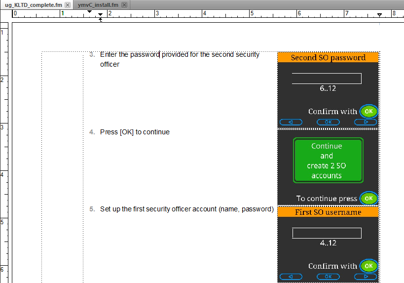
A basic layout question which I've somehow never run into before … the screenshot shows almost what the document owner wants; but I would like more vertical space between each graphic and the next paragraph, and (see point 5) a bit more horizontal space between the text and the graphic
Properties so far:
- anchored frame – run into paragraph, right align, gap 6.0 pt
- graphic – run around contour
I experimented with a run-in head paragraph for the text and a right-aligned paragraph for the graphic, but then I couldn't work out how to align the graphic to the top of the paragraph.
Hints and tips welcome!


 1 Correct answer

Increase the vertical size of the anchored frame I do this with software command icons except I left align the anchored frame. You can also set a object style to quickly offset the graphic to the upper right corner of the anchored frame.
 3
Replies
3
3
Replies
3
Copy link to clipboard
Copied
Increase the vertical size of the anchored frame I do this with software command icons except I left align the anchored frame. You can also set a object style to quickly offset the graphic to the upper right corner of the anchored frame.

Copy link to clipboard
Copied
The paragraph format could have an empty FrameAbove or FrameBelow, but you'd need to test FB for conflicts. FA has the [dis]advantage that it will work at the top of a page, whereas SpaceAbove does not.
The pgf can also have extra SpaceAbove or generous Space-Below.
But I used to do it by pulling down the bottom edge of the anchored frame, as already suggested.
Copy link to clipboard
Copied
extend the frame … yes, I can live with that :-} thanks for the tip.

 AdChoices