- Home
- FrameMaker
- Discussions
- Table Anchor Causing Formatting Offset
- Table Anchor Causing Formatting Offset
Copy link to clipboard
Copied
Hello everyone!
I have a formatting question, and I hope someone is able to help. Please let me know if you have any clarifying questions.
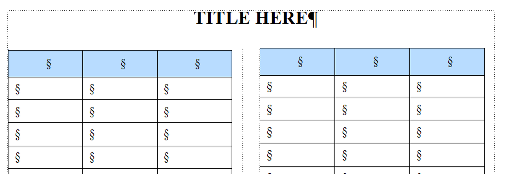
I am working on a new document type for my company. In this document, we have a two-column page set up, and are using a two-column table as well. However, we noticed that the table in column one is starting a milimeter or so below the table start in column two, which is creating a formatting offset. (See attached.)
Our table anchor is sitting on the line above the table, in column one, which is pushing this table lower on the page. When I attempt to move the anchor to sit against the document title, it pushes the table out of our two-column format and into a single column while also pushing the table onto the second page of the document, leaving the first page blank.
Does anyone have any suggestions on how to move the anchor to 1) remove the table offset and 2) preserve our two-column table?
Thank you!
 1 Correct answer
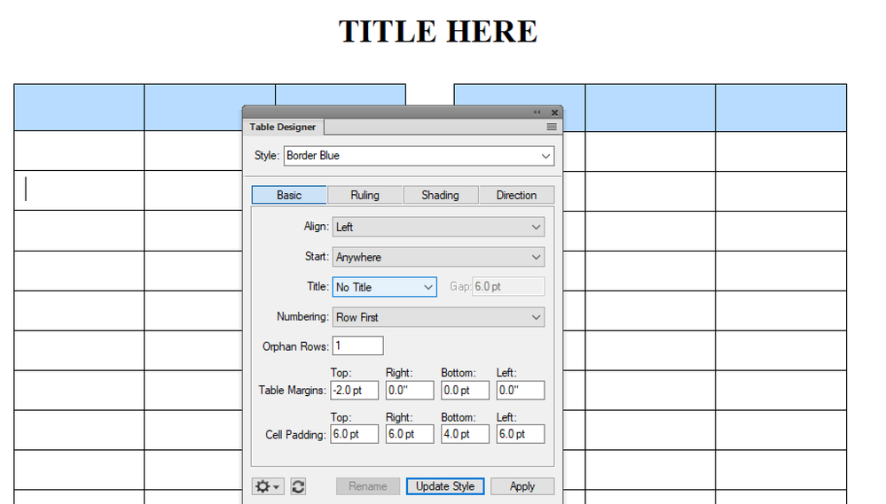
Try creating a table anchor tag (I call mine Anchor) that is set to a 2 pt font size. Then in the table designer for your table, set the top table margin to -2 pts.
[Side note: my practice is to have each table anchor in a separate paragraph. I find it's easier to select the one you want and also it lets you do tricks like the above, which keeps your table close to the preceding paragraph.]
Copy link to clipboard
Copied
Thank you so much! This fixed the document formatting.
Copy link to clipboard
Copied
Hi @Nicole5FB4 :
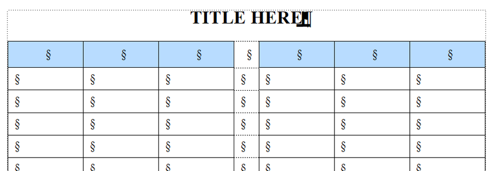
Maybe someone will offer a better option, but in this situation I take the undesirable path of making the three column table into a 7 column table, where column 4 is empty and matches the gutter and cut/paste the bottom of the table to columns 5–7, then remove the rows from the bottom.
If someone wants to add a missing row, I'm in a pickle, so I advise my client of this prior to starting the conversion.
This is where negative paragraph spacing values would come in handy.
~Barb
Copy link to clipboard
Copied
That's perfect Lin. I swear I've tried that before, but it just worked. Marking it as correct.
~Barb
Copy link to clipboard
Copied
Yours may still be a better solution. I wasn't thinking about needing the two tables to be perfectly aligned across the two column frames.
Copy link to clipboard
Copied
2pt seems a bit small for the text size.
I usually use 6pt (with -6pt Below & -6pt top margin in the table).
¶TableAnchor is set to a color that will be invisible in publication Color Views.
It also has an AutoNumber, at end of para, with some text making it more apparently that it is there.
This probably-not-documented hack has been necessary for some 20 years at least.
Copy link to clipboard
Copied
I'd forgotten about the -2 pt below for the anchor tag. Whoops!
The font size doesn't really matter. It's having the paragraph tag containing the table anchor use the negative value of the font size (so -2 pt for a 2 pt font size or -6 pt for a 6 pt font size) for the below paragraph setting and having the table tag with the top table margin ALSO set to the negative of the font size.
Copy link to clipboard
Copied
re: The font size doesn't really matter.
True enough, if you never need to touch it again, or pass it on to some other steward.
2 pt is going to greek-out at all useful zoom levels.
As I suggested above, I prefer that the anchoring para take on meta characteristics, distinctly visible, but only when authoring. So, 6pt or larger, color set to one named Authoring (controlled by Color Views), text-only AutoNumber at end of para (so not confounding anchor), and perhaps some text typed in memorializing what the table is/was in case lost - all made invisible at pub via CV.
A current project has tons of stuff in Authoring color: MP name, filename, spot Xrefs in margins, R-H/F feeder text, various oddball paras for local flow management (avoiding overrides), etc.
Copy link to clipboard
Copied
Now I need help! It's InDesign that doesn't accept negative paragraph spacing—that's the peril of using two Adobe page layout applications—so thanks to both of you for the Fm reminders.
But Lin, what does this mean? I wasn't thinking about needing the two tables to be perfectly aligned across the two column frames. When I set the table top margin to -2 the two columns lined up perfectly. See my last screen shot. BTW, the table is anchored to an empty ¶, but the anchor isn't visible because it is 2 pts.
~Barb
Copy link to clipboard
Copied
If they're using separate tables in each column but need them to align perfectly, they may need to fiddle the text to ensure that the table anchors are at the same vertical position in each column. I haven't worked in columned formats so while I know there are ways to align paragraphs, I'm not familiar with them.
If they're using the same table across both columns, though, they can use a combination of my solution and yours, which I think would work very well for them.
Copy link to clipboard
Copied
Ah, now I understand. From the two screen shots, I think Nicole has a two-column format with a straddle head and one long table underneath that needs to line up when it wraps back up to the top of the second column.
I do work with columns in Fm, so being reminded that we have negative spacing options has made my day. 😊 (And makes me wonder what else have I forgotten over the years. 😜)
~Barb
Copy link to clipboard
Copied
The dust is several inches thick in some places inside my brain. 😃


