Copy link to clipboard
Copied
Hello!
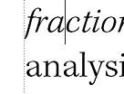
Certain characters (namely italics that extend past a normal character space) are extending past and being visually truncated by the main flow text frame. In the example below, the italic "f" has been chopped off at the trailing edge. If the same character is on the right edge of a frame, its frontmost portion is similarly chopped off.
While these ouput just fine on a press-ready PDF, it's obvious that they're extending by a very slight amount past the non-italic characters above and below them.
Ordinarily, I wouldn't be concerned about extending a couple of pixels beyond the text frame but CreateSpace is rejecting the PDF because of these places where I extend into the margin and I don't want an issue with that.
Is this a bug in FM, or perhaps a style setting I'm overlooking that can ensure characters never extend past the text frame, even in the slightest?
Thanks!
Copy link to clipboard
Copied
Whilst awaiting an authoritative answer, a couple of quick hacks might be:
Copy link to clipboard
Copied
My guess is that it is NOT a FrameMaker bug. It is a feature of the font's design. You can envision a character as a piece of metal type. It has a "body", which is essentially square. This body determines how close the character sits next to its adjacents characters (pieces of type). The actual character glyph sits on top of the body. And the glyph can extend outside the area of the body. ----For those who are more experienced in metal type, please excuse the terms; I am sure that I do not have the correct ones.---- This feature allows a line of type to look good without having to do extensive kerning.
So, FrameMaker is placing the first character in the line right next to the edge of the frame, but it places it according to the space occupied by the body, NOT the glyph. In my opinion, this is exactly what one wants. After you print or PDF the document, look at the margin. All the lines look nicely aligned. IF FrameMaker pushed each line in a little to keep EVERY bit of the glyphs inside the frame, I am willing to bet that the margin would look a little ragged. Font was designed to look best when the glyphs hang out a little into the margin. The issue applies with the type's baseline; the bottoms of Cs do not align horizontally with the bottoms of Ms, because otherwise, the Cs would appear to the eye to be a little above the line.
I do not know what CreateSpace is.
Copy link to clipboard
Copied
I think you're right. I know that fonts can be designed in this way and were Frame to absolutely restrict all components of a character to the text frame it would probably look exactly as you describe.
CreateSpace is Amazon's publishing subsidiary and a common way for small publishers or individuals to distribute books through Amazon. Their automated file checking utility flagged this behavior as an encroachment into the gutter and the software isn't sophisticated enough to determine whether or not this encroachment is sufficient to be of concern. It's likely that it's not, considering the trivial amount that the character exends into the gutter space.
While the previous suggestions would work, it would require subtle layout changes to a massive book that's ready to go to press. If CreateSpace decides that they're okay with this trival encroachment, I'll run with it.
Thanks!
Copy link to clipboard
Copied
How does CreateSpace KNOW what the margins or gutters are? Maybe you can simply give it sizes that are slightly smaller than those in your book.
Copy link to clipboard
Copied
Their printing technology imposes specific gutters, depending on the size and spine thickness (which is a product of page count). For example, a 6 x 9 paperback with a page count between 90 and 300 pages requires an inside gutter of 0.75 inches and an outside gutter of 0.25 inches.
Their software is sophisticated enough to parse the submitted PDF during preflight and recognize if any content whatsoever encroaches into this region.
Find more inspiration, events, and resources on the new Adobe Community
Explore Now