

3d Mapping in Illustrator is not accurate in output?

Copy link to clipboard
Copied
Hi All,
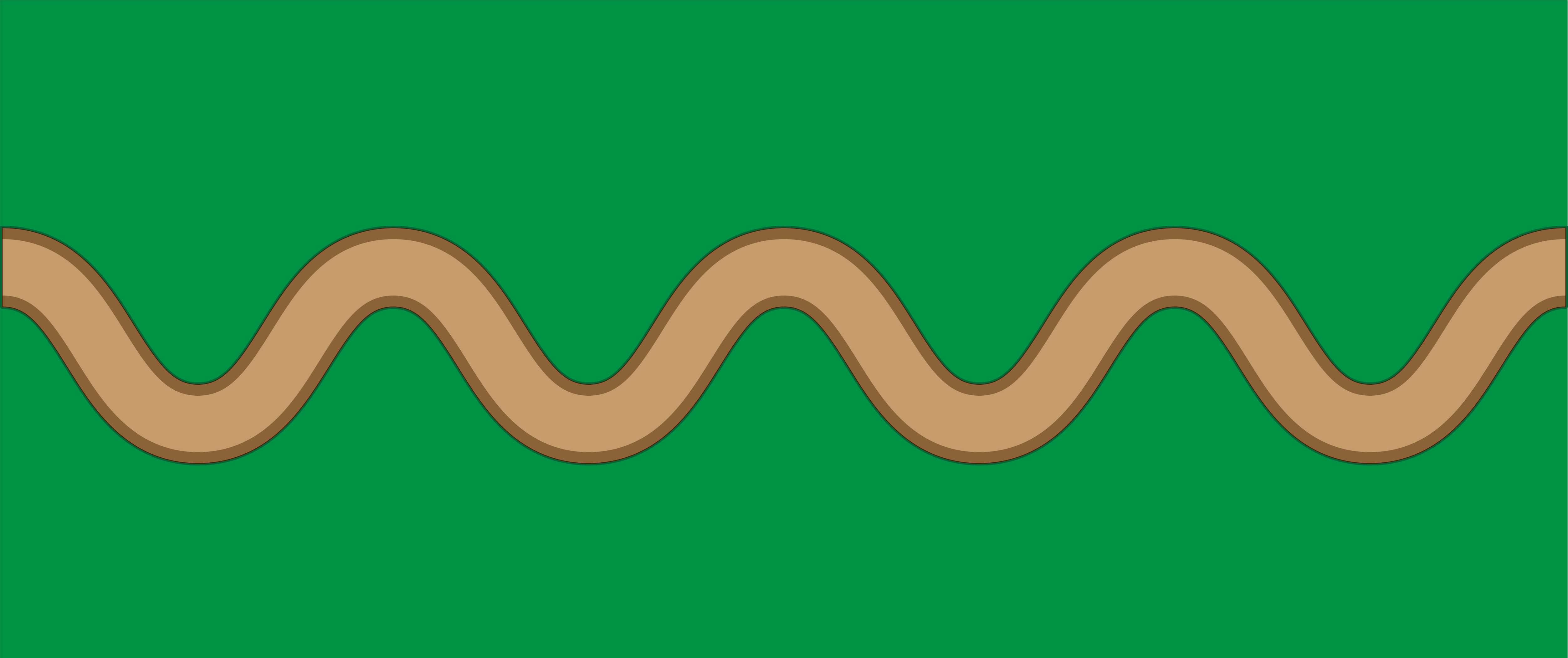
A question with an example illustration to show what I mean: 3d mapping with a symbol entirely made out of vector shapes, will result crappy on let's say, a sphere.
Does anyone know if there are setting to tweak in order to make these mappings perfect? I've tried adding more points, no avail. I know that shapes with straight lines perform better, but I'm sure that's not a fix.
Thanks in advance.
Using cc 2019 btw.


Explore related tutorials & articles
 11
Replies
11
11
Replies
11

Copy link to clipboard
Copied
Try adjusting your ambient lighting percentage. Sometimes you need to play around with your 3D surface settings.
Copy link to clipboard
Copied
Hi thx for replying, however this doesn't help. I've tried ambient and normal lighting, amount of blending, nothing works.

Copy link to clipboard
Copied
Have you tried [Strg]+
(toggle between GPU/CPU preview)
Copy link to clipboard
Copied
Yep also tried it, didnt change. Also, it's crap in the export so...
Copy link to clipboard
Copied
Export as … what?
Can you upload the file on a hoster of you choice (dropbox or eg xup.in) and link to here, please?
Copy link to clipboard
Copied
Sure thing, here it is. https://dmvd.stackstorage.com/s/AQLcinZTMKhNMUJ

Copy link to clipboard
Copied
Hi DMVD123,
When making the Symbol, I would not include the green background as part of the Symbol. Make the Stroke or Fill of the original vector object green. This will make it much easier to adjust the size of the Mapped Art.
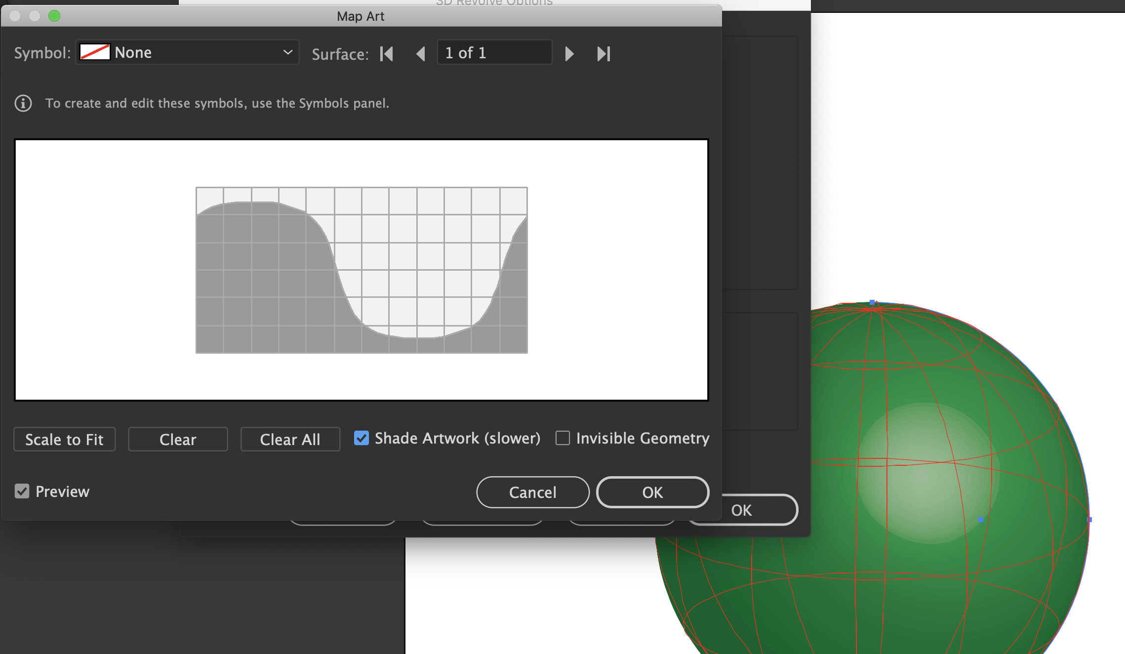
There is a "secret" setting that you're probably missing that would make the result work better. Check "Shade Artwork (slower)". It is slower, but it's well worth the wait, because the artwork will look like it's on the surface of the shaded object. See screenshot below.
Here's a video that might help: http://www.jeffwitchel.net/2011/11/good-as-gold/
It's a different 3D Effect, but it should be helpful for lighting and more.
The default lighting is awful, so you may want to get rid of ambient light and add an extra light as a "bounce light" to open up the dark side of the object a bit so you can see some detail. It's kind of like lighting a still life for photography with one main light source and then a much softer (less intense) light exactly opposite to create bounce or reflected light.
Hope this helps!
Jeff
Copy link to clipboard
Copied
Hey Jeff, thanks for your time and thorough reply.
When making the Symbol, I would not include the green background as part of the Symbol. Make the Stroke or Fill of the original vector object green. This will make it much easier to adjust the size of the Mapped Art.
Yes, good call. My symbol is indeed green in the background. Although that was just one of many tryouts, to see if something changed in my file. I did in fact also make the globe green, but it turned out that it wasn't the problem.
There is a "secret" setting that you're probably missing that would make the result work better. Check "Shade Artwork (slower)". It is slower, but it's well worth the wait, because the artwork will look like it's on the surface of the shaded object.
Unfortunately though, it doesn't seem affected by changing the shade artwork setting.
Unfortunately this also does not change much to the problem I'm having. Ticking shade artwork on or off doesn't get rid of the gaps and inconsistencies.
I've included a test file, maybe my Illustrator's just broken 🙂 You probably notice how the two road lines that overlap eachother have weird render problems on the sphere: https://dmvd.stackstorage.com/s/AQLcinZTMKhNMUJ
Copy link to clipboard
Copied
Hi DMVD123,
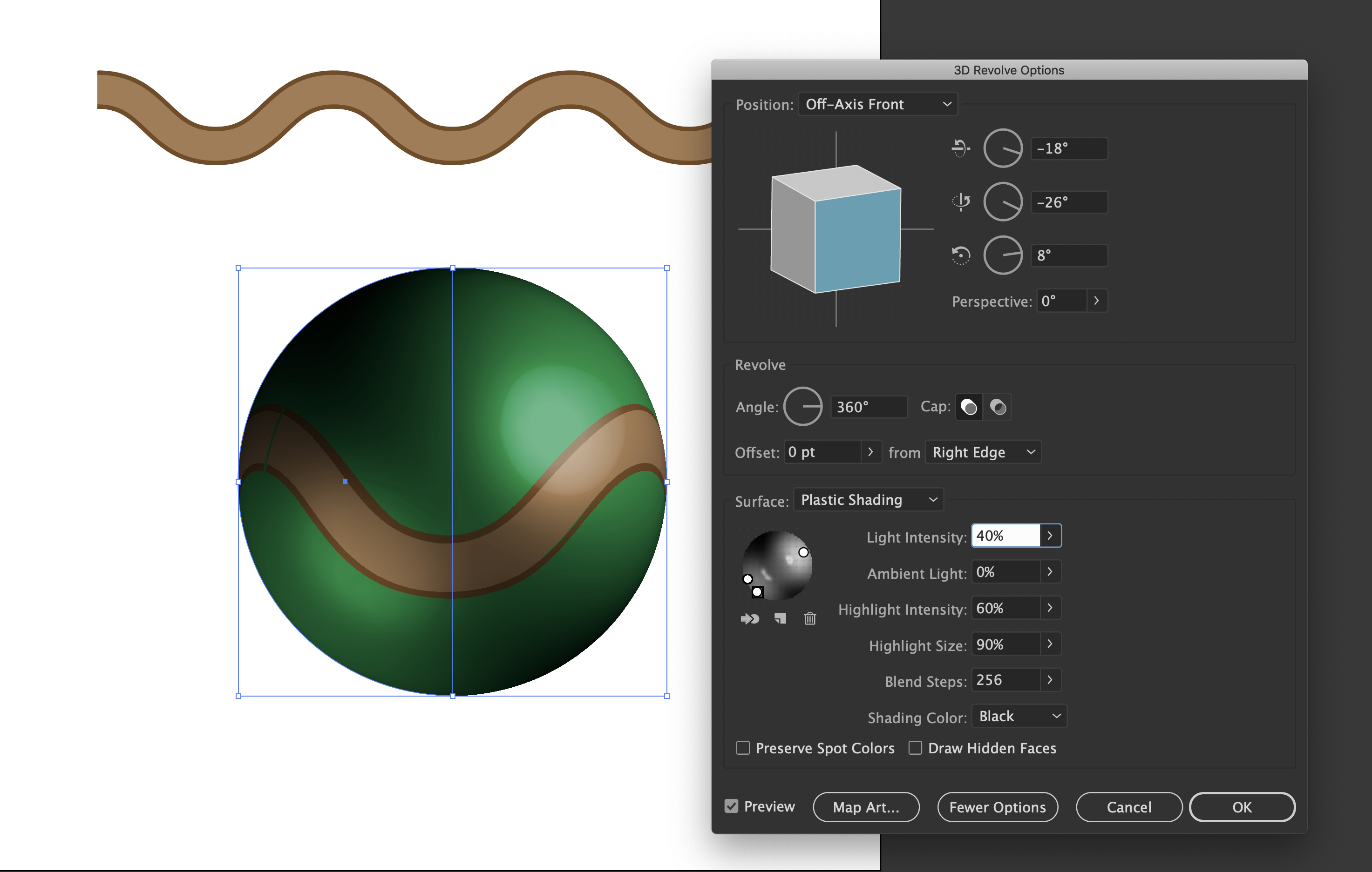
There's a lot of problems with the way your Effect is set up, so I'm not surprised that your not happy with it. There are way too many lights all with the same intensity which is flattening the Effect. One light needs to be a lot more intense, so it's main light source.
I would Trash the Effect and start over again.
You may want to use Plastic Shading instead of Diffused. It will look more 3D with a highlight even if you lower the intensity. And for shading use black. It will look more natural. Just my 2¢!
Here's a screenshot with the settings I used along with the art.
Hope this helps!
Copy link to clipboard
Copied
Hi Jeff, thanks again.
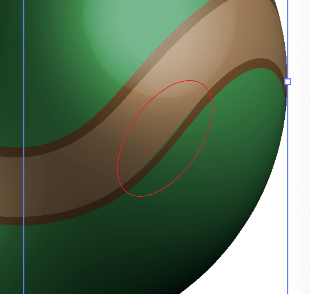
That indeed looks a lot better. However I can still see that the road displays incorrectly along the curves. So I guess I have my answer that it's not only my illustrator. I admit the way you set it up does make the inconsistencies less visible.

Copy link to clipboard
Copied
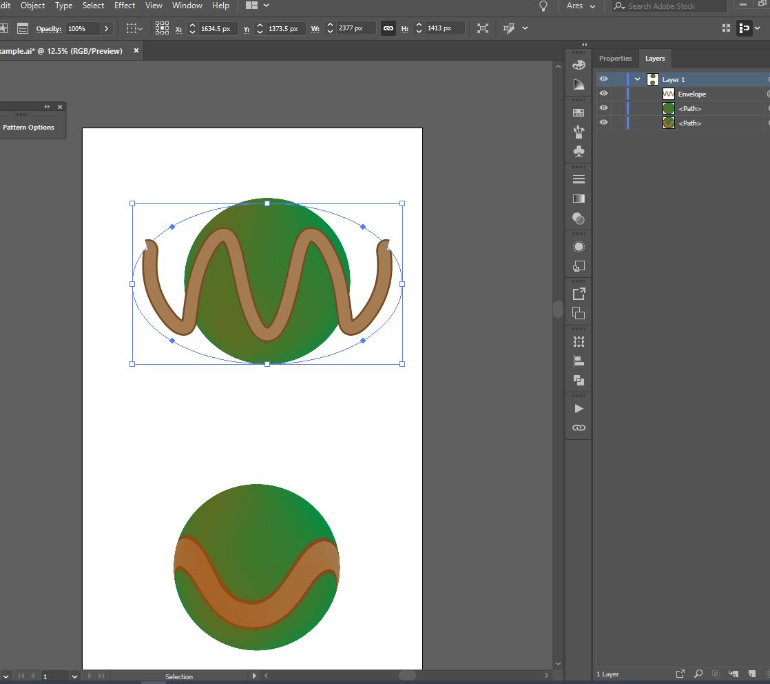
I can suggest you to try other methods>There are Envelope Distort submenu in Object Menu where you can find Warp, Mesh and Envelope with Top objects possibility. Some time they works better than 3D effect. I have attach a capture where I made Envelope with top object. In my case I use ellipse. You need to work manually for placing object on surface in correct or desired position

 AdChoices