 Adobe Community
- Home
- Illustrator
- Discussions
- Arial font is always showing up as narrow
- Arial font is always showing up as narrow
Arial font is always showing up as narrow
Copy link to clipboard
Copied
Hi everyone,
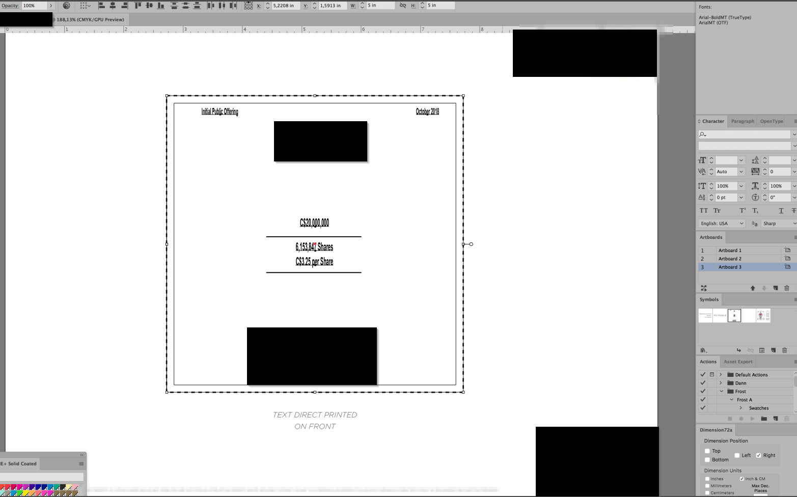
One of my artists right now is experiencing issues with the Arial font. Whichever document she opens that contains the Arial font, the font is always showing up as narrow. What's weird is that on the other artists' computers here, there's no issue at all with the Arial font.
Is there something to do to fix this ?

Thanks !
Explore related tutorials & articles
Copy link to clipboard
Copied
Which version is this?
What kind of document do you open?
Is there font management installed?
Copy link to clipboard
Copied
Hi !
Version 22.0
Just a regular .ai file
No font management, we manually import them in the Apple fontbook
thanks !
Copy link to clipboard
Copied
Is the correct font installed?
Is the font OK or could it be corrupted?
Copy link to clipboard
Copied
One solution is not using Arial. Just kidding.
But really I'm not a fan of that typeface at all. I work in the sign industry and I associate Arial with lots of BAD sign design. Arial alone is kind of ugly compared to other similar sans faces like Helvetica, Akzidenz Grotesk, Univers, Franklin Gothic, etc. IIRC, the typeface was commissioned by Microsoft and made by Monotype just so Microsoft wouldn't have to pay Linotype to license Helvetica in the Windows OS. Arial has the same metrics as Helvetica. It just doesn't look as "clean." But getting back to the issue with Arial and its use in the sign industry, I'll often see Arial distorted out of its normal proportions. Squeezed or stretched to fit a given space. It drives me nuts. I'll only spec Arial in a sign design if a customer specifically requests it. Our local airport did just that for some fabricated metal letters for its fire and emergency services building. Ugh.
Anyway, getting to the actual problem, I wonder if there is a conflict with the font file names in the document. Something has to be going on for the version of Arial referenced in the document loading the Narrow version. It's possible for the Arial font file to be corrupted and that the system font files need to be restored. Maybe the other computers that load the document correctly are using a different build of Arial. There are multiple versions of it. For instance, the stock version of Arial in Windows 10 has a far more elaborate character set than the one loaded in Windows XP.
