Copy link to clipboard
Copied
I hope this is allowed here. I skimmed the guidelines and it didn't seem to be a problem. If it's not then I would appreciate suggestions on the best place to go for this type of post.
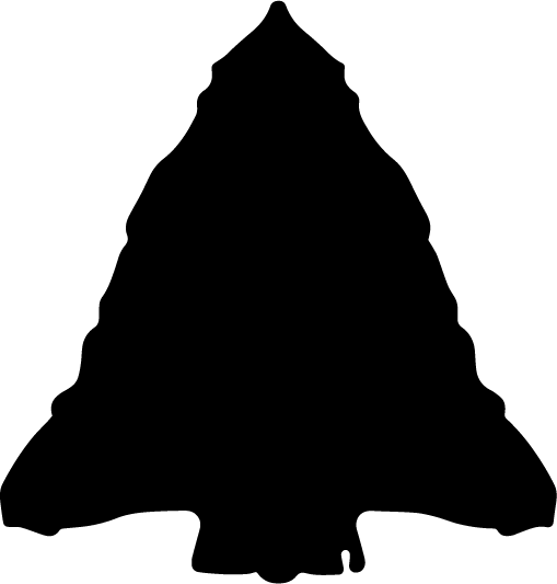
I am trying ot start a web design business of my own and am working on a logo. It's something I sketched on paper a year ago and have been off and on getting it to where it is now. The name of my business is Straight Arrow Design and my logo is of an arrowhead, here is what I have:
I would like to say that this is a very cleaned up Adobe Illustrator file, but it's somewhat messy at this point with so many edits over such a long period of time. I used a combination of image trace and manipulating the file in Illustrator and Photoshop both at this point.
I say all of that to say that most of the feedback I have gotten is that it looks more like a Christmas tree than an arrowhead. Any suggestions on how to adjust it to give it more of an arrowhead look?
Thanks for any help!
Zak
 2 Correct answers
You obviously use a reflection of the two sides which are exact copies of each other. Mix them up a bit and what would make it look real is the scallop effect of a real arrowhead.
Zak,
When I see it, my thought is that viewing a number of stone arrowheads, as here,
https://duckduckgo.com/?t=ffab&q=stone+arrowheads&atb=v1-1&iax=images&ia=images
could give inspiration to enhance/diminish details and adjust general shape to get (close) to an unambiguous arrowhead appearance, such as the one pointing upwards in the image to the far right in the third row.
Many of them also has an asymmetry that can be good, as Larry has mentioned.
Explore related tutorials & articles
Copy link to clipboard
Copied
You obviously use a reflection of the two sides which are exact copies of each other. Mix them up a bit and what would make it look real is the scallop effect of a real arrowhead.
Copy link to clipboard
Copied
Thanks Larry! Will give those suggestions a try. 🙂
Copy link to clipboard
Copied
Zak,
When I see it, my thought is that viewing a number of stone arrowheads, as here,
https://duckduckgo.com/?t=ffab&q=stone+arrowheads&atb=v1-1&iax=images&ia=images
could give inspiration to enhance/diminish details and adjust general shape to get (close) to an unambiguous arrowhead appearance, such as the one pointing upwards in the image to the far right in the third row.
Many of them also has an asymmetry that can be good, as Larry has mentioned.


