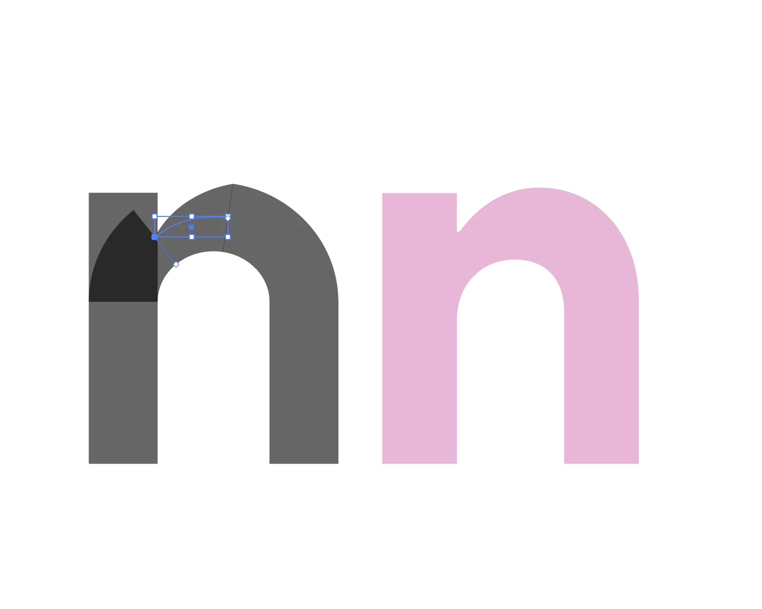
Font Creation - How to Increase Curve of Letters as They Meet Straight Line
Anyone who's ever created a font has probably noticed that - particularly with lower case letters in boldface fonts - the rounded curve of letters like "n" or "u" or "b" or "d" has to noticeably increase as the rounded portion of the letter approaches the straight vertical stem/ascender portion.
I'm currently having a surprising amount of trouble figuring about the best way of doing this. I have an entire alphabet that I've created as strokes (to be outlined into shapes later on), and I can't seem to use the width tool to gradually alter the curve without creating an ugly jagged result. Attached is an image with my failed attempt at a letter "n" on the left and an example of a good letter "n" on the right that I'd like to more or less emulate.
Perhaps this can't be completed in stroke form and I'll need to convert to shapes first? But even then, I'm not sure of the best way to go about this.
Any ideas would be much appreciated. Thank you.


