Gradient thickness of stroke?
Copy link to clipboard
Copied
Hi community,
Is there a way to make the stroke thickness smoother along all letters, a bit like a gradient from the 'N' outwards on both sides?
So for the below, I'd love for the stroke to flow and get thicker gradually rather than blocky and obvious that it's been made 'bolder' from the other letters.
I hope this makes sense to someone?
Explore related tutorials & articles
Copy link to clipboard
Copied
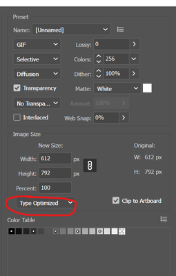
File >> Export >> Save For Web (Type Optimized)
https://helpx.adobe.com/photoshop-elements/key-concepts/aliasing-anti-aliasing.html
Copy link to clipboard
Copied
Thank you - I mean for the actual width of stroke, not for the pixel quality
Copy link to clipboard
Copied
The (not free) plugin WidthScribe has a tool that allows precisely that.
Peter
Copy link to clipboard
Copied
Oh this is awesome, never heard of that! Thank you so much.
Copy link to clipboard
Copied
Hello again - I was wondering if you could do a short video via loom about how you did this so I can see before purchasing????
Copy link to clipboard
Copied
There is a demo version available so you can try it for free for a few days and decide if it's useful for you.
Find more inspiration, events, and resources on the new Adobe Community
Explore Now


