 Adobe Community
- Home
- Illustrator
- Discussions
- Re: How do I create this look in illustrator....
- Re: How do I create this look in illustrator....
How do I create this look in illustrator....

Copy link to clipboard
Copied
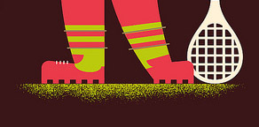
I'm recreating some vintage art and am trying to get this spray paint look. Any suggestions on how to go about achieving this look (see photo) in illustrator?
I'm currently running CS4 (I'm on my work computer)....

- I've tried looking in the preset brushes, no luck!
- I've tried creating my own brush using vector spray paint, no luck!
- I've tried looking for illustrator brushes online, no luck!
This seems like a very simple effect to do, I know how to create this look in photoshop but I need this to be vector. Any suggestions would be great!
Thanks guys!


Explore related tutorials & articles
 18
Replies
18
18
Replies
18
Copy link to clipboard
Copied
Sorry guys about the above link, first time poster....

Copy link to clipboard
Copied
You can live trace in illustrator your photoshop graphic of the dissovle texture to get this to be vector.
I usually almost always recomend to keep things vector, but in this case I recomend Photoshop >> Image >> mode >> Bitmap and choose 1200 dpi. Then save as .tif and colorize this in photoshop.
I had a project using a smiliar texture, and find that such a fine texture using vector made
- your files slow
- The sandpaper look plug up when you scale this. When you scale this, the amount of negative and positive space does not print out proportionately. I changed the advanced print settings in illustrator, to all bitmap and 1200 dpi, but could not keep a consistent look on this texture thourghout the project.
Depending on your usage you may want to go with live tracing this if you only have one graphic to do, but if you will be using this across a large project, the colorized tiff would be reomend.
Vector is great, but I found that tiny sandpaper likes textures like this do not print well, and the holes plug up when they are fine. If you are going for a coarser look than your sample, vector can hold up better.
The fusia brand is the project I had this happen with, on the edges of the cream colored banner.
Copy link to clipboard
Copied
Tried that, not the same crisp look as the example plus i need to have better control of the texture like in a brush format.
Copy link to clipboard
Copied
Getting crisp is no problem, just use more reosultion.
- CT Continous tone resolution is usually 300 dpi (eg: 150 lpi line screen)
- LW linework resolution is usually between 2540 & 3386 dpi in printing. (1200 usually does the job for what you need so you don't get a huge file)
Once you use more rsolution that wil help with either of the solutions I provided you of going vector or monotone colorized tif. Since you want to warp this on a brush, you will want to live trace this then.

Copy link to clipboard
Copied
Could you please post the results you are not comfortable with?
To achieve this you will have to go through several steps, each one will have an effect on the following one, so precise control will be difficult to achieve.
What you can do, is create a gradient in Illustrator (by one of several means), apply a grain filter. Then convert to pixels. Then live trace and tweak the options. For example the effect will change dramatically when you increase or decrease the threshold
Copy link to clipboard
Copied
Monika,
Your method is much easier and has resulted in almost the effect I'm wanting. It really doesn't allow for me to use it in the form of a brush for my illustration shadows and highlights but I think i can find a work around. Thanks for the advice! I'm going to toy around with your method but my first try out of the gate was good!
Copy link to clipboard
Copied
You're welcome

Copy link to clipboard
Copied
do people EVER answer anything with an easy 1 or 2 steps? My god, every question I have requires a bunch more research to just understand the initial question.
1. I can't wait until more options are available for dummies like myself - the learning curve for this gd product is insane
2. I wish people who answer questions didn't work so hard to show off what they know technically. Give a simple answer whenever possible.

Copy link to clipboard
Copied
what if there isn't a simple answer?

Copy link to clipboard
Copied
Maybe try these brushes
8 Free Stipple Shading Brushes for Adobe Illustrator
Draw a rectangle no stroke or fill
go into draw inside mode
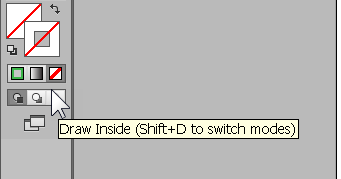
Select > Deselect
change to a stipple brush, assign a stroke colour
click away.
When satisfied go back to draw normal mode.
Create a rectangle with fill and send to back.
(or something like that ...)


Copy link to clipboard
Copied
do people EVER answer anything with an easy 1 or 2 steps?
Sure. When there is a 1 or 2 step answer in the subject program.
But first, you're asking this question in a thread that's over six years old. Second, this being the Illustrator forum, the assumption is that the thread starter wants to do it in Illustrator, which provides very little in the way of very simple raster-based effects. Third, "1 or 2 steps" answers were mentioned in the first paragraph of post 14, referring to applications in which such effects were quite commonly achieved in 1 or 2 steps.
The basic issue is that 1-bit raster imaging has been largely neglected since the earlier days of computer graphics, especially in primarily vector-based drawing programs. (Thus my suggestion that Illustrator's Rasterize command would be much improved by simply including a diffusion dither option.) You can see in this thread all the convoluted routines involving "higher end" features just to simulate what one could do in the 80s with, for another example, a mere swipe of the Airbrush Tool in Silicon Graphics SuperPaint, which directly did exactly what is needed here: it simply sprayed a very low-tech 1-bit diffusion dither on SuperPaint's raster layer.
I wish people who answer questions didn't work so hard to show off what they know technically.
This is a user forum. People answer the way they feel like answering. No one is obligated to answer anything, and if you don't like an answer, that's tough. If you don't like the style of answers others write, you're free to post the kind of answers you prefer and show off how your style is so superiorly efficient. But when you are seeking free how-to advice, you might do well to not start with an insult to everyone who's bothered to answer so far.
I, for one, tend to write longer posts because I write the kind of answers I would like to receive were I asking the question: One that bothers to explain the underlying principles rather than only providing a step-by-step procedure that a monkey could be trained to follow. I tend to include both, because I don't like to have to ask for free advice, and understanding a little of the principles involved can answer the question once and for all, not just for the current instance.
So I don't write posts assuming an attention span less than that of a three year old. You're welcome to ignore them.
JET

Copy link to clipboard
Copied
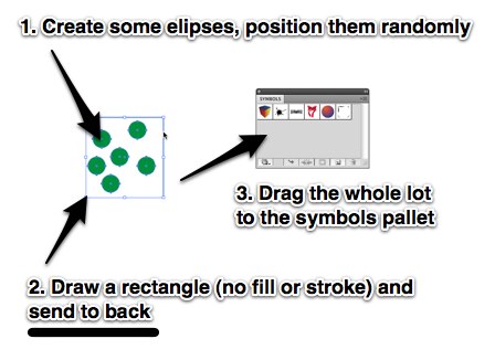
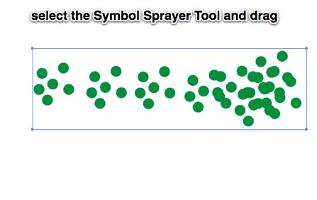
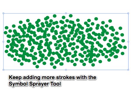
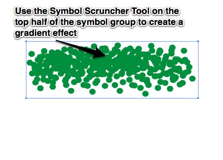
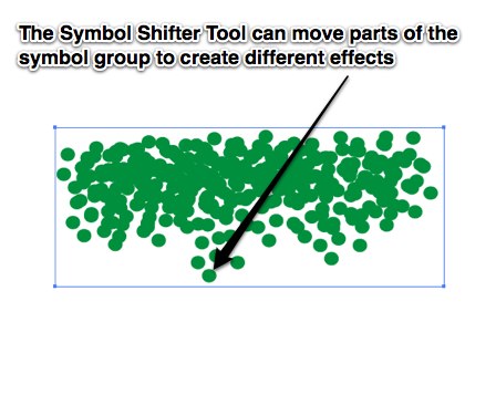
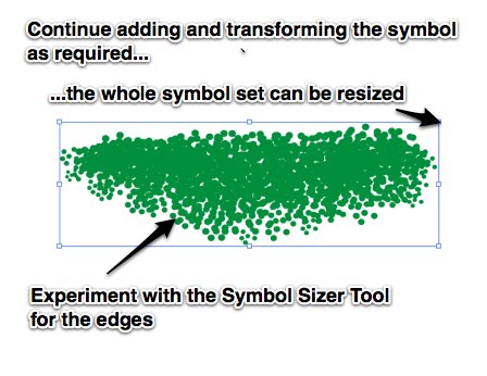
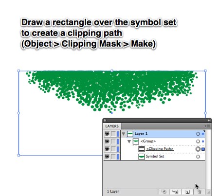
Try creating a new symbol of some random dots then use the Symbol Sprayer Tool. Fine tuning of the dots can be done with the other symbol-altering tools such as the Symbol Shifter Tool.

Copy link to clipboard
Copied
Hi ja3754,
Is there any chance you could expand on this tecnique and post your result?
I've tried using symbols to get something like the above result but can't get the crispness or the nice dissipating effect.
I've also tried gradient > grain > live trace
but haven't had much luck.
Thanks,
Ben (on CS4)
Copy link to clipboard
Copied
Copy link to clipboard
Copied
Thank you, much appreciated,
Ben

Copy link to clipboard
Copied
The look you are trying to get can be achieved in Illustrator... The way I would do it (and just tested to be sure it would work) was using one of the decorative brushes.
If you (using your pen tool) draw the shape you are roughly trying to create and then apply one of the confetti looking brushes to it (it will be all confetti colored but don't worry) you will have a good start, then apply several more layers with the pen tool creating more curves that flow with the way you want the design to look. make sure that as you apply layers you put more toware the top, than the bottom so that the top will appear more "filled in".
When you are done, expand all the lines, select all, and recolor them.
You can then use pathfinder to "merge" the pieces together and mask the area at the top to give it a flat edge. It would look like this:

So creating that type of texture is not that difficult if you know a couple tricks... If you would like the image that I built to use a a base, send me an email address and I will send it to you.
Copy link to clipboard
Copied
I just tried it out, pretty effective and it allows me to use my brush tool and target the specific areas of my illustration that i want to shadow and highlight.
Thanks!
Copy link to clipboard
Copied
First...
There is nothing wrong with a 1-bit diffusion dither object being raster, as far as printing results is concerned. Such images date back to the days of MacPaint and Hypercard. They are same-size (historically usually 1-point) pixels, randomly distributed at varying frequencies to suggest tones (as opposed to individual printer spots being combined to build varying size halftone dots).
So if the tiny squares are vector, yes, they are scaleable. But so are 1-bit pixels. When you scale a 1-bit raster, you're scaling square pixels, which are printed as squares. So a scaled 1-bit raster image is just as "resolution independent" as a bunch of vector squares.
Second...
This effect was employed in illustrations and designs since the very beginning of desktop publishing. For example, I frequently used it in the 80s thusly:
1. Draw a vector path of any shape in FreeHand.
2. Copy it to Photoshop. Blur it. Convert to 1-bit using diffusion dither. Save it as TIFF.
3. Import into FreeHand. Stack it below the object for which it served as a glow or drop shadow.
FreeHand had the ability to apply any color to a 1-bit or grayscale raster image, and the ability to set the white pixels of a 1-bit image to transparent. Illustrator didn't gain those abilities until decades later.
So it's not oppressively tedious to use that method nowadays, even in Illustrator. (And frankly, that's the way I'd do it.)
Third...
Illustrator sorely needs to provided a diffusion dither option in its Rasterize command for 1-bit color depth (as I've been arguing for years) instead of its lame pattern diffusion. Then this effect could be applied easily and quickly to any object, either as a "nailed down" rasterization, or as a live effect.
However...
You can simulate a vector diffusion dither pattern that you can apply to any path by combining several Scatter Brushes and storing their combined application as a Graphic Style:

1. Draw a 1 point square.
2. Store it as a Scatter Brush. Set the Spacing and Scatter settings to Random. To constrain the pattern to one side of the path to which it is applied, set the low limit of Scatter to zero.
3. Duplicate the Scatter Brush two or more times, changing the Spacing and Scatter upper limits in each duplicate so as to make each duplicate Brush increasingly sparse. In the example shown, the first Brush is named Scatter Brush 1 and has its upper limits for Spacing and Scatter to 300. This Brush was duplicated twice, and those two values doubled each time. But of course you can use whatever settings work for the effect you want.
4. Draw a temporary path with a 1-point stroke. Apply Scatter Brush 1. Select the Stroke Appearance and duplciate it. Apply Scatter Brush 2 to it. Duplicate the Stroke Appearance again, and apply Scatter Brush 3 to it.
5. Drag the whole path and drop it into the Graphic Styles palette to define a new Graphic Style. Now you can apply the whole Appearance stack to any other path(s) with one click.

Being Brushes, the fineness of the pattern can be adjusted by changing the weight of the strokes:

And, of course, you can apply other effects to the Brushes and strokes involved. For example, set the Colorization Mode of the Brushes to be able to change the color of the dither pattern; and/or apply Transform Effect to offset the pattern from the object to which it is applied (as for dithered drop shadows).
JET

 AdChoices