Copy link to clipboard
Copied
I am just learning how to use the pen tool and want to make sure I am using it in the most efficient way possible. After watching countless tutorials, I still feel like I don't fully understand how many anchor points I should be using and where precisely to place those anchor points when drawing different curves or shapes. I've heard the tips "use as few points as possible" and "place the anchor points at the extrema of the curve", but I am still confused because I see people drawing the same type of curves and shapes differently and the end result looks basically identical. Any pen tool masters out there that can help me out!? To understand what I mean I have provided two simple examples below. In these examples is option "A" or "B" the most efficient way to use the pen tool?
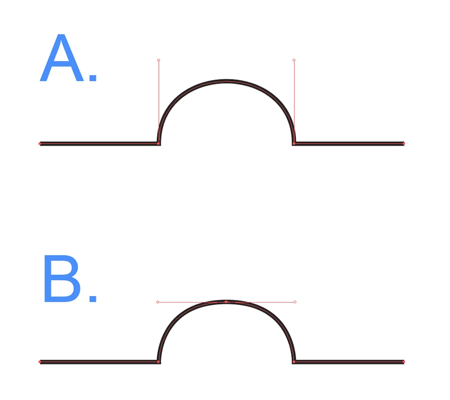
Example 1:
Example 2:
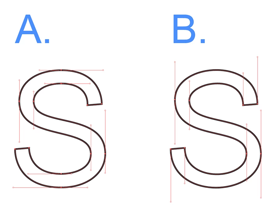
Copy link to clipboard
Copied
1. I would go for A, but it depends on the exact nature of the curve. If it's a semicircle, A should do.
2. Both wrong. A lacks handles on the corner points. A curve needs to always have handles on the anchor points on both sides. That is the foundation of Bézier curves.
B is just too extreme and I don't get peoples' obsession with vertical and horizontal handles. it might work better in specific situations, but don't make a law out of it.
Just watching tutorials will never get you there. You will need to get your hands dirty and get experience actually doing it. Only then you will get to know first hand what works and what doesn't.
Copy link to clipboard
Copied
Monika thanks for replying. I want to make sure I understood what you said about option A for the second example. Are you saying that every corner point needs to have two handles pulled out? I assumed that because it goes from a curve to a straight line that only 1 handle is needed at the most like I have in option B or even option A in the first example. The only way to wave two handles on a corner point would be to break one of the handles and then try to line it up perfectly where you want the straight line to be. But at that point you might as well get rid of that one handle right?
Copy link to clipboard
Copied
For a straight path segment, don't use handles, but a curved path segment needs handles on both sides.
Copy link to clipboard
Copied
Technically, Example 1A is insignificantly "more efficient" in that it has one less node.
Technically, Example 1B is more accurate when the precise height of the curve is important.
Practically, 1A is "more supple" if a continuously smooth, "kink-free" curve is more important that the mathematically-precise height of the curve.
Same principles apply to Examples 2A and 2B, but in reverse. If the S were being drawn for an actual font glyph, the nodes at the horizontal extrema are important because precise height of the characters is important for precise scaling and hinting. An S will also often have nodes at the middle of the diagonal sweeps to precisely control the greatest width of the character's "stroke." (You can learn a lot by converting quality fonts to curves and thinking about why nodes are placed as they are. Reading books on font design is a worthwhile thing for vector illustrators to do, even if they never intend to create fonts.)
But if the S were not an actual glyph, but just an example of a smoothly flowing curve, then again, minimizing nodes along the middle of a curve lets a Bezier curve do what it is designed to do: mathematically generate supple, eye-pleasing curves by interpolating the curve at the granularity (resolution) of the rendering device.
So as a general decision-guiding principle while drawing, continually think about whether interpolating a smoothly fluid curve is more important, or whether a particular position along that curve needs to be precisely "nailed down."
But don't go nuts over it. As a very loose and broad rule-of-thumb, curve "handles" are usually somewhere in the range of 1/3 the segment length. For most shapes that's a practical balance between visual smoothness and manipulation precision.
JET